

Unlock Designer Paint Colors on a Budget: Your Ultimate Guide to Affordable Style
Every week, my inbox lights up with questions about paint. “What color is that in your living room?” or “How do you mix paint colors?” are perennial favorites. It seems many are surprised to learn that achieving that coveted designer look doesn’t have to break the bank. For years, I assumed this simple trick was common knowledge, but the sheer volume of inquiries proves otherwise. Today, I’m thrilled to unveil my secret to acquiring high-end paint colors at everyday hardware store prices.
The home improvement landscape is constantly evolving, yet the desire for beautiful, stylish interiors remains constant. One of the biggest hurdles for many DIY enthusiasts and homeowners is the cost associated with premium paint brands. While labels like Benjamin Moore and Sherwin Williams offer stunning palettes, their price tags can often deter those working with a tight budget. But what if I told you there’s a straightforward method to bypass those hefty costs without compromising on the aesthetics of your dream home? Welcome to the world of paint color matching – a game-changer for anyone looking to refresh their space affordably.
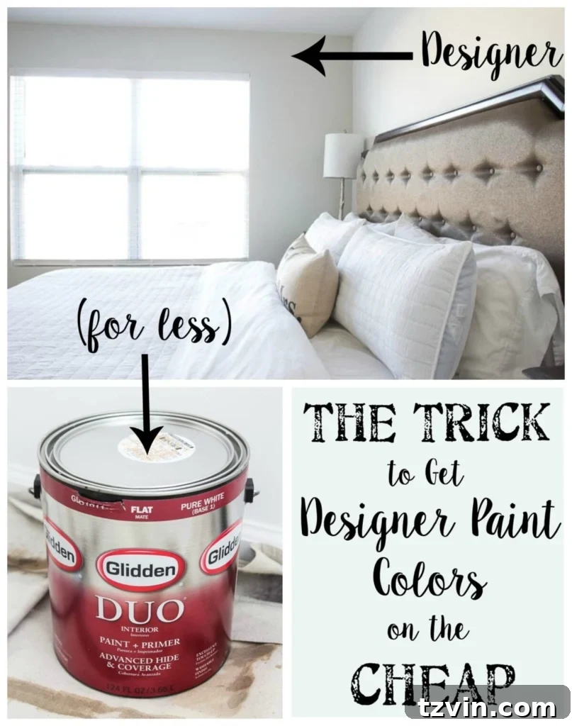
So, here’s the breakthrough many haven’t discovered: You can have virtually *any* brand’s paint color formula mixed into *any* other brand of base paint you desire. This seemingly simple fact opens up a world of possibilities for budget-conscious decorators. Why pay a premium for a specific brand’s pigment when you can get the exact color code — often available in a vast online database — and have it replicated in a more affordable base paint from your local hardware store?
My personal journey into this hack began out of necessity. As much as I adore the sophisticated hues offered by designer paint companies, my budget often dictates a more frugal approach. Plus, the convenience factor is undeniable. Who wants to drive across town with a restless toddler just for a specific gallon of paint when a perfectly good hardware store is right around the corner? This method eliminates the need to wait for sales or make special trips, making your painting projects both economical and hassle-free.
The Art of Paint Color Matching: How It Works and Why It Saves You Money
The magic lies in modern paint technology. Paint retailers, whether independent stores or large chains like Home Depot and Lowe’s, possess advanced color matching systems. These systems use spectrophotometers to analyze a color sample (a swatch, a piece of fabric, or even a digital color code) and then generate the precise formula needed to recreate that color using their own paint bases and colorants. This means that a Sherwin Williams “Sea Salt” or a Benjamin Moore “Moonshine” isn’t exclusive to their brand; it’s a specific blend of pigments that can be replicated.
When I head to the store, I often request designer colors like Sherwin Williams or Benjamin Moore to be mixed into more budget-friendly brands such as Glidden or Valspar. The choice usually depends on whether I’m at Home Depot (which carries Glidden and Behr) or Lowe’s (which features Valspar). What’s truly remarkable is that there are hundreds, if not thousands, of paint colors available in online databases. This liberates you from the limited selection of physical swatches on the wall, allowing you to choose any color that inspires you, regardless of the original brand.
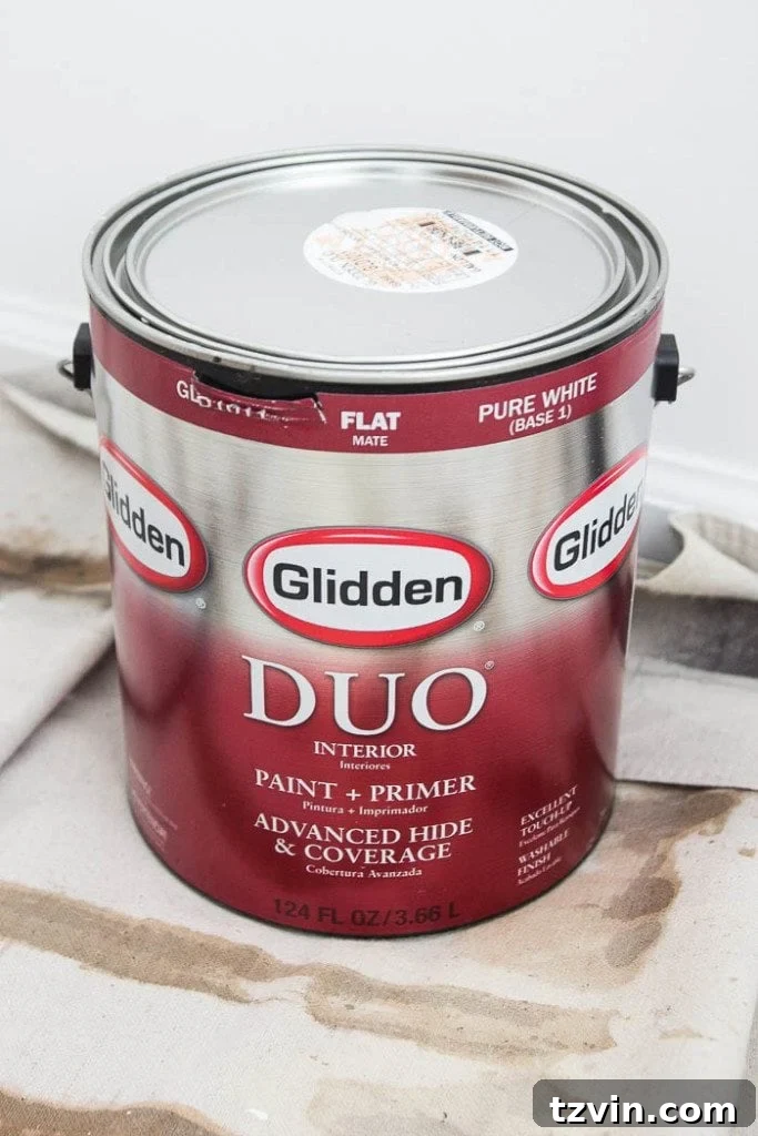
Through extensive trial and error, I’ve found Glidden to be an excellent, less pricey option that consistently delivers. Take a look at the label below: that’s Glidden paint, but the color is “Moonshine” by Benjamin Moore. This simple switch can save you upwards of $20-$25 per gallon, which significantly adds up on larger projects. I’ve even managed to stack manufacturer rebates on top of those savings, further maximizing my budget.
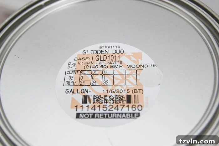
While Benjamin Moore and Sherwin Williams are renowned for their superior coverage and rich pigments, the truth is that many less expensive brands have significantly improved their formulas. Often, a single gallon of a hardware store brand is all I need for a room, especially when paired with efficient painting techniques. My husband, Robert, has even perfected the art of painting an entire room in just one coat, a testament to both good paint and skilled application. So, there you have it – my handy secret for getting a designer look for less. Every penny saved is a penny earned for your next DIY endeavor, wouldn’t you agree?
Tips for Flawless Color Matching and Paint Selection:
- Always Bring a Swatch: If possible, bring a physical paint chip or a small sample of the color you want to match.
- Verify the Color Code: Double-check the color name and its corresponding numerical or alphanumeric code to ensure accuracy.
- Ask for a Small Sample: Before committing to a large quantity, purchase a small sample pot to test the color in your home’s lighting conditions.
- Discuss Sheen: Decide on the appropriate paint sheen (e.g., matte, eggshell, satin, semi-gloss) for your specific application, as it affects durability and appearance.
A Curated Tour of Our Home’s Budget-Friendly Designer Paint Palette
Now that you’re armed with this cost-saving knowledge, let me show you how I’ve applied it throughout our home. We’re still tackling a few bare rooms upstairs, but this ongoing process allows me to continuously update our palette. Here’s a glimpse into the colors that bring peace and personality to our spaces, all achieved with smart paint choices:
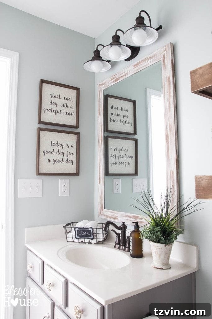
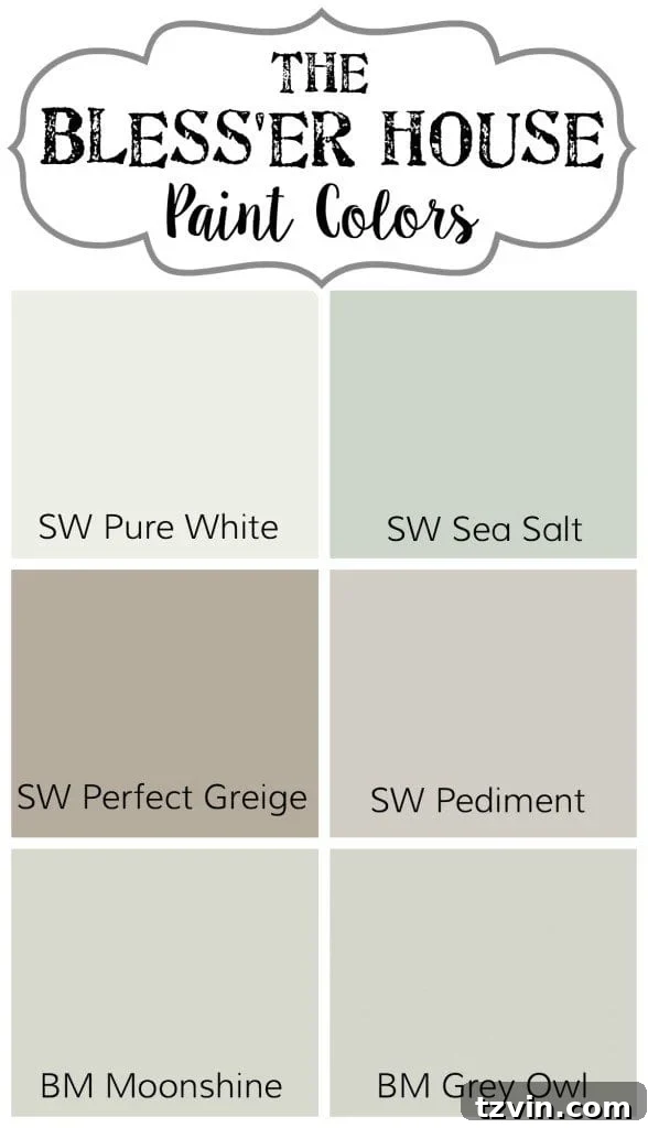
Guest/Kid’s Bathroom: Sherwin Williams Sea Salt mixed in Valspar
This color holds a special place in my heart; it’s arguably my absolute favorite in the entire house. Sea Salt is a true chameleon, gracefully shifting between soft blues, muted greens, and subtle grays depending on the light throughout the day. It creates an incredibly peaceful and clean atmosphere, making it perfect for bathrooms and even our powder room. I wouldn’t be surprised if it eventually finds its way into our laundry room too. For the bathroom cabinets, we opted for Benjamin Moore Winter Gates, also mixed into Valspar, providing a sophisticated contrast.
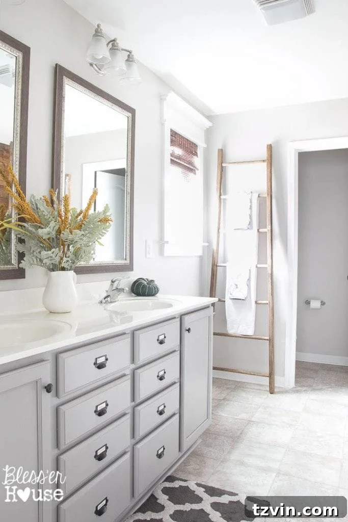
Master Bathroom: Sherwin Williams Pediment mixed into Valspar
For our master retreat, Sherwin Williams Pediment was the ideal choice. This light neutral strikes a perfect balance between warm and cool tones, making it incredibly versatile and a safe bet when you’re overwhelmed by paint choices. It provides a serene backdrop without feeling too stark or too warm. Just like in the guest bathroom, the cabinet color is Benjamin Moore Winter Gates, maintaining a cohesive design flow.
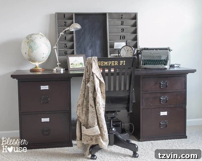
Office: Sherwin Williams Pediment mixed into Valspar
Necessity is the mother of invention, and in this case, a leftover gallon of Sherwin Williams Pediment from the master bathroom found its new home in my office. It was a no-brainer to use what we had rather than let it go to waste. While I sometimes ponder if a darker, more dramatic color might have given the room a hyper-masculine edge, I remain pleased with the calming and consistent feel that Pediment brings. It keeps the space bright and conducive to focused work.
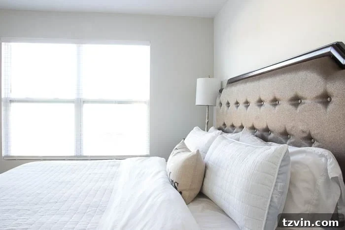
Master Bedroom: Benjamin Moore Moonshine mixed into Glidden
We’ve just begun the exciting journey of transforming our master bedroom, and the chosen color, Benjamin Moore Moonshine, mixed into Glidden, already feels like a triumph. It’s a beautifully soft, very light gray that evokes a sense of tranquility and peace – precisely what you want in a bedroom sanctuary. This subtle hue sets the perfect foundation for a relaxing and stylish retreat.
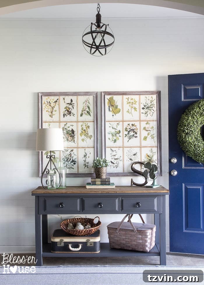
Foyer: Sherwin Williams Pure White mixed into Valspar
For a truly crisp and versatile white, Sherwin Williams Pure White is my absolute go-to. Mixed into Valspar, it graces our plank wall, all the trim throughout the house, and the fireplace surround. It’s a clean, bright white that serves as the perfect canvas, allowing other design elements to truly shine without any unwanted undertones. This color is a testament to the fact that sometimes, simplicity is the ultimate sophistication.
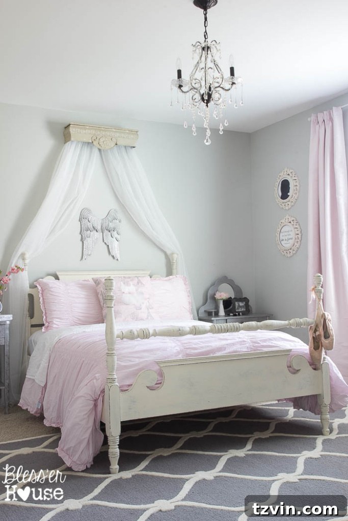
Olivia’s Bedroom: Benjamin Moore Grey Owl mixed into Sherwin Williams
Olivia’s room features Benjamin Moore Grey Owl, which I managed to get mixed into Sherwin Williams during a fantastic 40% off sale. This light gray is so lovely that I could easily envision painting our entire house in it. It carries a delicate hint of blue, adding a serene and whimsical touch perfect for a child’s room. It’s a reminder that sometimes the best deals come when you’re flexible with the base paint brand, seizing opportunities like sales to maximize savings.
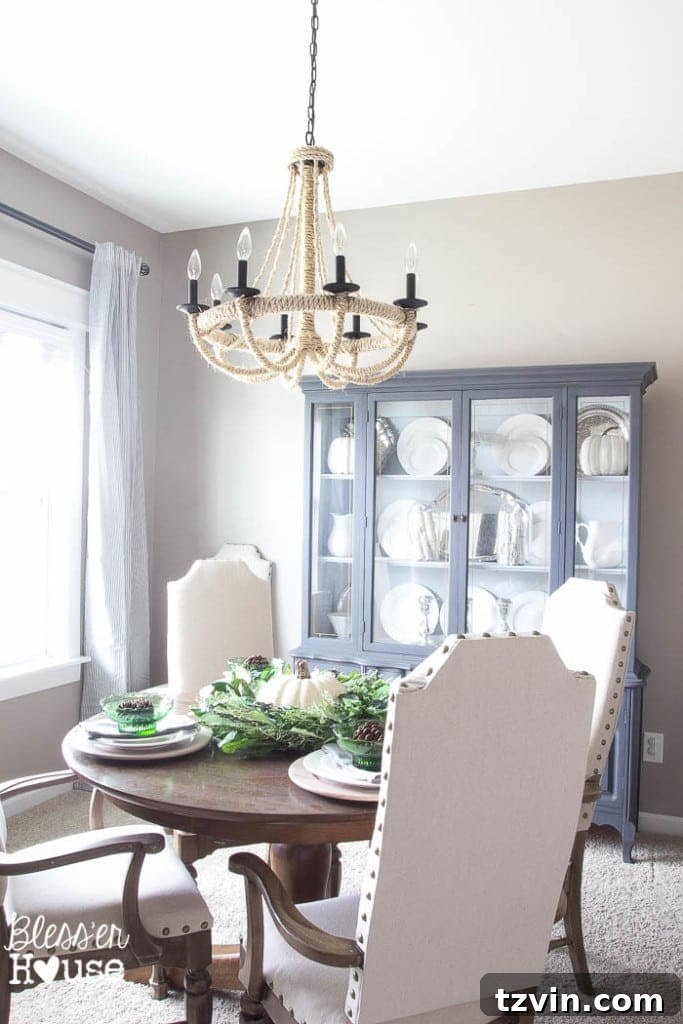
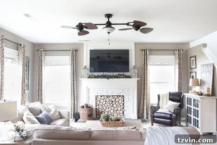
Dining Room, Living Room, Kitchen, and Breakfast Area: Sherwin Williams Perfect Greige
Ah, the dining room – a space that taught me valuable lessons in paint selection! This area, along with our living room, kitchen, and breakfast area, is painted in Sherwin Williams Perfect Greige. I had to choose a paint color for the entire downstairs in a hurry before moving in, rushing the decision during another 40% off sale. While it’s not that I dislike the color, it turned out to be darker and more beige than I had envisioned. It’s a classic example of how important it is to test swatches in natural light before committing. That said, Perfect Greige does exhibit a beautiful chameleon quality, appearing more gray in certain light conditions. It’s pretty, just not my ideal choice in hindsight, but it doesn’t bother me enough to repaint it – a testament to learning to live with and appreciate your choices. This experience highlights the importance of thorough consideration, even when you’re under a time crunch.
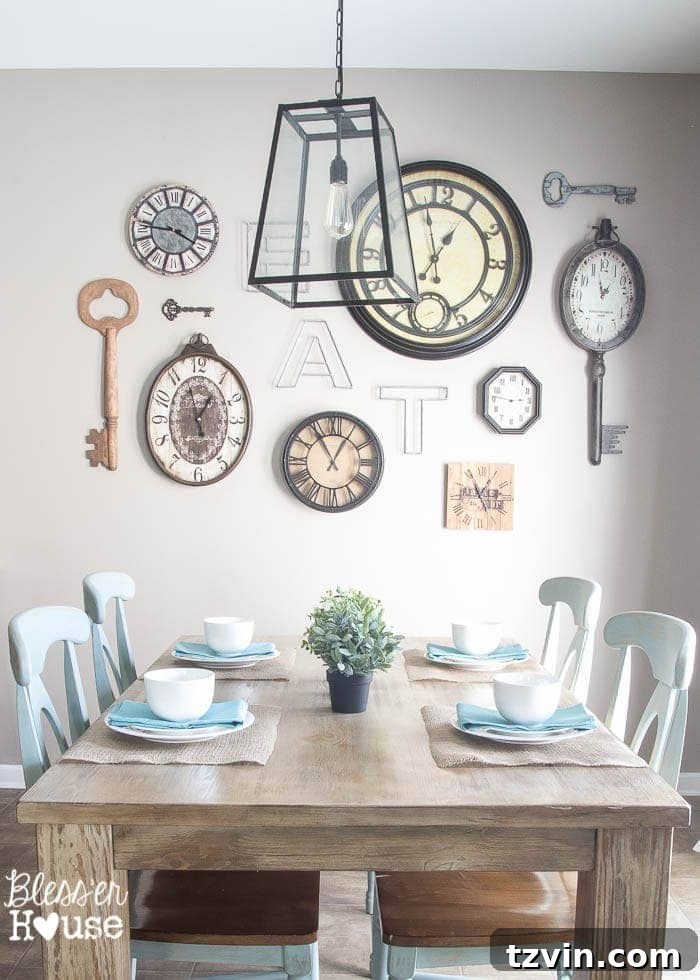
Kitchen Chairs: Annie Sloan Duck Egg
Beyond wall colors, paint plays a huge role in furniture makeovers. Our kitchen chairs, for instance, are painted in the charming Annie Sloan Duck Egg. This is a chalk paint, known for its velvety matte finish and minimal prep work required. Duck Egg is a gorgeous, soft blue-green that perfectly complements our neutral palette without overwhelming it. It’s my absolute favorite for those who, like me, adore neutrals but crave a subtle pop of inviting color.
Beyond the Walls: Maximizing Your Paint Budget and Project Success
Choosing the right color is just the first step in a successful paint project. To ensure your efforts yield lasting beauty and efficiency, consider these crucial aspects:
The Power of Samples and Sheens:
As my dining room anecdote reveals, testing paint samples is non-negotiable. Always buy small sample pots of a few contenders and paint swatches directly onto your walls. Observe them at different times of day and under various lighting conditions to truly understand how the color will react in your space. Additionally, selecting the right paint sheen is vital. Matte and eggshell finishes are ideal for walls, offering a subtle, forgiving look, while satin or semi-gloss are better for trim, doors, and high-traffic areas due to their increased durability and ease of cleaning.
Preparation is Key for a Professional Finish:
No amount of designer color or budget-friendly paint can compensate for poor preparation. Take the time to clean your walls thoroughly, fill any holes or cracks, sand rough patches, and apply painter’s tape with precision. A clean, smooth, and well-prepped surface is the foundation for a flawless, professional-looking paint job that will last for years.
Efficient Painting Techniques Save Time and Paint:
Learning a few smart painting tips can significantly reduce your project time and ensure better coverage. Techniques like “cutting in” with a brush before rolling, using the “W” method for rolling walls, and properly loading your brush or roller can prevent drips, streaks, and the need for extra coats. These small adjustments make a big difference in both the final aesthetic and your overall experience.
For quick reference, here’s a visual summary of our home’s paint colors:
If you’re still refining your approach to color selection, be sure to check out my detailed guide:
And for those looking to save precious time during their painting projects, these pointers are invaluable:

With our laundry room and playroom still on the painting horizon, I’m always on the lookout for fresh inspiration. Have you discovered any designer paint colors that you’ve successfully matched on a budget, or do you have any go-to hues that bring you pure joy? Share your favorites in the comments below – I’d love to hear what makes you “jazz-hands level excited” about your paint choices!

Follow us for more home decor inspiration:
Facebook | Pinterest | Instagram | Twitter | Google+ | Bloglovin