
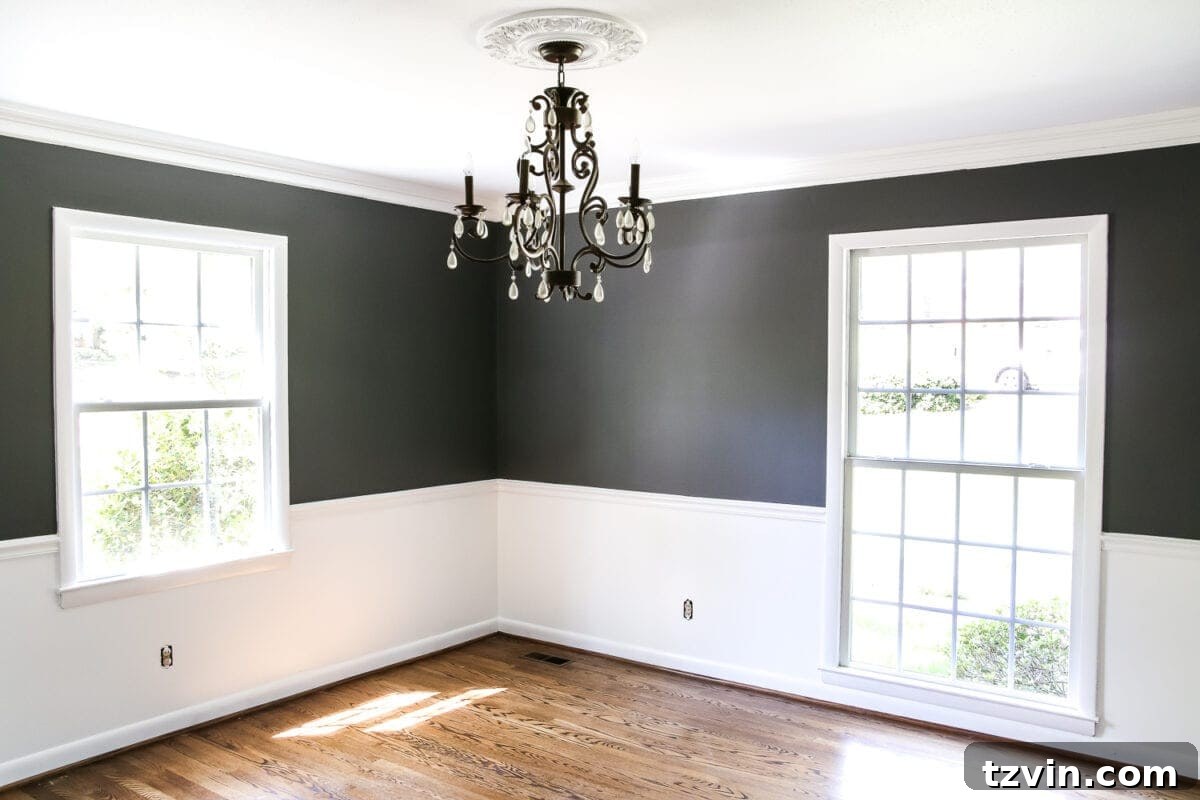
A Bold Transformation: Our High-Contrast Dining Room Reveal
There’s a captivating allure to high-contrast design that has truly captured my imagination lately. It’s a style that has quickly become a firm favorite, transforming spaces with an undeniable sense of drama and sophistication. After sharing the striking high-contrast paint job in our living room last week, the reactions were wonderfully polarized – a true testament to the power of bold design choices. It seems many of you are right there with me, enthusiastically embracing the dramatic shift, while others are perhaps a little more hesitant about venturing into the world of bright whites paired with deep, moody darks.
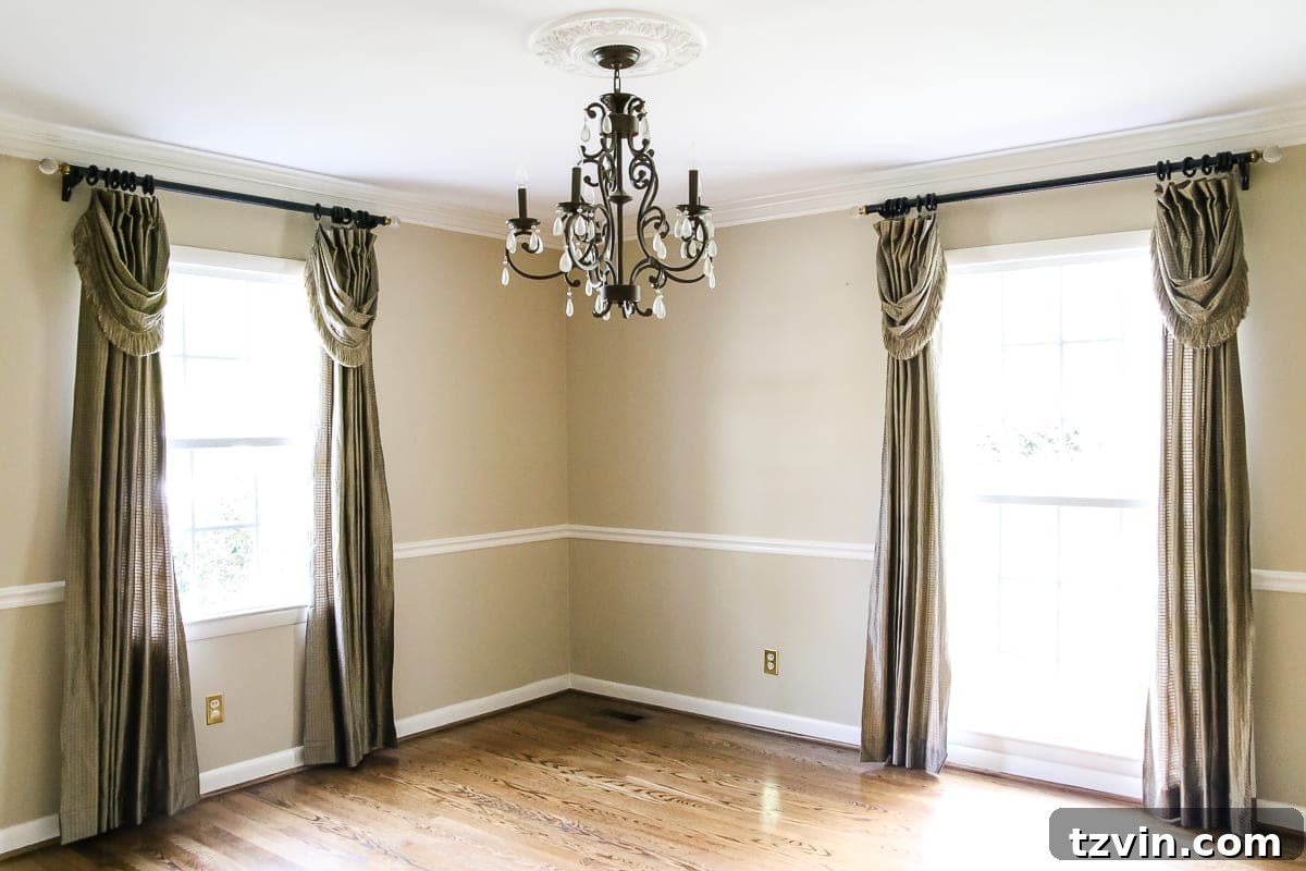
This journey into bold aesthetics continues as I unveil the latest transformation within our home: the dining room. This particular makeover even took me by surprise, pushing my own design boundaries in the most exciting way. Just a week ago, this space held a completely different essence, awaiting its dramatic reveal. To truly appreciate the journey, let’s take a moment to look back at its beginnings.
Embracing the Unexpected: A Dining Room Bathed in Drama
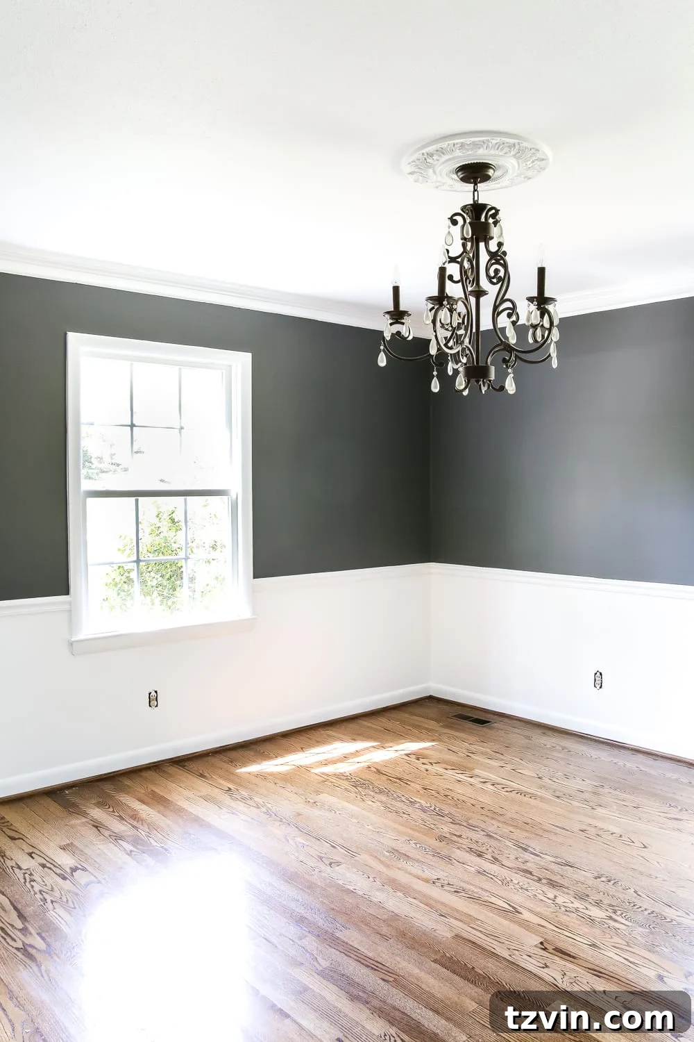
And now, after a single day’s dedicated effort, the dining room has been completely reimagined, cloaked in an exquisitely moody ambiance. Honestly, I never would have envisioned painting a room in our home this dark. However, this house, with its distinct personality, continues to inspire choices that diverge significantly from my past design inclinations. It’s a complete departure from the bright, airy feel of our previous home. This isn’t a space that calls for ubiquitous white shiplap; instead, it presents a thrilling new challenge, prompting me to explore different textures, depths, and contrasts.
My primary goal for this dining room transformation was to introduce an element of elegance and architectural interest. By strategically breaking up the walls above and below the existing chair rail, I aimed to create a more sophisticated and layered feel. The initial vision is for this dramatic backdrop to be harmonized by softer elements. I anticipate that installing light linen curtains will introduce a much-needed textural warmth, while a more casual, inviting dining table will prevent the space from feeling overly formal or severe. Achieving this balance is key to creating a truly welcoming yet impactful dining experience. While the vision is clear, I admit I’m still somewhat “flying by the seat of my pants” with the final decorating touches, allowing the room to evolve organically as it takes shape.
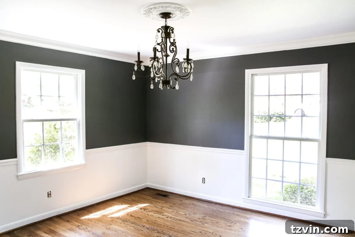
The Power of Paint: Benjamin Moore’s Simply White & Kendall Charcoal
Currently, without the softening influence of furnishings, artwork, and those light linen curtains, the room does possess an intense, “in-your-face” quality. But this starkness highlights the sheer transformative power of paint. For the pristine white, we opted for Benjamin Moore Aura semi-gloss paint in Simply White (OC-117). This award-winning white is celebrated for its clean, crisp nature without feeling stark or cold. Its subtle warmth prevents it from leaning too grey or yellow, making it an incredibly versatile choice for trim, ceilings, and in our case, the wall area below the chair rail. The semi-gloss finish adds a beautiful subtle sheen, enhancing the architectural details and offering exceptional durability, which is perfect for high-traffic areas and easy cleaning. We’re still contemplating whether to introduce additional molding to the lower wall section, but for now, we’re content to let the paint speak for itself.
For the dramatic upper portion of the walls, we chose Benjamin Moore Aura eggshell in Kendall Charcoal (HC-166). This isn’t just any dark grey; Kendall Charcoal is renowned for its rich depth and incredible versatility. It’s a sophisticated deep grey with warm, earthy undertones that allow it to beautifully complement a vast array of other colors, from crisp whites and soft creams to vibrant jewel tones. The eggshell finish provides a soft, low-sheen look that beautifully absorbs light, contributing to the room’s cozy and enveloping ambiance. The combination of Simply White and Kendall Charcoal creates an immediate and undeniable sense of contrast that feels both modern and timeless. I genuinely can’t get over how fresh and impactful this space feels now, a true testament to Benjamin Moore’s exceptional color palette and paint quality.
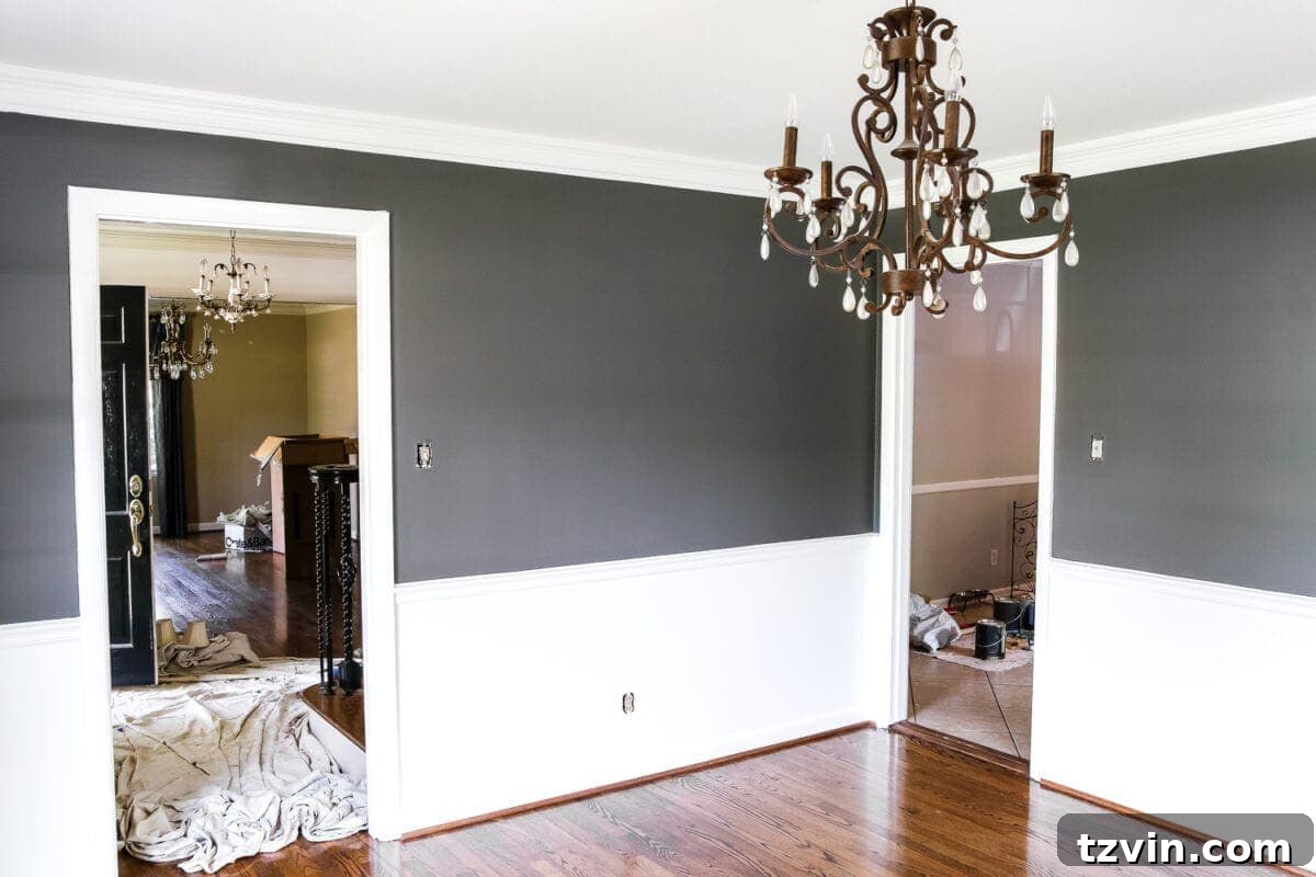
Behind the Scenes: The Reality of Home Renovation
Of course, as with any home renovation project, reality often peeks through the polished facade. For every perfectly painted wall, there are glimpses of other rooms still very much in “mid-prep” mode – a reminder that home transformations are a process, not an instant magic trick. #RealLifeYo is indeed the mantra! Many of you have expressed interest in seeing more of these “progress” posts, rather than just the flawlessly finished spaces. If you’re eager for a peek into the delightful chaos and everyday action that accompanies these projects, I frequently share candid updates and behind-the-scenes moments on my Instagram Stories. It’s a fantastic platform to connect and share the unfiltered journey. Perhaps one day I’ll conquer the mysteries of Facebook Live to share even more real-time insights, but for now, I’m content honing my skills on Instagram!
Designing with Confidence: Tips for Your High-Contrast Project
Embarking on a high-contrast design journey can be incredibly rewarding, but it often involves stepping out of your comfort zone. Here are a few tips I’ve learned along the way that might help you confidently tackle your own bold home projects:
- Test, Test, Test: Always sample your chosen paint colors directly on your walls, observing them in different lighting conditions throughout the day. What looks perfect on a swatch can transform dramatically in your actual space.
- Consider Your Lighting: Natural and artificial light sources profoundly impact how colors appear. Darker rooms might need more deliberate lighting choices to prevent them from feeling cavernous, while lighter rooms can handle bolder statements.
- Balance is Key: High contrast doesn’t mean neglecting harmony. Balance bold paint choices with softer textures, natural materials, and carefully selected furnishings. Think about how lighting, textiles, and artwork will complement and soften the strong color scheme.
- Embrace Architectural Features: Use existing features like chair rails, crown molding, or wainscoting to your advantage. These elements provide natural breakpoints for color changes, adding depth and architectural interest without extensive renovation.
- Trust Your Instincts: While it’s good to consider popular trends, your home should ultimately reflect your personal style. If a bold choice resonates with you, go for it! Design is an iterative process, and you can always adjust.
So, that concludes the initial “State of the Dining Room Address.” This space, with its newly painted high-contrast walls, feels like a fresh canvas. I’m eager to see how it truly comes to life as we begin the next, most enjoyable phase: decorating! I’m confident that as this room and I get to know each other better, a comprehensive and cohesive design plan will fully emerge, transforming it into a truly elegant and inviting hub for gatherings and everyday moments.
What are your immediate thoughts on this bold dining room transformation? Are you loving the dramatic shift, finding it a bit too intense, or perhaps somewhere in between? It’s completely understandable if it’s hard to form a definitive opinion at this stage, especially before the “fun part” – the decorating – truly begins. Your feedback and insights are always welcome as we continue to shape this space into its full potential.

*A special thank you to Benjamin Moore for generously providing the exceptional paint used in this stunning dining room makeover.