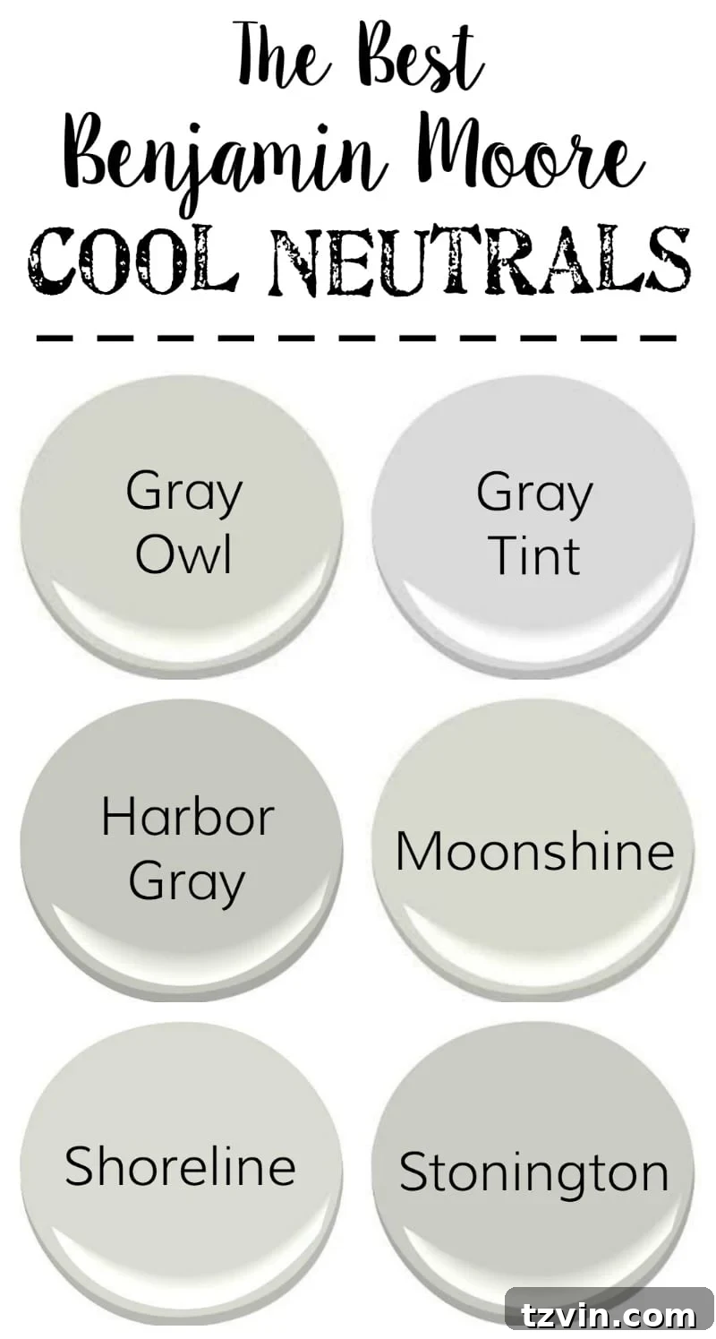
Embarking on a new home journey often brings a surge of inspiration, a desire to redefine your living spaces and perhaps, even a little bit of yourself. Much like the exhilarating feeling of a fresh start—a blank canvas upon which to create something entirely new—our recent move into a new house ignited a passion for transformation, especially through the power of paint. For weeks, our home has been a hive of activity, adorned with painter’s tape and the scent of fresh coatings, as we meticulously crafted the perfect palette.
While the allure of vibrant hues and bold statements often captures immediate attention, there’s an enduring elegance and unparalleled versatility in the world of neutral paint colors. They are the quiet heroes of interior design, providing a serene backdrop that allows your unique style, cherished furnishings, and personal accents to truly sing. In our pursuit of creating a harmonious and inviting atmosphere, we found ourselves repeatedly drawn to Benjamin Moore’s exquisite range of neutrals. These sophisticated shades offer a foundation of calm, making any room feel instantly refreshed, spacious, and infinitely adaptable.
Neutrals, contrary to some misconceptions, are anything but boring. They possess a subtle complexity, a depth that comes from their nuanced undertones—be it a hint of blue in a cool gray, a touch of cream in a warm white, or the grounding presence of a soft beige. They serve as the ultimate chameleon, effortlessly blending with diverse design aesthetics, from minimalist modern to rustic farmhouse, ensuring your home remains timeless and elegant. This inherent flexibility means you can effortlessly update your decor with the changing seasons or evolving tastes, without the commitment of a complete overhaul. They are the ultimate investment in lasting style and comfort.
The beauty of neutrals lies in their ability to evoke different moods. A crisp, clean white can flood a space with natural light, making it feel expansive and airy. A soft gray introduces a contemporary edge, offering endless possibilities for layering textures and colors through accessories. Even beige, often unfairly labeled as mundane, delivers an unparalleled sense of warmth and tranquility, creating a cozy sanctuary perfect for unwinding after a long day. It’s this profound impact on the atmosphere of a room that makes choosing the right neutral color such a crucial step in home design.
Recently, a trip to Benjamin Moore to gather an array of paint samples for our walls reaffirmed my love affair with these foundational colors. It prompted me to curate a collection of my go-to, no-fail neutral paint colors, perfect for anyone ready to pick up a paintbrush and infuse their home with fresh energy. Whether you’re seeking a modern touch, a timeless elegance, or a cozy embrace, these selections are designed to guide you toward creating your ideal living environment. From the calming depths of cool grays to the inviting warmth of nuanced beiges, the transformative power of the right white, and the dramatic flair of darker tones, prepare to discover the perfect shades to elevate your home’s aesthetic.
Cool Neutrals: Serene and Sophisticated Hues
If your design preference leans towards a sleek, contemporary feel, or if you simply appreciate an aesthetic that feels crisp and clean, cool neutrals are your perfect partners. These shades, primarily grays with subtle blue, green, or violet undertones, imbue a space with a sense of calm and sophisticated elegance. They are exceptional at reflecting light, which can make smaller rooms feel larger and brighter, while also providing a refreshing contrast to warmer elements within your decor. Imagine a bathroom transformed into a spa-like retreat with a cool gray, or a living room exuding modern chic with walls that hint at the sky or a gentle sea. These six neutrals are stellar choices if you’re seeking a gray with that coveted cool, bluish undertone, bringing a breath of fresh air into any interior.
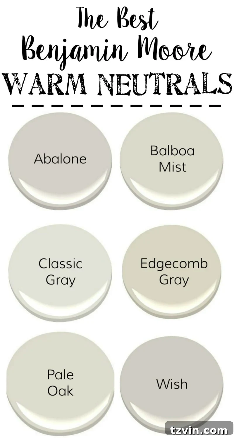
Warm Neutrals: Inviting Comfort and Subtle Warmth
For those who crave a comforting, cozy ambiance without venturing into overly yellow or orange territories, warm neutrals offer a beautiful solution. These shades, often characterized by subtle beige, taupe, or greige undertones, strike a perfect balance between warmth and neutrality. They avoid the starkness sometimes associated with cooler tones, instead creating an inviting atmosphere that feels grounded and welcoming. While they aren’t overtly “tan,” their inherent warmth makes them incredibly versatile, capable of softening a room and pairing beautifully even alongside cooler gray shades. This allows for a harmonious flow between different areas of your home, bridging diverse color palettes with understated grace. Warm neutrals are ideal for creating a comfortable living room, a serene bedroom, or any space where you desire a sense of embrace and subtle richness.
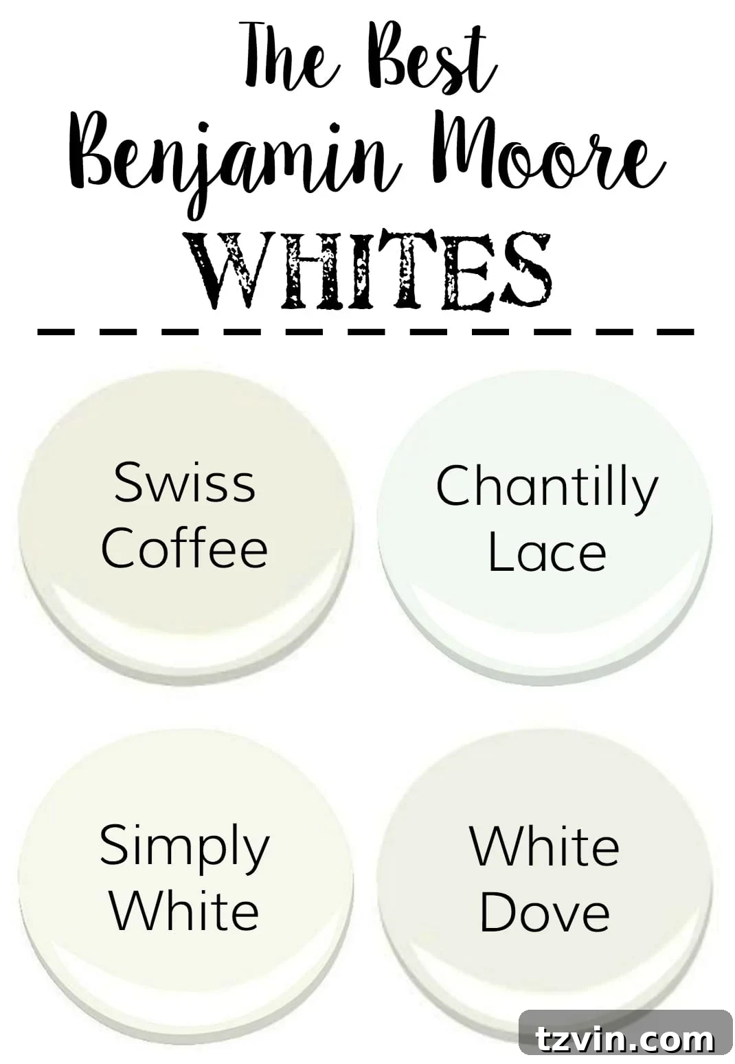
Whites: The Art of Illumination and Refinement
The spectrum of white paint is far more diverse and complex than one might initially imagine. Far from being a singular, simple color, whites are defined by their subtle undertones, which can dramatically alter the perception of light and space in a room. Choosing the right white involves understanding whether you desire a crisp, modern feel; a soft, creamy warmth; or a clean, almost gallery-like brightness. These four whites are my absolute favorites for their versatility and inherent beauty, proving that white is never just white. They are perfect for refreshing cabinets, trim, ceilings, or entire rooms.
We recently painted our living room with Benjamin Moore’s Swiss Coffee, and the transformation was immediate and profound. It instantly brightened the space, creating an airy feel, yet retained a comforting warmth that makes the room incredibly welcoming. It possesses a slightly creamy quality without veering into an undesirable yellow tint, striking a perfect balance between crispness and softness. For our trim throughout the house, we opted for Simply White. This choice delivered a truly bright white that, remarkably, still harmonizes beautifully with the warmer, creamy tones found in Swiss Coffee and other elements of our decor. It’s a testament to how carefully selected whites can work in concert, creating depth and sophistication within a seemingly monochromatic palette. These whites lay the foundation for a luminous and sophisticated interior, allowing architectural details and furnishings to truly shine.
Darks: Embracing Drama and Luxe Sophistication
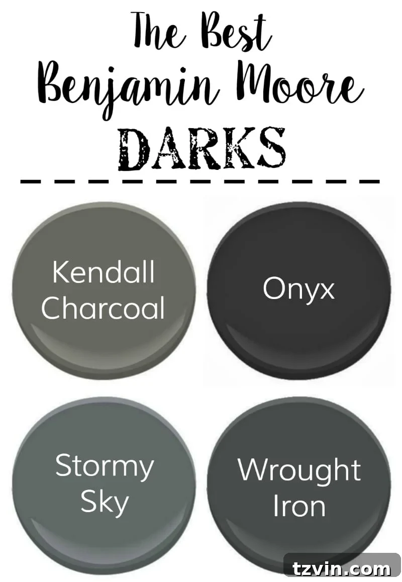
For those daring to make a statement, to infuse their home with an undeniable sense of drama and luxurious depth, embracing dark paint colors is a design choice that truly pays off. Far from making a room feel smaller, when used strategically, dark hues can create an enveloping, intimate atmosphere that exudes sophistication. They draw the eye in, highlighting architectural features and making lighter elements, like artwork or metallic accents, pop with stunning contrast. Dark colors can transform a mundane space into a jewel box, a cozy den, or a strikingly elegant dining room, evoking a sense of refined opulence.
These four dark shades are my top picks for achieving this dramatic effect. We recently painted our interior doors with Benjamin Moore’s Wrought Iron, and the result is nothing short of spectacular. It’s the perfect deep shade—darker than a standard charcoal gray, yet it possesses more dimension and subtle complexity than a flat black. This nuance prevents it from feeling harsh, instead lending a rich, moody elegance that instantly elevates the entire entryway and hallway. Used on an accent wall, in a powder room, or to define a cozy reading nook, these dark hues can profoundly impact the mood and perceived luxury of your home, inviting a touch of the unexpected and truly personalizing your space.
The journey of transforming a house into a home is a deeply rewarding one, and the careful selection of paint colors plays an enormous role in defining its character. While the extensive preparation and meticulous application can be time-consuming, especially when dealing with intricate moldings and detailed architectural elements, the final reveal makes every brushstroke worthwhile. Just a few more touch-ups, and I’ll be eagerly sharing the completely repainted living room later this week, a testament to the power of thoughtful color choice.
Beyond the aesthetic appeal, remember that paint is one of the most cost-effective ways to update and personalize your living space. Don’t be afraid to experiment with samples on your walls, observing how the colors shift throughout the day with natural and artificial light. This crucial step can prevent costly mistakes and ensure you select shades that truly resonate with your vision. Also, invest in quality tools and proper surface preparation—these steps, though seemingly minor, are key to achieving a professional, long-lasting finish.
Do you have any absolute favorite neutral paint colors that have transformed your home? Or perhaps a vibrant, colorful shade that you swear by? Share your best tips to make the painting process go lightning fast—we could all use those! Let’s inspire each other to create beautiful, personalized spaces that truly feel like home.