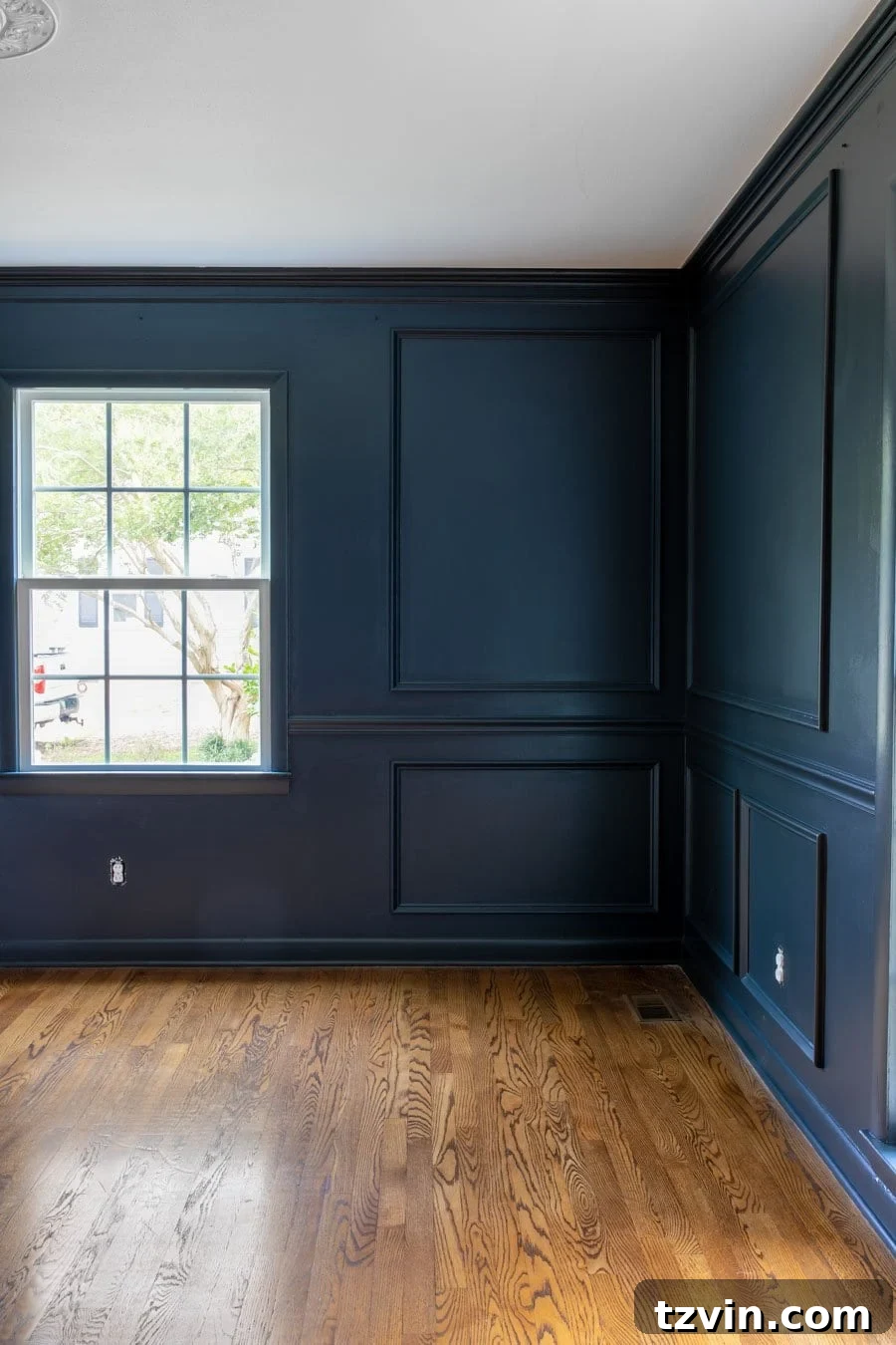
Navy blue paint colors are undeniably the epitome of classic style. Much like a cherished pair of blue jeans that effortlessly pairs with any color, navy demonstrates remarkable versatility, harmonizing beautifully with all hues and seamlessly integrating into diverse interior design aesthetics. However, navigating the vast spectrum of dark blues to pinpoint that perfect navy can be surprisingly challenging.
When seeking a sophisticated splash of color, a dark blue paint is invariably a dependable choice. Its profound depth allows it to function almost as a neutral, providing a stable foundation that grounds a room while still delivering a compelling visual statement. This makes it an ideal selection for those who desire to embrace a darker, richer palette without sacrificing a timeless elegance.
Navy blue evokes a sense of calm, confidence, and tradition. It’s a color that has graced homes and grand spaces for centuries, evolving with trends yet always maintaining its inherent charm. From a cozy cottage feel to a sleek modern urban loft, navy blue has the chameleon-like ability to adapt and enhance any environment it inhabits. Its deep, rich tones absorb light beautifully, creating a sense of intimacy and luxury that few other colors can achieve. Whether you’re aiming for a coastal vibe, a preppy aesthetic, or a grand traditional design, navy blue provides a magnificent backdrop.
Where to Integrate Navy Blue Paint into Your Home Design
The versatility of navy blue paint is one of its greatest assets, making it a favorite among interior designers for a multitude of spaces. Whether you envision a tranquil and moody master bedroom, a traditional and distinguished home office, or a dramatic and inviting living room, a dark blue paint color serves as a superb choice. It offers a bold aesthetic without venturing too far outside conventional comfort zones, ensuring a refined yet striking impact.
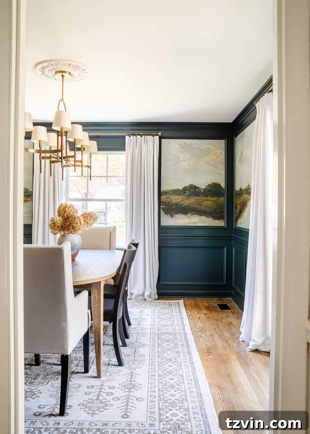
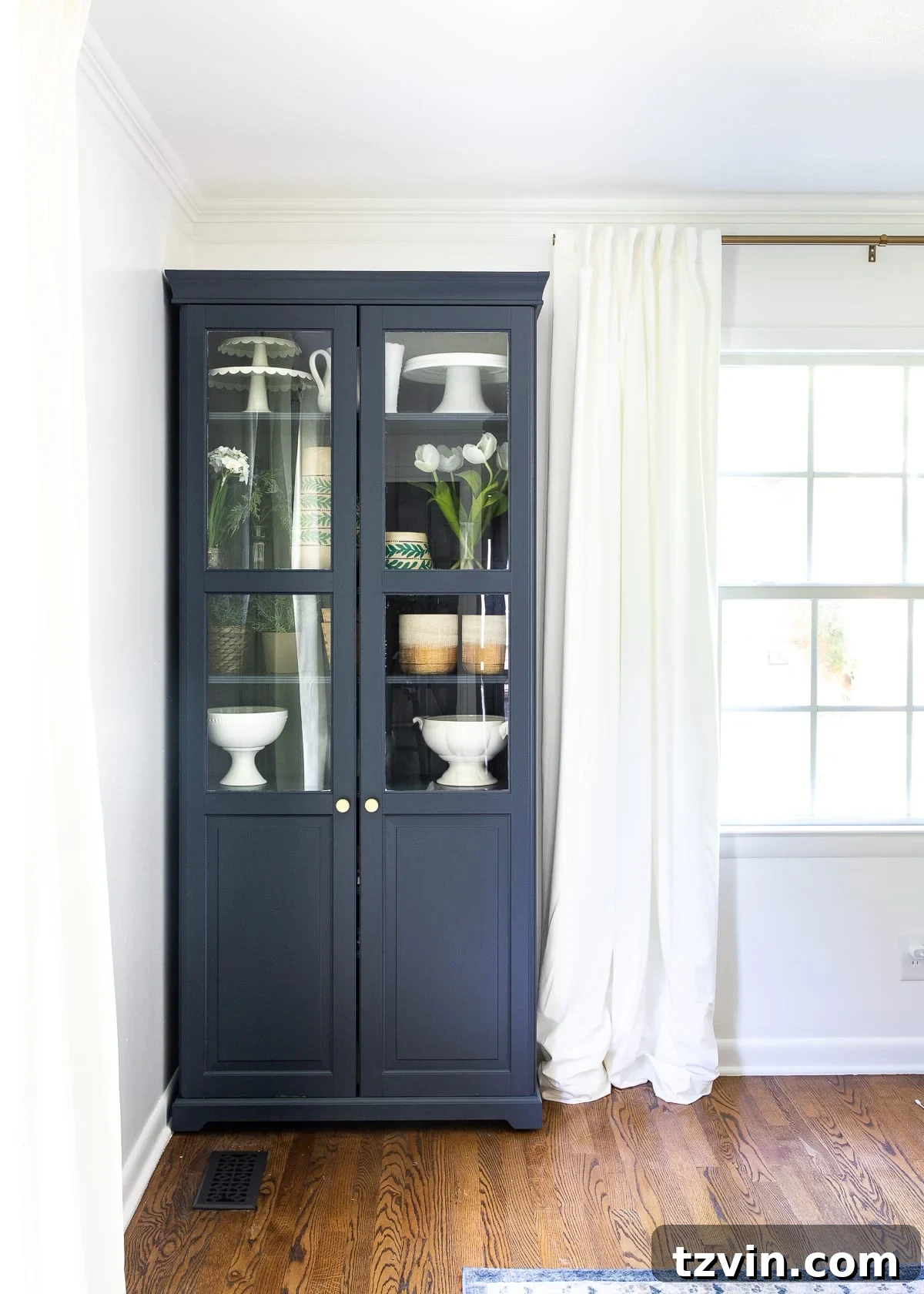
Beyond these larger areas, navy blue excels in accent applications. Consider an accent wall in a vibrant navy to anchor a room or draw attention to a specific architectural feature. Even in smaller spaces, such as powder rooms or bathrooms, a dark blue hue can create a surprising sense of spaciousness and sophistication, turning an ordinary functional area into a stylish retreat. Since we introduced navy into our dining room, we’ve become completely enamored with its transformative power and adaptability. It truly is one of the most versatile colors available!
If you’re contemplating incorporating the elegance of dark navy blue into your home, this curated list of the best navy paint colors—extensively utilized and highly recommended by expert interior designers—will provide invaluable guidance and inspiration for applying this timeless shade anywhere in your living space. Prepare to discover the perfect navy that resonates with your personal style and elevates your home’s aesthetic.
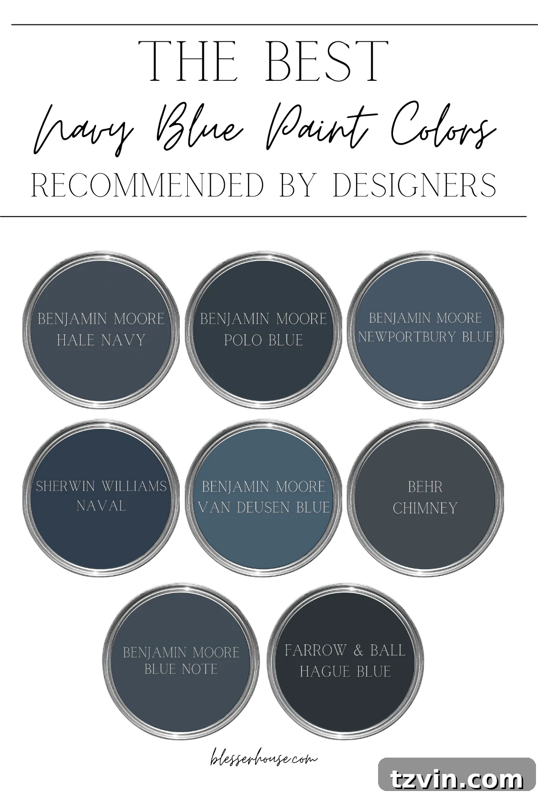
Discovering the 8 Best Navy Blue Paint Colors Recommended by Experts
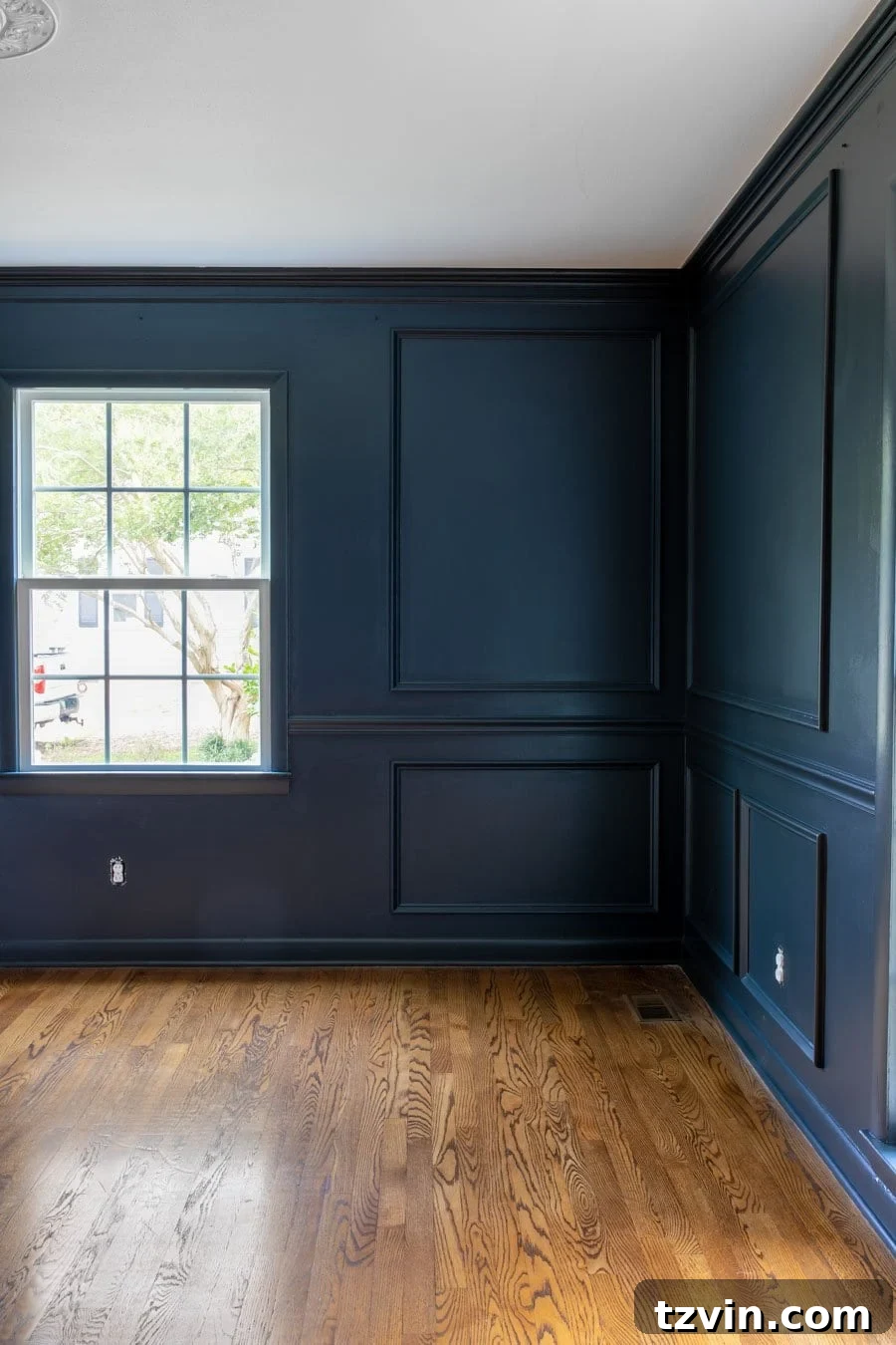
Choosing the ideal navy blue can be a delightful journey, and some shades stand out consistently for their beauty and designer appeal. For the wall color in our own dining room, we opted for Romabio Blue Ridge Parkway, a truly breathtaking dark blue from the Bless’er House paint color line. It is an absolutely stunning, deeply saturated navy that has brought immense character to our space.
If you’ve ever felt overwhelmed trying to pinpoint the perfect navy blue for your residence—perhaps for kitchen cabinets, a striking island, or a refurbished piece of furniture—consider Romabio Blue Ridge Parkway a highly recommended option. However, this comprehensive list features other exceptional navy paint colors that are widely acclaimed and frequently chosen by top designers. These are truly winning shades, each offering unique qualities and charm.
After dedicating years to testing countless swatches and incorporating various navy hues into our own home projects, we’ve compiled our definitive list of market favorites. These selections represent the cream of the crop, promising to deliver enduring style and sophistication to your interiors.
1. Benjamin Moore Hale Navy (HC-154)
Benjamin Moore Hale Navy is celebrated as a timeless and exquisitely rich true navy blue paint color. It strikes an impeccable balance between sophistication and boldness, making it an enduring favorite for impactful accent walls, statement furniture pieces, or enveloping an entire room in its distinguished hue. This shade is renowned for its subtle yet discernible gray undertones, which masterfully soften the deep blue, preventing it from feeling overwhelming or cold.
These nuanced gray hints provide a neutral grounding that makes Hale Navy incredibly versatile, allowing it to pair seamlessly with a diverse range of decor styles—from modern minimalist to classic farmhouse—and complement a myriad of color schemes. Its ability to adapt to varying lighting conditions, appearing slightly more gray in dimmer light and a truer blue in brighter settings, further enhances its broad appeal and explains why it consistently ranks among the top navy blue paints.
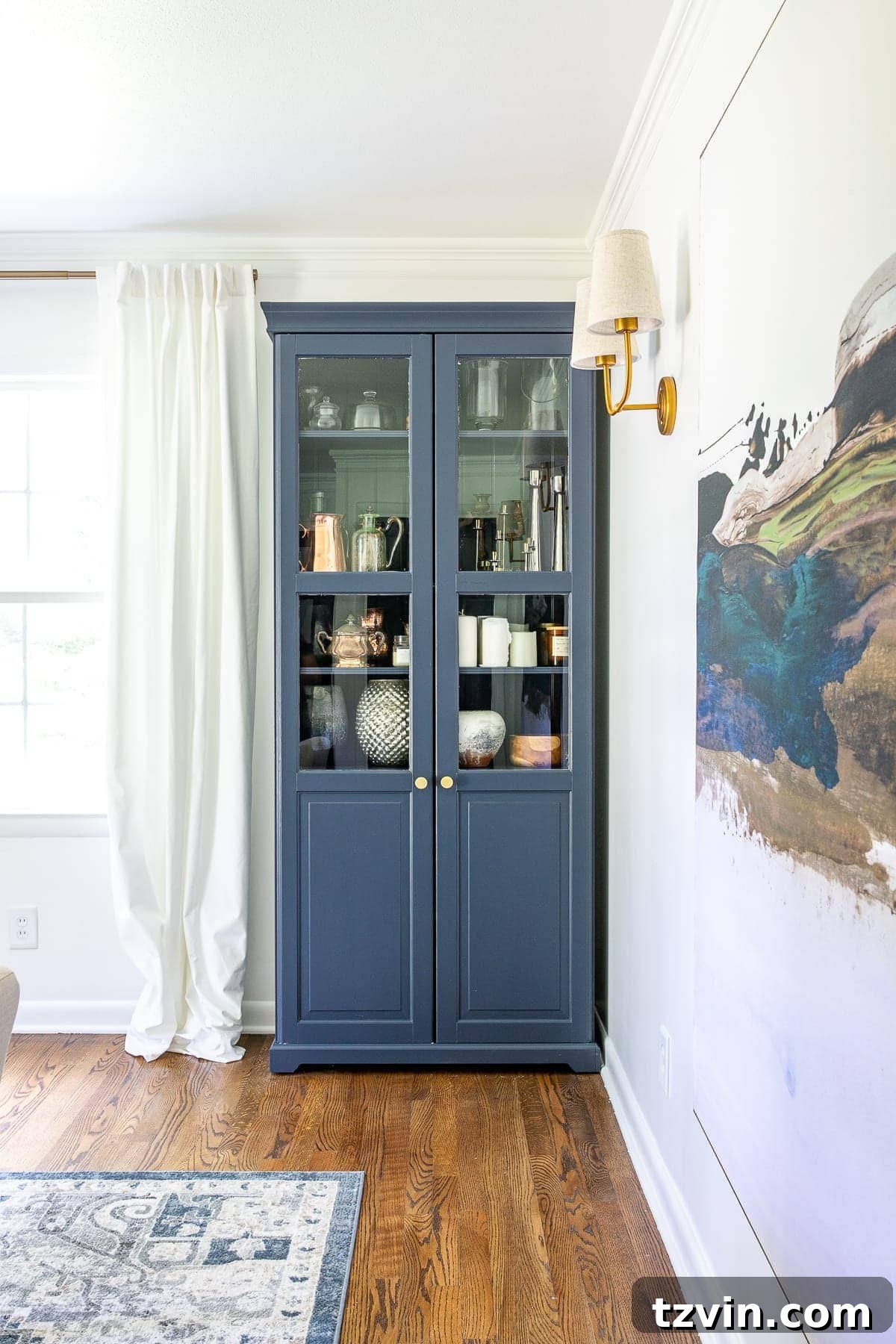
2. Benjamin Moore Blue Note (2129-30)
Benjamin Moore Blue Note is a truly captivating deep, moody blue that possesses the remarkable quality of shifting its appearance, often presenting as an almost regal royal blue when artfully contrasted with crisp white trim and accents. This dynamic characteristic is attributed to its complex undertones, which are a sophisticated blend of black and navy.
This intricate mix bestows Blue Note with a profound depth, allowing it to perform beautifully and consistently across a spectrum of lighting conditions. Whether bathed in abundant natural light or illuminated by dimmer, ambient fixtures, its rich character shines through. It’s an excellent choice for creating intimate and dramatic spaces, adding a touch of bold elegance that feels both modern and timeless. Consider it for libraries, formal dining rooms, or a striking entryway.
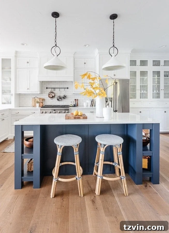
3. Benjamin Moore Polo Blue (2062-10)
Benjamin Moore Polo Blue stands out as a rich, classic navy paint color that instantly imbues any space with an unmistakable aura of elegance and serenity. What sets this particular shade apart are its subtle yet distinctive green undertones. These unique undertones introduce a surprising warmth and complexity to the color, differentiating it from more traditional, cooler navies.
This nuanced blend makes Polo Blue an exceptionally versatile choice, equally at home in both traditional and contemporary design schemes. It pairs beautifully with natural wood tones, brass accents, and creamy whites, creating a sophisticated and welcoming ambiance. Furthermore, its robust character makes it a remarkably popular option as an exterior paint color, particularly for commanding front doors and classic siding, where it offers curb appeal and a timeless statement.
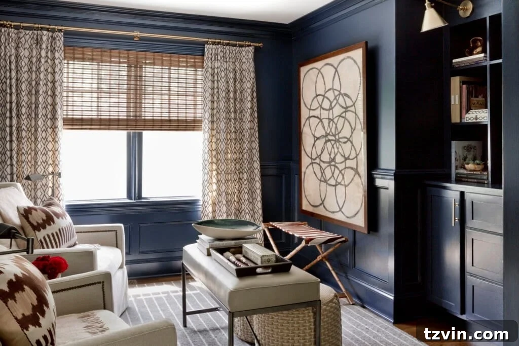
4. Sherwin Williams Naval (SW 6244)
Sherwin Williams Naval is a deeply engaging and widely admired navy blue that effortlessly imparts a profound sense of calmness and depth to any room it graces. While distinctly a rich blue, it leans slightly brighter than some of its counterparts, radiating an inviting energy. Its unique character is enhanced by a subtle, warm undertone of purple, which introduces an intriguing layer of complexity to the color palette.
This nuanced purple hint prevents Naval from feeling stark, adding a welcoming warmth that makes it incredibly versatile for a broad spectrum of design aesthetics. It excels in creating serene bedrooms, sophisticated living areas, and dramatic kitchen cabinetry. Naval’s balanced nature allows it to harmonize beautifully with both cool and warm accents, making it a truly adaptable and beloved choice for designers seeking a timeless yet distinctive navy.
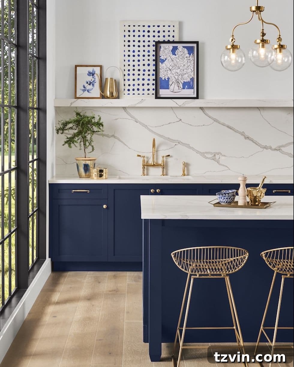
5. Benjamin Moore Newburyport Blue (HC-155)
Benjamin Moore Newburyport Blue is a captivating, medium-toned blue that possesses a vibrant energy, making it an exceptional choice for those looking to create a memorable statement within their home. It strikes a beautiful balance between being bold and inviting, ensuring it adds significant character without overwhelming the space.
Its undertones are a subtle yet effective blend of gray, which skillfully softens the inherent intensity of the blue. This touch of gray adds a crucial layer of versatility, enabling Newburyport Blue to harmonize effortlessly with a wide array of decor styles and existing color palettes. Whether incorporated into a coastal-inspired living room, a preppy study, or a classic bedroom, its balanced depth ensures it remains a sophisticated and appealing selection for interior projects.
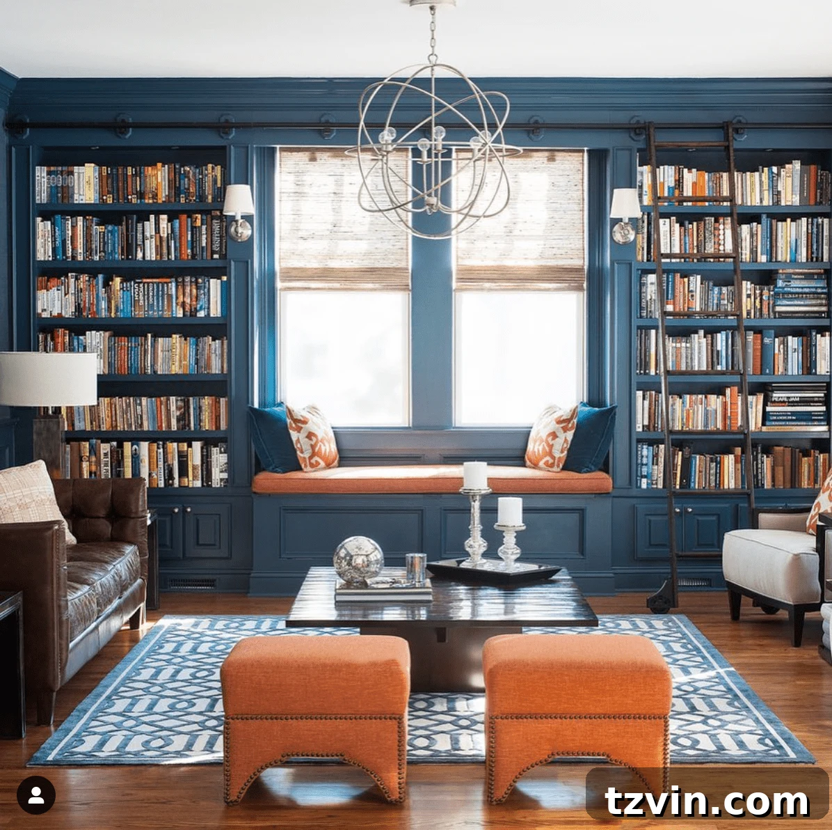
6. Behr Chimney (PPU25-05)
Behr Chimney is an intriguing deep charcoal gray paint color that offers a sophisticated and inherently moody ambiance to any space it adorns. While technically a very dark gray, its distinctive character is defined by pronounced blue undertones. These undertones infuse the color with a cool and subtly maritime feel, significantly enhancing its versatility and adding a compelling depth that draws the eye.
This deep navy-leaning shade functions brilliantly as a neutral, tilting slightly more towards gray than many other conventional navy options. This makes it an incredibly adaptable and use-anywhere shade of navy, capable of grounding a room with its understated elegance. It’s perfect for creating a cozy, enveloping atmosphere in bedrooms, an elegant backdrop in living areas, or a contemporary touch in kitchens, proving that navy doesn’t always have to be overtly blue to make a statement.
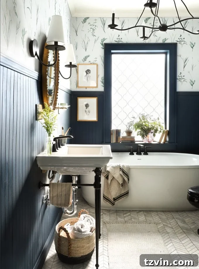
7. Benjamin Moore Van Deusen Blue (HC-156)
Benjamin Moore Van Deusen Blue is a remarkably rich, smoky blue that is expertly crafted for creating spaces that exude serenity and sophisticated charm. Its depth and subtle complexity make it an excellent candidate for rooms where a calm, enveloping atmosphere is desired, such as a cozy reading nook or a restful bedroom retreat.
A key characteristic of this elegant hue lies in its subtly gray undertones. These undertones don’t detract from its blue identity but rather infuse it with a soft, muted quality. This unique characteristic prevents the color from appearing too stark or overpowering, allowing it to seamlessly integrate into various design schemes. Its balanced nature makes it a highly favored navy paint among many designers who appreciate its understated elegance and ability to create a truly refined interior.
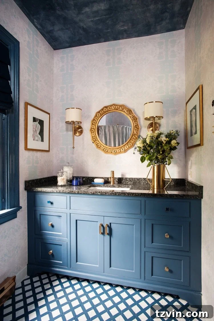
8. Farrow & Ball Hague Blue (No. 30)
Farrow & Ball Hague Blue is an exceptionally rich navy with a profound, almost historical depth that makes it a truly luxurious backdrop for any room. This iconic shade is renowned for its intense pigment and unique character, which instantly elevates the perceived value and sophistication of an interior space.
It is distinctively characterized by its subtle yet influential green undertones. These undertones infuse the color with a unique warmth and a nuanced complexity, allowing it to respond dramatically to different lighting conditions throughout the day. In certain lights, it might appear more blue-green, while in others, a deeper, almost black-blue. This dynamic quality significantly enhances its versatility, making it a spectacular choice for creating dramatic and inviting rooms, from cozy studies to elegant dining areas, where it offers a sophisticated, ever-changing visual experience.
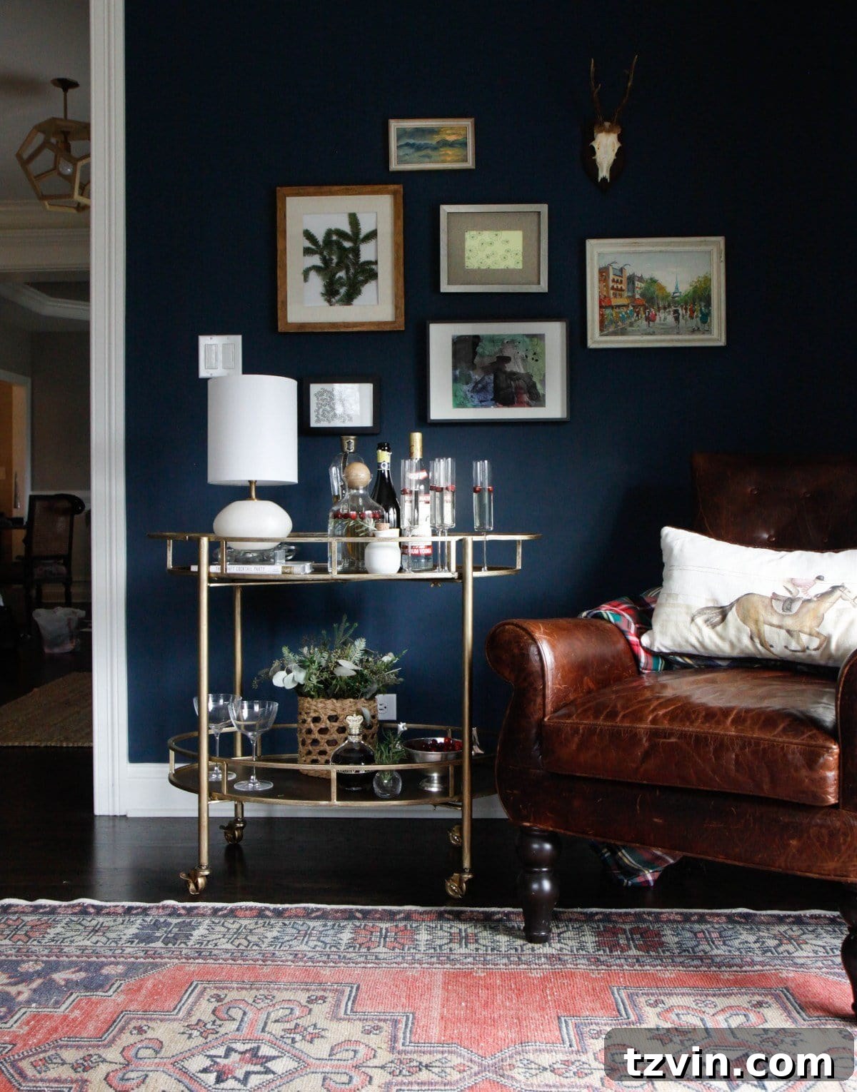
Choosing the Right Paint Sheen for Your Navy Blue Walls and Surfaces
The sheen of your paint can significantly impact the final look and durability of your chosen navy blue, influencing how light reflects off the surface and how easy it is to maintain. While design rules can often be playfully broken, here are the typical recommendations for paint sheens to guide your selection:
- Ceilings – A flat sheen is almost universally recommended for ceilings. Its non-reflective quality helps to hide imperfections, absorb light, and create a smooth, consistent appearance that minimizes glare.
- Walls – Eggshell is often the go-to choice for interior walls. It offers a soft, low-sheen finish that is subtle and elegant. Crucially, eggshell paint is durable enough to be wiped clean, making it practical for living areas, bedrooms, and hallways without the noticeable shine of higher gloss options.
- Cabinets – For kitchen or bathroom cabinets, satin is the most frequently recommended sheen. It provides a beautiful, soft luster that is easy to clean and highly durable. Alternatively, semi-gloss can be used if you prefer an extra layer of shine and a more reflective, often traditional, look that can highlight architectural details and offers superior scrubbability.
- Trim/Doors – We typically opt for semi-gloss for trim and doors. This higher sheen creates a crisper, more traditional look, offering excellent durability and making these high-traffic areas easy to maintain and clean. However, satin can also work exceptionally well for a more contemporary, subtle finish that still provides good protection.
Consider the light in your room: a higher sheen will reflect more light, making a dark navy appear brighter, while a flatter sheen will absorb light, deepening the color and enhancing its moody quality.
The Essential Guide to Finding the Perfect Navy Blue Paint Color for Your Space
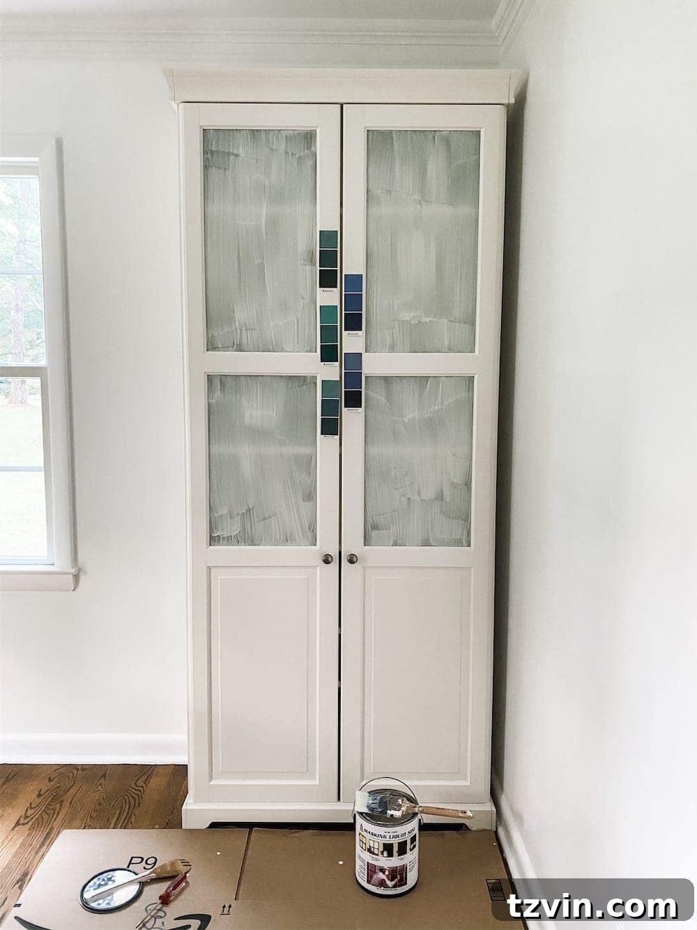
The single most crucial piece of advice for selecting the right paint color, especially for a nuanced shade like navy blue, is to **sample, sample, sample!** Visualizing a small swatch in a store is vastly different from seeing the color come to life in your actual home environment. Here’s a structured approach to ensure you make the best choice:
- Initial Selection: Begin by narrowing down your favorite navy blue options. Collect color swatch cards from various paint brands that catch your eye. Pay attention to any subtle undertones (gray, green, purple) that might be apparent even on these small cards.
- Acquire Samples: Once you have a shortlist of 3-4 top contenders, visit your local paint store and have color sample paints mixed. These small quantities are perfect for in-home testing without committing to a full can.
- Test on Poster Boards: This step is critical. Instead of painting directly onto your wall (which can be hard to cover or influence subsequent tests), brush generous coats of each sample paint onto 3-4 separate white foam poster boards. The crisp white background of the poster board prevents any existing wall color from skewing your perception and allows your eye to clearly discern the true undertones and depth of each navy shade.
- Observe in Varied Lighting: Once dry, tape these painted poster boards onto various walls within the room you intend to paint. Crucially, observe the paint colors at different times of the day, under both natural light (morning, midday, evening, sunny days, cloudy days) and all types of artificial lighting (overhead lighting, lamp lighting, task lighting). Lighting dramatically alters how a color appears, and a navy that looks perfect in morning sun might take on a different character under evening lamps.
Taking the time for this sampling process will save you from potential disappointment and ensure you select a navy blue that you truly love and that complements your home’s unique lighting and decor. For more detailed tips and expert strategies on how to find the best paint colors for your home, explore our comprehensive guide.
Is There a Universal Paint Color for Every Room?
While the allure of a single, universally perfect paint color for every room is strong, the reality is that such a color doesn’t exist. This is the crucial aspect of interior design: lighting conditions within every home are inherently unique, and it is lighting—both natural and artificial—that fundamentally alters our perception of color. A shade that appears vibrant and inviting in a sun-drenched room might look muted and dull in a north-facing space, or even shift its undertones completely under different artificial lights.
Therefore, the key to successful color selection, especially with complex shades like navy blue, lies in understanding your specific environment and testing colors within it. Embrace the process of sampling and observation to find the navy blue that truly comes alive in your unique space. Do you have a favorite navy blue paint color that you would enthusiastically add to this list? Or perhaps you’ve recently painted something navy in your house that you are absolutely delighted with? Share your experiences and inspire others!
Frequently Asked Questions About Navy Blue Paint
On the color wheel, orange is directly opposite blue, making it its most complementary color, capable of creating a dynamic and vibrant contrast. Beyond orange, many other colors beautifully complement dark blue, including bright yellows, soft pinks, rich reds, and classic whites. Neutrals like cream, beige, and various shades of gray also pair exquisitely, providing a sophisticated backdrop to navy’s depth.
When your home’s exterior boasts a striking navy blue, choosing the right front door color can significantly enhance its curb appeal. Two of the most popular and effective front door colors paired with navy blue exteriors are vibrant yellow and another complementary shade of blue. Yellow offers a cheerful and welcoming pop of contrast, while a lighter or slightly different shade of blue can create a harmonious, monochromatic elegance. Other excellent choices include bright red for a classic look, crisp white for a timeless appeal, or even a deep emerald green for a touch of unexpected sophistication.
Explore More Expert Paint Color Recommendations
12 Trending Burgundy Paint Colors Recommended by Designers
12 Best Sage Green Paint Colors for a Relaxing Room
The Most Recommended Blue Grey Paint Colors
See more paint color recommendations by professional interior designers here.