This post is sponsored by Samplize. All opinions are my own.
Recently, Robert and I visited Newport, Rhode Island to celebrate an anniversary and toured The Breakers. Ever since, I’ve been completely captivated by The Gilded Age—especially one room in the Russell family’s mansion.
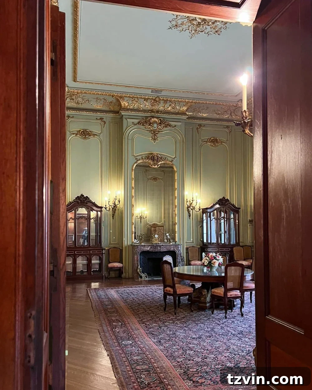
It’s that beautiful gray-green room with gilded millwork that keeps replaying in my head. Our guest bedroom is overdue for an update, so naturally I’ve been hunting for the perfect version of that shade for our house.
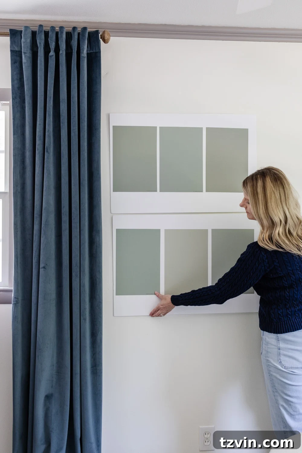
Finding the right gray-green should be simple, but it’s not. What looks perfect in someone else’s home can appear too gray, too green, or even slightly blue once it’s on your wall. That’s why my walls are currently covered in Samplize swatches.
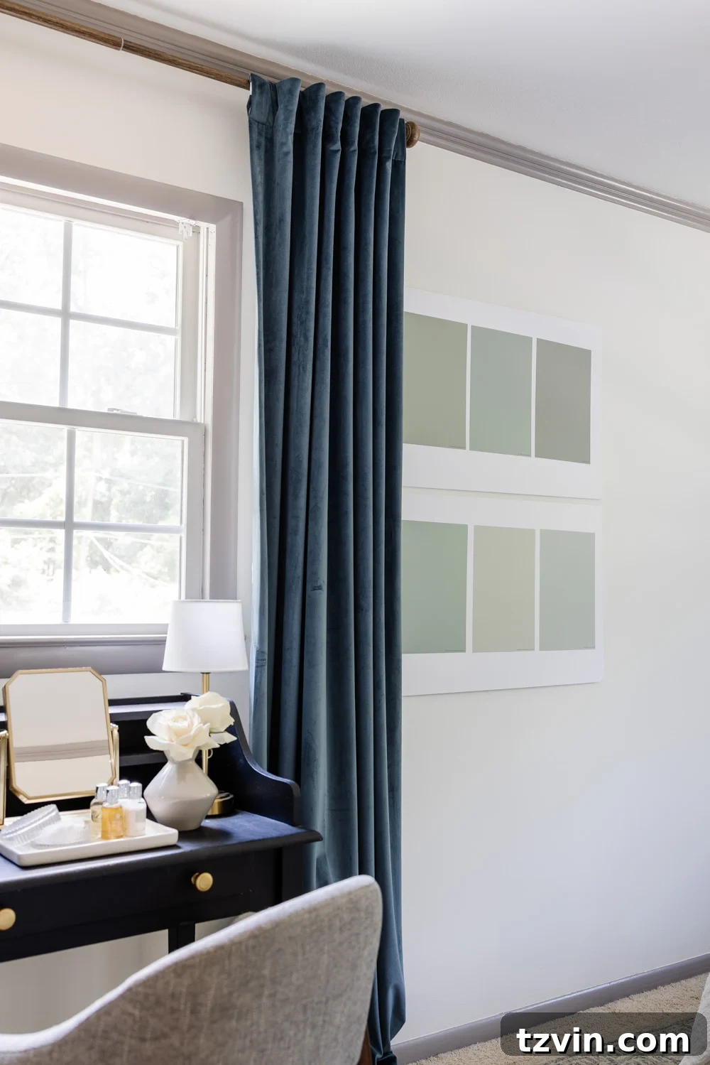
Paint color selection is tricky. The frustrating part isn’t always choosing a color you love; it’s getting that color to look the way you expect it to in your own space. Even if you knew the exact shade used in a historic home, it may not read the same under your room’s specific lighting and finishes.
After years of painting rooms and learning from mistakes, I’ve realized most paint regrets aren’t caused by picking the wrong color—they come from choosing colors the wrong way. If a freshly painted room ever made you think “this isn’t what I pictured,” you’ve likely encountered one of the mistakes below.
1. Stop Trusting That Tiny Paint Chip
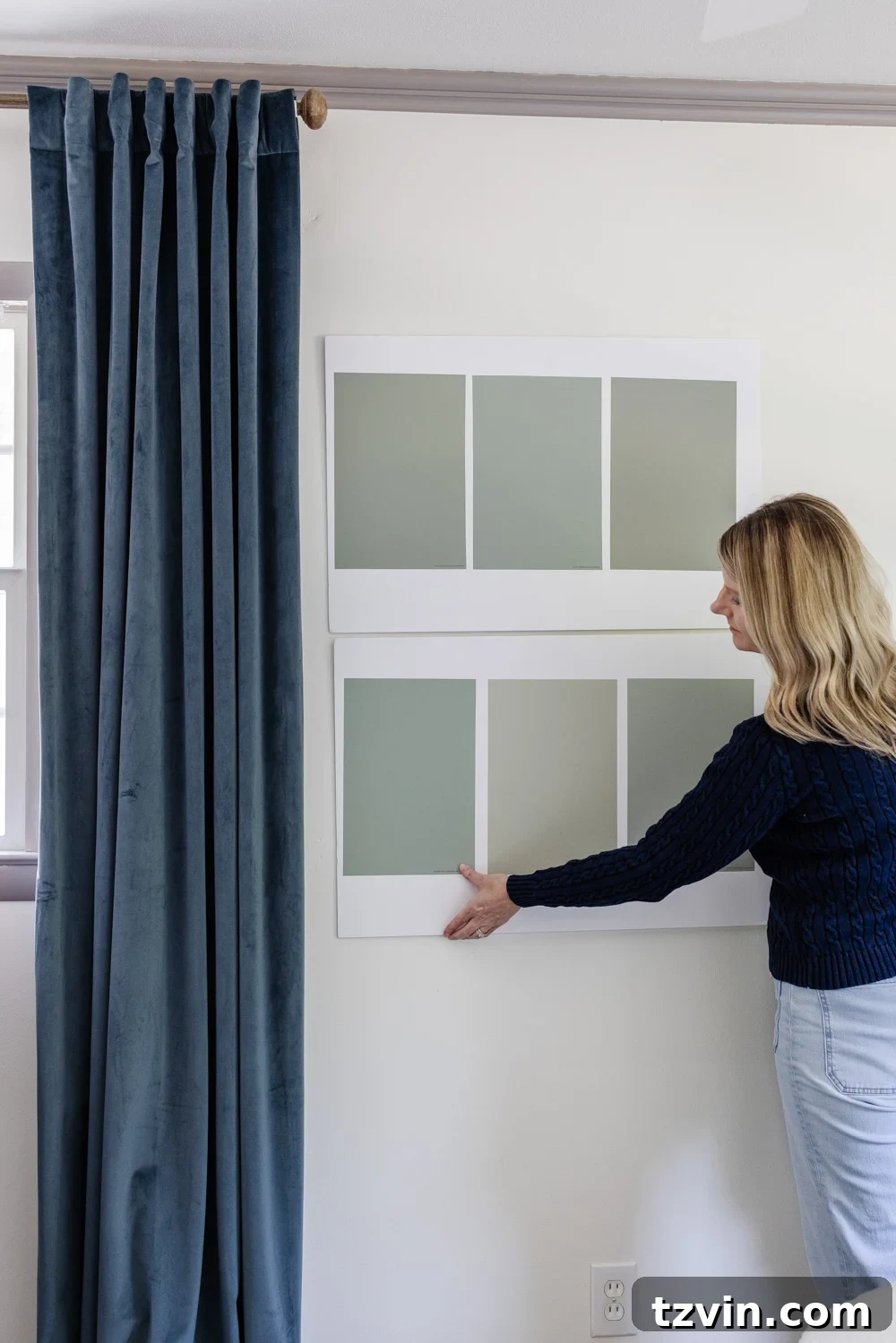
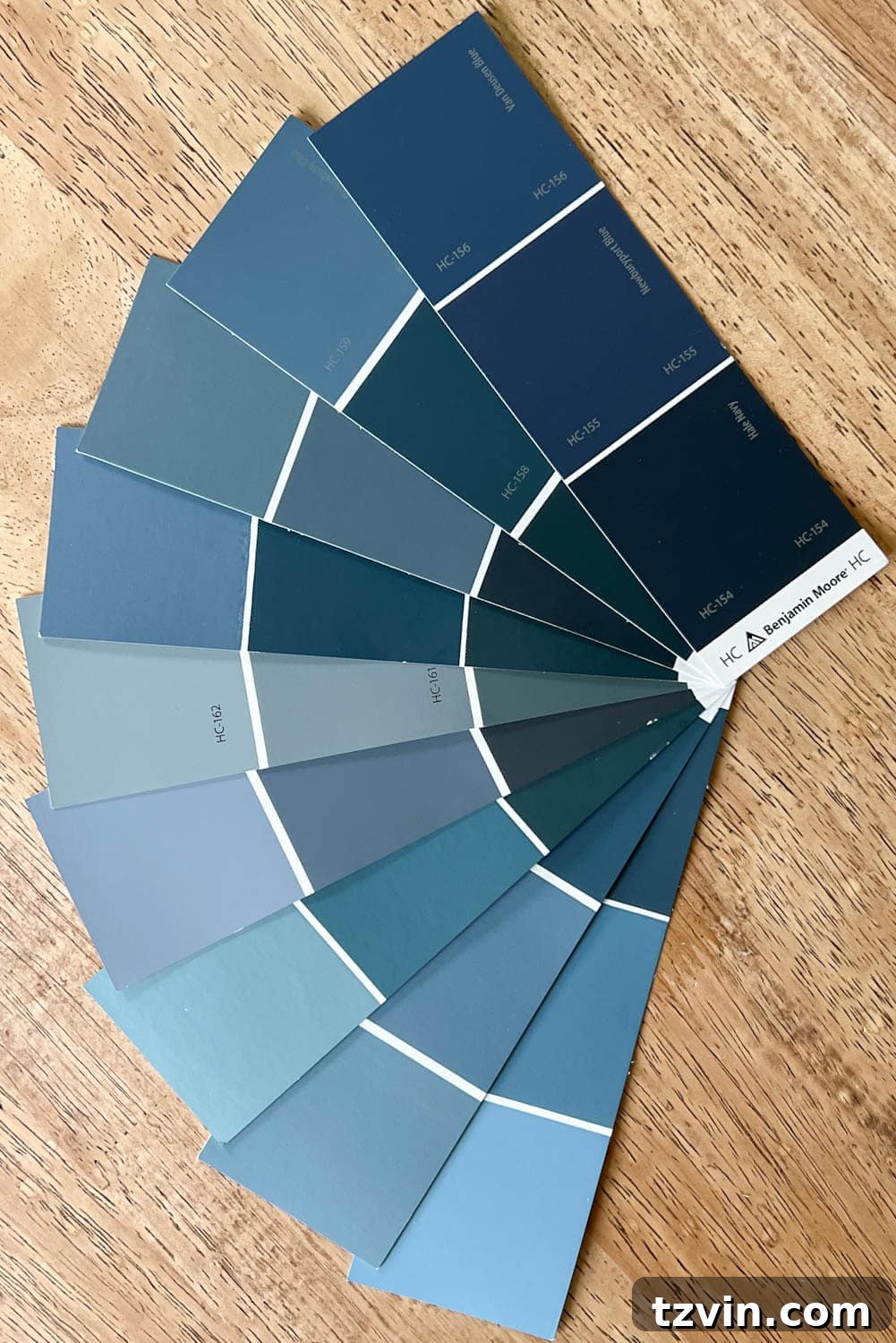
One of the most common missteps is choosing a color from a tiny store paint chip. Colors change when they cover a large surface: undertones become more obvious and the look shifts with scale. That’s why I always test a large area first.
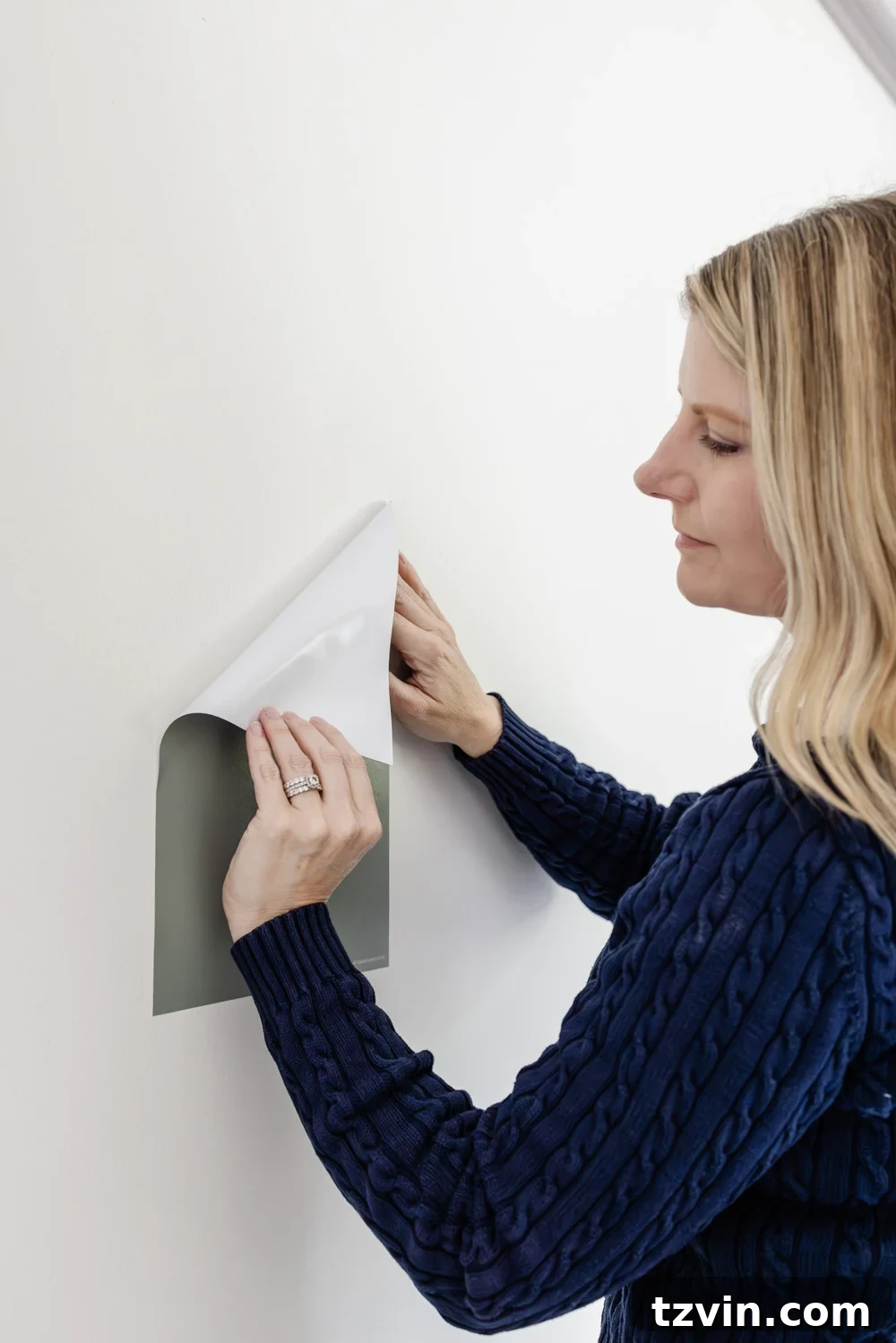
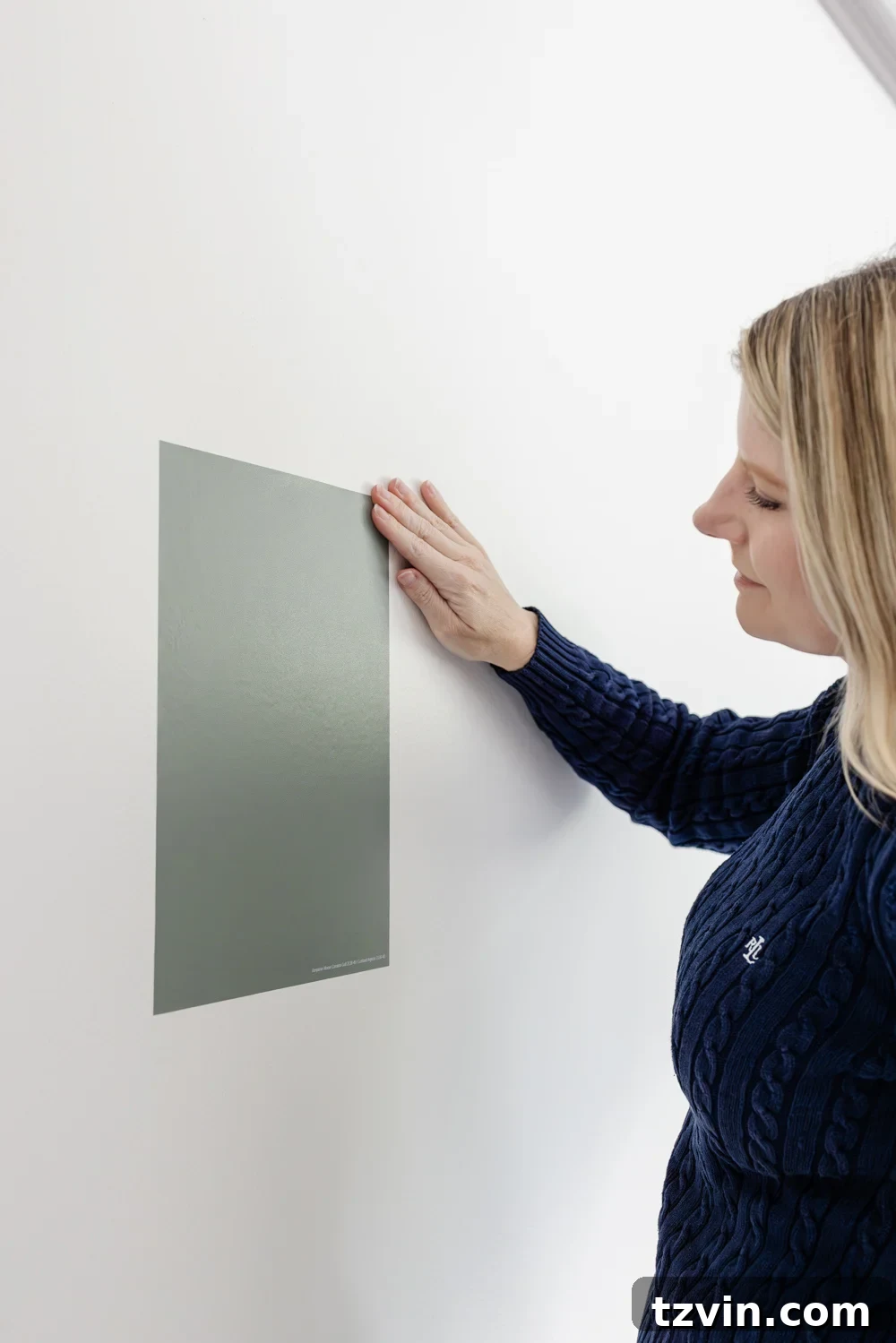
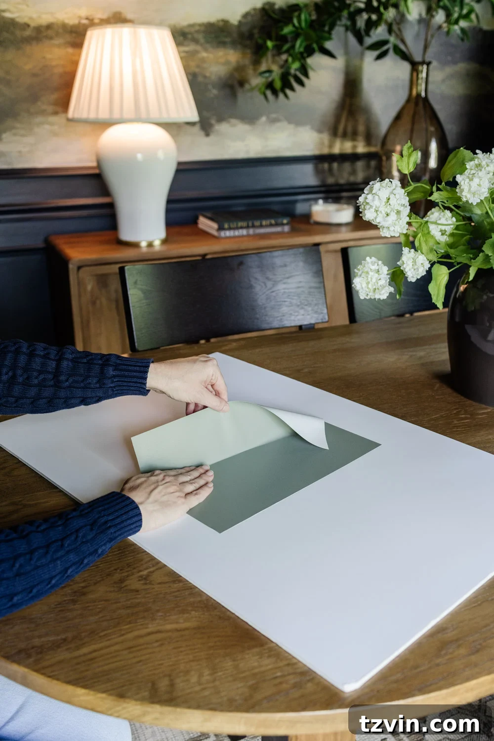
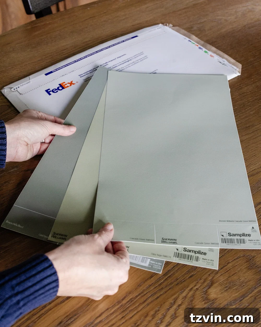
For years I painted sample squares directly on walls, which worked but left messy patches to cover later. Now I use Samplize peel-and-stick paint samples. Because they’re made with real paint, they show how a color will behave next to flooring, trim, and furniture. Some samples come in extra large sizes, and they’re reusable—peel them up and try them elsewhere.
2. If You Ignore Undertones, You’ll Regret It
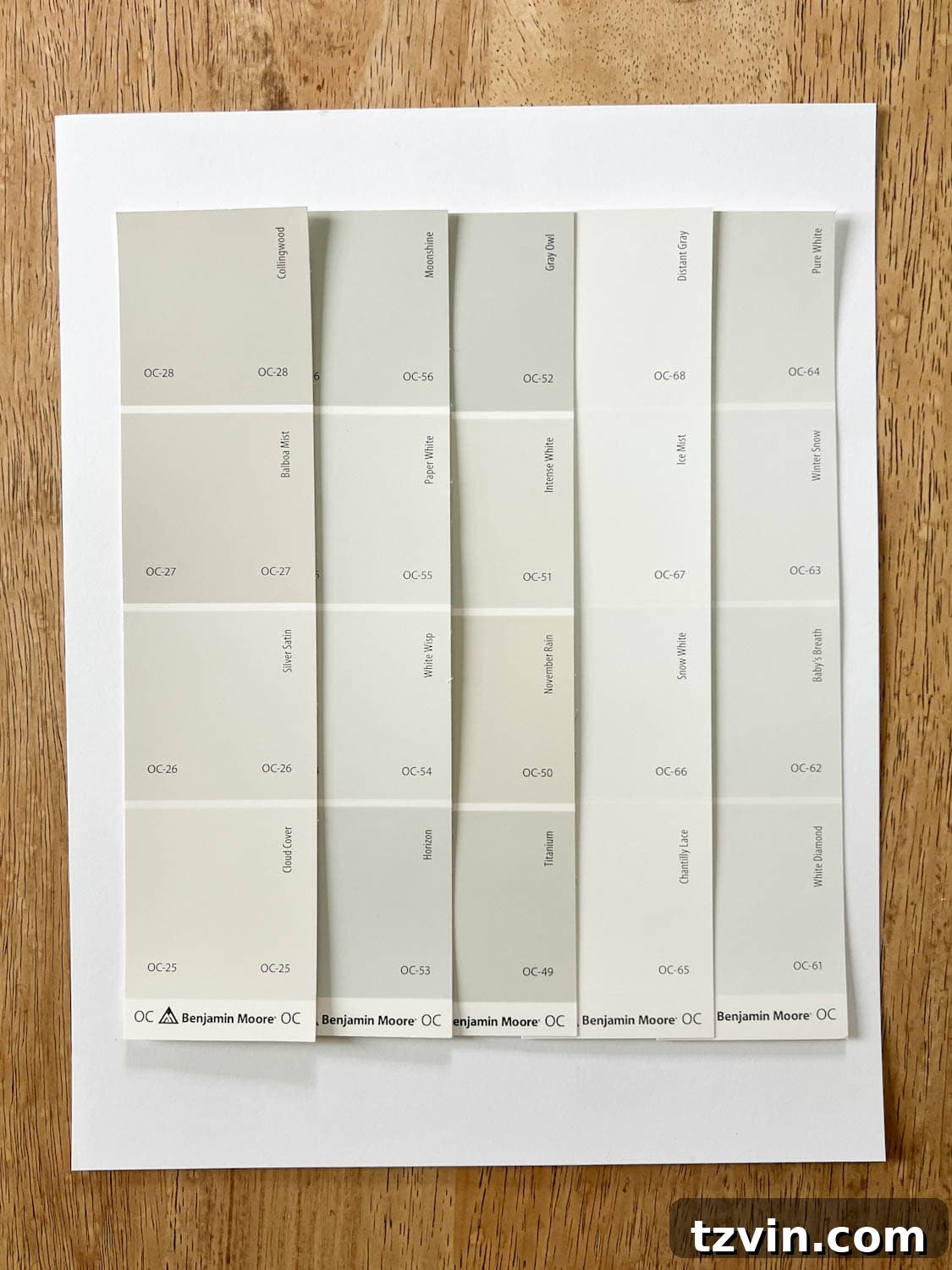
Undertones make or break how a color reads. Every paint has them—even neutrals. Some grays lean blue or purple, some lean green. Whites can shift creamy, yellow, pink, or blue depending on light and nearby finishes.
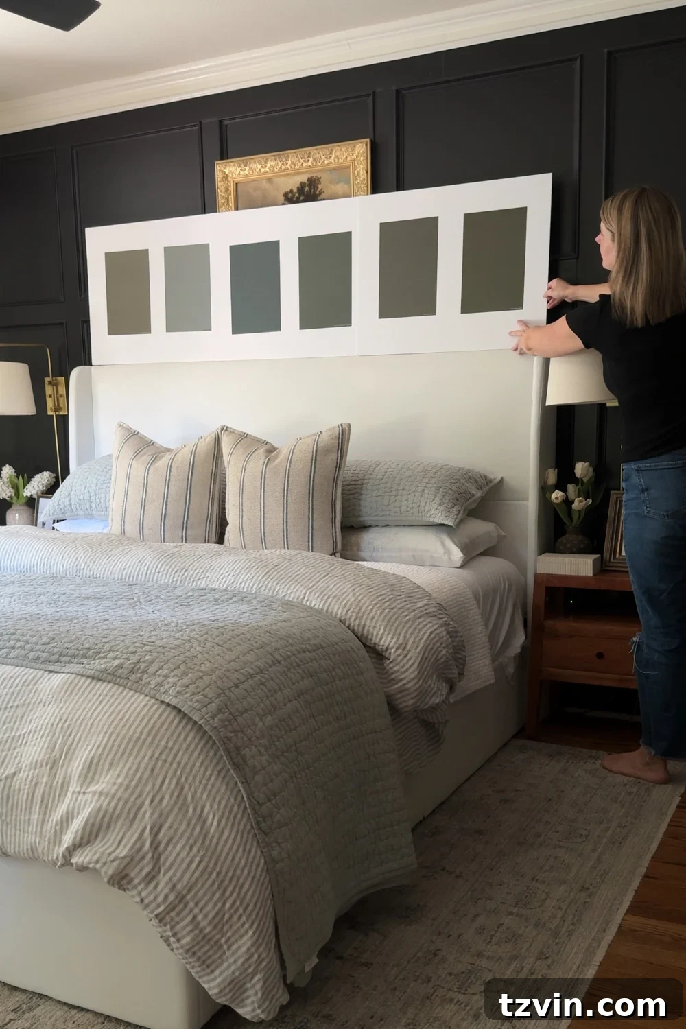
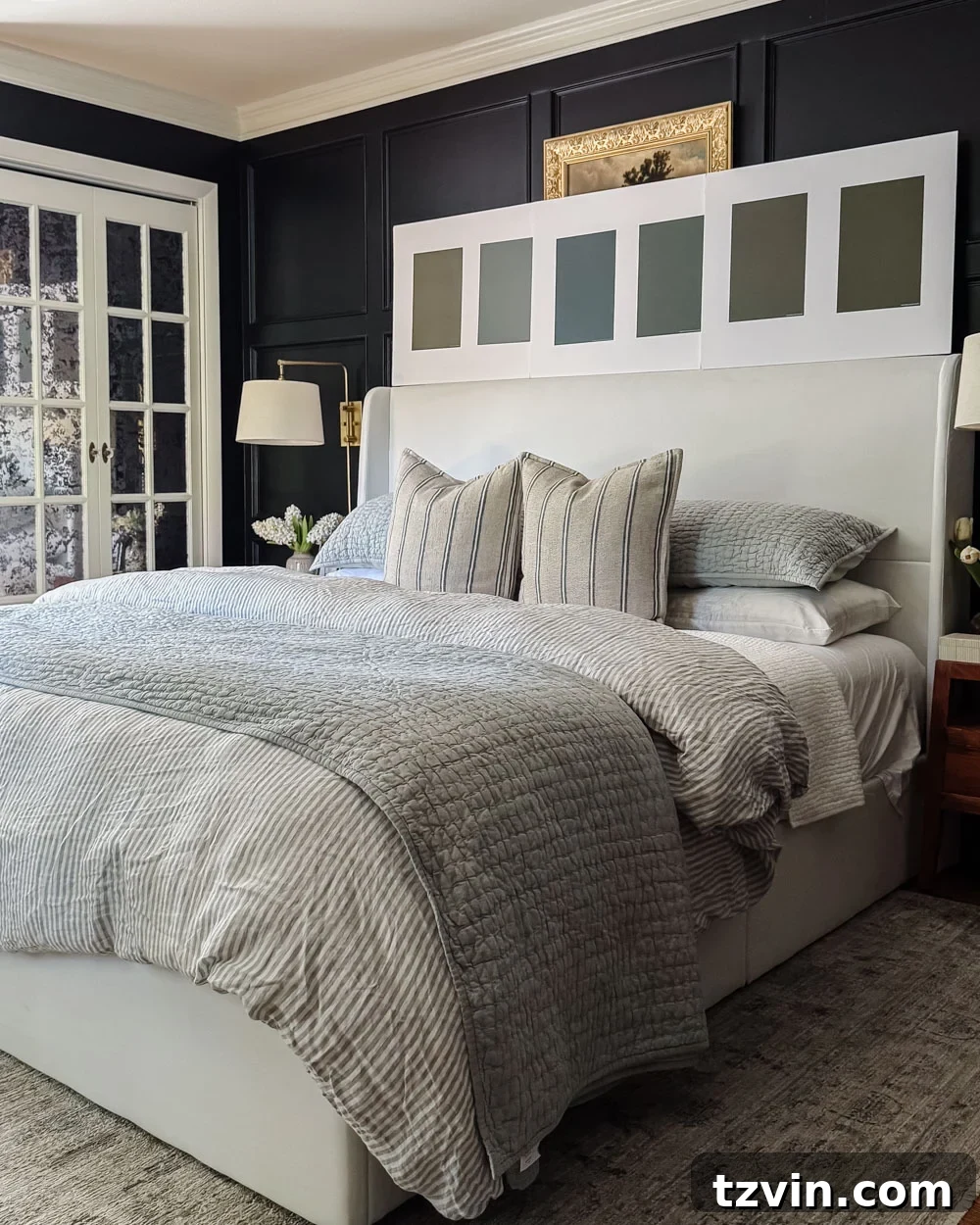
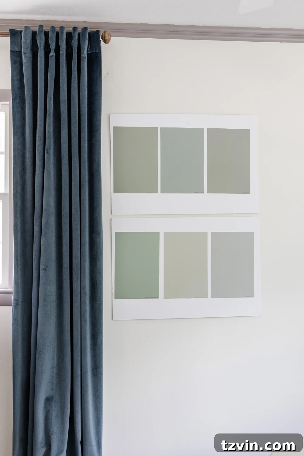
The best way to spot undertones is to compare colors side-by-side. Right now I’m testing several gray-green options for our guest room. I attach Samplize samples to large white poster boards and move them around the room. The white background helps reveal undertones because surrounding colors and materials can otherwise fool your eye.

3. Paint Colors Look Different Throughout the Day
Don’t decide on a color after one quick glance. Paint shifts with the time of day, weather, and which direction your room faces. Moving samples around the house and checking them at different times is essential. That’s another reason I mount samples on poster board: they’re easy to carry and view in varying light without scarring your walls.
Morning light, afternoon light, sunny days, and overcast skies will all change how a color feels. Online photos can help, but nothing replaces seeing the shade in your home.
4. Flooring Gets a Vote
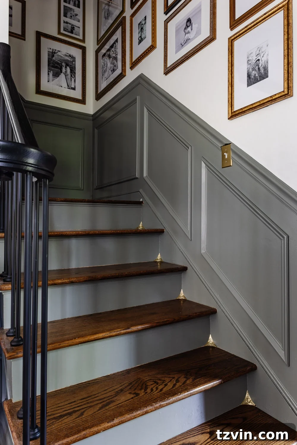
Flooring, countertops, tile, cabinetry, and large furniture all influence how a paint color reads. A hardwood floor with warm orange undertones can pull a neutral one way, while cool tile can nudge it another. To spot these interactions, carry a piece of white card stock and hold it next to fixed elements; it helps reveal hidden undertones.
If a color feels “off” despite being pretty on paper, odds are the undertones are clashing with existing finishes. Don’t overlook flooring and other permanent features when choosing paint.
5. Stop Choosing Paint Before Everything Else
People often assume paint should come first because it covers the most surface, but paint is one of the easiest elements to change. Bigger investments—sofas, rugs, drapes, bedding, countertops, and large furniture—should guide your paint choice whenever possible. There are thousands of paint colors to coordinate with your existing pieces; it’s much harder to find furniture that perfectly complements a preselected paint shade.
6. Trendy Doesn’t Always Mean Right
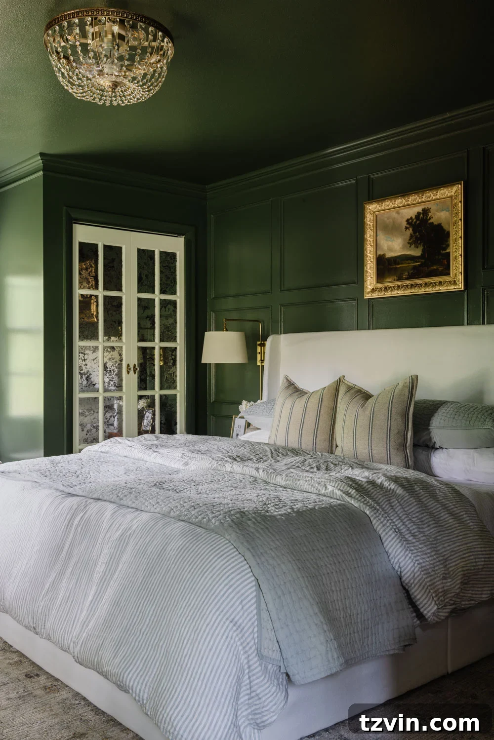
Trends are fun, but they shouldn’t be the main reason you pick a color. The best paint shade is the one that complements your home’s lighting, architecture, furnishings, and finishes—regardless of what’s currently popular. Ask what works best in your space rather than what’s trending.
My Favorite Way to Test Paint Colors Before Painting
After painting too many sample squares on walls, I switched to Samplize peel-and-stick paint samples. They remove much of the guesswork: I can compare multiple colors side-by-side, move samples throughout the house, and see how shades look next to flooring, trim, and furnishings before committing to gallons of paint.
It’s also convenient to compare colors from different brands—Benjamin Moore, Sherwin-Williams, Farrow & Ball—without running to several stores. The samples arrive quickly and make decisions faster and more confident, reducing the chance of costly mistakes.
Final Thoughts
Most paint color mistakes come from the process, not the shade. Trusting tiny chips, ignoring undertones, checking samples only once, and forgetting fixed finishes can all lead to disappointment. The good news: these missteps are avoidable.
Take your time, test thoroughly, and pay attention to undertones and lighting. A little patience up front will save you regret later. If you’re hunting for the perfect paint color, you’re not alone—I’ll be here moving gray-green samples around our guest bedroom, trying to capture a bit of that Gilded Age magic.
Need More Paint Color Help?
- Our Calming Whole House Paint Color Palette
- How to Choose Paint Colors for Your Home Like a Pro
- Top Recommended Contrast Trim Paint Color Ideas