Transform Your Home: Essential Decorating Tips to Avoid Common Mistakes
Embarking on a home decorating journey can be exciting, but it’s also a path paved with potential pitfalls. Over a decade of beautifying homes, I’ve stumbled upon numerous “doofus” decorating mistakes that, with a little foresight, could have been easily avoided. Perhaps you’ve experienced similar frustrations – a paint color that looked perfect in the store but awful on your walls, or a tiny rug trying to make a statement in a sprawling living room.
I learned many lessons the hard way, and if I could go back in time, I’d certainly warn my past self! This article is my way of sharing those hard-earned insights with you, friend to friend, so you can sidestep common decorating blunders and create a home you truly love. From selecting the right paint to arranging furniture, and from managing clutter to enhancing ambiance, these expert tips will guide you toward a more beautiful and functional living space.
I’ve compiled this list of the most common decorating mistakes I’ve witnessed (and made myself!), along with practical solutions to help you achieve a polished and inviting home. This isn’t just about aesthetics; it’s about creating spaces that truly reflect your style and enhance your daily life.
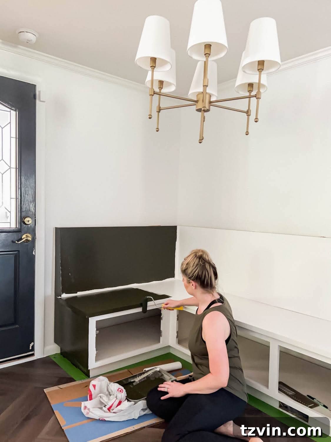
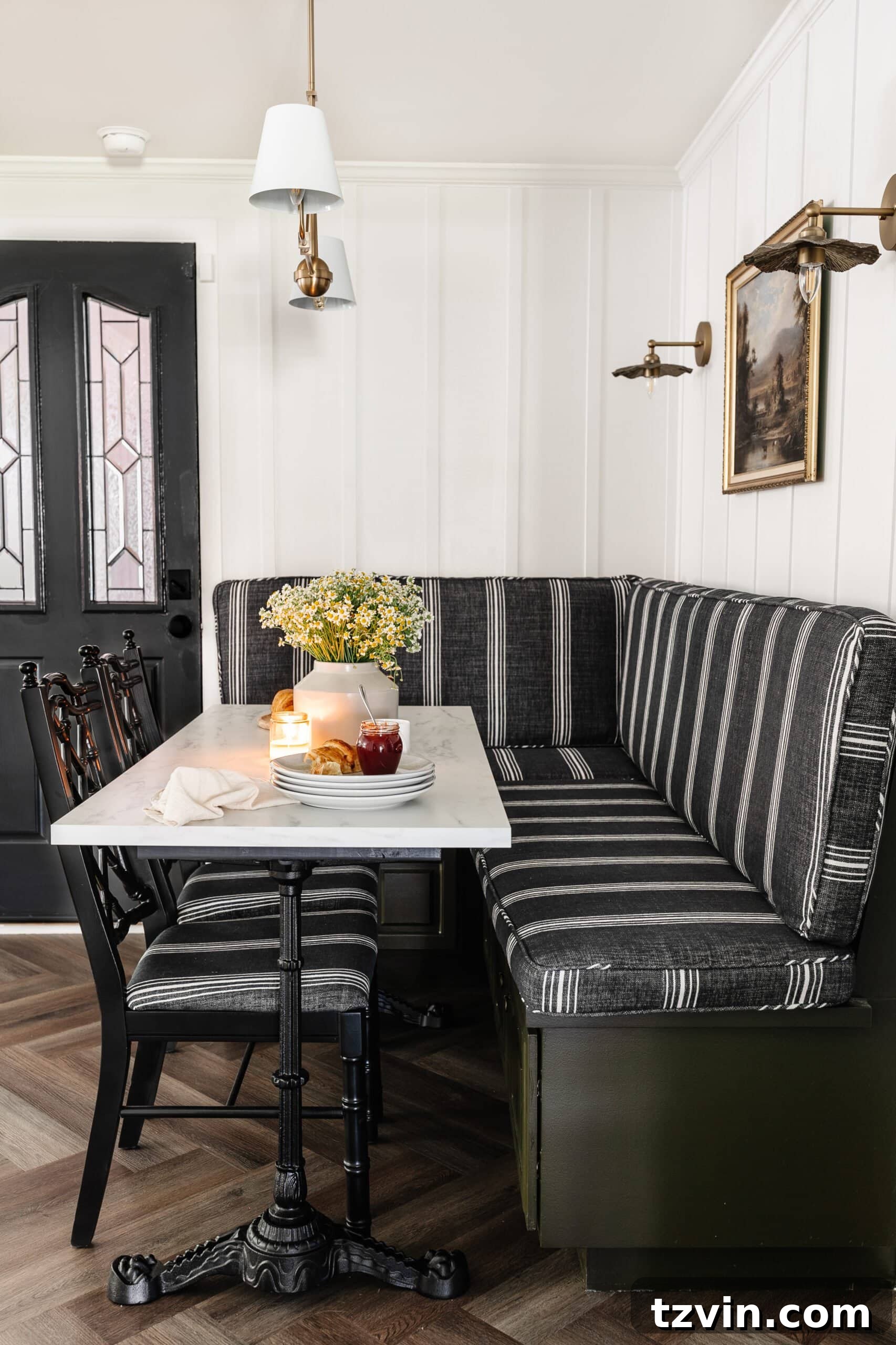
1. Not Testing Paint Colors Before Buying
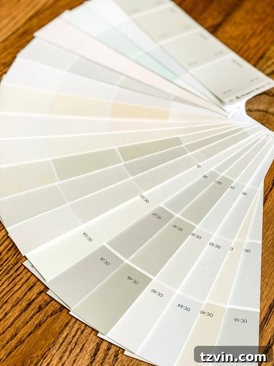
One of the most frequent and impactful decorating mistakes is choosing a paint color without properly testing it in your own home. I once selected a paint color from a tiny chip, under the dim lamplight of a different house, only to realize after our entire downstairs was painted that it was a huge, yellowy-beige misstep. The truth is, paint colors look dramatically different under various lighting conditions – natural daylight, overcast skies, evening lamps, and even the direction of your windows all play a role.
To avoid this costly error, always follow a smart sampling process:
- Curate Your Options: Begin by selecting 3-5 potential paint colors from paper swatches. Browse Pinterest and Instagram for inspiration, paying attention to how colors appear in real homes similar to yours.
- Get Samples: Purchase sample pots of your chosen colors. These are small quantities designed specifically for testing.
- Test Smartly: Paint generous swatches onto large pieces of white foam board. Avoid painting directly onto your wall, as existing wall colors can skew your perception.
- Observe and Evaluate: Tape the foam boards to different walls in the room you intend to paint. Observe them over one to two days, noting how the colors change from morning to evening, under both natural and artificial light. This comprehensive approach will reveal the true character of each shade, allowing you to make an informed and confident final decision.
Related: How to Choose Paint Colors for Your Home Interior Like a Pro
Investing this small amount of time and effort in the sampling process will save you from the disappointment and expense of repainting. Trust me, your future self will thank you. If you need a starting point, explore some of my favorite go-to paint colors for reliable choices.
2. Decorating With Too Many Small Accessories
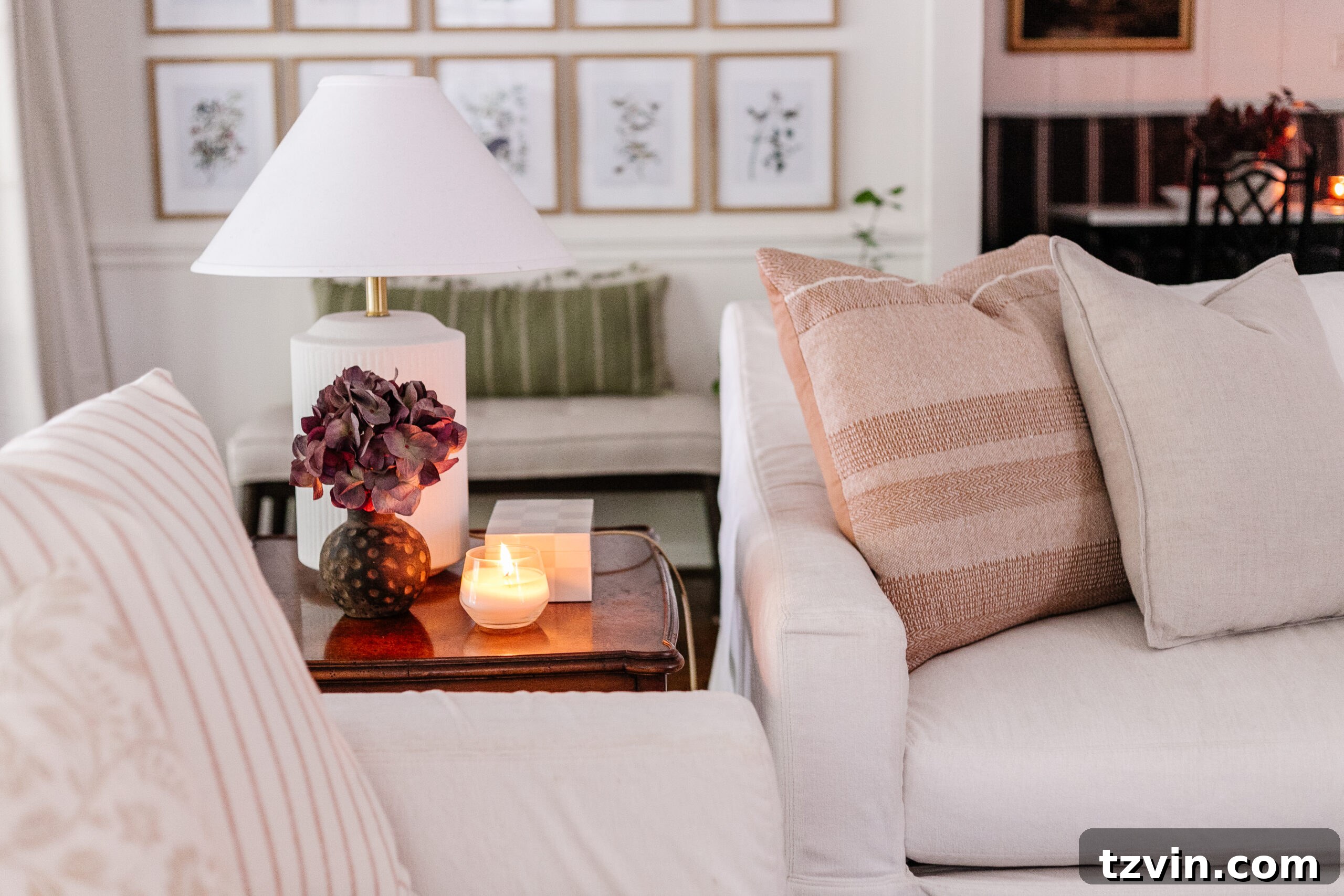
In my early decorating days, I was guilty of “knick-knack overload.” I’d gather twenty small, individual decor accents that I loved, thinking they would look cute together on a dresser or shelf. The result? A cluttered, chaotic mess that diminished the beauty of each piece and made the space feel overwhelming rather than curated.
The key to successful accessorizing is understanding that less is often more. Instead of filling every available surface, focus on creating cohesive vignettes that offer visual interest without clutter. Here are some guiding principles:
- The Power of Three: Group items in odd numbers, typically three, for a naturally pleasing arrangement.
- Vary Heights and Sizes: When styling tabletops, dressers, chests, or shelves, incorporate objects of varying heights, widths, and textures. This creates dynamic visual flow and prevents a flat, monotonous look.
- Embrace Negative Space: Allow for breathing room around your decor. Empty space is just as important as the objects themselves, giving the eye a place to rest and highlighting your chosen pieces.
- Consider Function: Ensure accessories serve a purpose, even if it’s purely aesthetic. Each item should feel intentional, not just placed to fill a void.
For more specific guidance, explore these styling tips for coffee tables, entry tables, nightstands, buffets, and end tables. Learning to create balanced and beautiful vignettes will elevate your home’s aesthetic dramatically.
Related: How to Style Tabletops Step by Step Like a Pro
3. Not Having Plants (Whether Real or Fake)
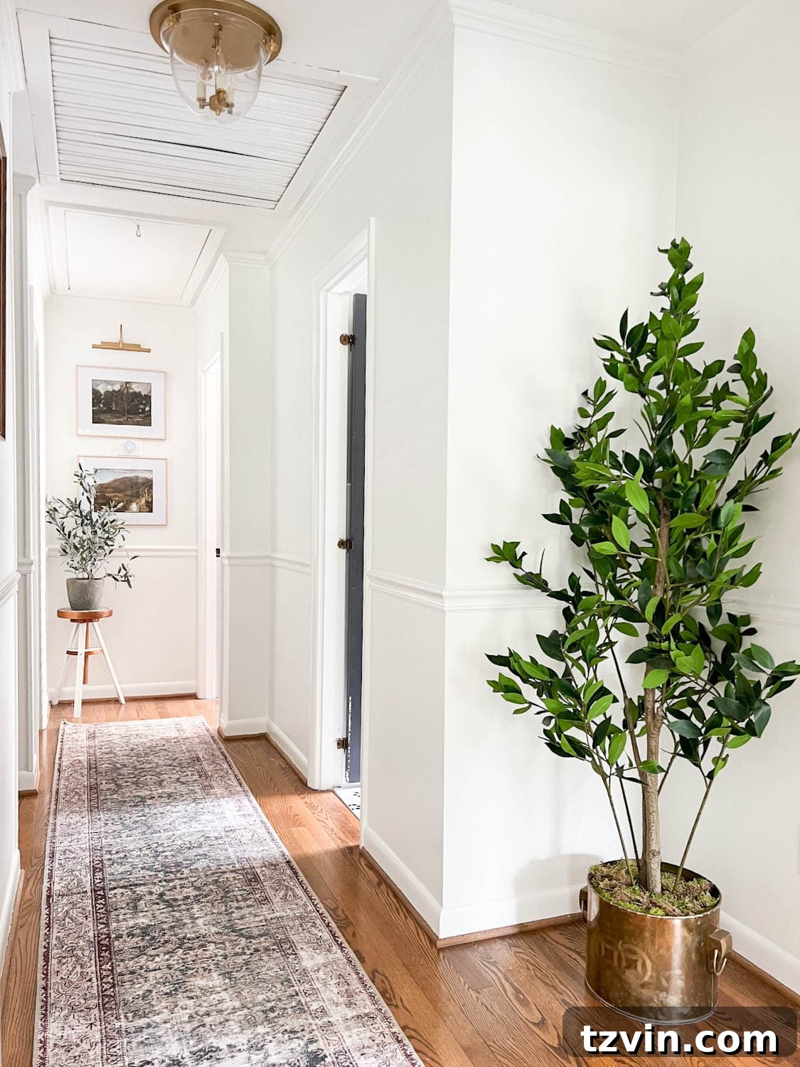
There was a period when I would look at a finished room and feel that something was undeniably “missing,” yet I couldn’t quite pinpoint it. That “aha!” moment arrived when I realized the absence of life – specifically, plants. Think about a beautiful hallway or a cozy living room; now, mentally remove any greenery. What’s left? Often, a space that feels flat, sterile, and lacking warmth. Plants, whether real or high-quality artificial, infuse a room with vitality, color, and a sense of connection to nature, instantly elevating its mood and aesthetic.
Even if you have a notorious “black thumb” and struggle to keep real plants alive, there’s no excuse to forgo greenery. Today’s artificial plants are incredibly realistic and offer all the visual benefits without the maintenance. They brighten a room, add texture, and introduce a crucial organic element that makes any space feel more inviting and alive. Consider adding a large floor plant, a few smaller potted plants on shelves or tables, or even a hanging planter to bring a touch of the outdoors in.
Related: Best Artificial Indoor Trees and Tips to Make Them Look Real | Where to Find the Best Fake Flowers That Look Real
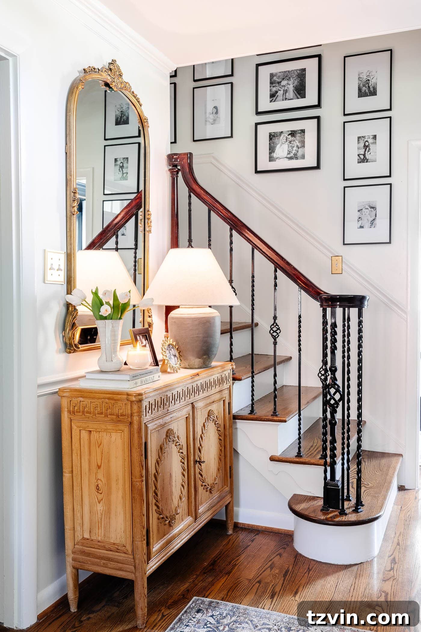
4. Having Too Many Picture Frames on Tabletops
While some “decorating tips” might suggest abandoning family photos for abstract art, I firmly believe a home should reflect the lives lived within it. We’re not robots; our homes should be filled with cherished memories. However, there’s a fine line between sentimental display and overwhelming clutter. I used to cover entire console tables with an excessive number of picture frames, creating a visual jumble that detracted from the sentiment each photo held.
Instead of a cluttered tabletop, consider these more refined approaches to showcasing your family photos:
- Curated Tabletops: For flat surfaces like console or end tables, select just one or two small, beautifully framed photos. Choose frames that complement your decor style and let these chosen images shine as intentional accents.
- Gallery Walls: This is the ideal solution for displaying a larger collection of family memories. A well-designed gallery wall allows you to group multiple photos, creating a cohesive visual statement that’s both personal and stylish.
- Streamlined Aesthetic: For a clean, modern, and timeless look, opt for black and white prints in simple, matching black frames. This creates instant visual unity and sophistication, ensuring your sentimental photos enhance, rather than overwhelm, your decor.
By thoughtfully curating your photo displays, you can honor your memories while maintaining an elegant and uncluttered living space.
5. Having Exposed Cables and Cords
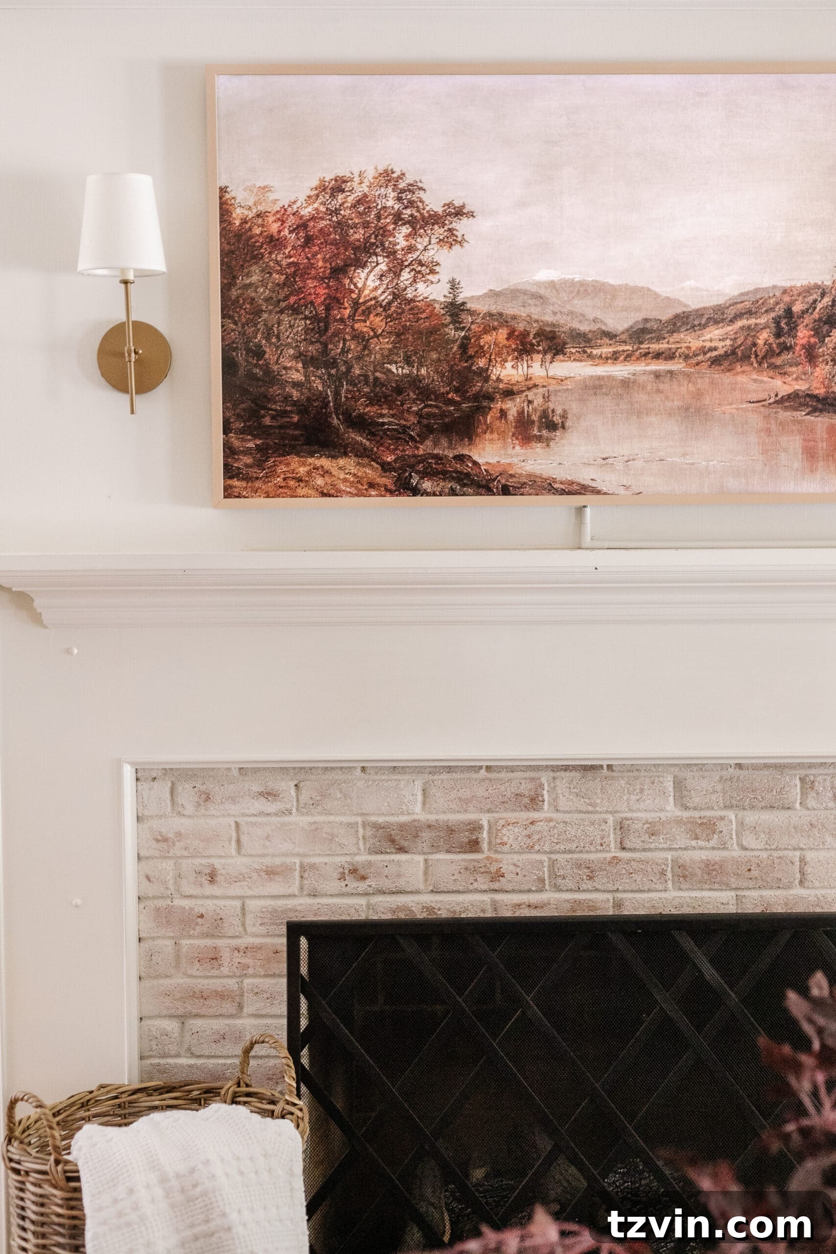
Untidy cables and cords are a common visual annoyance that can quickly detract from even the most meticulously designed room. When we first mounted our TV, the tangle of wires was a chaotic mess. It’s a problem many people tolerate, but fortunately, it’s one of the easiest to fix with a few simple solutions that significantly enhance your home’s neatness and aesthetic.
Here’s how to effectively disguise those unsightly wires:
- Cord Covers: The simplest and most popular solution is to use cord covers. These channels neatly encase your wires. Once installed, they can be painted the same color as your wall, making them virtually disappear.
- Cable Ties and Sleeves: For less visible areas or bundles of wires, use cable ties or fabric sleeves to group them together. This creates a cleaner, more organized look, even if they’re not fully hidden.
- Furniture with Cable Management: Many modern entertainment units and desks come with built-in cable management systems, including cutouts and channels to route wires discreetly.
- Creative Storage Solutions: Consider incorporating storage that can conceal electronic boxes and cables. For example, we integrated our electronic boxes into a DIY window seat, keeping everything out of sight while adding functionality.
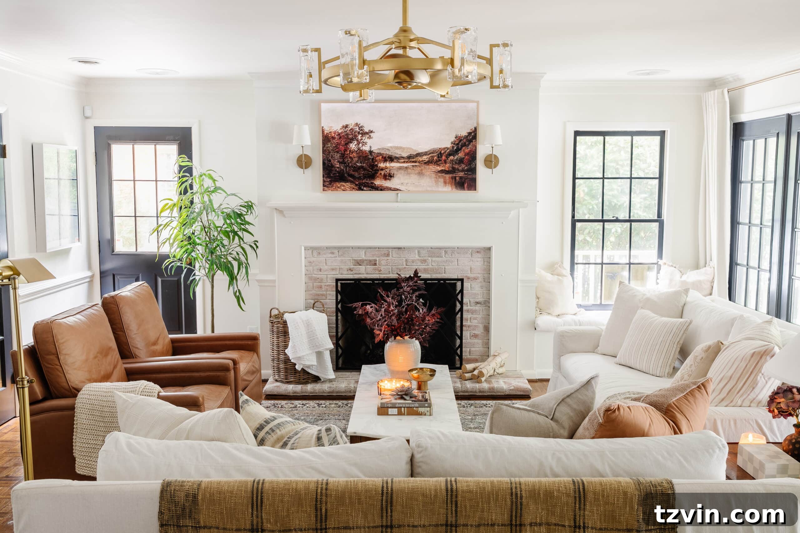
By taking a few steps to manage your cables, you’ll achieve a far more polished and serene living environment. Notice how barely noticeable our TV cords are thanks to intelligent cord management – it’s a small detail that makes a big difference!
Related: 15 Aesthetically Pleasing Ideas to Hide Ugly Household Items
6. Decorating Around Something You Hate
If I had a dollar for every time I tried to force a piece of furniture I genuinely disliked into a decorating scheme, I’d be quite wealthy! It’s a common trap: you have a hand-me-down, an impulse buy, or something you just can’t stand, but you try to “make it work.” The unfortunate reality is that decorating around an item you hate doesn’t salvage it; it merely contaminates the entire room with that same feeling of dissatisfaction. You end up with a space that never truly feels right, because it’s anchored by something that brings you no joy.
The solution is simpler than you might think, and it doesn’t require a hefty budget for brand-new furniture. Instead of compromising your vision, consider these alternatives:
- Sell or Donate: List the offending item on Facebook Marketplace, Craigslist, or local buy/sell/trade groups. You might be surprised how quickly it sells, providing funds for a replacement. Alternatively, donate it and enjoy the tax deduction and clear space.
- Thrift and Transform: Explore thrift stores, consignment shops, yard sales, and estate sales. These treasure troves are often packed with quality, pre-loved pieces that can be refinished, painted, or reupholstered to perfectly match your desired aesthetic.
- DIY and Upcycle: With a little creativity, an undesirable piece can sometimes be transformed. A fresh coat of paint, new hardware, or a clever repurposing can give it new life. However, be honest with yourself about whether it’s truly salvageable or if it’s better to move on.
Prioritize pieces you love or can genuinely grow to love. Your home should be a sanctuary, and that begins with furniture that brings comfort and happiness, not regret.
Related: How to Find the Best Deals on Facebook Marketplace
7. Not Decluttering Before Redecorating
Watching home renovation shows like “Love It or List It” often highlights a fundamental truth: many homeowners attribute their dissatisfaction to a “dysfunctional” house when, in reality, a significant portion of their problems could be solved by simply decluttering. Trying to redecorate a space that is already overflowing with unnecessary items is like trying to frost a messy cake – the underlying chaos will always show through. Decluttering is not just about tidiness; it’s about creating a clean canvas, both physically and mentally, for your new design vision.
Before you even begin to think about new furniture, paint colors, or accessories, embrace the power of a thorough declutter. Here’s how to approach it:
- Empty the Space: Remove everything from the room. Yes, everything! This radical step provides a fresh perspective and allows you to see the true potential of the space.
- Sort Ruthlessly: Go through each item with a critical eye. Ask yourself: Do I use this? Do I love this? Does it add value to my life or to this room?
- Categorize and Decide: Create piles for ‘Keep’, ‘Donate/Sell’, ‘Trash/Recycle’. Be honest about what you truly need and want to keep.
- Organize What Remains: For the items you choose to keep, develop a clear organization system. Invest in smart storage solutions – bins, baskets, drawer dividers – to ensure everything has a designated home.
Only after you’ve decluttered and organized can the “pretty decor” truly shine. This foundational step will make your redecorating efforts far more effective and result in a home that feels both beautiful and functional. Need help getting started? Here is a decluttering checklist that can guide you through the process.
Related: How to Declutter Your Home Quickly with These Organizer Secrets
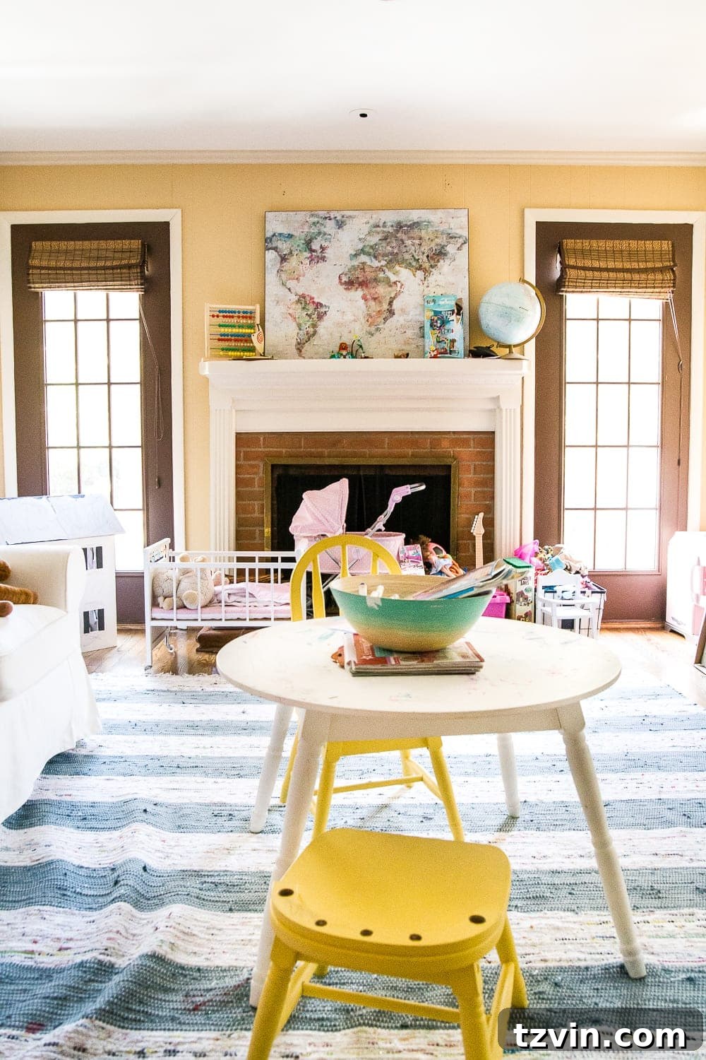
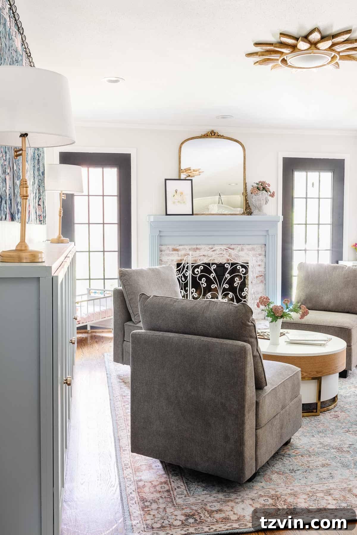
8. Having Too Much Furniture
A common misconception in home decorating is that more furniture equals more comfort or functionality. In reality, a room crammed with too many pieces can feel suffocating, make the space appear significantly smaller, and hinder natural foot traffic flow. This creates an uncomfortable and impractical environment, counteracting any aesthetic efforts. Understanding the importance of scale and proportion is crucial for creating a balanced and inviting room.
To avoid over-furnishing, consider these points:
- Assess Traffic Flow: Can you easily move through the room without bumping into furniture? If not, it’s a sign you have too many pieces or they are improperly arranged. Maintain clear pathways for comfortable navigation.
- Prioritize Essential Pieces: Identify the core furniture items that are absolutely necessary for the room’s primary function. For a living room, this might be a sofa, a coffee table, and an accent chair. For a dining room, a table and chairs.
- Edit and Scale Back: If your room feels tight, consider removing non-essential pieces. Could that extra side table go elsewhere? Is that large armchair really needed, or could a smaller one suffice?
- Choose Appropriately Sized Furniture: When purchasing new items, pay close attention to their dimensions relative to the room’s size. A massive sectional might overwhelm a small living room, just as a tiny console table would be lost in a grand entryway. Aim for pieces that are proportionate to the space they occupy.
- Embrace Multi-functional Furniture: For smaller spaces, opt for furniture that serves multiple purposes, such as an ottoman with storage or a sofa bed. This maximizes utility without sacrificing precious square footage.
By thoughtfully editing your furniture and ensuring each piece serves a purpose and fits the scale of the room, you can create an open, airy, and truly functional living space.
9. Using Rugs That Are Too Small
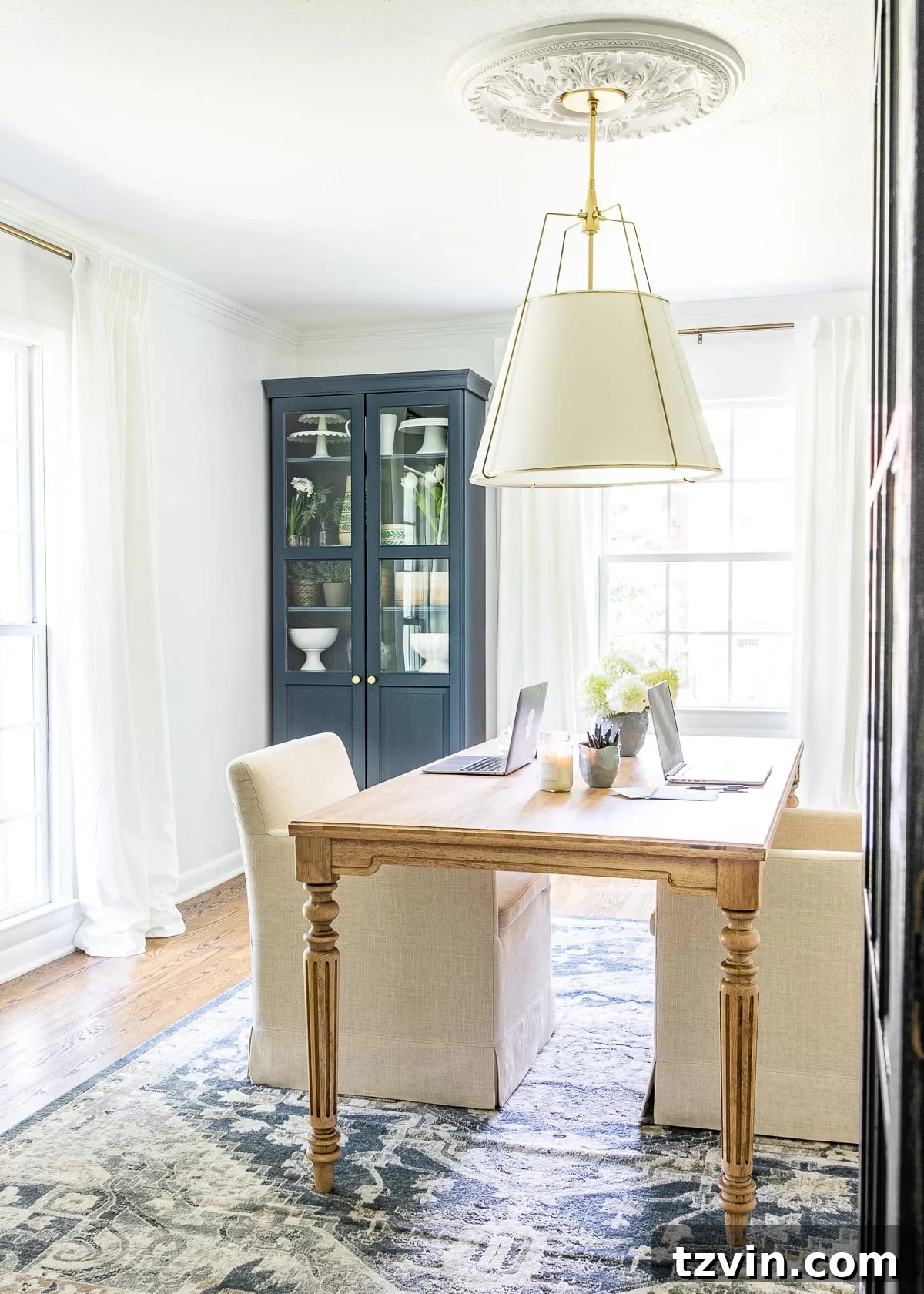
A rug is more than just a floor covering; it’s a foundational element that defines a space, anchors furniture, and adds warmth, texture, and color. However, one of the most common decorating mistakes, and one I’ve personally made, is using a rug that is simply too small for the room or furniture it’s meant to accompany. I once placed a 4×6 rug under our dining table, only to find the chairs constantly catching on the edge, making it an awkward obstacle rather than a cohesive design element. A postage-stamp-sized rug in a giant living room creates an imbalance, making the room feel disjointed and smaller than it actually is.
To ensure your rug enhances your space, follow these guidelines for proper sizing:
- The “Legs On” Rule:
- Living Rooms: Ideally, all four legs of your main furniture pieces (sofa, armchairs) should sit on the rug. If that’s not possible due to space or budget, ensure at least the front two legs of all major pieces are on the rug. This visually anchors the seating arrangement.
- Dining Rooms: The rug should be large enough so that when chairs are pulled out, all four legs remain on the rug. This typically means extending the rug at least 24-30 inches beyond the table’s edge on all sides.
- Bedrooms: For a queen-sized bed, an 8×10 rug is usually a good starting point, allowing the rug to extend comfortably beyond the sides and foot of the bed. For king-sized beds, a 9×12 or larger may be necessary.
- Define Zones: In open-concept spaces, rugs are excellent for delineating functional zones (e.g., a living area from a dining area). A properly sized rug clearly marks the boundaries of each zone.
- General Sizes: As a rule of thumb, consider a minimum of 8×10 rugs for most living rooms and under beds (9×12 for larger spaces). For dining tables, a 6×9 is often the minimum, provided it allows ample space for chairs to be pulled out without falling off the rug.
Using the correct rug size is a game-changer for spatial perception and functionality. Don’t let a small rug undermine your decorating efforts. Use this comprehensive rug selecting guide to find the perfect fit for your room.
Related: 25 Best Places to Buy Rugs Affordably Online
10. Mixing Too Many Disjointed Patterns
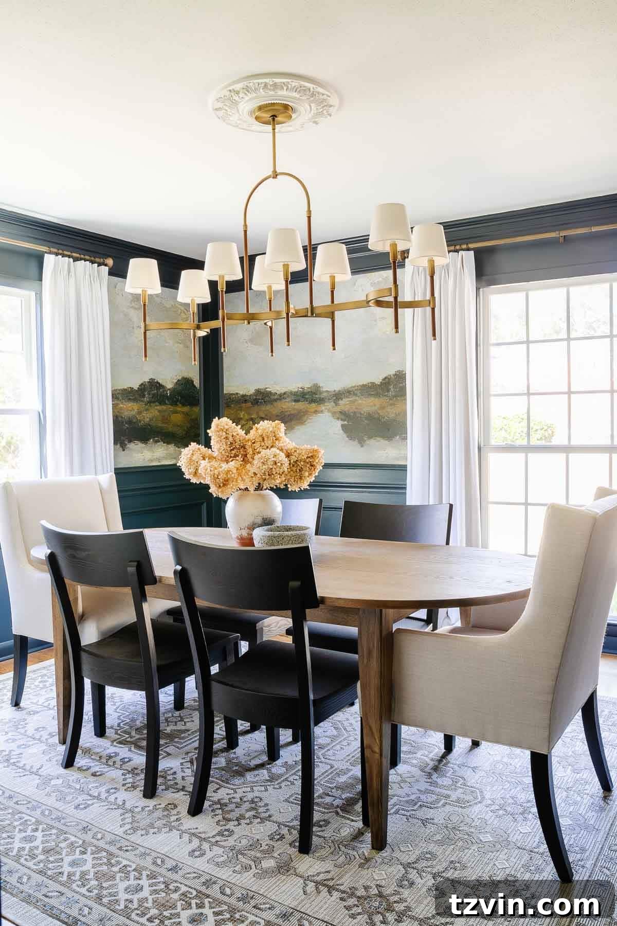
There was a time when I had an aversion to solid fabrics, leading to a home filled with rugs, curtains, and pillows, each sporting a different, often clashing, print or pattern. The result was a visually overwhelming and chaotic space that lacked harmony and sophistication. Successfully mixing patterns is an art, not a free-for-all, and it requires a thoughtful approach to create a dynamic yet balanced aesthetic.
To avoid a “busy mess” and achieve a designer-approved look, follow these principles for mixing patterns:
- Limit Your Palettes: Stick to approximately three primary fabric patterns within a single space. This guideline provides enough variety without tipping into visual chaos.
- Vary Scale: Combine patterns of different scales – one large, one medium, and one small. For instance, a large-scale floral rug, a medium-sized geometric print on throw pillows, and a subtle textured stripe on curtains. This ensures each pattern has its moment without competing aggressively.
- Introduce Solids and Textures: Crucially, intersperse your patterns with solid fabrics. These solid elements act as visual resting points, allowing the eye to process the patterns without feeling overwhelmed. Think textured solids like linen, velvet, or chunky knits that add depth without introducing another print.
- Choose a Dominant Pattern: Select one pattern to be the hero of the room, often the largest or most vibrant. The other patterns should complement, not overpower, this dominant choice.
- Consider the “Forgiving” Print: I often favor vintage-style rugs because their distressed or faded patterns tend to be more fluid and forgiving, blending seamlessly with other prints.
- Cohesive Color Story: Ensure all chosen patterns share at least one common color, or belong to the same color family. This ties everything together, even if the patterns themselves are diverse.
By consciously layering patterns with varying scales, textures, and a unifying color scheme, you can create a richly decorated room that feels both sophisticated and inviting, not overwhelming.
Related: How to Mix and Match Throw Pillows
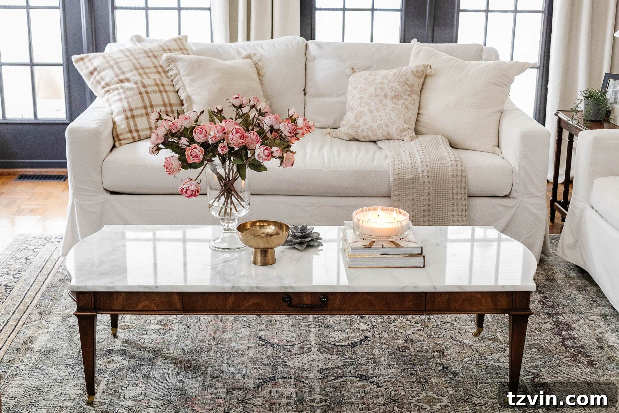
11. Hanging Picture Frames Too High
It’s a common rookie mistake, and one I certainly made early on: hanging wall decor and picture frames at the level of door frames or even higher. I’d strive for perfect horizontal alignment, only to realize, after flipping through interior design magazines, that my artwork was literally “hitting the ceiling.” This error disconnects the art from the furniture below it and creates an awkward visual gap, making the room feel unbalanced and less grounded.
The secret to perfectly placed wall art lies in hanging it at an appropriate eye-level. Here’s the professional standard:
- Eye-Level Rule: The center of a piece of art or a gallery wall should generally be hung at an average eye-level, which typically falls between 57 and 60 inches from the floor. This measurement applies to the *center* of the artwork, not its top edge. (And yes, we mean average human eye-level, not Shaquille O’Neal eye-level!).
- Relating to Furniture: When hanging art above a sofa, console table, or headboard, ensure there’s a harmonious relationship. The bottom edge of the artwork should be approximately 6-12 inches above the top of the furniture. This creates a cohesive grouping without leaving too much empty space or making the art feel disconnected.
- Groupings and Gallery Walls: For multiple pieces in a gallery wall, treat the entire arrangement as one large unit and apply the 57-60 inch rule to the center of the entire grouping. Plan your layout on the floor first before committing to nail holes.
Properly hung art draws the eye in, contributes to a balanced aesthetic, and makes your room feel more polished and professionally designed. It’s a simple adjustment that yields significant visual impact.
Related: Mistakes Most People Make When Hanging Picture Frames
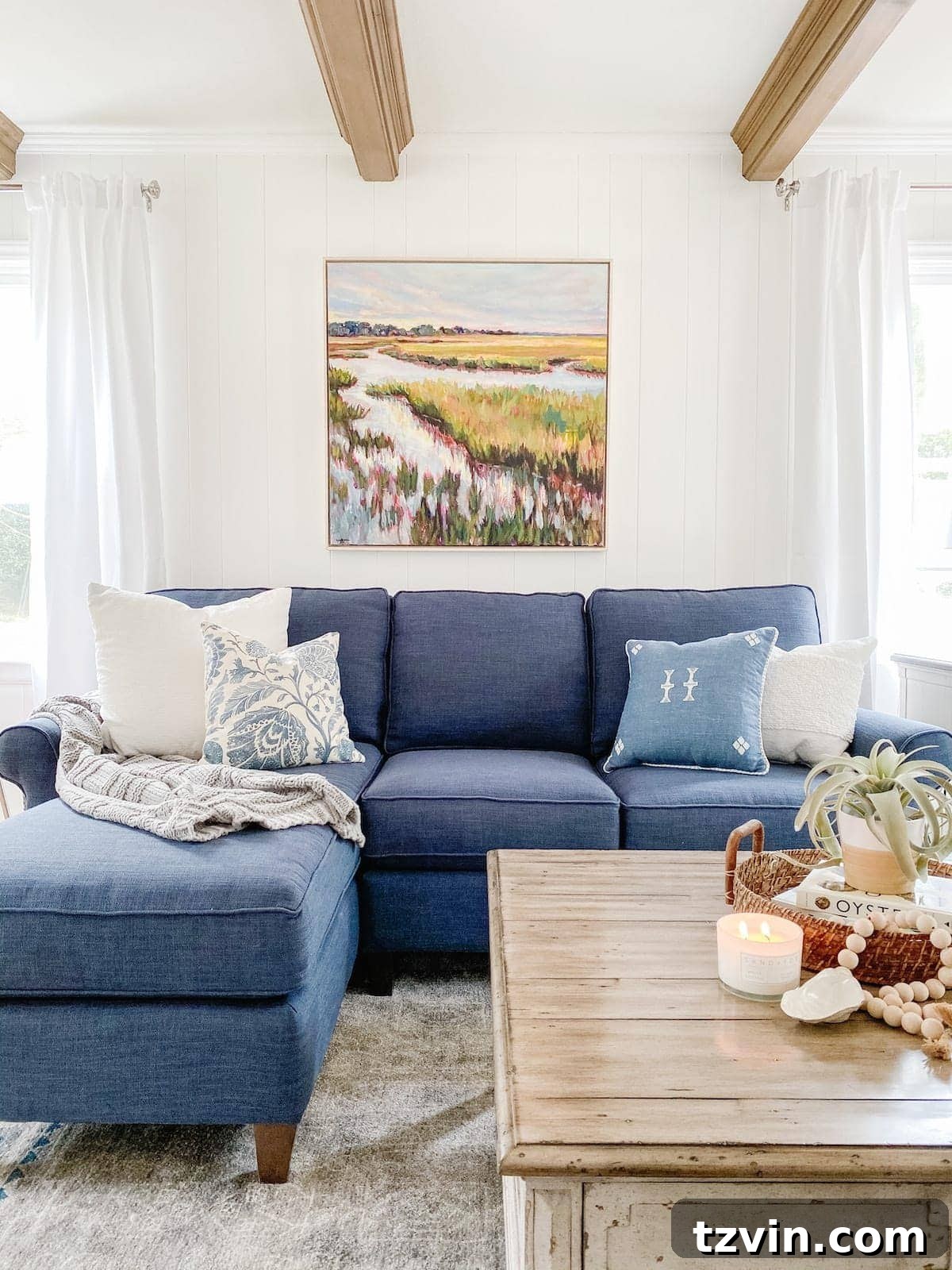
12. Not Using Any Color or Contrast
My initial foray into decorating our previous home was characterized by a monotonous palette of beige, brown, gray, and greige. While neutrals certainly have their place, relying exclusively on them resulted in a “snooze-fest” – a room that felt utterly bland and devoid of personality. A lack of color and contrast makes a space feel flat and uninspired, failing to engage the eye or evoke any particular mood.
Even if you prefer a predominantly neutral backdrop, incorporating thoughtful pops of color and strategic contrast is essential for bringing a room to life. Here’s how to do it effectively:
- Neutral Base, Colorful Accents: Neutral walls provide a versatile foundation, allowing you to experiment with color in less permanent elements. Use throw pillows, blankets, artwork, rugs, and decorative accessories to inject vibrant hues. This approach is perfect if you’re color-timid, as accents are easy to swap out seasonally or when your taste evolves.
- Embrace Nature’s Palette: For those hesitant to go bold, colors found in nature – blues and greens – are excellent choices. They are inherently calming, versatile, and less visually jarring than some bolder shades. Think serene sages, deep navies, or fresh mints.
- Contrast is Key: Contrast doesn’t always mean bright colors. It can also involve varying shades within a neutral palette (e.g., dark charcoal against crisp white), or mixing textures (e.g., smooth leather with chunky knit fabrics). Dark trim against light walls, or a dark rug on a light floor, creates depth and visual interest.
- Create Focal Points: Use color and contrast to draw attention to specific features or areas in a room, such as an accent wall, a colorful piece of furniture, or a vibrant piece of art.
Don’t be afraid to introduce color and contrast. Even small doses can have a profound impact, transforming a dull room into one that feels vibrant, sophisticated, and deeply personal. Explore some of my top recommendations for dark blue, light blue, dark green, and light green paint colors. You might also find inspiration in this calming paint color palette.
Related: Top Recommended Contrast Trim Paint Color Ideas
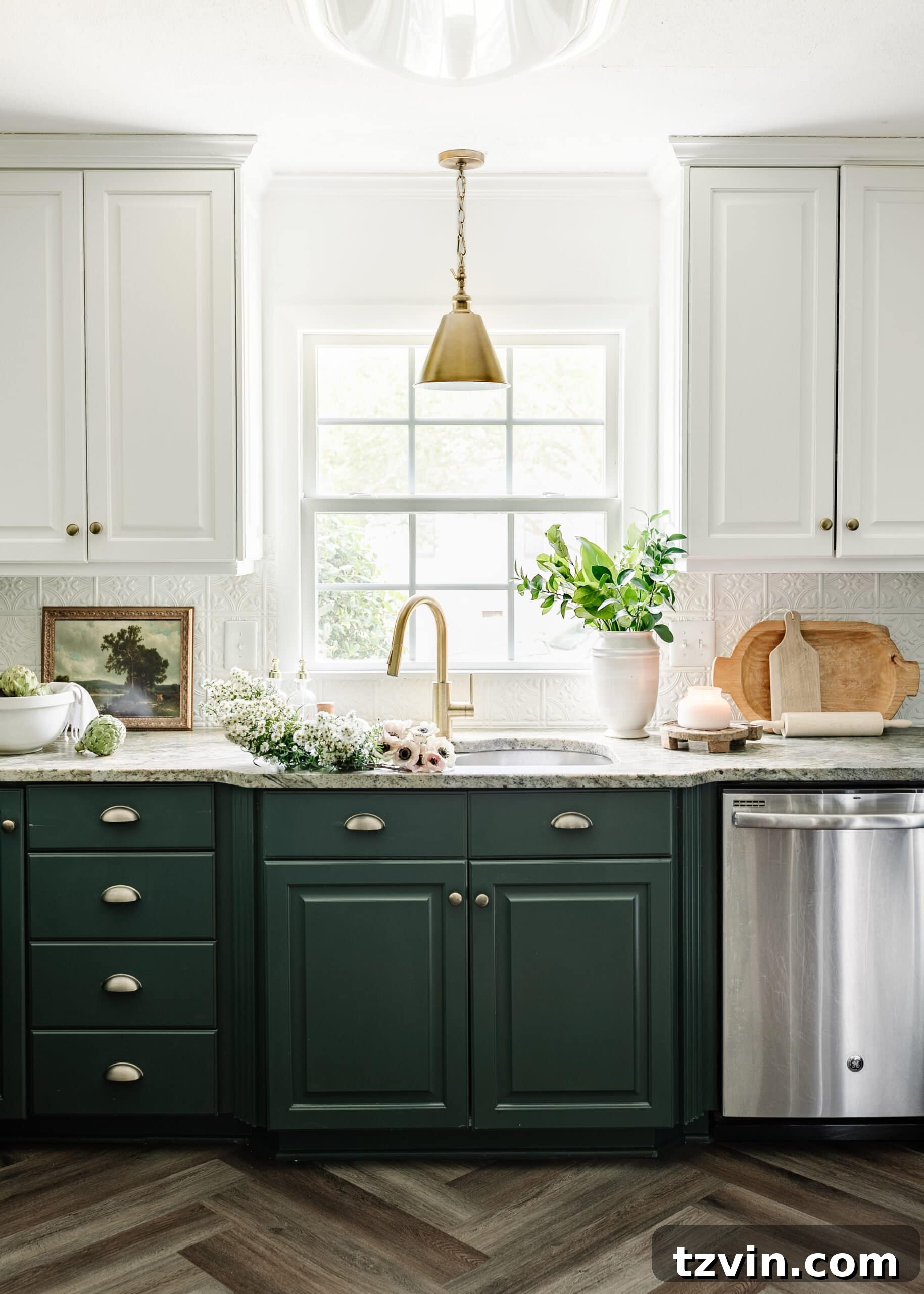
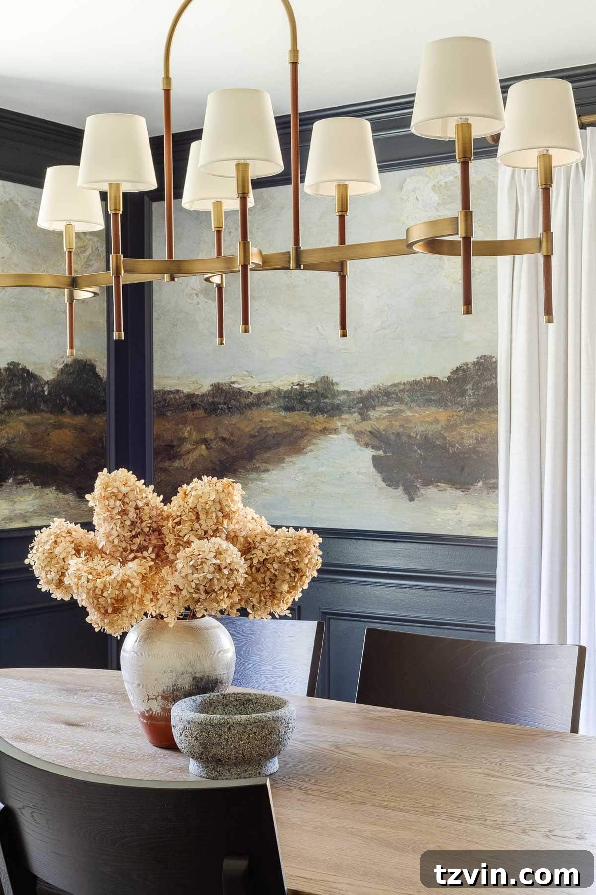
13. Hanging a Chandelier Too High
Chandeliers are stunning focal points that add elegance and ambient lighting to dining rooms, entryways, and even bedrooms. However, an improperly hung chandelier, particularly one placed too high, can significantly diminish its impact and functionality. A chandelier hung too high loses its ability to adequately illuminate the table or space below, making the room feel disconnected and the fixture itself appear out of place and undersized. It’s a common oversight that can easily be corrected with a simple rule.
The general guideline for hanging a chandelier over a dining table ensures it provides both optimal lighting and visual harmony:
- Standard Ceiling Height (8 feet): For rooms with an 8-foot ceiling, the bottom of the chandelier should typically hang between 30 to 34 inches above the surface of the dining table. This height prevents obstruction of views across the table while providing ample light.
- Higher Ceilings: If your ceilings are higher than 8 feet, you should adjust the chandelier’s hanging height accordingly. For every additional foot of ceiling height, add an extra 3 inches to the hanging distance from the table. For example, if you have a 10-foot ceiling, the chandelier should hang approximately 36-40 inches above the table.
- Entryways and Open Spaces: In entryways or other open areas where a chandelier is purely for ambient light and architectural statement, ensure the bottom of the fixture is at least 7 feet (84 inches) from the floor to allow for comfortable passage underneath.
Proper chandelier placement ensures that this elegant fixture serves its purpose beautifully, both as a source of light and a captivating centerpiece. Double-check your measurements to guarantee your chandelier is hung at the ideal height.
Related: Shaded Chandeliers for All Budgets: Splurge vs Save
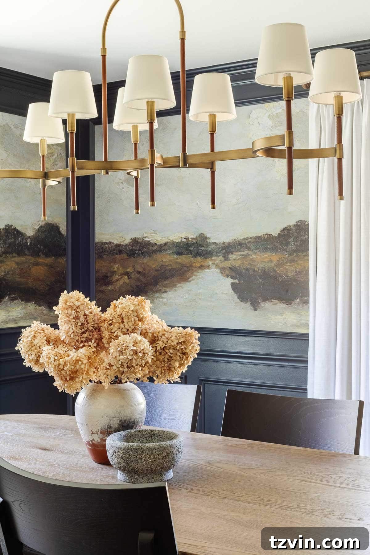
14. Hanging Curtains Too Low or Too Short
Curtains are far more than just window coverings; they are essential design elements that can dramatically impact the perceived size and elegance of a room. One of the most common and visually jarring decorating mistakes is hanging curtains too low or choosing panels that are too short. This creates an awkward, stubby look that chops up your walls and makes your windows, and consequently your entire room, appear smaller and less grand than they truly are. The goal is to maximize height and width, creating an illusion of larger windows and higher ceilings.
Master the art of curtain hanging with these transformative tips:
- Hang High: Mount your curtain rod as close to the ceiling as possible – ideally, just below the crown molding, or approximately 3-4 inches from the ceiling itself. This simple trick draws the eye upward, making your ceilings appear taller and your windows more expansive. This applies even to arched windows; aim to hang the rod above the arch to extend the visual height.
- Hang Wide: To make windows appear wider and allow maximum natural light when curtains are open, extend the curtain rod approximately 10-12 inches beyond the window frame on each side. This means the curtain panels will cover more wall space than window, creating a luxurious and full appearance.
- Perfect Length: Curtain panels should always reach the floor. There are three common “floor kiss” lengths, depending on your desired aesthetic:
- Kissing the Floor: The bottom of the curtain just barely brushes the floor. This is a clean, tailored look.
- Slight Puddle: The curtain fabric pools slightly (about 1-2 inches) on the floor. This creates a softer, more romantic or luxurious feel.
- Full Puddle: The curtain fabric pools significantly on the floor. While visually dramatic, it can be impractical for high-traffic areas as it collects dust and requires more maintenance.
- Avoid “High Water” Curtains: Never let your curtains stop several inches above the floor. This is the biggest offender and instantly cheapens the look of a room.
By implementing the “high and wide” rule and choosing the correct length, your curtains will enhance your room’s architecture, creating a sense of grandeur and sophistication.
Related: Best Luxury for Less Amazon Curtains & Window Shades
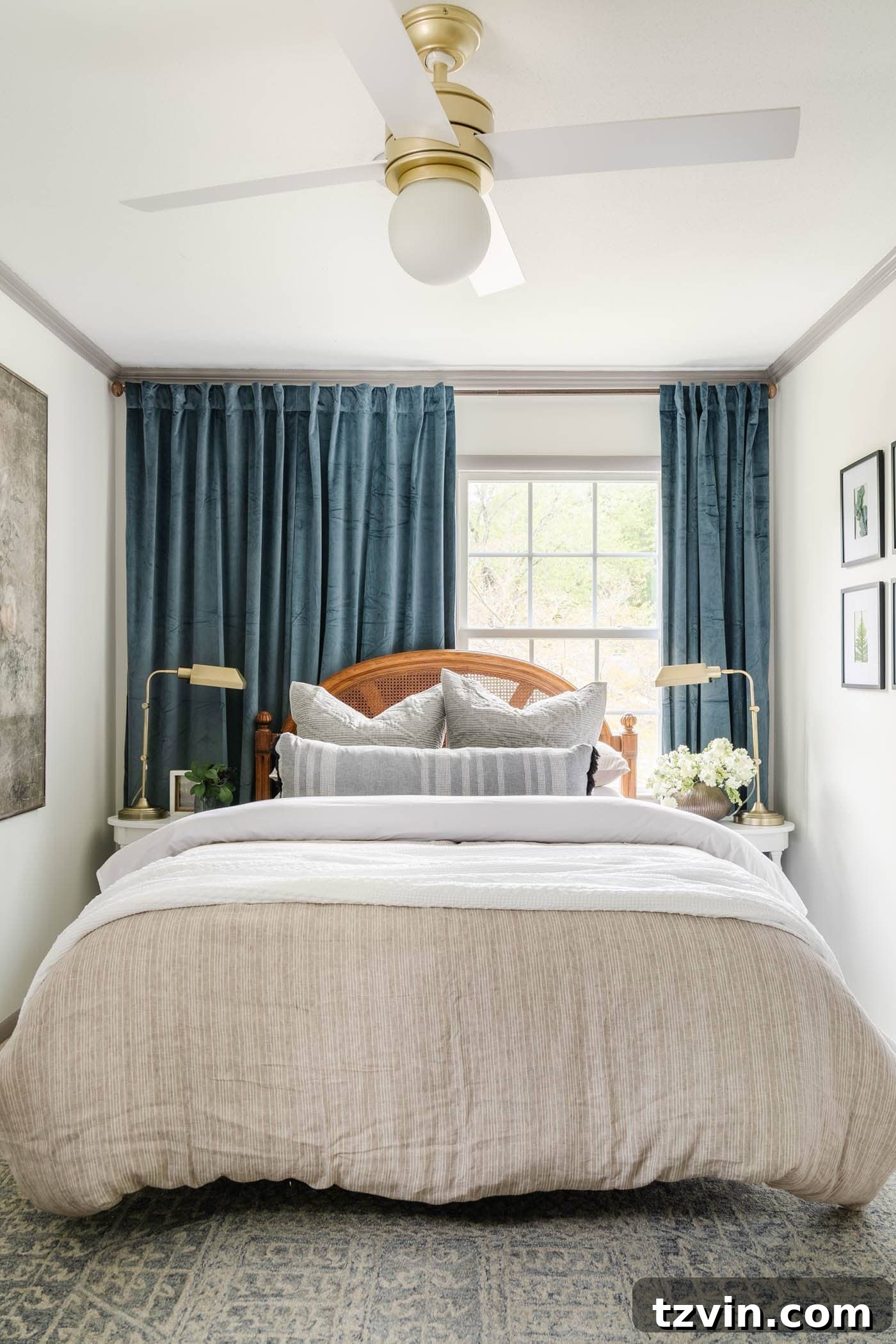
15. Relying Completely on Overhead Lighting
Many homes fall into the trap of relying solely on a single overhead light fixture, often a recessed light or a central ceiling fixture. While overhead lighting provides general illumination, it can create a harsh, unflattering glow that lacks warmth, depth, and ambiance. This “single source” lighting approach makes a room feel flat and uninviting, casting unflattering shadows and failing to highlight specific features or create cozy zones. Professional designers understand that successful lighting is all about layering.
To achieve a balanced, warm, and inviting atmosphere, integrate a variety of light sources:
- Ambient Lighting: This is your general, foundational light, often provided by overhead fixtures, but softened and diffused. Think dimmable ceiling lights, chandeliers (hung correctly, of course!), or large floor lamps.
- Task Lighting: Focused light designed for specific activities. This includes desk lamps for reading or working, under-cabinet lighting in kitchens for food prep, or bedside lamps for reading in bed.
- Accent Lighting: Used to highlight specific features, artwork, or architectural details. This could be picture lights, wall sconces in hallways or dining rooms, or uplights on plants.
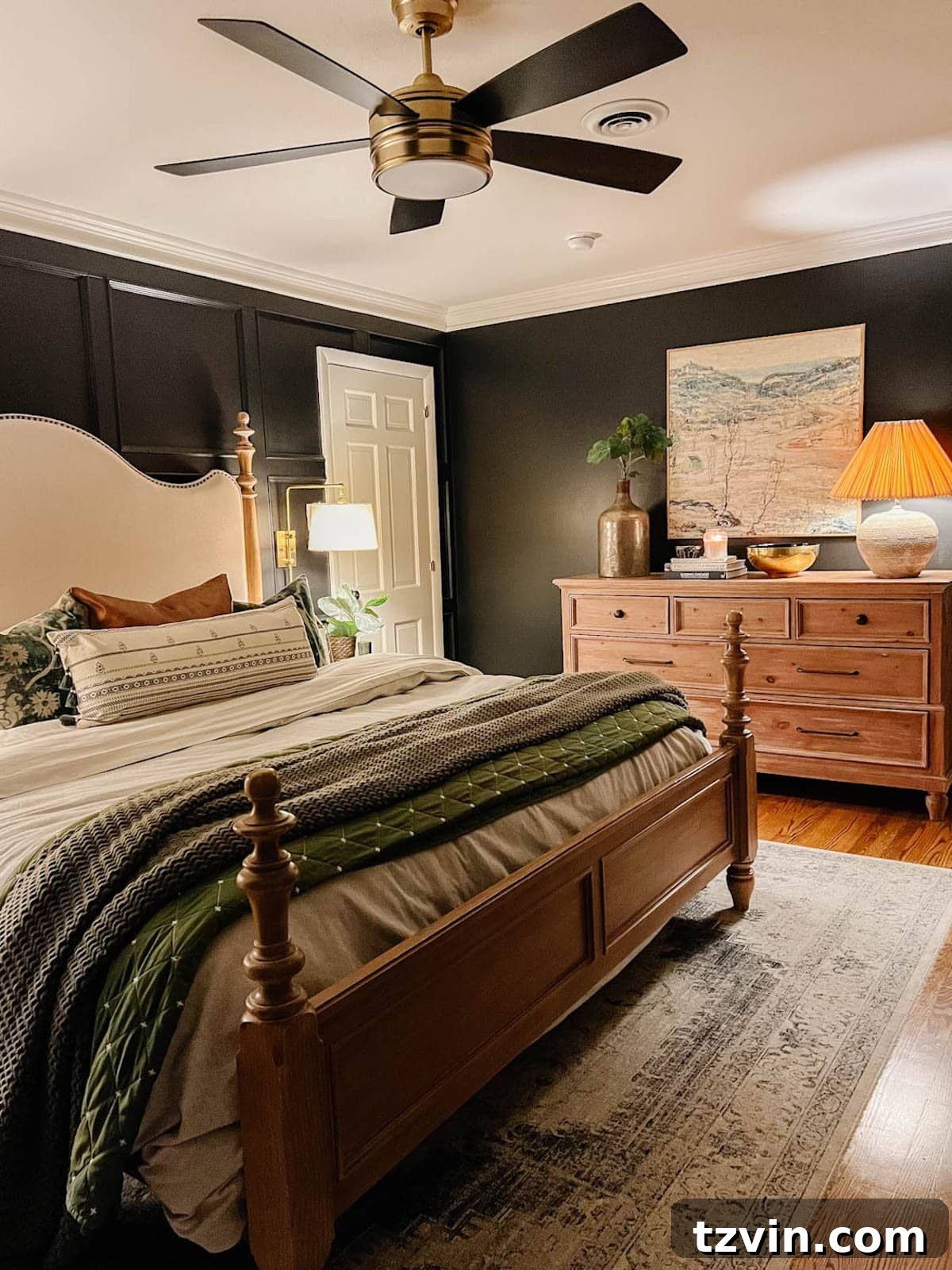
By layering these three types of lighting, you create a dynamic and flexible lighting scheme. Table lamps, floor lamps, and wall sconces placed strategically can eliminate shadows, add warmth, and define different areas within a room. For optimal warmth without being too yellow or too blue, I recommend using 3000K light bulbs throughout your home. This layered approach creates a sophisticated, evenly lit room that feels incredibly cozy and welcoming at any time of day.
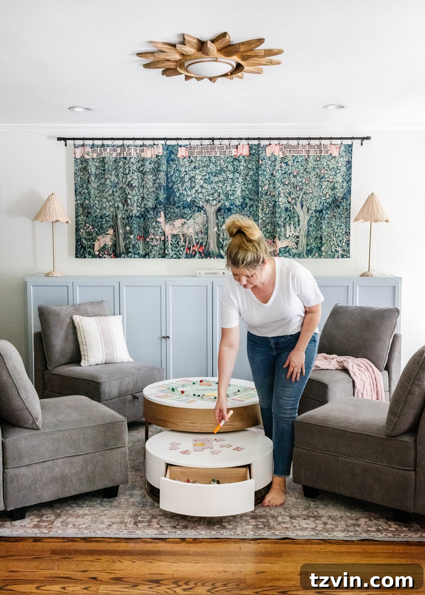
16. Not Decluttering Toys or Having a Toy Storage Solution
For families with children, toy clutter can quickly become an overwhelming force, spilling from playrooms into living areas and making the entire house feel disorganized. This common challenge isn’t just about mess; it affects the aesthetic and functionality of your home, and surprisingly, even impacts children’s engagement with their toys. A lack of proper toy storage and regular decluttering can lead to constant visual noise and frustration for both parents and kids.
Here are effective strategies to manage toy clutter and create a more harmonious home:
- Toy Rotation: This is a game-changer. Divide your children’s toys into 2-3 batches. Keep one batch accessible and store the others in a closet, attic, or dedicated storage bin. Rotate the toy sets every 2-3 months. This strategy reduces visible clutter, makes cleanup easier, and sparks renewed interest in “new” toys when they reappear, preventing boredom and overstimulation.
- Pre-Holiday Declutter: Establish a tradition of decluttering toys before major gift-giving occasions like Christmas and birthdays. This teaches children about giving back (donating gently used toys) and makes room for new items without increasing overall clutter.
- Smart Storage Furniture: Invest in furniture that doubles as storage. Ottomans with hidden compartments, bench seating with lift-top lids, or shelving units with baskets and bins are excellent choices. This keeps toys out of sight but easily accessible.
- Organized Bins and Baskets: Utilize clear bins or attractive baskets to categorize and contain smaller toys. Consider using toy labels, especially picture labels for non-readers, to make cleanup intuitive for children.
- Dedicated Play Zones: If possible, designate specific areas for play. Even a corner of a living room can be an effective play zone if it has contained storage.
Implementing these toy organization strategies will not only reclaim your living spaces but also foster a sense of order and calm in your home, benefiting the entire family. Check out these chic Amazon storage furniture pieces that effectively hide toys.
Related: Secret Toy Storage in the Playroom + the Chicest Amazon Storage Furniture
If only I had known all these insights when I first embarked on my decorating journey years ago! While I’ve made my share of missteps, the beauty of home design lies in the continuous learning process. Every mistake is a stepping stone to discovering what truly works for your space and reflects your unique style. Don’t be discouraged by past errors; instead, embrace them as part of your decorating adventure. Start somewhere, learn as you go, and always prioritize what makes your home feel authentic and comfortable.
Remember, the goal is to create a home that brings you joy and functions beautifully for your family. If you have any other decorating mistakes you’ve learned from, or clever tips to share, please leave them in the comments below! Your insights might just save someone else from a future design cringe.
More Home Decorating Tips
How to Decorate a Room from Start to Finish in 13 Steps
Mistakes Most People Make When Hanging Picture Frames
40 Ways to Improve Your Home for Under $100