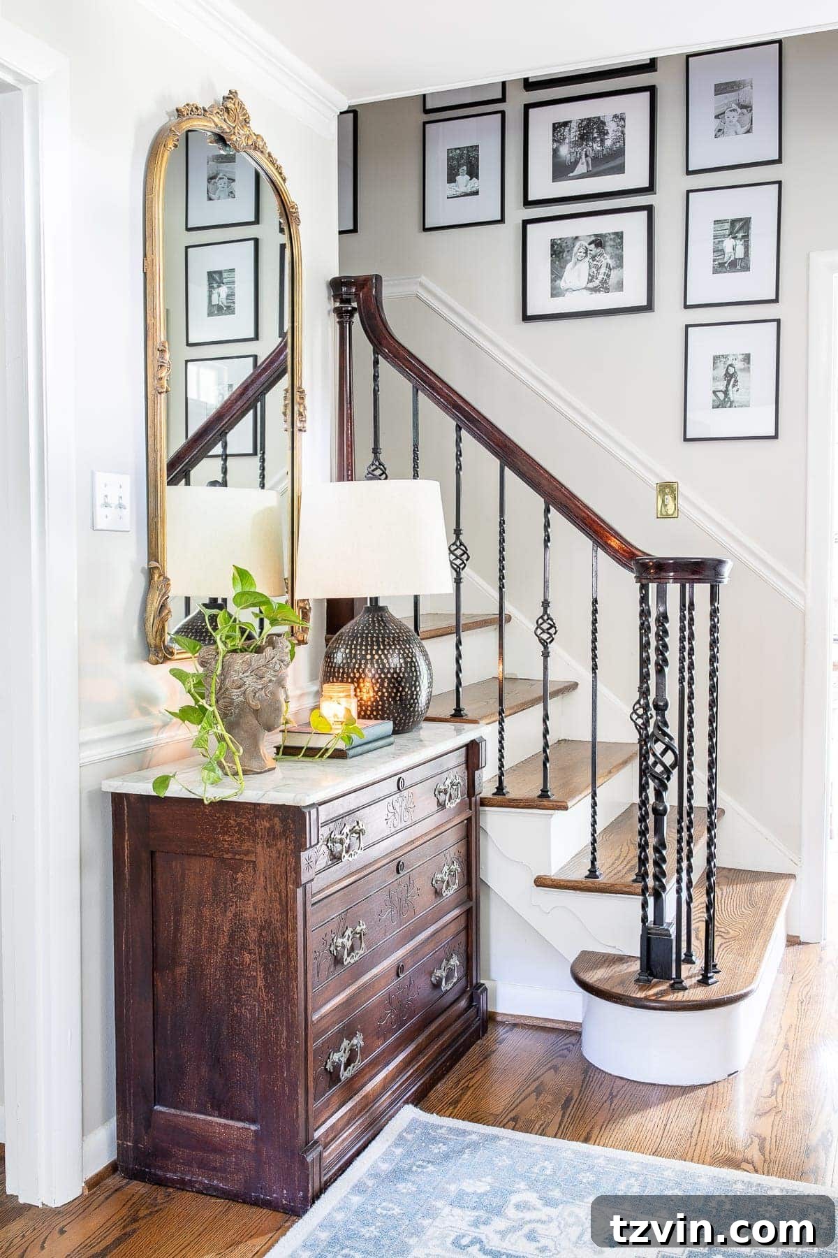
Discover the ultimate guide to the best off-white paint colors, handpicked by designers to create bright, sophisticated, and inviting homes. Achieve that warm, inviting glow you’ve always dreamed of with these expert-recommended shades.
Choosing the perfect paint color can be one of the most impactful decisions in home design, and perhaps no hue presents more subtle complexities than off-white. This seemingly simple color family is renowned for its incredible versatility, yet its numerous nuances can be surprisingly tricky to navigate. The difference between a beautifully warm, creamy undertone and an unexpectedly glaring yellow or stark blue can entirely transform the mood and appearance of a room.
Many homeowners find themselves captivated by the elegance of off-white but overwhelmed by the sheer number of options. Our inboxes are consistently filled with questions about the off-white paint colors we feature in our own home, proving just how essential it is to get this decision right. If you’ve ever struggled in the paint color department, particularly with the vast spectrum of whites, then this comprehensive guide is tailored for you. We’re diving deep into the world of off-whites to demystify the process and help you select a shade that perfectly complements your living space.
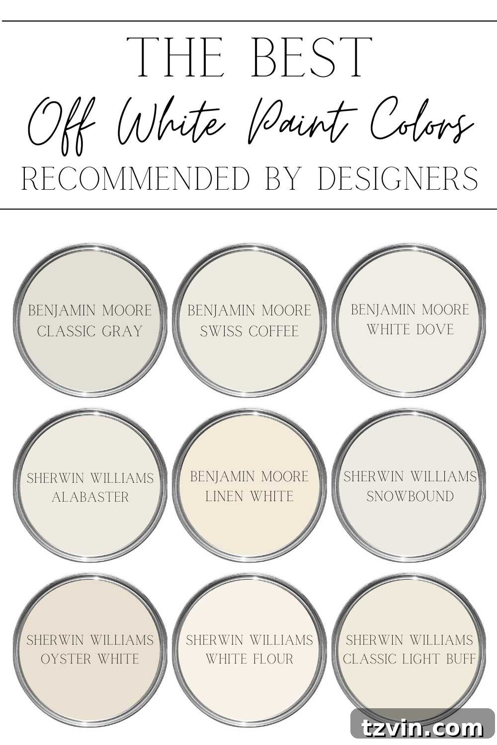
Contrary to common perception, not all white shades are created equal. The right white hue can serve as the foundational element that elevates your interior design, while the wrong choice can leave a room feeling cold, dull, or simply “off.” It’s about finding that delicate balance between warmth and brightness, ensuring your home feels both airy and welcoming.
Why Choose Off-White Paint Colors for Your Home?
Off-white paint colors are a design staple for a reason. They offer a timeless elegance and incredible versatility that true whites often lack. Here’s why off-white might be the perfect choice for your next home refresh:
- Timeless Appeal: Off-whites never go out of style, providing a sophisticated backdrop that withstands changing trends.
- Enhanced Brightness: They reflect light beautifully, making spaces feel larger and more open without the starkness of a pure white.
- Warm and Inviting Atmosphere: Unlike cool whites, off-whites often carry subtle undertones that inject warmth, making a room feel cozy and welcoming.
- Versatile Pairing: These shades serve as an excellent canvas, allowing furniture, artwork, and decor to truly pop. They complement a wide range of color palettes and design styles, from modern minimalist to rustic farmhouse.
- Softens Architectural Features: Off-whites can soften sharp lines and blend architectural details seamlessly, creating a cohesive and harmonious look.
Understanding Off-White Undertones
The secret to selecting the perfect off-white lies in understanding its undertones. These subtle hints of color within the white can dramatically influence how the paint appears in your home. Common off-white undertones include:
- Yellow Undertones: Create a creamy, warm, and inviting feel. They can make a room feel sunnier and more traditional.
- Pink/Red Undertones: Offer a subtle warmth that can appear sophisticated and slightly rosy, often found in more complex neutral shades.
- Gray Undertones: Lend a cooler, more modern, and sophisticated edge. They can make an off-white feel grounded and less stark.
- Blue/Green Undertones: Introduce a crisp, fresh, and sometimes cooler feel, often seen in off-whites that lean towards “greige” or a very pale sage.
Identifying these undertones is crucial for ensuring the paint harmonizes with your existing decor and the natural light of your space.
What to Consider Before Choosing the Perfect Off-White Paint
Before committing to a gallon (or five) of your chosen off-white, a thoughtful evaluation of your space is essential. These crucial factors will significantly influence how any paint color, especially off-whites, will look in your home:
- Natural Light Exposure: This is arguably the most critical factor. Rooms with abundant natural light from a south-facing window can handle cooler off-whites, which might appear too stark in a north-facing room. North-facing rooms, which receive cooler, indirect light, often benefit from off-whites with warmer (yellow, pink, or beige) undertones to prevent them from looking gray or drab. East-facing rooms get warm morning light, while west-facing rooms are bathed in warm afternoon light, both of which can enhance warmer undertones.
- Artificial Lighting: Don’t overlook your light bulbs! Incandescent and warm LED bulbs (around 2700K-3000K) can bring out yellow and red undertones, making off-whites appear creamier. Cooler LED or fluorescent bulbs (4000K-5000K+) can accentuate blue or gray undertones, making warm whites appear more neutral and neutral whites appear cooler. Test your samples under both natural light and the specific artificial lighting you use most often.
- Existing Interior Elements: Take stock of your home’s fixed elements. Consider your flooring, cabinetry, existing wood stains (like trim, doors, or furniture), countertops, and any dominant pieces of artwork or upholstery. Stick large paint samples directly against these elements to see how the undertones interact. A warm off-white might clash with cool-toned marble, for instance, or beautifully complement rustic wood beams.
- Paint Samples are Non-Negotiable: Always purchase actual paint samples from the manufacturer, not color-matched versions from different brands. Color matching can be inconsistent, and the subtle differences are especially noticeable with off-whites. Paint large swatches (at least 2×2 feet) on several walls in the room you plan to paint. Observe these swatches at different times of day—morning, noon, and evening—and under various weather conditions (sunny, cloudy).
- Consider Light Reflectance Value (LRV): The LRV measures how much light a color reflects. A higher LRV (closer to 100) means more light is reflected, making a room feel brighter. Off-whites typically have high LRVs, but slight variations can make a big difference in how luminous a room feels. Understanding a paint’s LRV can help you choose an off-white that achieves your desired level of brightness.
- Use a Primer: Especially when painting over an existing dark or vibrant wall color, applying a good quality interior primer is crucial. Primer creates a neutral base, ensuring that the true hue of your new off-white paint color shines through without being influenced by the previous color.
- Exterior Considerations: If you’re selecting an off-white for your home’s exterior, the testing process is even more vital. View samples outdoors throughout the day, as the intensity of sunlight and shadows will constantly change its appearance. Consider how it looks at dawn, midday, and dusk, and under both sunny and cloudy conditions.
By carefully considering these factors, you’ll prevent any unexpected surprises and ensure your chosen off-white paint color perfectly enhances your home’s ambiance. This blog post serves as an excellent starting point, offering a curated list of designer-approved off-white paint colors that have consistently delivered stunning results.

Top Designer-Recommended Off-White Paint Colors
Here are some of the most beloved and versatile off-white paint colors, frequently chosen by interior designers for their ability to create stunning, livable spaces:
1. Benjamin Moore Classic Gray OC-23
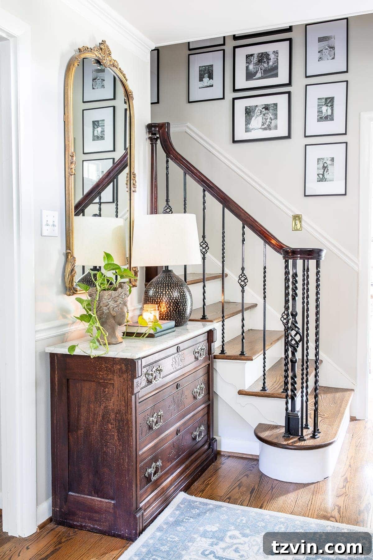
Benjamin Moore Classic Gray is a true chameleon neutral, earning its spot as a designer favorite. It graced our foyer and stairway, proving to be incredibly adaptable. This shade feels wonderfully light and airy, yet it possesses an inviting warmth. Its beauty lies in its ability to lean slightly gray or slightly beige depending on the natural and artificial lighting throughout the day, making it an ideal choice for spaces where light conditions vary. It offers a sophisticated backdrop that complements both modern and traditional decor effortlessly. The Benjamin Moore Off White Color Collection is an excellent resource for exploring similar versatile shades.
2. Benjamin Moore Swiss Coffee OC-45
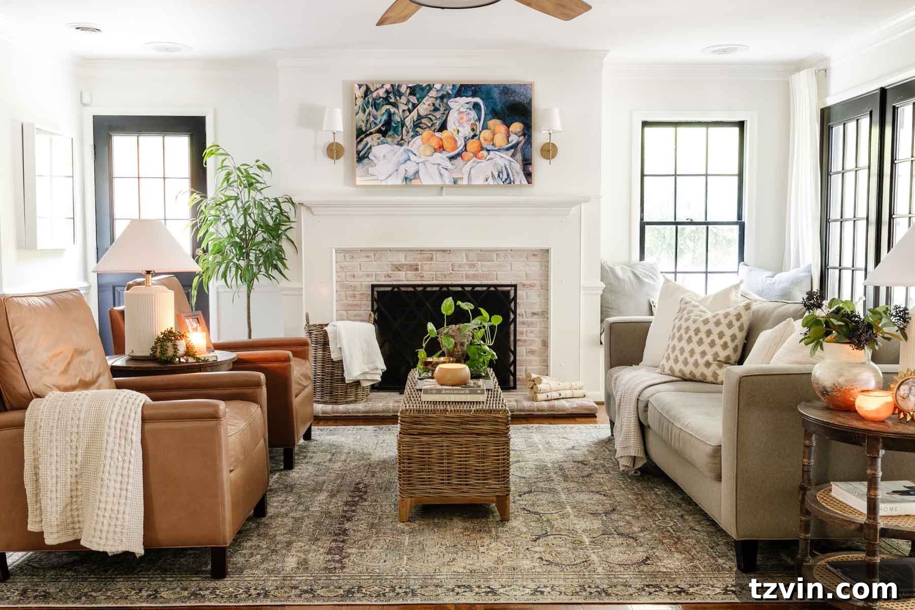
A perennial favorite for a clean, creamy white, Benjamin Moore Swiss Coffee offers just enough yellow undertone to avoid feeling stark. This subtle warmth creates a soft, rich hue that makes a room feel instantly more welcoming. When paired with high-contrast elements like black or dark gray—such as Benjamin Moore Wrought Iron—it exudes an air of sophisticated calm. It’s an excellent choice for larger, brightly lit living spaces, making it our preferred off-white for our expansive living room, where it maximizes natural light while maintaining a cozy ambiance.
3. Benjamin Moore White Dove OC-17
Benjamin Moore White Dove is a beloved off-white that strikes a beautiful balance. It’s slightly lighter than Swiss Coffee, yet still possesses enough creamy warmth to feel comforting and inviting, rather than cold. Its soft, warm undertones are particularly adept at brightening up other beige tones within a room, making it a fantastic choice for trim, moldings, and even cabinetry. We skillfully used White Dove in our bathroom refresh to downplay existing beige countertops we weren’t fond of, and the result was perfectly harmonious, creating a fresh and updated look.
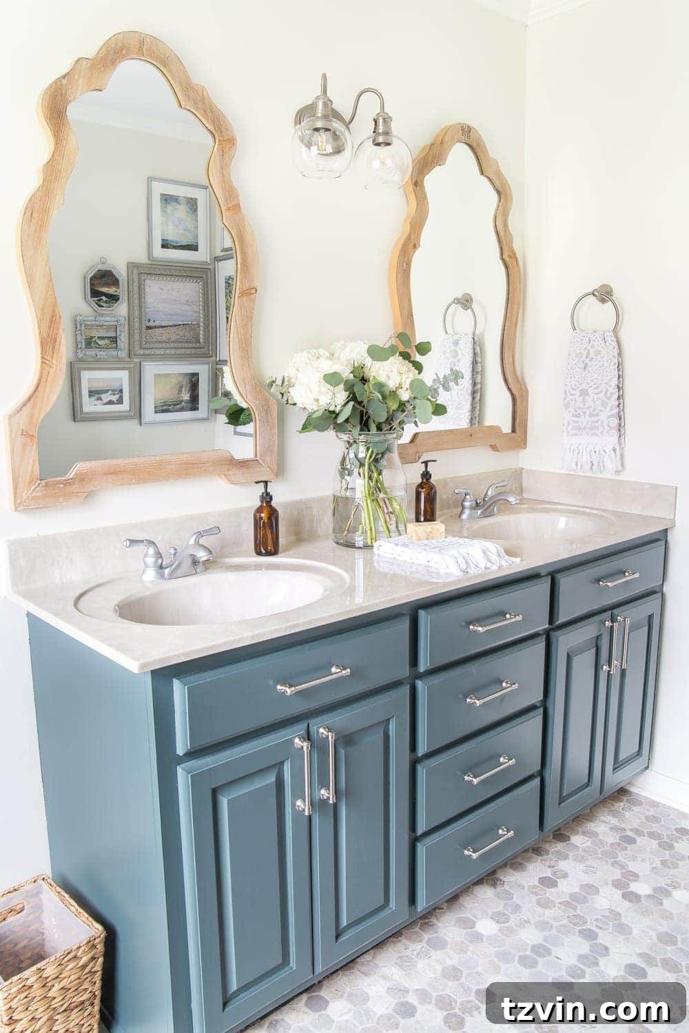
4. Sherwin Williams Alabaster SW 7008
Sherwin Williams Alabaster is a supremely popular soft, creamy white that walks the line between a true white and a distinctly warm off-white. Its gentle warmth is just enough to counteract the potential starkness often found in brighter whites, offering a welcoming glow instead. If you find yourself torn between the crispness of a true white and the coziness of an off-white, Alabaster presents a perfect, balanced solution. We absolutely adored its effect in the primary bedroom of our previous home, where it contributed to a serene and restful atmosphere.
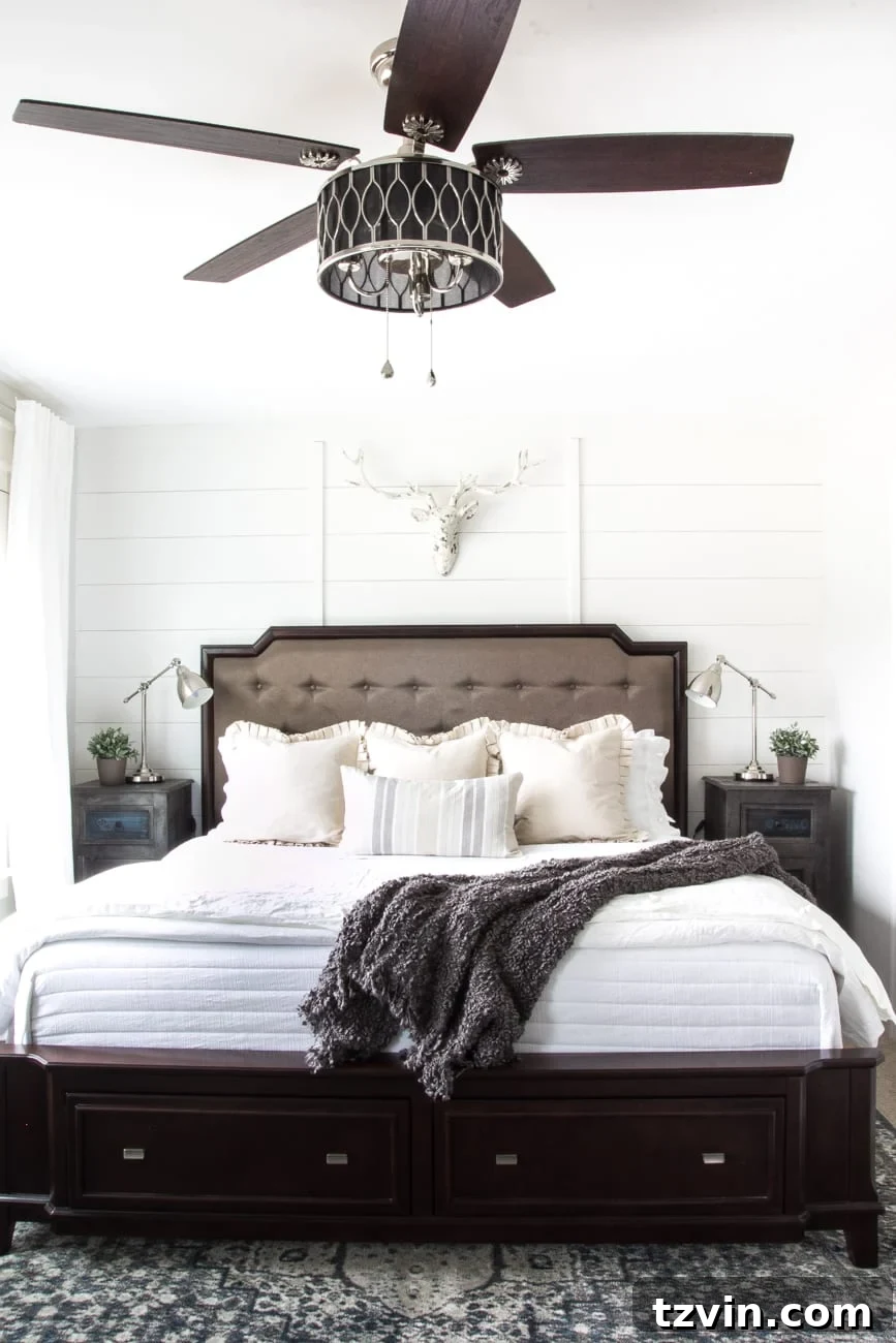
5. Benjamin Moore Linen White OC-146
Benjamin Moore Linen White offers a deeper, more saturated off-white experience. This shade leans distinctly more yellow than many other off-whites on this list, imbuing spaces with a rich, buttery warmth. It performs exceptionally well in north-facing rooms, which often suffer from cool, muted light that can wash out other colors. In these challenging lighting conditions, Linen White effectively counteracts the coolness, preventing the room from feeling flat and instead creating a vibrant, sun-kissed atmosphere. Its pronounced warmth makes it a charming choice for traditional and cozy interiors.
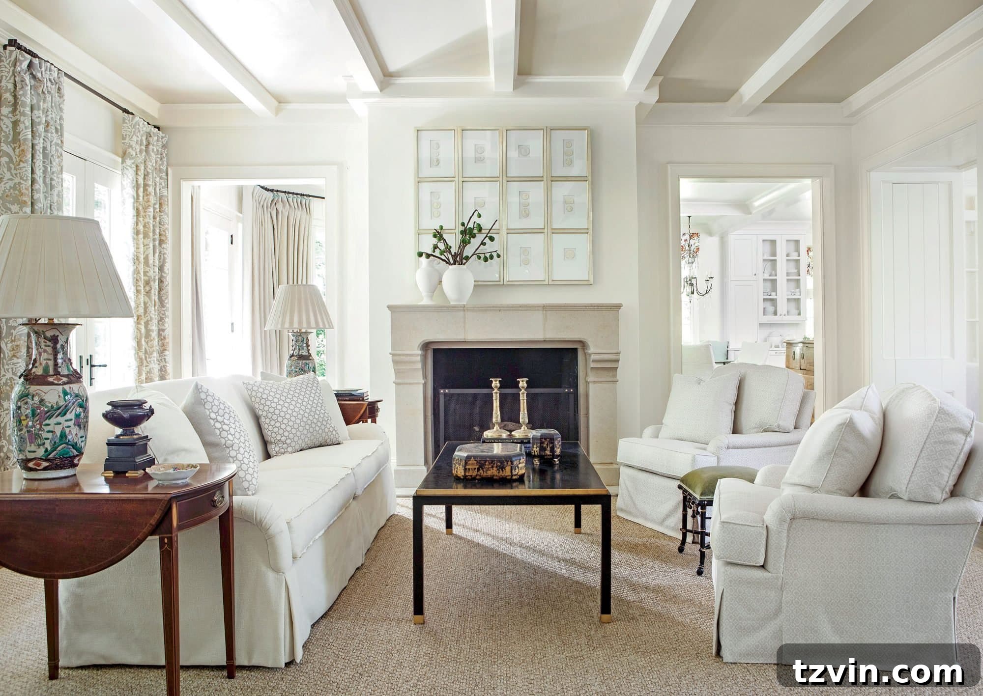
6. Sherwin Williams Snowbound SW 7004
For those seeking an off-white with a touch of modern coolness, Sherwin Williams Snowbound is an excellent contender. This color features a subtle gray undertone, making it lean cooler than its warmer counterpart, Alabaster. Despite its cooler nature, Snowbound remains soft and inviting, never feeling stark. It’s a superb choice for east or west-facing rooms, where it can beautifully interact with varying light temperatures throughout the day. Its crispness also makes it a popular selection for trim, interior cabinets, and even home exteriors, offering a clean, sophisticated look.
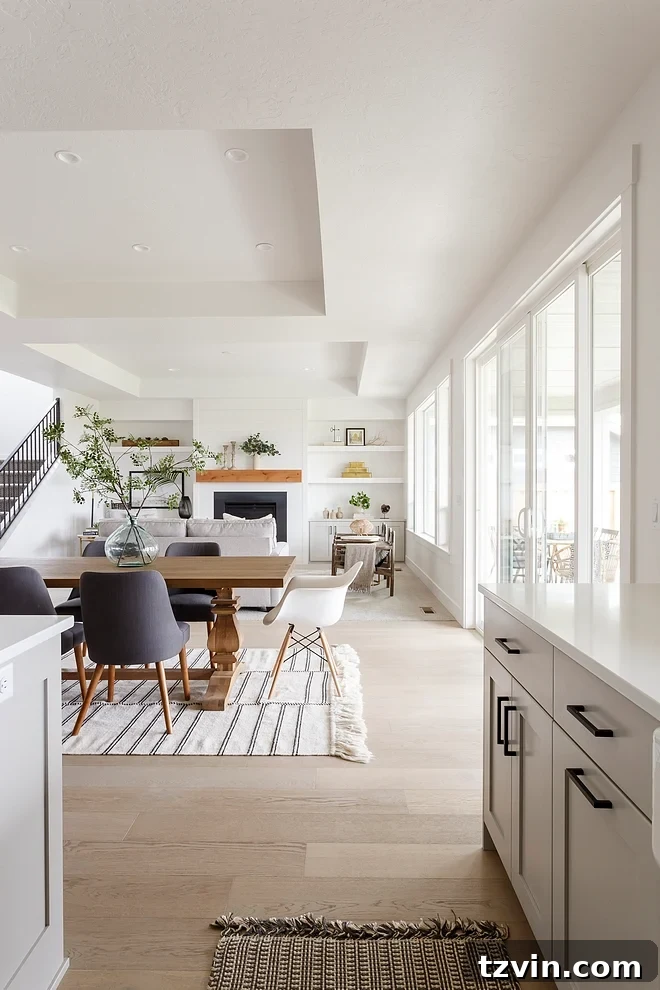
7. Sherwin Williams Oyster White SW 7637
Sherwin Williams Oyster White is a captivating shade that often defies easy categorization, blurring the lines between off-white and greige. This color typically leans towards cool tones with its subtle gray and green undertones, offering a refined and earthy feel. However, it possesses a chameleon-like quality, often appearing surprisingly warm in darker rooms or at certain times of day. This adaptability makes it a compelling choice for spaces that experience varied lighting conditions, where it can shift from a cool, calming neutral to a soft, inviting backdrop, depending on the environment.
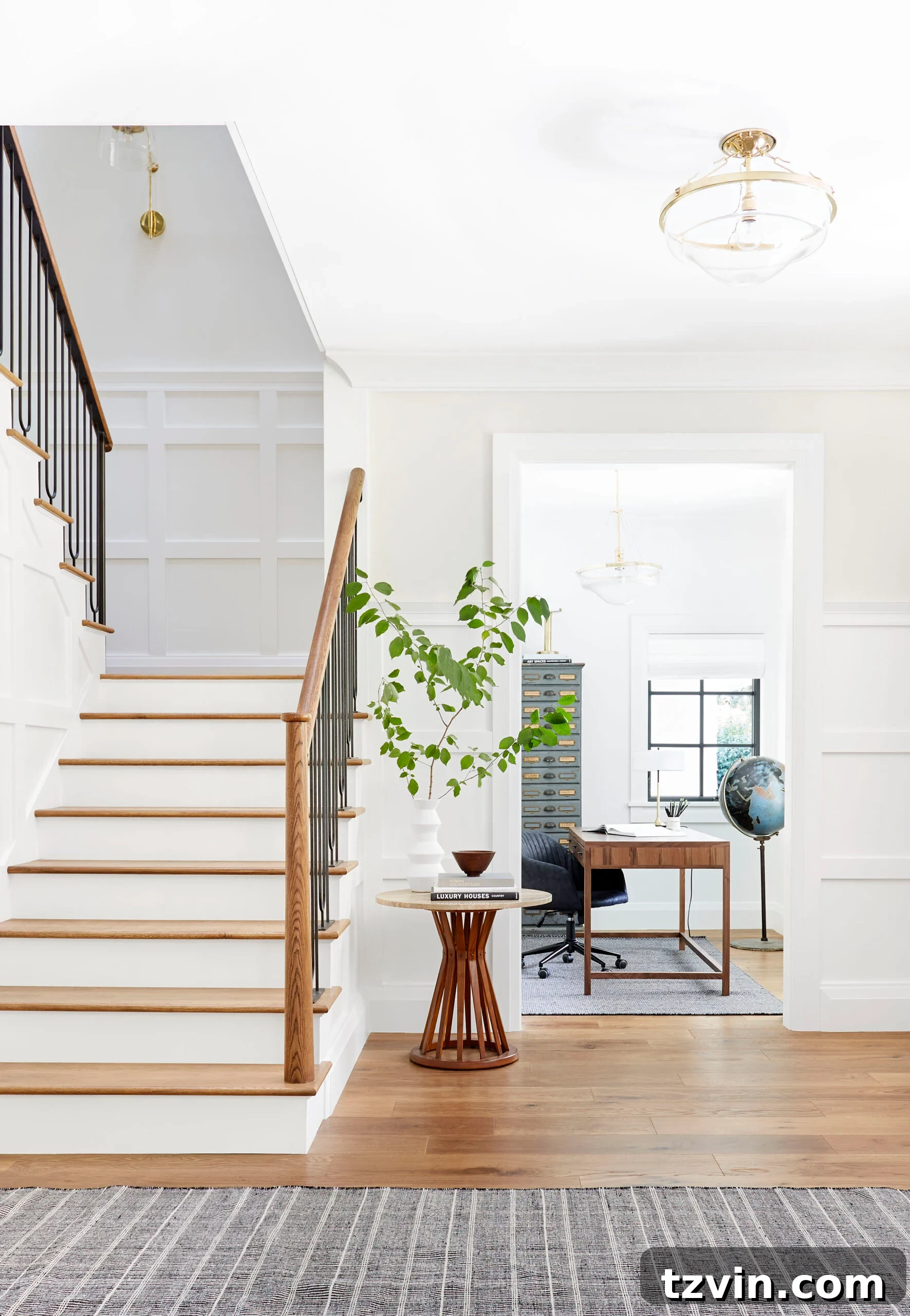
8. Sherwin Williams White Flour SW 7102
For those who desire a touch more obvious warmth, Sherwin Williams White Flour leans notably closer to the yellow family of colors. This delightful off-white can evoke a distinct feeling of comfort and coziness, reminiscent of freshly baked goods. Its warm, inviting character makes it perfect for creating cheerful and nurturing environments. However, due to its strong yellow undertone, caution is advised when pairing it with cooler blue or gray colors, as this contrast can make the yellow appear even more pronounced. Use it thoughtfully, keeping the overall color scheme of the room in mind, to achieve a harmonious and inviting space.
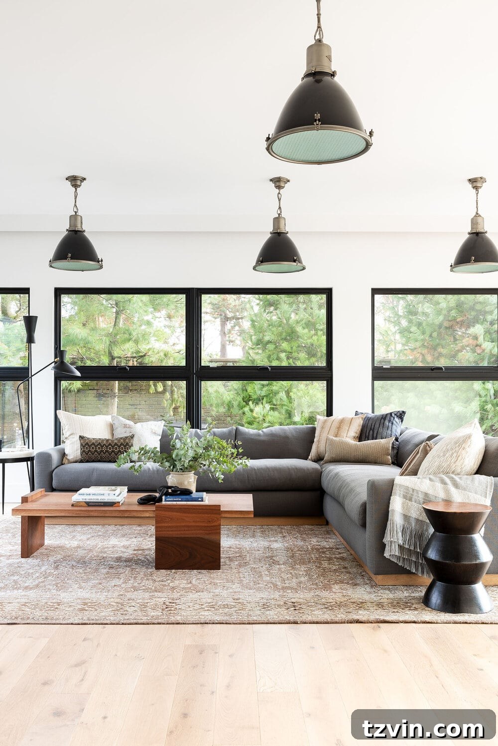
9. Sherwin Williams Classic Light Buff SW 0050
Sherwin Williams Classic Light Buff is a nuanced paint color that delivers clean sophistication without the starkness often associated with true whites. It presents as a creamy, casually elegant off-white, imbued with a subtle, sun-kissed quality. This shade feels exceptionally inviting and natural, making it an excellent choice for creating interiors that are both refined and comfortable. Its gentle warmth ensures a soothing atmosphere, while its depth provides a beautiful alternative for those who desire more presence than a typical off-white, without veering into a full-fledged beige.

10. (Bonus) Romabio Feather
As a personal favorite, we can’t help but give a shameless plug to Romabio Feather. This exceptional paint color is a light, airy off-white that masterfully teeters the line between warm and cool. Its balanced undertones allow it to adapt beautifully to various lighting conditions and design schemes, offering a crisp yet inviting presence. Romabio Feather delivers a soft, luminous quality that brightens spaces without feeling cold, making it a highly versatile and reliable choice for achieving that perfectly balanced off-white look in any room.
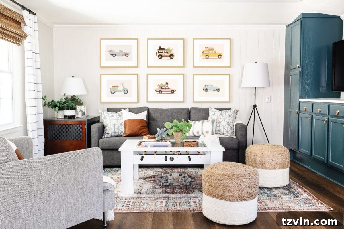
Best Cool White Paint Colors for a Crisp, Modern Look
While warm off-whites create a cozy ambiance, sometimes a truly crisp and clean aesthetic calls for a cool white. These shades often have subtle gray, blue, or even green undertones that deliver a more contemporary and expansive feel, perfect for minimalist designs or spaces desiring a fresh, invigorating atmosphere. If you’re looking for suggestions for true white walls that lean cooler, consider these highly-rated options:
- Benjamin Moore Chantilly Lace OC-65: A true, bright white with minimal undertones, offering a clean and sharp look.
- Benjamin Moore Simply White OC-117: A slightly softer pure white, with just a hint of warmth to prevent it from feeling stark, yet still very crisp.
- Sherwin Williams Pure White SW 7005: A versatile and bright white, often used for trim and ceilings, that provides a clean foundation without being overly cold.
- Benjamin Moore Cloud White OC-130: A creamy white that bridges the gap between warm and cool, with a subtle off-white character that’s not quite a true cool white, but softer than Chantilly Lace.
Designer Tip: Regardless of whether you choose a warm off-white or a cool white, the golden rule remains: always view generous samples of your paint colors in natural light, under artificial light, and at various times throughout the day. This comprehensive approach is the only reliable way to make your final decision and ensure the color performs as expected in your unique space.
For more detailed guidance, see our comprehensive guide on How to Choose Paint Colors for Your Home Interior Like a Pro.
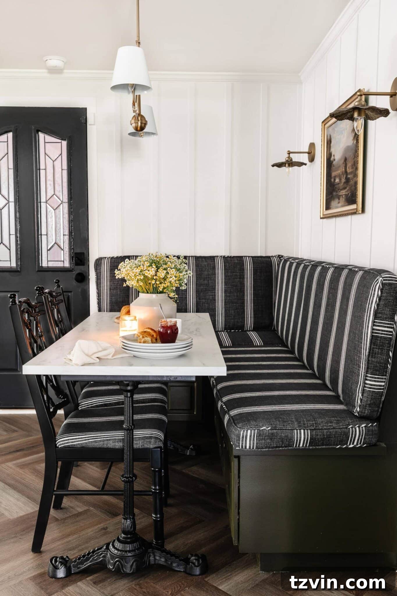
Off-white paint colors, while undeniably beautiful, can be notoriously tricky to get just right. We hope this curated list and detailed advice empower you to confidently select an off-white that brings warmth, sophistication, and a truly inviting feel to your home. Experiment with samples, trust your instincts, and enjoy the transformative power of the perfect off-white!
Do you have any other off-white paint colors you absolutely love and recommend? Share your favorites with us! We’re always eager to discover new shades that deliver stunning results. And if there are any other color families you’d like us to round up to help you make the best paint decisions, let us know – we’re on a roll over here!
More Top Rated Paint Colors
The Most Recommended Navy Blue Paint
The Most Recommended Blush Pink Paint
12 Best Sage Green Paint Colors for a Relaxing Room
The Best Haint Blue Paint Color for Porch Ceilings
How to Choose the Perfect Paint Color for Your Home Every Time
See more of the best paint color recommendations by interior designers here.
Frequently Asked Questions About Off-White Paint
Absolutely! Off-white paint colors are not just “in style” but are a timeless classic that consistently remains a favorite among designers and homeowners alike. As of 2024, warm neutral tones, including various shades of off-white, are highly trending, celebrating comfort, elegance, and versatility. While specific undertones or creaminess levels may fluctuate in popularity, the fundamental appeal of off-white for creating bright, sophisticated, and inviting spaces ensures it never truly goes out of fashion. It’s a foundational choice that provides a serene backdrop for any decor style.
The choice of paint sheen largely depends on the surface, the desired aesthetic, and the level of durability needed. Here’s a general guideline for off-white paints:
- Flat/Matte: Best for ceilings and low-traffic areas. It hides imperfections well and offers a soft, velvety look, absorbing light rather than reflecting it. However, it’s less durable and harder to clean.
- Eggshell: The most common choice for interior walls. It offers a subtle, soft sheen (like an eggshell) and is more durable and washable than flat. It provides a good balance of hiding imperfections and ease of maintenance.
- Satin: A popular choice for walls in high-traffic areas, trim, doors, and cabinets. Satin has a noticeable sheen, is highly durable, and very easy to clean. It adds a touch of elegance and reflects more light than eggshell.
- Semi-Gloss: Ideal for trim, doors, and cabinets where high durability and easy cleaning are paramount. Its higher sheen significantly reflects light, highlighting architectural details.
- Gloss: Offers the highest level of shine and durability, often used for furniture, doors, and surfaces that require frequent cleaning. It’s less common for entire walls due to its highly reflective nature and tendency to show imperfections.
Ultimately, while these are general guidelines, paint sheen rules are often made to be broken based on your personal style and the specific look you aim to achieve.
Testing off-white paint samples correctly is critical due to their subtle undertones. Here’s how to do it effectively:
- Buy True Samples: Purchase actual manufacturer samples, not color-matched versions.
- Paint Large Swatches: Apply generous swatches (at least 2×2 feet) on multiple walls in the room you’re painting. This gives you a better sense of how the color behaves over a larger area.
- Observe in Different Lights: View the samples at various times of day (morning, midday, evening) and under different lighting conditions (natural sunlight, cloudy, artificial lighting). Pay attention to how the undertones change.
- Compare with Fixed Elements: Place the samples next to your existing flooring, trim, cabinetry, and furniture to ensure harmony.
- Don’t Rush: Live with the samples for a few days before making your final decision. The perfect off-white will reveal itself over time.