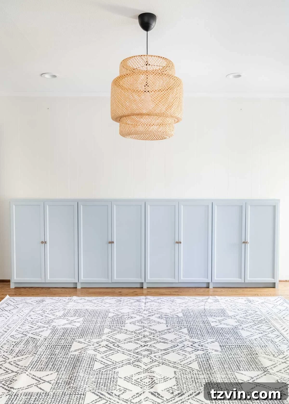
Discover the Best Blue Grey Paint Colors: Designer-Approved Shades for a Serene Home
In the quest to create a truly tranquil and inviting home environment, few color palettes offer the profound sense of calm and sophistication that blue-grey paint colors do. After a long, demanding day, returning to a space that instantly melts away stress is invaluable, and blue-grey hues are masters at achieving this serene atmosphere. They effortlessly blend the soothing qualities of blue with the grounding neutrality of grey, resulting in a versatile and elegant choice for any room.
However, navigating the vast spectrum of blue-grey shades can be surprisingly challenging. The perfect balance is key: you want to avoid a dull, flat grey, or a color that veers too much into a stark “baby blue.” The ideal blue-grey possesses a nuanced depth, offering a touch of color without overwhelming the space. This comprehensive guide will delve into the top designer-recommended blue-grey paint colors, helping you find the perfect shade to transform your living spaces into havens of peace and style.
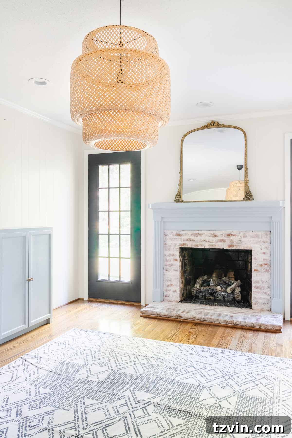
Ideal Spaces for Blue Grey Paint Colors
The inherent soothing and relaxing qualities of blue-grey paint make it an incredibly versatile choice for various rooms throughout your home. While it’s often celebrated for bedrooms and bathrooms due to its calming effect, its adaptability extends far beyond these intimate spaces. Blue-grey truly shines in environments where tranquility and sophistication are desired, seamlessly complementing a wide range of design aesthetics, from modern minimalist to classic traditional.
For instance, these versatile hues are particularly well-suited for **coastal style interiors**, evoking the serene hues of the ocean and sky. They can create a refreshing backdrop that enhances natural textures like linen, rattan, and light wood tones. In a similar vein, blue-grey shades can bring a touch of understated elegance to **farmhouse or Scandinavian designs**, providing a clean yet inviting foundation.
Consider using blue-grey paint for your **front door** to instantly boost your home’s curb appeal with a subtle pop of color that feels both welcoming and refined. It offers a sophisticated alternative to bolder shades, making a tasteful first impression.
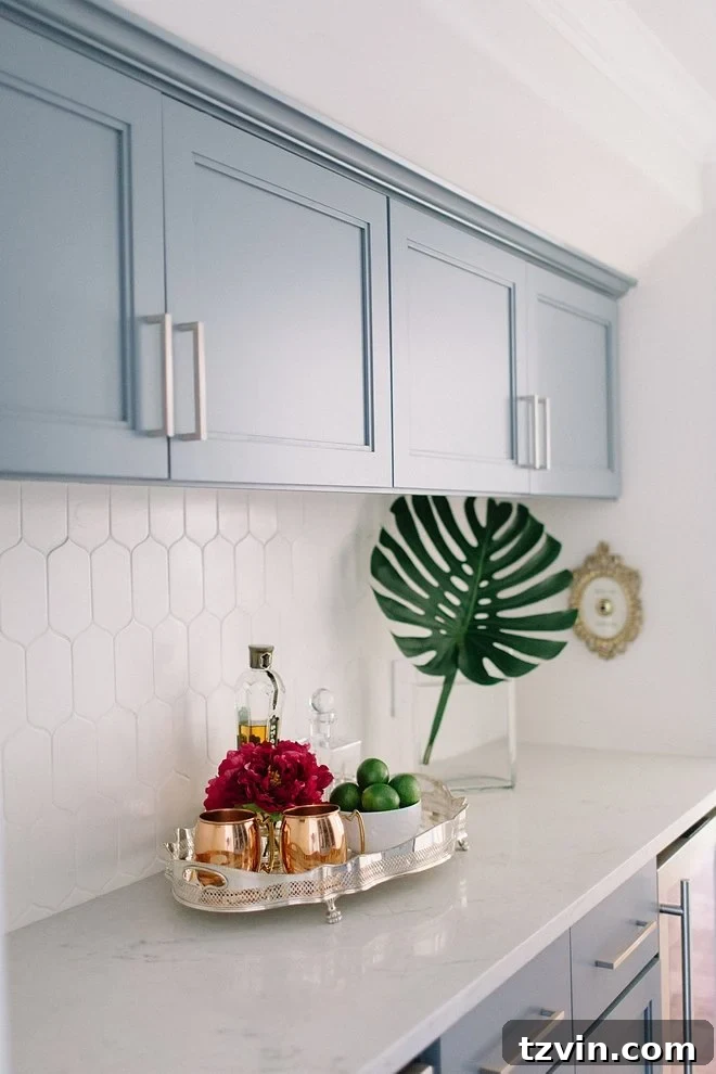
Beyond walls, blue-grey also works beautifully on **kitchen cabinets**. If painting an entire kitchen wall feels too overwhelming, cabinet paint in a blue-grey shade can introduce color and character, creating a focal point that feels fresh and inviting. It pairs wonderfully with white countertops, brass hardware, or natural wood elements.
Dreaming of a serene **living room**, an elegant **dining room**, or a peaceful **master bedroom retreat**? The favored blue-grey paint colors we’ll explore are excellent choices. They provide a backdrop that encourages relaxation and deep conversation, making these gathering spaces feel more harmonious. Their subtle depth adds character without demanding attention, allowing your furniture, artwork, and decor to truly stand out.
In essence, blue-grey can work well in virtually any space where you desire a hint of whimsy combined with classic elegance. Whether it’s a home office needing a calming focus, a nursery designed for gentle slumber, or a laundry room that benefits from a fresh, clean feel, these shades are a testament to timeless style.
As always, the golden rule of paint selection applies: **always test paint samples on your walls.** View the colors in various types of lighting – natural daylight, evening lamplight, and even under different weather conditions. This crucial step ensures you find the perfect shade for your unique space, as the ideal blue-grey is never a one-size-fits-all solution.
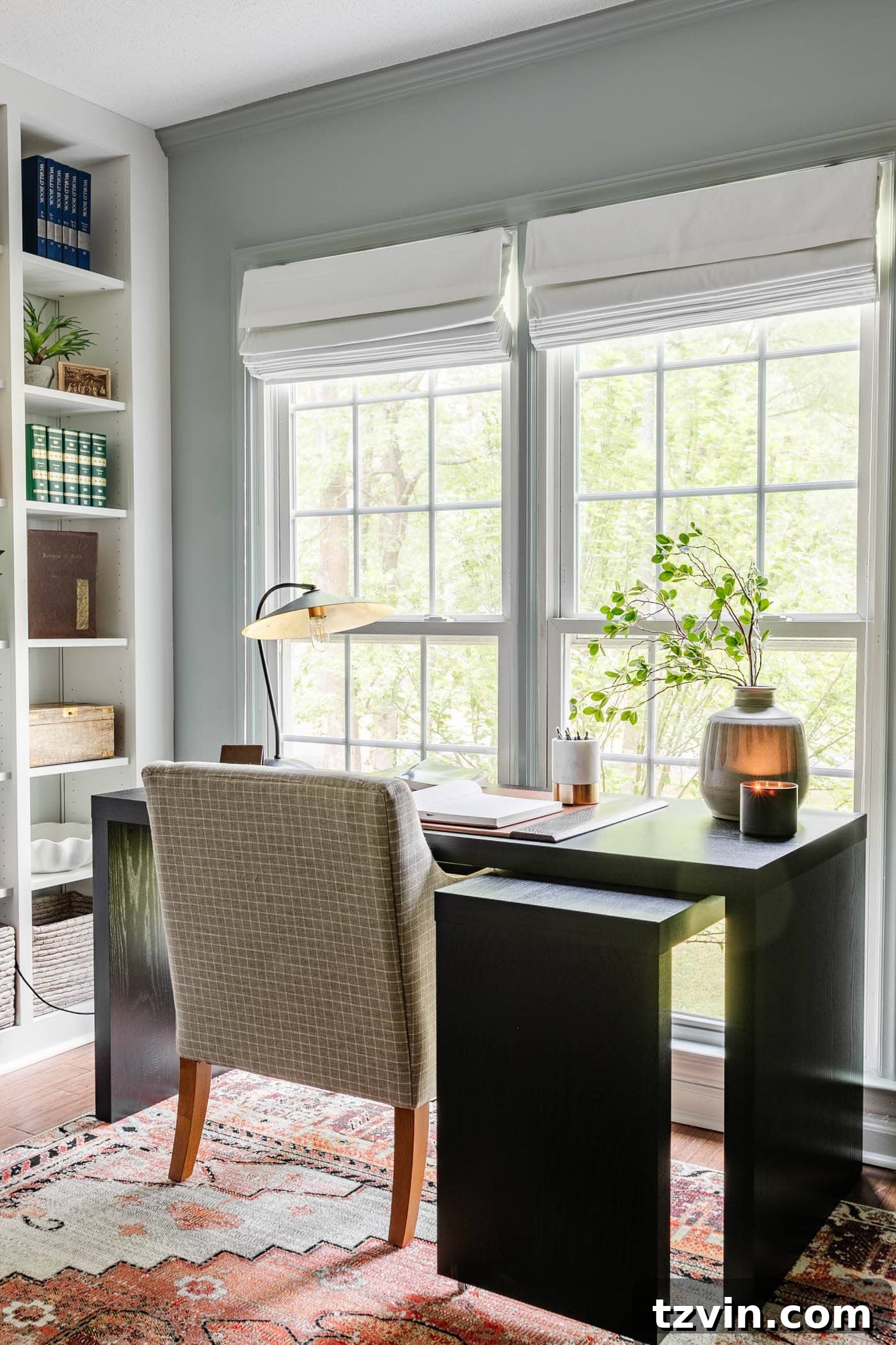
Expert Tips for Choosing the Best Blue Grey Paint Color for Your Home
Selecting the perfect blue-grey paint color can be one of the most rewarding yet challenging decisions in interior design. These nuanced hues are highly susceptible to changes in lighting, making thorough testing absolutely essential. We highly recommend utilizing a comprehensive paint color selecting method that accounts for the unique light conditions in every room. The way colors are perceived can dramatically shift based on natural light, artificial light, and even the time of day, so don’t skip this critical step.
Understanding Undertones: Blue-Dominant vs. Gray-Dominant
Before you even begin sampling, decide on your preference: do you want a blue with subtle gray undertones, or a gray with a hint of blue? This distinction is crucial to achieving your desired aesthetic. A light blue-gray paint color, often described as having a “spa-like” feel, will lend an airy, expansive quality to a room. These shades are excellent for creating a serene and uplifting atmosphere, perfect for bathrooms, bedrooms, or sunlit living areas.
Conversely, darker blue-grays, which lean more towards a gray base with a significant blue influence, tend to make a bolder statement. These deeper shades can add dramatic sophistication and coziness, ideal for a more intimate dining room, a distinguished home office, or an accent wall that grounds the space. Understanding this fundamental difference will help you narrow down your choices considerably.
The Importance of Testing in Real-World Conditions
What appears as a sophisticated grey on a small paint chip can transform into a surprisingly bright “baby boy nursery blue” once applied to an entire wall. This phenomenon underscores the necessity of proper sampling. Purchase several small cans of your top contenders and paint large swatches – ideally 2ft x 2ft – directly onto your walls, or onto large white poster boards that you can move around the room.
- Observe Throughout the Day: Pay close attention to how each sample looks in different lighting conditions throughout the day. Morning light, midday sun, afternoon shadows, and evening artificial light will all reveal different facets of the color.
- Consider Room Orientation: Rooms facing north will receive cooler, indirect light, which can enhance the blue tones and make the color appear even cooler. South-facing rooms, conversely, get warmer, brighter light, which might temper the coolness of blue-grays or even bring out unexpected undertones.
- Evaluate with Existing Decor: Hold up fabric swatches, artwork, and other decor items against the painted samples. Ensure the blue-grey harmonizes with your existing furnishings and accessories.
- Paint Multiple Coats: Always apply at least two coats of the sample paint to get a true representation of the color’s depth and intensity.
By investing time in this testing process, you’ll gain confidence in your choice and ensure that the blue-grey paint color you select creates the perfect ambiance for your room, avoiding costly mistakes and ensuring long-lasting satisfaction.
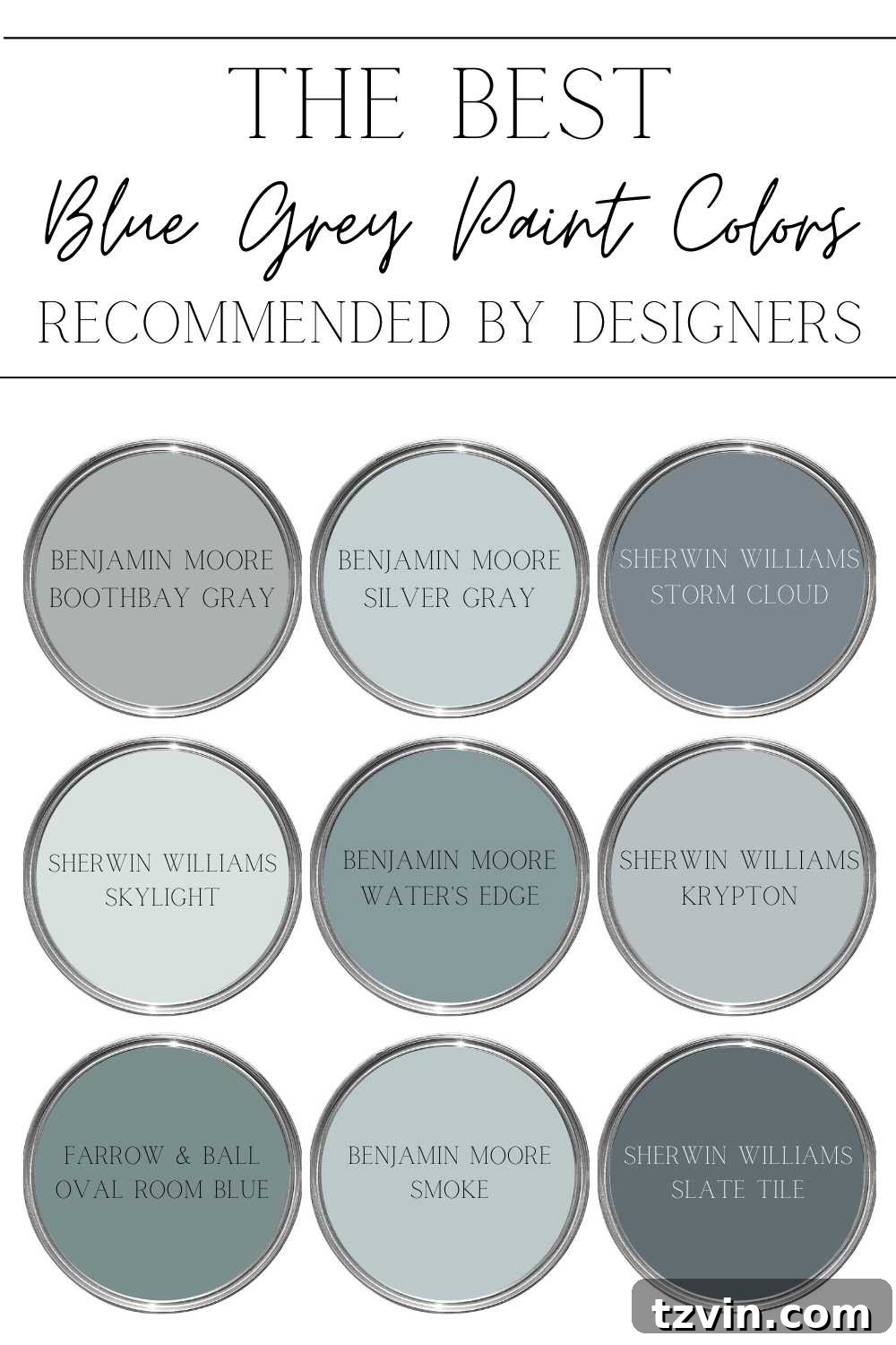
The 9 Best Blue Grey Paint Colors: Designer Favorites for Every Home
As discussed, the transformation of a paint swatch to a full wall can be surprising. A seemingly neutral grey swatch might reveal strong blue tones in certain lighting, making it crucial to test your selections diligently. To help you navigate this vast color landscape, we’ve compiled a list of 9 highly recommended blue-grey paint colors, beloved by interior designers and homeowners alike. These tried-and-true shades offer a fantastic starting point for finding the perfect hue for your space.
1. Benjamin Moore Boothbay Gray
Benjamin Moore Boothbay Gray is an exquisite, soft, mid-tone grey that exudes a cool, breezy coastal feel. Its subtle blue undertones are reminiscent of a tranquil sky just before sunset, imparting a deep sense of calm and sophistication. Designers frequently gravitate towards Boothbay Gray for its ability to create a relaxing yet refined atmosphere. It’s an ideal choice for home offices, helping to relieve stress and foster concentration, or for bedrooms where a serene retreat is desired. This shade pairs beautifully with crisp white trim, natural wood finishes, and metallic accents, making it incredibly versatile for both modern and traditional settings.
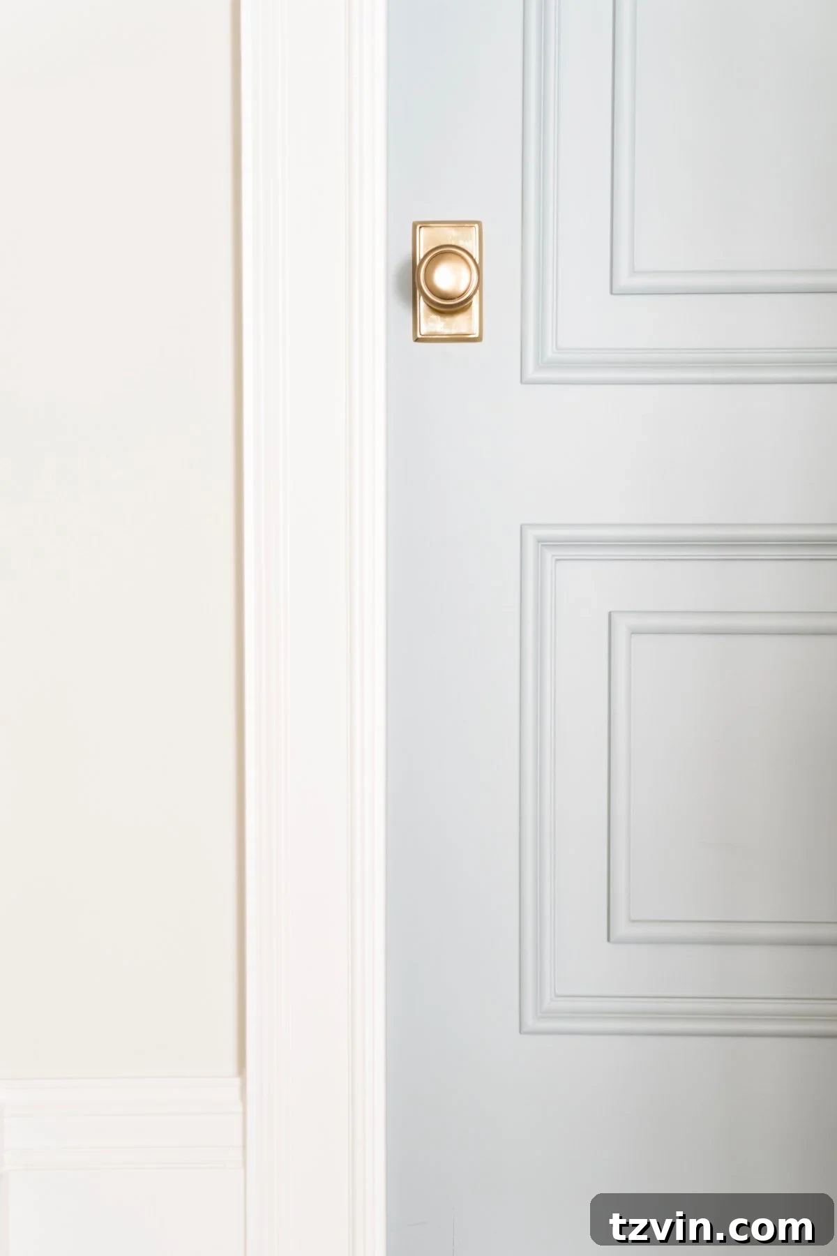
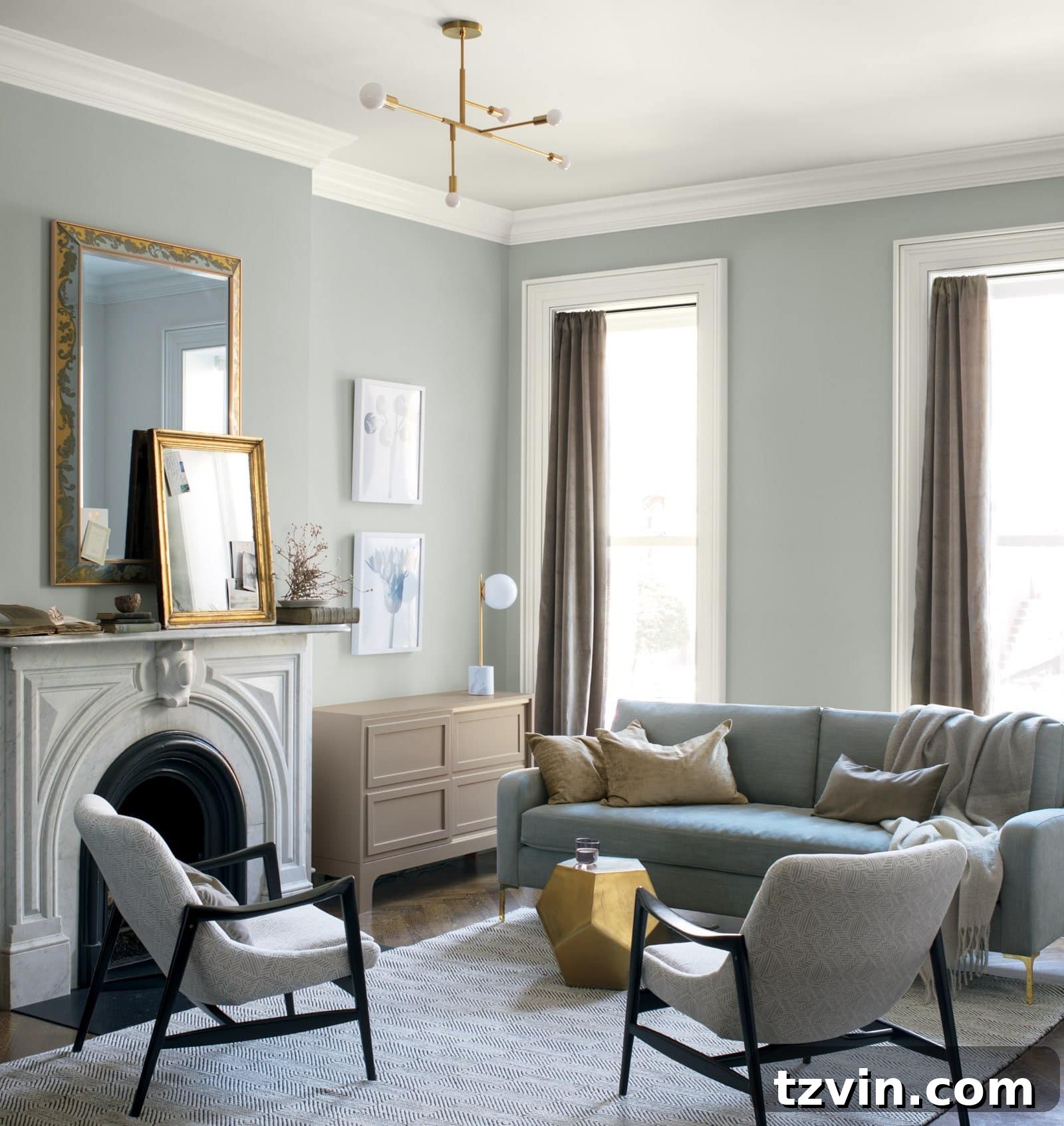
2. Benjamin Moore Silver Gray
Benjamin Moore Silver Gray is a truly ethereal and light blue-grey, perfect for infusing a room with a sense of spaciousness and airiness. This cool color possesses delicate blue undertones that prevent it from appearing stark, instead lending a gentle, refreshing quality. It’s an exceptional choice for creating a serene interior, reminiscent of a luxurious spa or a peaceful morning sky. Silver Gray works wonderfully in sunrooms, open-plan living areas, or master bathrooms where a clean and tranquil ambiance is paramount. Its lightness also makes it an excellent option for smaller rooms, as it can help expand the visual footprint of the space. Pair it with soft whites, natural textures, and minimal decor for an ultimate calming effect.
3. Sherwin Williams Storm Cloud
For those seeking a more dramatic and sophisticated blue-grey, Sherwin Williams Storm Cloud delivers. This deeper, richer shade offers a captivating blend of blue and grey, creating an atmosphere of elegant depth and maturity. It’s one of the most popular blue-grey paint colors for adding character, particularly when applied to cabinetry. Imagine Storm Cloud on laundry room cabinets, infusing a typically utilitarian space with unexpected style, or as an accent wall in a library or media room for a cozy, enveloping feel. It also works beautifully in transitional spaces like hallways or mudrooms, providing a grounding element. Its richness allows it to pair well with both warm and cool metals, dark wood tones, and crisp white trim for a striking contrast.
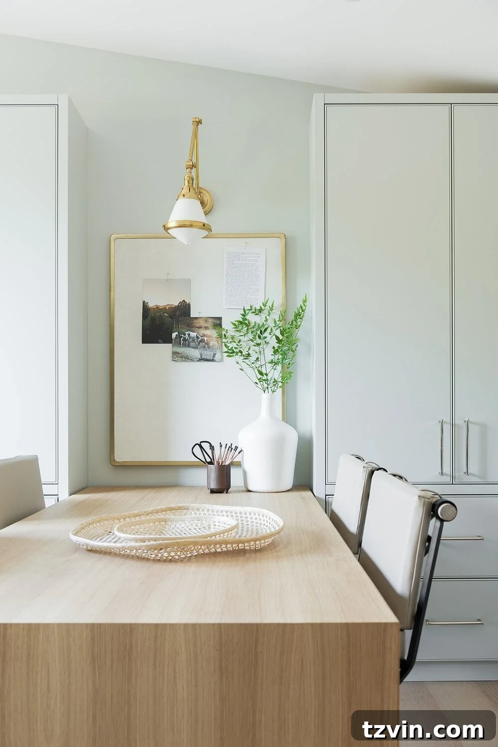
4. Sherwin Williams Sky High
Sherwin Williams Sky High is a breath of fresh air, a light and airy blue that truly captures the expansive essence of a clear, open sky. Its soft undertones of grey subtly ground the color, preventing it from feeling too saccharine or juvenile. This delicate balance enhances its versatility, making it perfectly suited for creating an uplifting and inspiring space. Sky High is particularly wonderful for children’s rooms, playrooms, or creative studios, where a light, optimistic atmosphere is desired. It also works beautifully in bathrooms to create a clean and refreshing feel, or in entryways to greet guests with a welcoming brightness. Pair it with whites, light wood, and pastel accents for a cheerful yet refined look.
5. Benjamin Moore Water’s Edge
Benjamin Moore Water’s Edge is a wonderfully tranquil, medium-toned blue-grey that evokes the serene depths of a calm body of water. What sets this color apart are its subtle green undertones, which add remarkable depth and a grounding, slightly earthy quality. This makes Water’s Edge feel more organic and natural than some other blue-grays, lending a sophisticated yet inviting aura to any room. It’s an excellent choice for dining rooms, creating an elegant backdrop for meals, or in a master bathroom where its calming depth can enhance a luxurious spa-like experience. It also works beautifully on kitchen islands or accent walls, particularly when paired with warm woods or natural stone. The green undertone allows it to harmonize well with other earthy tones and subtle metallics.
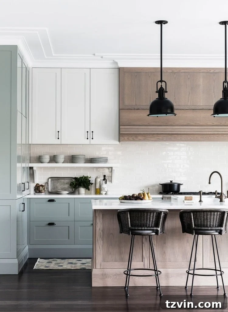
6. Sherwin Williams Krypton
Sherwin Williams Krypton is a remarkably cool and airy blue-grey, perfectly suited for establishing a light, fresh, and calm environment. Its subtle grey undertones are expertly balanced, allowing Krypton to almost behave as a neutral. This characteristic makes it incredibly adaptable, blending seamlessly with a wide range of decor styles and color palettes. It’s an ideal choice for open-concept living spaces where you want continuity and a quiet elegance, or for bedrooms and guest rooms that benefit from a crisp, clean feel. Krypton can also brighten up hallways or entryways, reflecting light beautifully. Its inherent coolness makes it a fantastic pairing with warm wood tones, creams, and even vibrant accent colors, allowing the blue-grey to serve as a sophisticated foundation for diverse design elements.
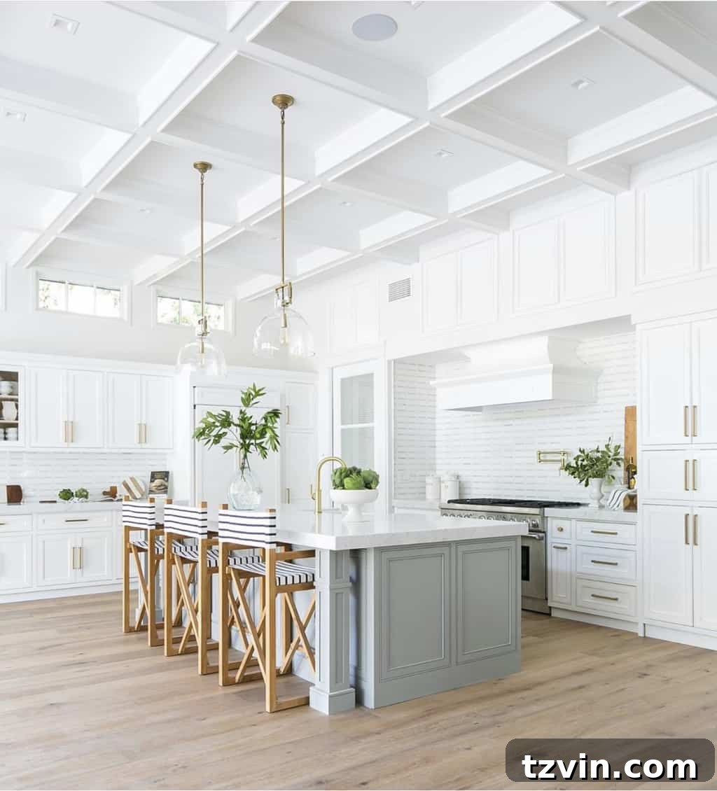
7. Farrow & Ball Oval Room Blue
Farrow & Ball Oval Room Blue stands out as a refined, historically-inspired blue-grey with an unmistakable soft, understated elegance. This distinguished shade carries warm grey undertones that imbue it with a timeless versatility, making it equally suitable for both contemporary and traditional spaces. Its depth of color creates an enveloping, sophisticated ambiance, perfect for dining rooms, libraries, or master bedrooms where a touch of classic charm is desired. Oval Room Blue also works wonderfully on feature walls or built-in bookshelves, providing a rich backdrop that complements antique furnishings and modern art alike. When paired with darker woods, creams, or even earthy greens, it creates a harmonious and inviting palette that feels both grand and intimate.
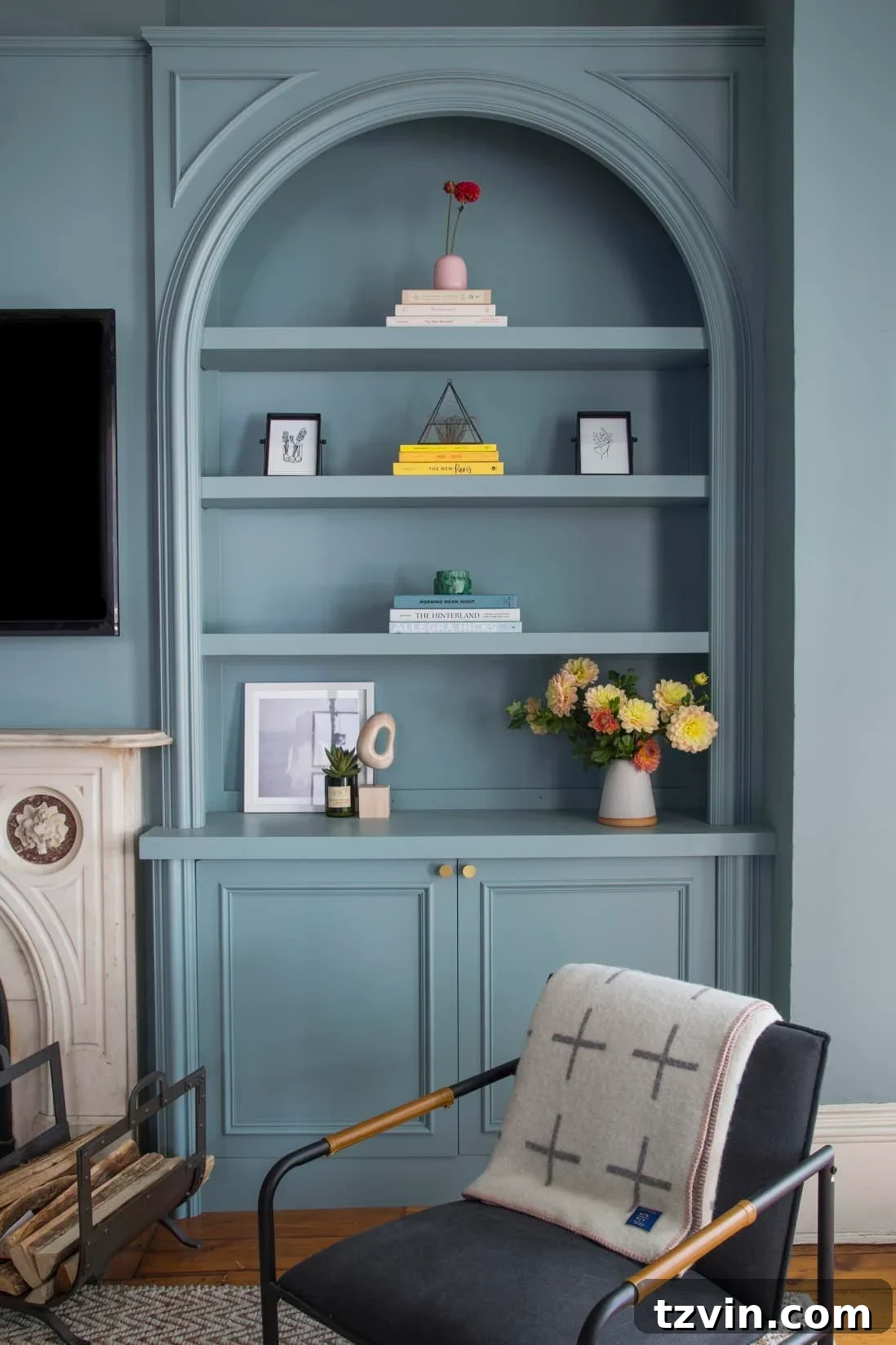
8. Benjamin Moore Smoke
Benjamin Moore Smoke is a soft, ethereal grey that creates an incredibly soothing and serene retreat. What makes this color truly special are its strong blue undertones, which impart a delightful dose of playful whimsy without losing its sophisticated edge. Smoke is a fantastic choice for bedrooms and bathrooms, where its light, airy quality promotes relaxation and calm. It also shines in nurseries or children’s rooms, offering a gentle blue hue that isn’t overtly “baby blue.” Its versatile nature allows it to pair well with a variety of design elements, from crisp whites and creams to natural wood and even pops of vibrant color. Smoke is excellent for creating a modern, minimalist aesthetic or for softening a more traditional space, providing a clean and refreshing backdrop that feels utterly welcoming.
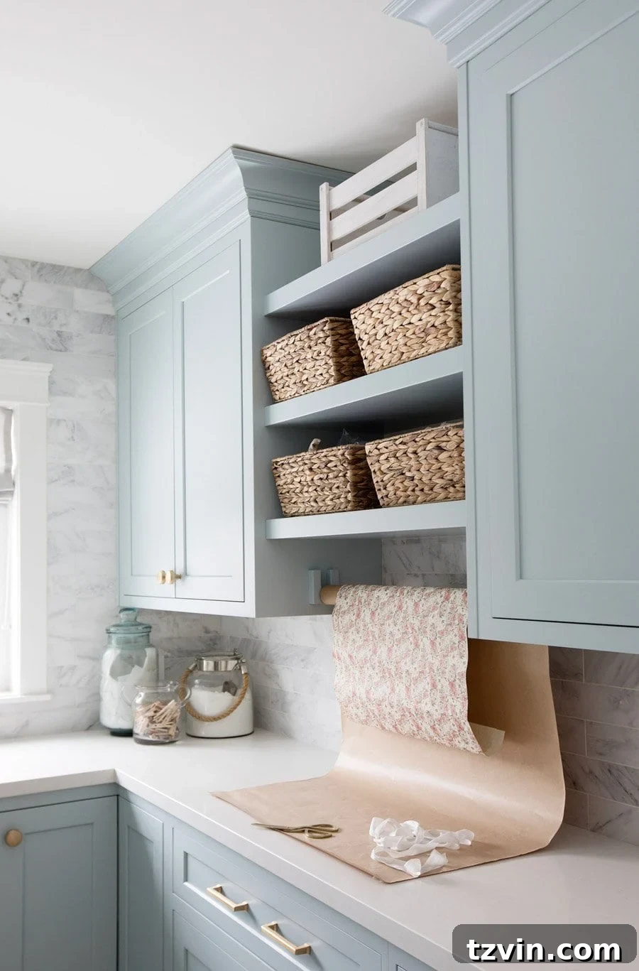
9. Sherwin Williams Slate Tile
Sherwin Williams Slate Tile is a deep, highly sophisticated blue-grey that beautifully captures the stony essence and natural variations of actual slate. Its rich, earthy undertones significantly enhance its depth and complexity, preventing it from feeling cold. Instead, Slate Tile offers a grounding and luxurious feel, making it an excellent choice for spaces where you want to evoke natural beauty and enduring elegance. This color is superb for kitchen or bathroom cabinetry, providing a strong, elegant statement. It also works wonderfully in cozy living rooms, studies, or even accent walls in a master bedroom, creating a dramatic yet comforting atmosphere. Pair it with lighter wood floors, polished chrome or brushed nickel hardware, and organic textures to highlight its natural inspiration and create a truly refined interior.
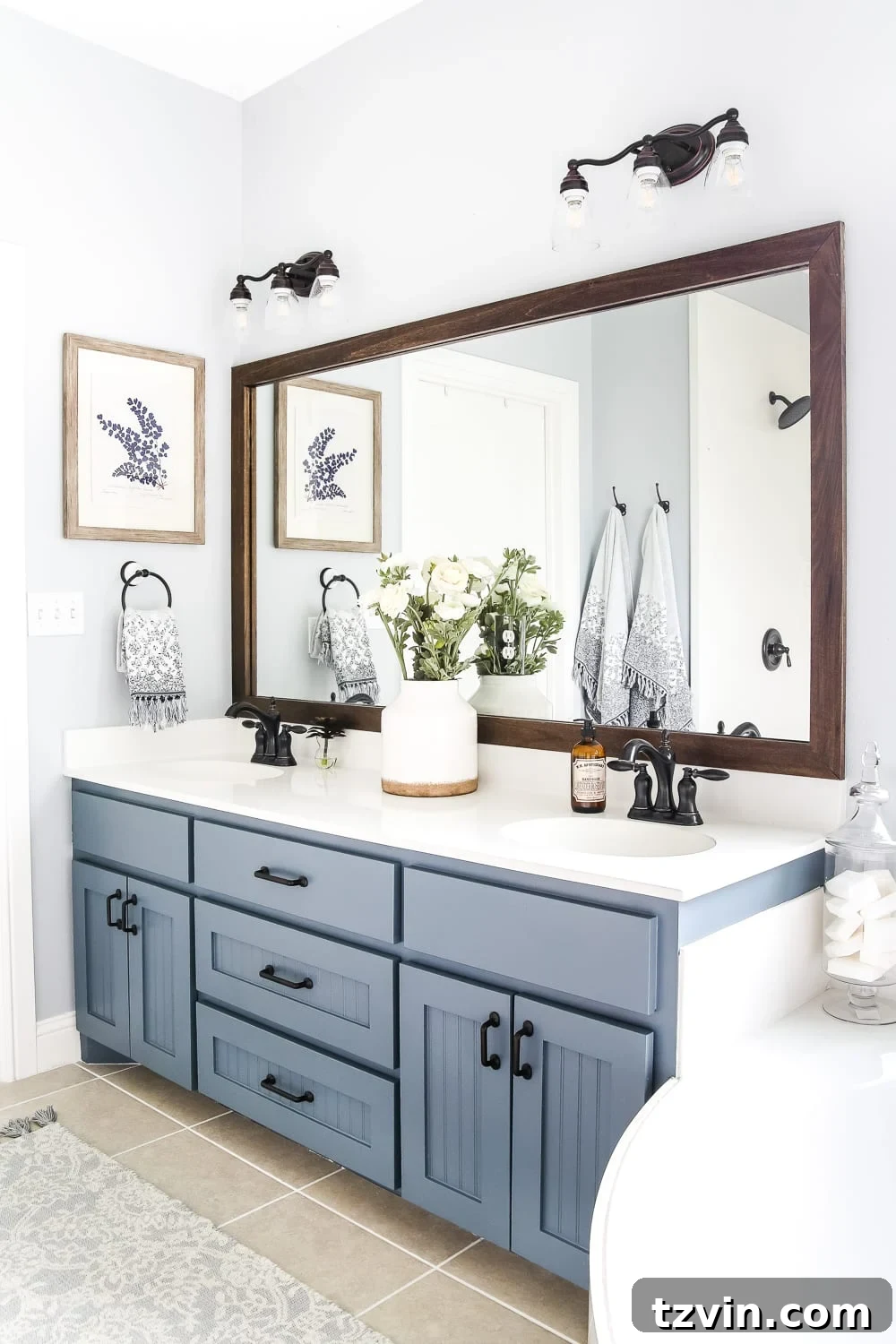
Frequently Asked Questions About Blue Grey Paint Colors
Blue-grey paint colors are remarkably versatile and harmonize beautifully with a variety of complementary shades. For a fresh and crisp look, pair them with clean whites and soft creams. Earthy greens can enhance the natural, calming aspects of blue-grey, while greiges (a blend of grey and beige) offer a sophisticated, muted backdrop. To prevent a room from feeling too cool or sterile, it’s highly recommended to incorporate a few accents of warmer tones. Think mustard yellows, which provide a vibrant yet grounded contrast, or rich warm browns in furniture, textiles, or decorative accents. These warmer elements can help balance the coolness of blue-grey, creating a space that feels inviting, balanced, and deeply comfortable.
In the realm of color psychology, blue-grey embodies a powerful combination of attributes. Grey is often associated with balance, stability, and neutrality, providing a solid, grounding presence. Blue, on the other hand, universally represents serenity, peace, and tranquility. When these two colors merge into blue-grey, the resulting hue evokes feelings of composure, reliability, and calm. This unique blend makes it a highly popular choice for rooms dedicated to rest and rejuvenation, such as bedrooms, bathrooms, and even professional spas, where an atmosphere of peace and stability is paramount. It’s a color that fosters mental clarity and emotional well-being, helping to reduce stress and create a sanctuary-like ambiance in any home.
Generally, blue-grey is considered a cool color due to its blue undertones. Blue is inherently a cool hue, often associated with water and sky. However, the addition of grey can temper this coolness, and some blue-greys can even lean slightly warmer if they contain subtle green or even a touch of red undertones. The specific balance of blue and grey, along with any hidden undertones, will determine its overall perceived temperature. Always observe the paint in your specific lighting conditions to see if it reads as more cool and crisp or slightly softer and warmer.
Absolutely! Light blue-grey paint colors are an excellent choice for small rooms. Their light-reflective qualities can make a space feel larger, more open, and airy. Darker blue-greys, while bold, can also work in small rooms to create a cozy, intimate, and sophisticated jewel-box effect, especially when paired with ample lighting and lighter furnishings to prevent the space from feeling too enclosed. The key is to test samples and ensure the chosen shade doesn’t overwhelm the room but instead enhances its character.
Do you have any other blue-grey paint colors you would add to this curated list of designer favorites? We’d love to hear your tried-and-true recommendations! Drop them in the comments below to help make this post a continued resource for anyone seeking the perfect blue-grey for their home.
Explore More Expert Paint Color Recommendations
12 Trending Burgundy Paint Colors Recommended by Designers
12 Best Sage Green Paint Colors for a Relaxing Room
Best Navy Blue Paint Colors Recommended By Designers
See more paint color recommendations by pro interior designers here.