A huge thank you to Behr for generously supplying the paint for this transformative project. As always, all opinions and design choices expressed here are 100% honest and entirely my own.
Mastering the Art of Gray: Your Ultimate Guide to Choosing the Perfect Paint Color
If I had to title this post with an attention-grabbing, slightly cheeky name, “Fifty Shades of Gray” would certainly come to mind. But for reasons perhaps too obvious to state, I’ll opt for something a little more practical and universally helpful. Because, let’s be honest, navigating the vast spectrum of gray paint colors can feel as complex and nuanced as a popular romance novel, yet far more rewarding when you find “the one” for your home.
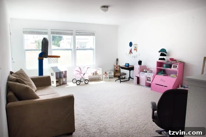
Our home has been a whirlwind of activity lately, particularly as we’ve been diligently chugging along on the playroom makeover train. This isn’t our first rodeo; just recently, we tackled a colossal undertaking – a true Goliath of a project – with our elaborate wall-to-wall built-in shelving system. That project laid a fantastic foundation, creating much-needed storage and architectural interest, but it also left us with something less desirable: vast expanses of stark, builder-grade white primer walls.
And while the bones of the room were coming together beautifully, I can’t express how utterly thrilled I am to finally have some vibrant, carefully chosen wall paint breathing life into this space! Honestly, if I had to gaze at those endlessly white walls for one more solitary day, I was dangerously close to grabbing Olivia’s markers and unleashing my inner (and limited) artist, creating stick-figure murals across every surface. (Because, let’s face it, that’s truly the extent of my artistic prowess.)
Beyond the Blank Canvas: Why Builder White Just Won’t Do
Don’t get me wrong, white can be incredibly chic, minimalist, and versatile. It has its place, undoubtedly. But in this particular space, destined to be a lively, imaginative playroom, the endless expanse of unadorned white was a bit much. Okay, let’s be honest, it was a *lot* too much. It felt less like a canvas ready for creativity and more like a sterile, uninspiring box.
And here’s a little secret I’m willing to share: Despite all my DIY projects and design endeavors, I still get profoundly nervous when it comes to selecting wall paint colors. There’s nothing quite like that stomach-sinking feeling that washes over you when you’ve dedicated days – sometimes weeks – to prepping and painting a large space, only to step back, admire your “finished” work, and realize with a quiet dread that you secretly loathe the color you chose. It’s a design nightmare that haunts many of us.
My past self, being notoriously stubborn, often hated admitting defeat even more than I hated the chosen color. So, more often than not, I would simply live with the regrettable hue, which, I can now confidently say, was arguably worse than staring at those pristine primer white walls. It’s a commitment that’s hard to undo, both in terms of effort and cost, making the initial decision feel incredibly high-stakes.
However, after years of trial and (many) errors, I’ve finally honed a reliable, stress-reducing method for picking wall colors, especially for those notoriously tricky grays. Gray, in particular, seems to be a chameleon among colors, capable of shifting dramatically depending on its undertones and the environment it’s in. The challenge lies in striking that delicate balance: you absolutely don’t want to veer too warm, resulting in a beige or “greige” that wasn’t your intention. But equally, you want to avoid going too cool, ending up with a blue or purple undertone that chills the room rather than warms it. Finding that sweet spot is the ultimate goal.
Discovering the perfect gray paint is akin to finding that most comfortable, perfectly fitting pair of jeans – the kind that not only feels amazing but also makes you look absolutely fantastic. You might have to sift through a few duds, try on several pairs that just don’t quite hit the mark, but the effort is unequivocally worth it when you finally find the one that feels tailor-made for you and your space.
My Proven 4-Step Method for Selecting the Perfect Gray Paint Color
To help you avoid the pitfalls and anxieties of paint selection, I’m sharing my tried-and-true four-step process. This method has saved me countless hours, dollars, and moments of regret, especially when it comes to the nuanced world of gray paints.
-
Step 1: Immerse Yourself in a Sea of Color Swatches
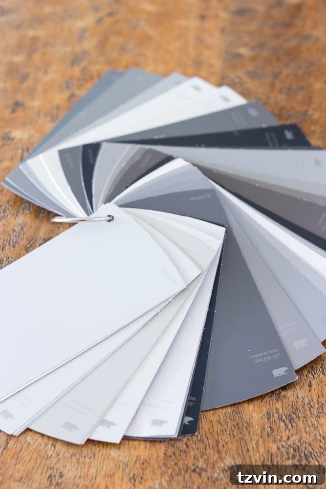
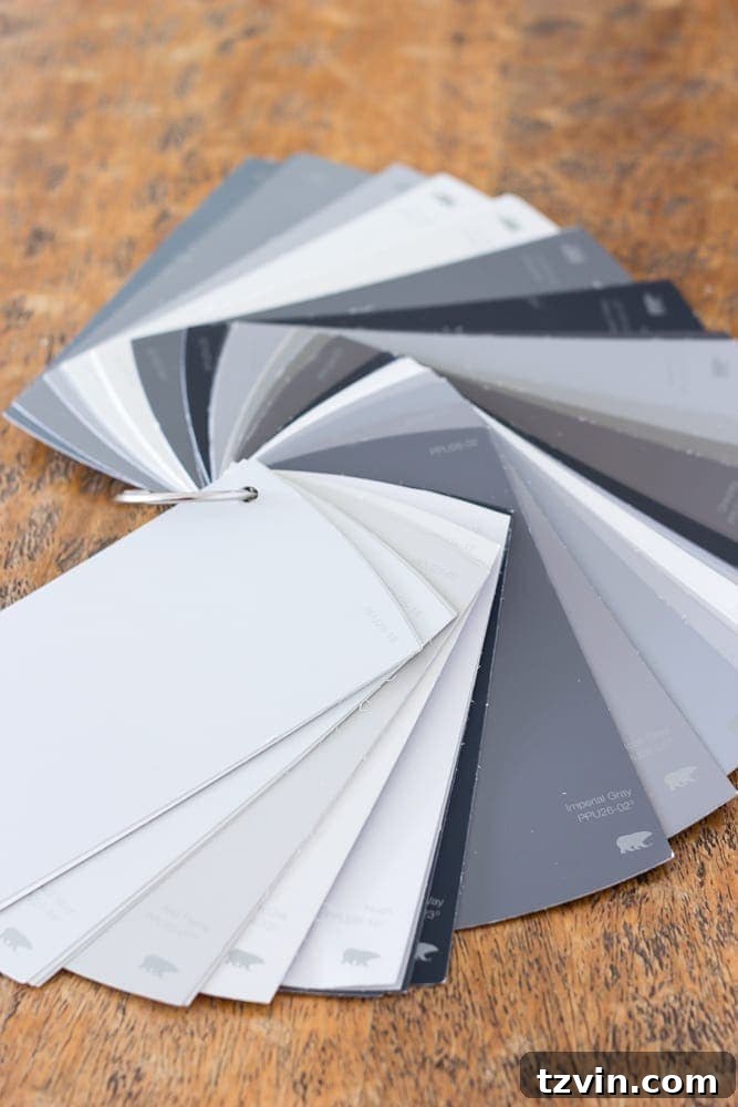
Your journey to the perfect gray begins not with a single card, but with an abundance of them. Head to your local paint store and gather every gray swatch that vaguely catches your eye. Don’t be shy; grab handfuls! The magic happens when you bring these swatches home and lay them out, side-by-side. It’s truly remarkable how much easier it becomes to discern the subtle cool (blue, purple, green) versus warm (beige, yellow, red) undertones when multiple colors are juxtaposed. A gray that looks perfectly neutral on its own might suddenly reveal a hidden blue tint when placed next to a warmer gray. This initial comparison stage is crucial for narrowing down your options and understanding the true character of each shade before you commit to anything larger.
Pay close attention to how these small swatches react to the light in your own home, not just the fluorescent lighting of the paint store. The light streaming through your windows, or even your interior artificial lighting, will dramatically influence how a color appears. Consider the existing elements in your room – flooring, furniture, textiles – and how the gray swatches complement or clash with them. This preliminary deep dive into swatches is a low-stakes way to eliminate many contenders and get a clearer sense of the gray spectrum.
Step 2: Harness the Power of Online Inspiration (with Caution)
Once you have a handful of favorite swatches, it’s time to move your research online. Platforms like Pinterest, Instagram, and design blogs are treasure troves of inspiration. Search for rooms featuring the gray paint names you’ve shortlisted. You can discover which gray paint colors are consistently favored by interior designers and see how these shades translate in real-world room designs. This visual research can provide a wealth of ideas for pairing and styling your chosen gray.
However, a critical caveat: never, ever rely solely on online images for definitive paint color selection. In my extensive experience, digital representations of paint colors are almost never perfectly accurate. The calibration of your computer monitor, phone, or tablet screen is unreliable, and colors can appear drastically different due to photography lighting, editing, and screen settings. Use online resources as a starting point for ideas and to gauge general popularity or aesthetic, but always, always proceed to the next step before making a final decision.
Step 3: The Indispensable Paint Sample Test
This is arguably the most crucial step, one I implore you never to skip. When I’m standing in front of that dizzying wall of color swatch cards in the paint aisle, there’s always a powerful temptation to just grab a card, hand it directly to the helpful person behind the desk, and have them whip up a gallon on the spot. I’ve been there, done that, and I can assure you, it rarely – if ever – turns out well. Impatience is the enemy of a successful paint project.
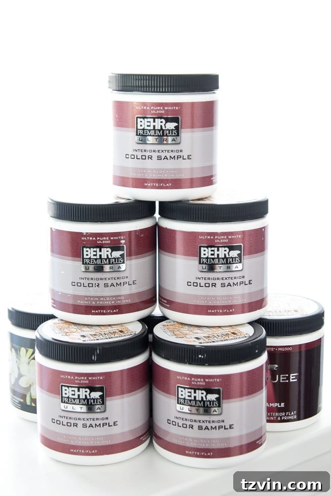
Investing $15 or so on a few paint sample pots to try them out directly on your walls is worth every single penny, and then some. Consider it a small insurance policy against a much larger, more frustrating, and more expensive mistake. It’s far better to spend $15 on a few samples than to spend $50-$100 (or more, depending on the size of your room) on several gallons of the wrong color paint. That’s a mistake that costs time, money, and your sanity.
When testing, paint generous swatches (at least 1×1 foot squares) of your top contenders on several different walls in the room. Why multiple walls? Because light hits each wall differently, and a color can look entirely distinct depending on its orientation. If you’re hesitant to paint directly on your walls, a clever alternative is to swipe your sample paints onto large pieces of white foam poster board. Once dry, you can tape these boards to your walls, move them around, and observe them in various spots without making a permanent mark.
My personal experience selecting the perfect gray for our playroom highlights this point perfectly: I ended up with a collection of NINE sample pots! Each one had its own unique personality, and only through direct application could I truly understand them.
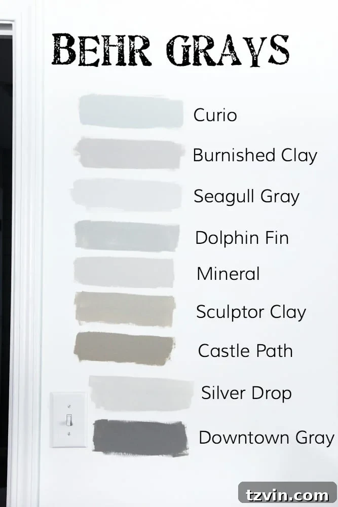
It truly is astonishing to witness how dramatically different the actual paint can appear compared to its small color swatch card. For instance, I was so close to choosing a color called “Curio” because the swatch looked like a beautiful, balanced gray. But once on the wall, it clearly revealed itself to be very much on the blue side. While gorgeous in its own right, it wasn’t the vibe I was going for in the playroom. (However, it’s so pretty that I’ve mentally filed it away for a potential future project elsewhere in our home!) Similarly, “Castle Path,” which presented as a warm gray on the card, transformed into a much more prominent tan once it dried on my walls. These real-world observations are impossible to make from tiny cards alone.
Step 4: Understand Your Room’s Unique Lighting
Once your samples are painted on your walls (or poster boards), the final and perhaps most critical step is to observe them diligently. Do not make a decision based on a single glance. Instead, make it a point to look at the colors at various times throughout the day – morning, midday, afternoon, and evening. Observe them under different lighting conditions: bright sunshine, overcast skies, and even at night with your room’s artificial lighting turned on. A paint color can look completely different in the soft glow of morning light than it does in the harsh direct sunlight of the afternoon or the warm embrace of evening lamps.
Furthermore, consider the number and orientation of windows in your space. Rooms with abundant natural light might be able to handle a slightly darker gray without feeling cave-like, while north-facing rooms that receive cooler, indirect light often benefit from warmer grays to prevent them from appearing too cold or stark. Conversely, south-facing rooms bathed in warm light might make a gray with warm undertones appear too yellow or beige. The natural light truly dictates the perceived warmth, coolness, and intensity of a color.
Our Playroom’s Perfect Shade: Behr Premium Plus Ultra in Seagull Gray
After careful deliberation, numerous sample pots, and meticulous observation, we ultimately chose Behr Premium Plus Ultra in Seagull Gray with an eggshell finish. And a huge bonus for busy DIYers like us: it covered beautifully in just one coat – thank goodness for high-quality paint!
Seagull Gray is a distinctly cool gray, but crucially, it doesn’t lean overtly blue. It strikes that perfect balance I was seeking. It’s a light shade, which was a top priority for our playroom. I wanted to ensure the space felt airy, bright, and open, fostering a sense of boundless creativity and play. The light color allows the room to feel expansive and welcoming, rather than enclosed. (The window trim paint is still a work in progress, but it will further enhance the crispness of the gray.)
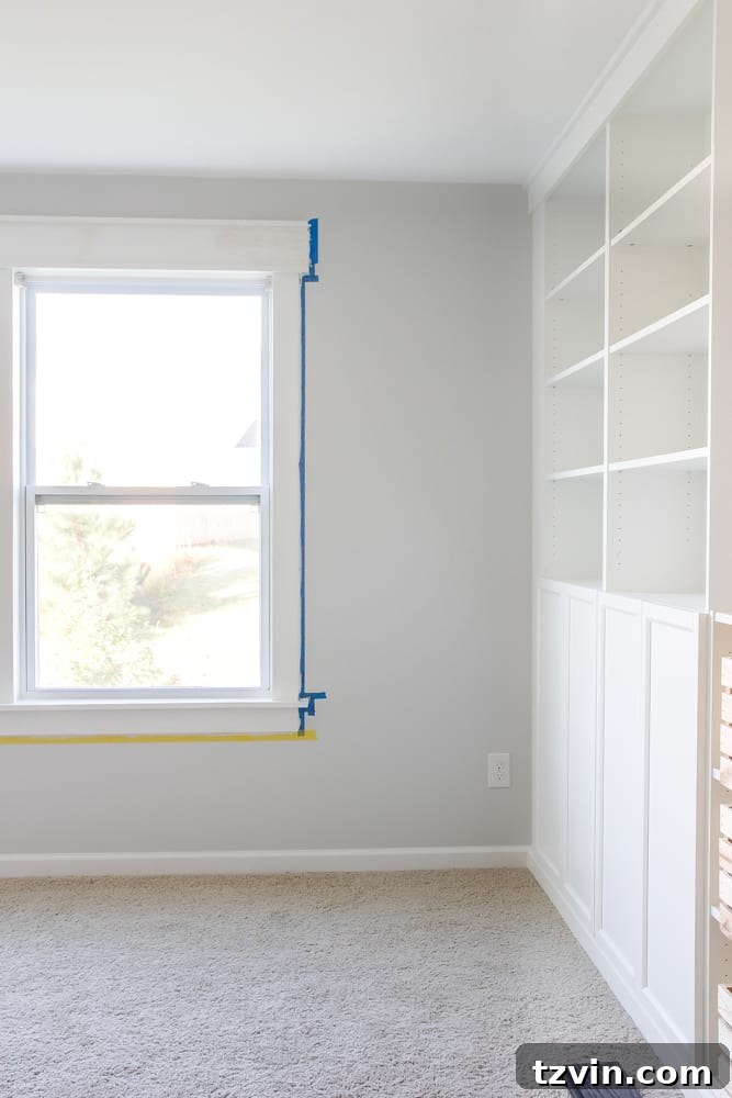
The difference from the previous builder white is subtle, yet profoundly impactful. I deliberately didn’t want an overly dramatic color transformation, as our playroom seamlessly opens into our entire upstairs hallway and stairway. A vibrant or intensely dark color might have felt jarring in such an open-concept area. Seagull Gray provides just enough contrast to define the space without overwhelming it.
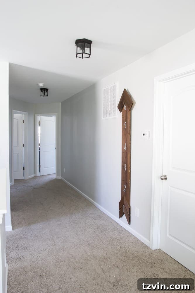
It’s fascinating to observe how the same color behaves differently across various areas of our home. In the hallway, for instance, where there are no windows to provide natural light, Seagull Gray appears noticeably darker. Yet, it never feels like a ‘cave.’ Instead, it maintains a sophisticated, calming presence, demonstrating its versatility and depth even under varying light conditions.
Your Turn: Share Your Gray Paint Wisdom!
We’re incredibly pleased with our choice of Seagull Gray. It has transformed the playroom into a cheerful, inviting space, perfect for creative play and cozy family time. But I’m always eager to hear from fellow home decorators! Do you think we made the right color choice for our playroom? Do you have any unique paint color choosing tips or tricks of your own that you’ve discovered through your projects? Or perhaps you have a tried-and-true favorite gray paint color that is your absolute go-to for any space? Don’t hesitate to share your thoughts, experiences, and recommendations in the comments below!
I cannot wait to show you all even more progress on our playroom makeover this Thursday for another exciting One Room Challenge update! Until then, for a sneak peek and real-time glimpses of our ongoing transformation, be sure to follow along on my Instagram stories. Happy decorating!