Elevate Your Home: Discover the Timeless Appeal of Gray and Taupe Trim Paint
In the world of interior design, trends come and go, but some looks transcend the fleeting fads to become enduring classics. One such design choice that is captivating homeowners and designers alike is the sophisticated application of gray and taupe trim paint. Far from the traditional stark white, these nuanced neutral shades offer a fresh yet timeless aesthetic, creating a modern-meets-classic vibe that breathes new life into any room.
Imagine transforming a once dull space into an inviting sanctuary. Many homes, like our own guest bedroom, often start with dated beige walls and lacklustre trim. The simple act of refreshing the walls with a crisp white can instantly brighten a room, but the true magic happens when you introduce a contrasting, yet harmonious, trim color. This article delves into the beauty of gray and taupe trim, offering a wealth of inspiration and guiding you toward the perfect paint colors to achieve this elegant transformation.
Why Gray and Taupe Trim is a Design Game-Changer
The concept of painting trim in a color other than white has been gaining significant traction, and for good reason. Gray and taupe tones bring a depth and character that pure white simply cannot match. Here’s why this trend is not just a passing fancy but a sophisticated design choice:
- Modern Sophistication: Gray and taupe instantly update a space, giving it a contemporary edge while retaining a sense of warmth and elegance.
- Versatile Neutrals: These colors are incredibly adaptable, pairing beautifully with a wide array of wall colors—from bright whites and creams to deep blues and greens.
- Architectural Enhancement: Darker trim emphasizes architectural details like crown molding, window casings, and baseboards, making them stand out as intentional design elements.
- Cohesive Flow: When chosen carefully, gray or taupe trim can create a seamless transition between rooms, fostering a sense of harmony throughout your home.
- Unique Personality: It offers an opportunity to infuse your personal style and create a space that feels curated and unique, stepping away from conventional choices.
Whether you’re aiming for a cozy farmhouse feel, a sleek minimalist look, or a grand traditional atmosphere, gray and taupe trim can be the subtle yet powerful element that ties your entire design together. It’s about creating a refined backdrop that allows your furniture, artwork, and personal touches to truly shine.
Gray vs. Taupe: Understanding the Nuances
While often grouped, gray and taupe possess distinct characteristics that influence the overall feel of a room. Understanding these differences is key to choosing the perfect shade for your home:
The Many Faces of Gray
Gray is a spectrum, ranging from cool grays with blue or purple undertones to warm grays that lean towards green or brown (often called “greige”).
- Cool Grays: These shades can evoke a sense of calm and modernity. They work wonderfully in spaces with ample natural light or alongside cooler wall colors. Think of grays with subtle blue undertones that provide a crisp, clean contrast.
- Warm Grays (Greige): A blend of gray and beige, greige offers the best of both worlds. It carries the sophistication of gray but with the warmth and inviting nature of beige. Greige is incredibly versatile and often feels softer and more comforting than a true gray. It’s an excellent choice if you’re concerned about a room feeling too cold.
The Richness of Taupe
Taupe is essentially a grayish-brown, often richer and warmer than greige. Its brown undertones are more pronounced, giving it an earthy, organic feel. Taupe trim can add a luxurious and grounding element to a room, especially when paired with cream, off-white, or even deeper jewel-toned walls. It’s a fantastic option for creating a cozy, sophisticated, and slightly more traditional aesthetic.
The best way to determine whether gray or taupe (and which specific shade) is right for your space is to test paint swatches on your trim. Observe them at different times of the day, under various lighting conditions, as light dramatically affects how colors appear.
Inspiration Gallery: Envisioning Your Trim Transformation
To truly grasp the transformative power of gray and taupe trim, let’s explore some stunning examples. These inspirations highlight how diverse design styles can benefit from this sophisticated paint choice.
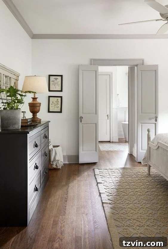
Source: Magnolia.com
This beautiful space from Magnolia Home exemplifies how warm gray trim can perfectly complement light, airy walls, grounding the room with a subtle strength. The contrast is gentle yet effective, highlighting the architectural lines without overpowering the serene atmosphere.
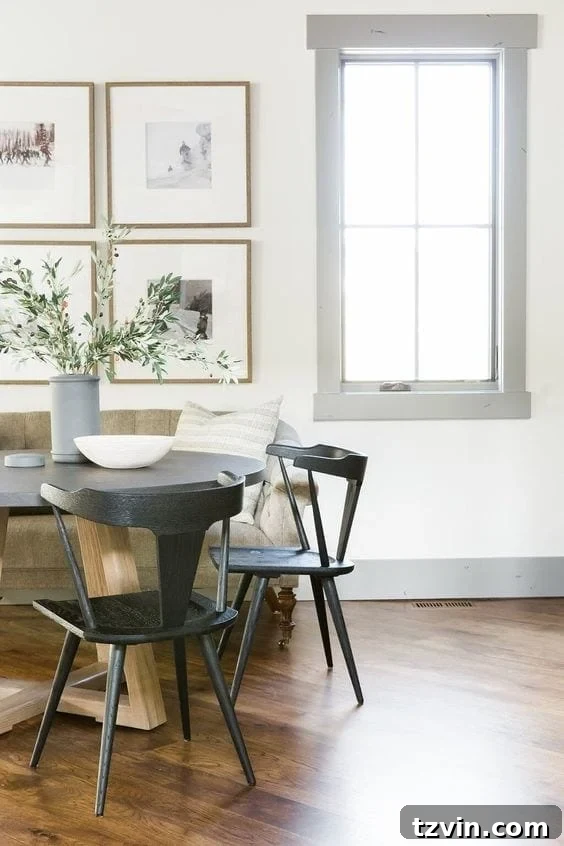
Source: Studio McGee
Studio McGee masterfully uses a deeper gray trim to create a striking contrast against white walls. This approach adds a touch of drama and sophisticated definition, drawing the eye to the room’s perimeter and accentuating its height and scale.
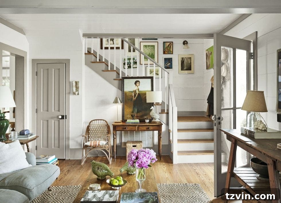
Source: Country Living
This image showcases how greige trim can harmonize beautifully with natural textures and a slightly more rustic aesthetic. The softness of the greige prevents the look from being too stark, contributing to a cozy and inviting environment.
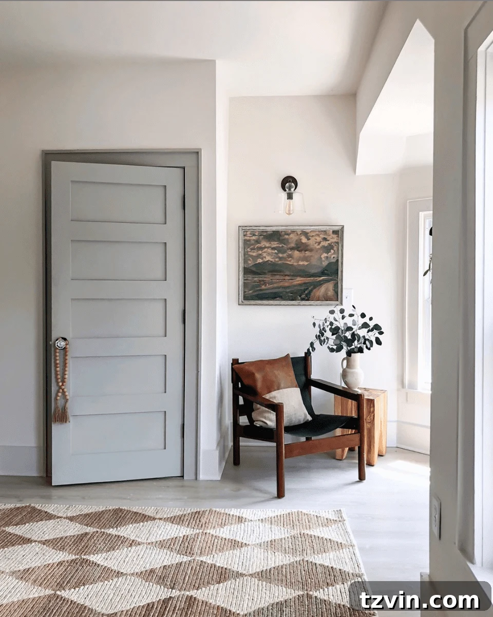
Source: I SPY DIY
Here, a lighter taupe trim offers a more subtle differentiation from the wall color, resulting in a cohesive and understated elegance. This approach is perfect for those who desire definition without a bold contrast, creating a serene and spacious feel.
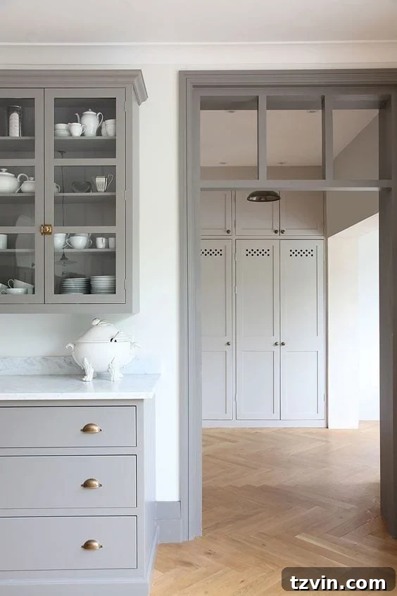
Source: Room for Tuesday
This example demonstrates how taupe trim can beautifully frame architectural features, adding a custom, bespoke feel to a room. The trim becomes a deliberate design statement, enhancing the overall sophistication.
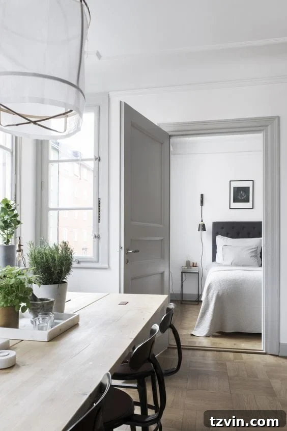
Source: Minimal Blogs
A well-balanced mid-tone gray trim provides a comfortable contrast, making the room feel grounded and polished. This approach is ideal for creating a refined look that isn’t overly dramatic, perfect for gathering spaces.
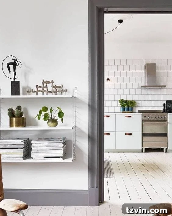
Source
Here, the gray trim works seamlessly with a subtle wall texture, enhancing the overall tactile experience of the room. It’s a testament to how these neutral trims can elevate spaces beyond just color.
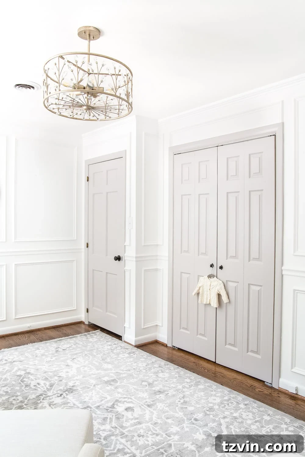
Source: Bless’er House (Our own project!)
Even in a delicate setting like a nursery, gray trim provides a grounded yet gentle touch. This personal project demonstrates how a carefully selected gray can complement soft palettes, adding depth without sacrificing a light and airy feel.
Selecting the Perfect Gray or Taupe Paint Colors for Your Trim
Choosing the right paint color can feel overwhelming with countless options available. After extensive research and poring over countless examples, we’ve identified some highly recommended gray and taupe paint colors that consistently deliver stunning results. Remember to consider your room’s natural light, existing furnishings, and desired mood when making your final selection.
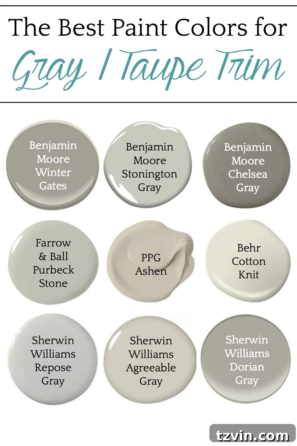
Top Gray and Greige Trim Paint Recommendations:
- Sherwin-Williams Accessible Beige (SW 7036): Despite its name, this is a beloved greige that leans warm with subtle gray undertones. It’s incredibly versatile and pairs beautifully with both warm and cool wall colors, making it an excellent choice for trim when you want a soft, inviting feel.
- Benjamin Moore Revere Pewter (HC-172): A true classic in the greige category, Revere Pewter is known for its chameleon-like ability to adapt to various lighting conditions, sometimes appearing more gray, other times more beige. It’s a sophisticated choice for trim that offers a rich depth without being too dark.
- Sherwin-Williams Repose Gray (SW 7015): A light, true gray with subtle warm undertones, Repose Gray is incredibly popular for walls and trim alike. It’s a sophisticated, neutral gray that rarely reads as cold, making it a safe yet stylish choice for trim.
- Benjamin Moore Pale Oak (OC-20): A very light greige, Pale Oak is warm and creamy, acting almost like an off-white but with more depth. It’s perfect for trim when you want a subtle contrast that maintains a bright and airy feel.
- Farrow & Ball Elephant’s Breath (No. 229): This unique warm gray has a subtle magenta undertone, which gives it a comforting and intriguing quality. It’s a sophisticated option for trim, especially in spaces where you want a slightly bolder, more characterful neutral.
- Benjamin Moore Stonington Gray (HC-170): A crisp, cool-leaning gray that offers a clean and contemporary contrast. It works wonderfully with bright white walls for a classic New England feel or with deeper blues for a coastal vibe.
- Sherwin-Williams Dorian Gray (SW 7017): A medium-dark warm gray, Dorian Gray provides a more pronounced contrast for trim. It’s rich and elegant without being overly dark, perfect for emphasizing architectural details in a grander setting.
Practical Tips for Painting Your Trim
Once you’ve chosen your perfect gray or taupe, a successful paint job requires a little preparation and technique:
- Clean Thoroughly: Before painting, ensure your trim is free of dust, grime, and grease. A degreaser can be helpful for older, dirtier trim.
- Sand Lightly: A light sanding with fine-grit sandpaper will help new paint adhere better, especially if the existing trim is glossy. Wipe away sanding dust completely.
- Tape Off Walls: Use high-quality painter’s tape to create crisp lines where the trim meets the walls. Press firmly to prevent bleed-through.
- Prime (if necessary): If you’re painting over a dark color with a lighter one, or if your trim is bare wood or glossy, a good primer will ensure better coverage and adhesion.
- Use Quality Tools: Invest in a good angled brush for cutting in and a roller designed for smooth finishes on trim.
- Apply Thin Coats: Two to three thin coats will always look better and be more durable than one thick coat. Allow adequate drying time between coats.
- Remove Tape While Wet: For the cleanest lines, remove painter’s tape while the final coat is still slightly wet.
Bringing It All Together: Your Transformed Space
The decision to embrace gray or taupe trim is an exciting step towards a more personalized and elegant home. It’s a subtle shift that yields dramatic results, elevating the overall aesthetic and infusing your space with a sense of curated sophistication.
Whether you opt for a bold contrast or a soft, harmonious blend, these versatile neutrals offer endless possibilities. The feeling of stepping into a room where every detail, including the trim, has been thoughtfully considered, is truly unmatched. This isn’t just about painting; it’s about crafting an atmosphere, defining your style, and making your house feel more like a beautifully designed home.
What do you think? Are you feeling the pull of gray or taupe trim? Love it? Or are you already reaching for that paintbrush? If you’re anything like us, this inspiration has probably ignited a desire for a fresh, sophisticated change in your own home!