
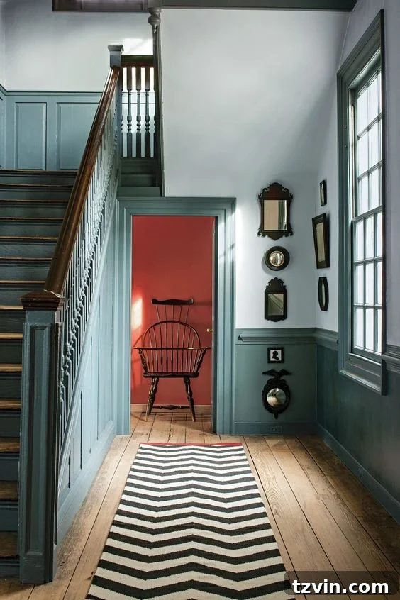
Transform Your Home: Discover the Best Contrast Trim Paint Colors Recommended by Interior Designers
In the evolving world of interior design, trends come and go, but some stand the test of time, while others emerge to offer a refreshing change. While “color drenching” has had its moment, a new, equally impactful trend is captivating homeowners and designers alike: the art of contrasting trim. This technique, far from being just a fleeting fad, offers a sophisticated and dynamic way to add depth, character, and a touch of modern elegance to any space.
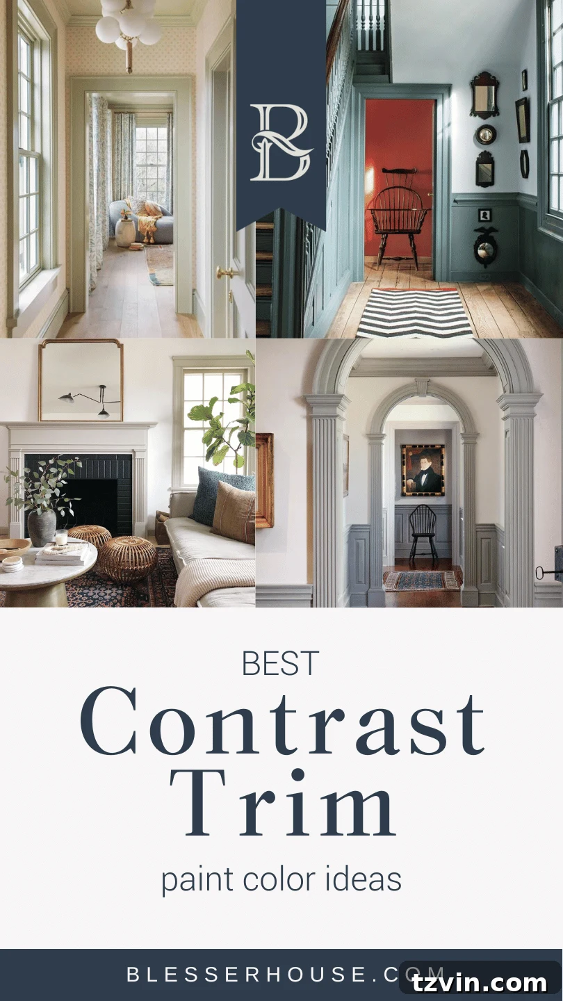
Imagine the dramatic potential of your hallway, staircase, or living room with crisp, chunky wainscoting and a carefully selected burst of color painted on the trim and moldings. This isn’t just about paint; it’s about creating an architectural statement, defining spaces, and infusing personality into your home. The appeal is undeniable, promising a powerful transformation without demanding a monumental budget or a complete overhaul of your existing wall colors.
If you’re weary of monotonous white walls or any single wall color dominating your space, embracing a contrasting color on just your trim elements can unveil a massive aesthetic shift. This clever design strategy allows you to introduce vibrancy, sophistication, or a subtle accent that elevates the entire room’s ambiance. It’s an efficient and effective solution for achieving a high-end look with minimal effort, making it a favorite among design professionals.
What Exactly is Contrast Trim in Interior Design?
Contrast trim, at its core, is an interior design technique where the architectural trim (such as baseboards, crown molding, door casings, window frames, and wainscoting) is painted a distinctly different color from the main wall color. Typically, this involves pairing light-colored walls – often neutral shades like crisp whites, soft grays, or warm beiges – with a trim color that offers a stark visual difference. The beauty of this approach lies in its ability to highlight and accentuate the architectural features of a room, transforming them from mere functional elements into striking design statements.
The choice of trim color is crucial: the darker or more saturated the hue you select, the more pronounced the contrast and the greater the drama it introduces into a room. This design choice can create a variety of moods, from subtle sophistication to bold artistic expression, depending on the colors chosen and the overall aesthetic of the home.
Why Opt for Contrasting Trim? The Benefits Unveiled
For those eager to inject vibrant personality or sophisticated depth into a neutral home without committing to painting entire walls, contrasting trim presents an ideal solution. It’s a less labor-intensive project compared to repainting entire rooms, yet it yields an incredibly impactful result. Here’s why contrasting trim is gaining immense popularity:
- Highlights Architectural Features: In older homes brimming with ornate moldings, intricate door casings, and detailed wainscoting, contrasting trim serves to beautifully emphasize these unique architectural elements. It draws the eye to craftsmanship that might otherwise blend into the background, celebrating the home’s historical character.
- Creates Visual Interest: In contemporary homes or smaller spaces where clutter is a concern, contrasting trim offers a fantastic way to introduce visual intrigue and dimension without adding physical objects. It provides a focal point, making a room feel more intentional and designed.
- Defines Spaces: By outlining the edges of a room, doors, and windows, contrasting trim can subtly define areas, making a space feel more structured and cohesive. This is particularly effective in open-concept layouts where subtle visual boundaries are desired.
- Adds Depth and Drama: A darker trim against a lighter wall instantly adds depth, making walls recede slightly and emphasizing the trim as a decorative frame. This dramatic effect can make a room feel more grand, cozy, or impactful, depending on the color palette.
- Budget-Friendly Transformation: Compared to extensive renovations or furniture purchases, a paint project involving only the trim is relatively inexpensive, offering a high return on investment in terms of aesthetic appeal.
- Personal Expression: It’s a fantastic avenue for personal expression. Whether you prefer subtle tone-on-tone contrasts or bold, unexpected color pairings, contrasting trim allows you to infuse your unique style into your living environment.
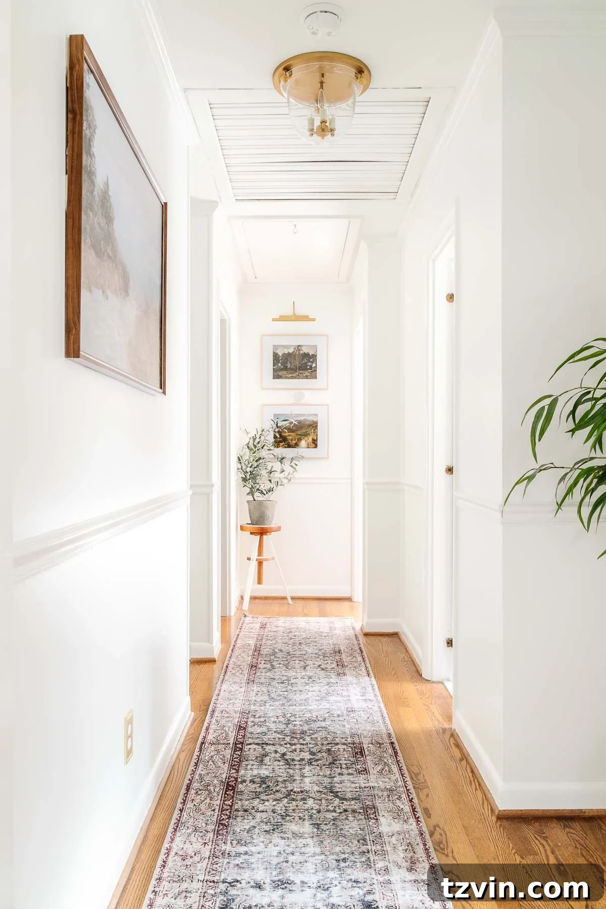
Consider our own hallway, stairway, and foyer. It’s a space that has always been predominantly white, a palette I’ve enjoyed for its airy simplicity. However, I can’t help but envision the extraordinary dynamism it would achieve with a striking pop of contrasting paint on the existing trim, elegant crown molding, and stately doors. The transformation promises to be nothing short of breathtaking, adding an entirely new layer of character and visual appeal.
Can you envision the captivating change already?
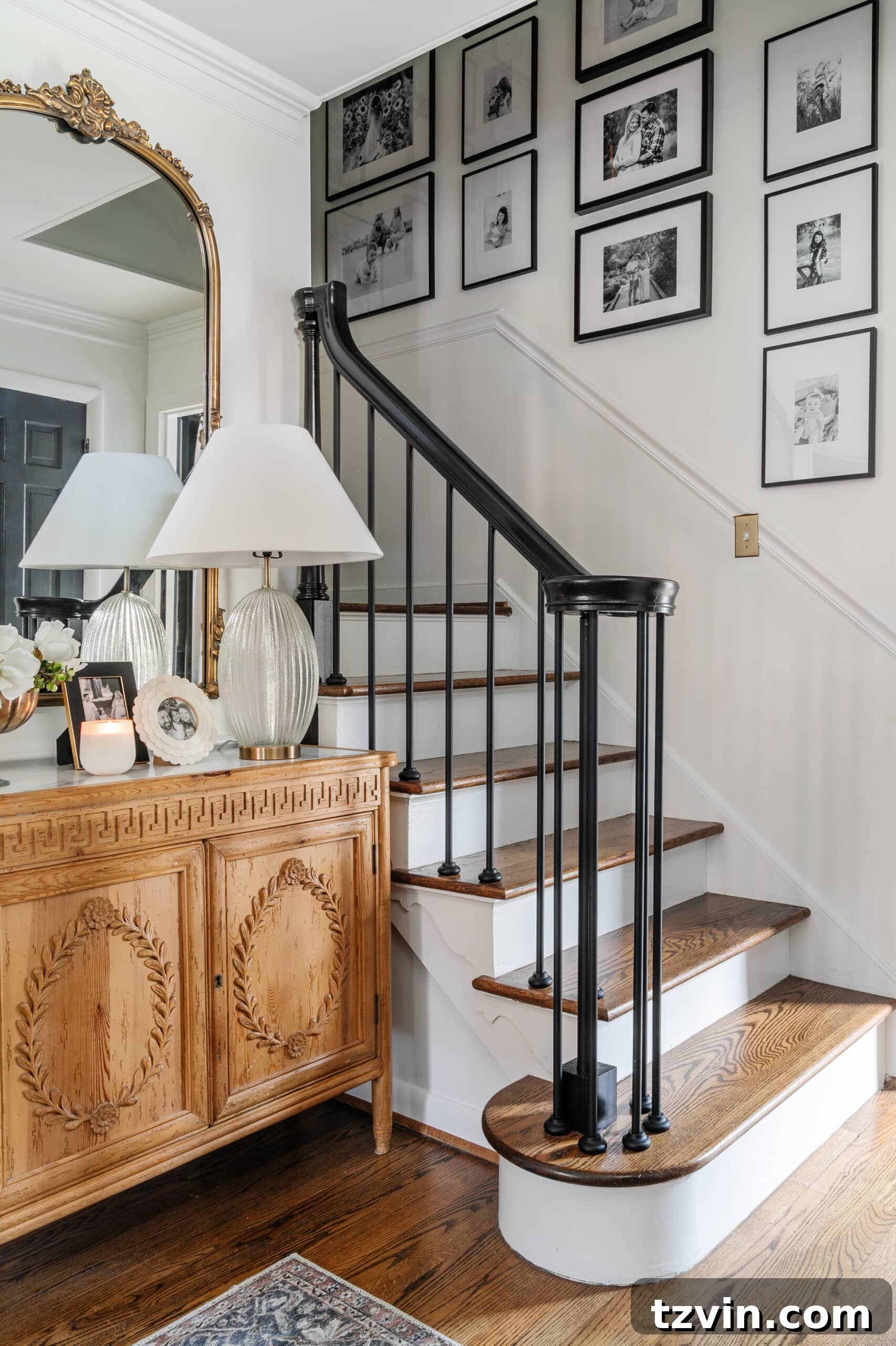
Imagine the invigorating dose of color a deep blue or lush green scheme would impart on the trim and wainscoting, creating an immersive and sophisticated journey through your home!
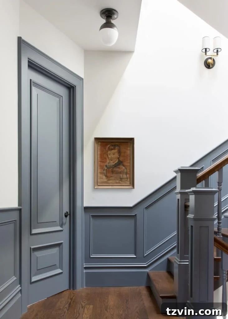
Source | Sunset
Inspiring Paint Color Ideas for Contrasting Trim: A Spectrum of Choices
If you’re eager to embrace the high-contrast look in your home, the good news is that interior designers and paint professionals have a wealth of popular and highly recommended paint colors perfect for trim work. To help you navigate the myriad of options, we’ve rounded up top selections across every color family, ensuring that every hue gets its well-deserved moment in the design spotlight.
Remember, while these recommendations offer an excellent starting point, the ultimate choice for your trim color should resonate with your personal style and complement your home’s unique lighting and existing decor. It’s always a wise practice to visit your local paint store to examine paint chips in person, gather paint pots for samples, and rigorously test your chosen trim color combinations in the varying natural light conditions of your own home. This crucial step prevents costly mistakes and ensures you achieve the desired ambiance.
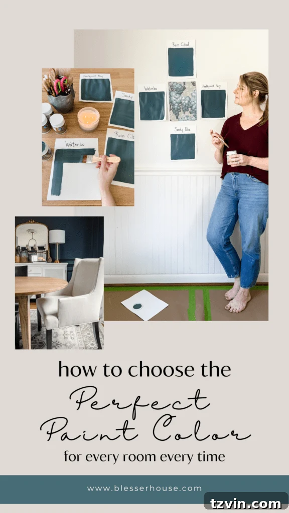
Essential Reading: How to Choose Paint Colors for Your Home Interior Like a Pro
Challenge your conventional design instincts and dare to deviate from traditional white trim. By exploring different shades and more vibrant hues, you can unlock an unparalleled level of sophistication and personality for your living spaces. I, for one, will definitely be consulting my trusty paint deck fan in the coming week to “try on” several of these captivating colors for my own project!
Source | Becca Interiors | Rikki Snyder
Red Trim Paint Colors: Boldness and Warmth
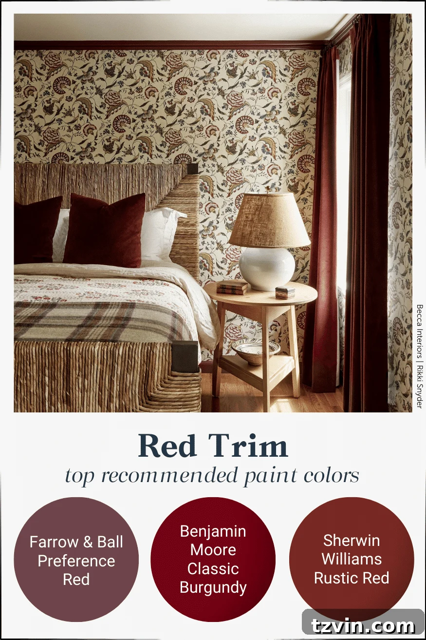
Red, a color synonymous with passion, energy, and warmth, makes a striking statement when applied to trim. From deep burgundies to vibrant crimsons, red trim can evoke a sense of heritage, luxury, or playful drama. It pairs beautifully with neutral walls like cream or light gray, creating a sophisticated contrast. Consider using red trim in dining rooms to stimulate conversation, or in studies for a classic, distinguished feel. It can also add a cozy, inviting touch to living spaces.
- Farrow & Ball Preference Red
- Benjamin Moore Classic Burgundy
- Sherwin Williams Rustic Red
Source | Avery Cox Design
Orange Trim Paint Colors: Earthy and Invigorating
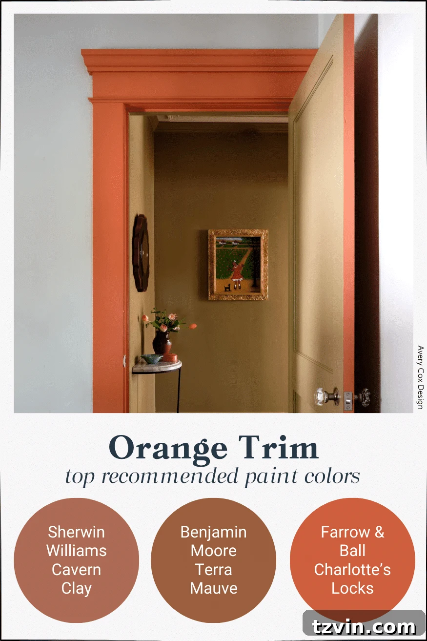
Orange, ranging from soft terra cotta to vibrant tangerine, offers an invigorating and often earthy appeal. When used for trim, it can inject a lively, optimistic energy or a grounding, organic feel, depending on the shade. Terracotta tones are excellent for creating a Southwestern or bohemian vibe, especially against creamy whites or warm beiges. Brighter oranges can add a pop of modern zest to more contemporary spaces. It’s an unconventional choice that truly makes a design statement.
- Sherwin Williams Cavern Clay
- Benjamin Moore Tarra Mauve
- Farrow & Ball Charlotte’s Locks
Source | Wit and Delight
Yellow Trim Paint Colors: Sunny and Uplifting
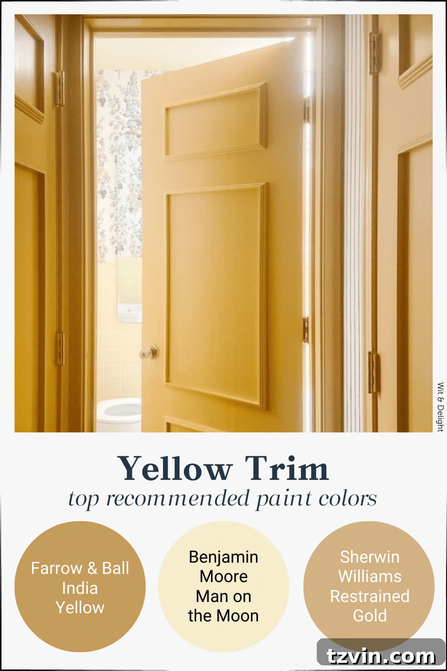
Yellow, the color of sunshine, inherently brings cheerfulness and warmth into a room. Yellow trim, especially in muted mustards or rich golds, can add an unexpected layer of sophistication and light. It works wonderfully in spaces that lack natural light, instantly brightening the ambiance. Paired with soft greys or muted blues on walls, yellow trim can create a cheerful yet refined look, ideal for kitchens, nurseries, or creative spaces.
- Farrow & Ball India Yellow
- Benjamin Moore Man on the Moon
- Sherwin Williams Restrained Gold
Source | One Kindesign
Green Trim Paint Colors: Serene and Natural
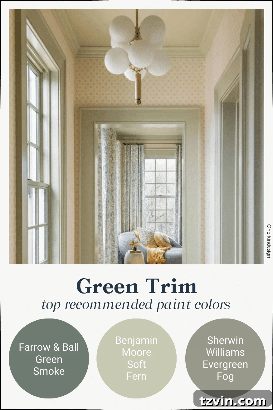
Green, a color deeply connected to nature, offers a sense of tranquility, balance, and growth. Green trim can range from vibrant emeralds to muted sages and deep forest greens, each bringing a unique feel. Darker greens create a sophisticated library aesthetic or a cozy, enveloping atmosphere, especially when paired with off-white or cream walls. Lighter, softer greens can evoke a fresh, botanical feel, perfect for sunrooms, bedrooms, or bathrooms, fostering a connection to the outdoors.
- Farrow & Ball Green Smoke
- Benjamin Moore Soft Fern
- Sherwin Williams Evergreen Fog
Source | Vanderhorn Architects | Amy Hirsch Design
Blue Trim Paint Colors: Calm and Classic
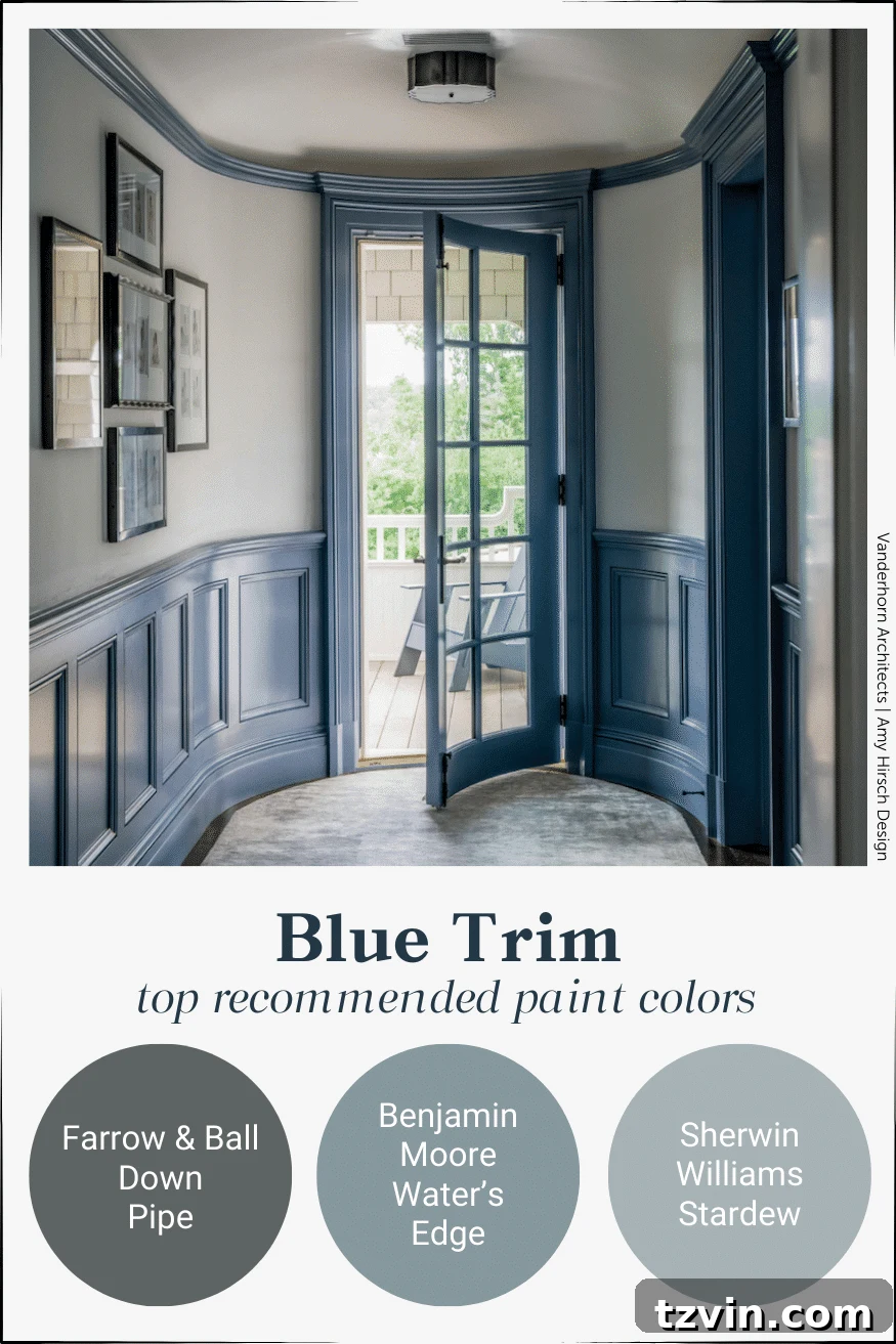
Blue, a universally beloved color, embodies serenity, stability, and intelligence. As a trim color, blue can range from deep, moody navy to soft, airy sky blues, each creating a distinct mood. Navy trim against crisp white walls offers a classic, maritime-inspired elegance, perfect for a traditional study or a sophisticated living room. Lighter blues can bring a coastal calm to bedrooms or bathrooms. Blue trim is incredibly versatile, adapting to various design styles from modern to farmhouse.
- Farrow & Ball Down Pipe
- Benjamin Moore Water’s Edge
- Sherwin Williams Stardew
Source | Notes of Colour
Purple Trim Paint Colors: Regal and Mysterious
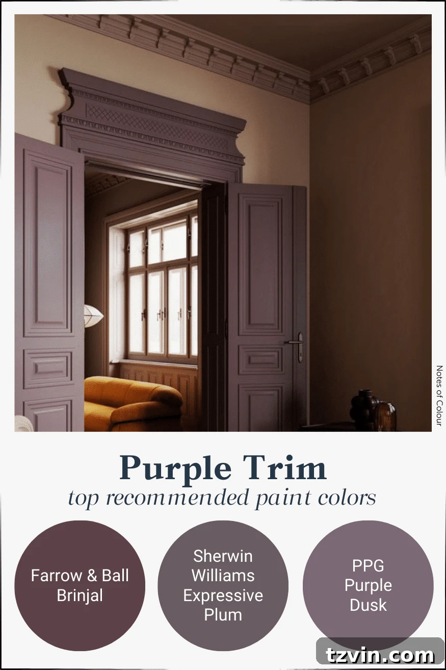
Purple, historically associated with royalty and luxury, brings a touch of opulence and intrigue. Deep plums and rich eggplants for trim can create a dramatic, sophisticated, and somewhat mysterious ambiance, particularly effective in dining rooms or intimate studies. Lighter lavenders or mauves can introduce a softer, more romantic or whimsical feel, suitable for bedrooms or dressing areas. Purple trim is a bold, artistic choice that speaks volumes about personal style.
- Farrow & Ball Brinjal
- Sherwin Williams Expressive Plum
- PPG Purple Dusk
Source | Stef Turner
Pink Trim Paint Colors: Playful and Chic
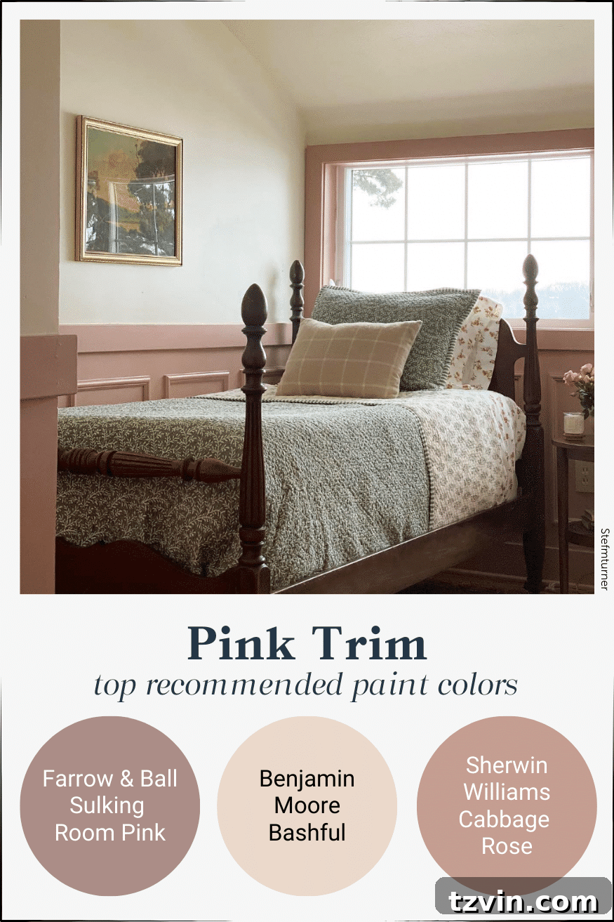
Pink, often associated with gentleness, romance, and playfulness, can be surprisingly chic and sophisticated as a trim color. From soft blushes to bolder fuchsias, pink trim can add warmth and a modern edge. Muted dusty pinks provide a serene, almost neutral backdrop that feels fresh and inviting, especially against light gray or warm beige walls. Brighter pinks can create a vibrant, artistic statement in children’s rooms or eclectic living spaces. It’s a color that defies expectations and adds unexpected charm.
- Farrow & Ball Sulking Room Pink
- Benjamin Moore Bashful
- Sherwin Williams Cabbage Rose
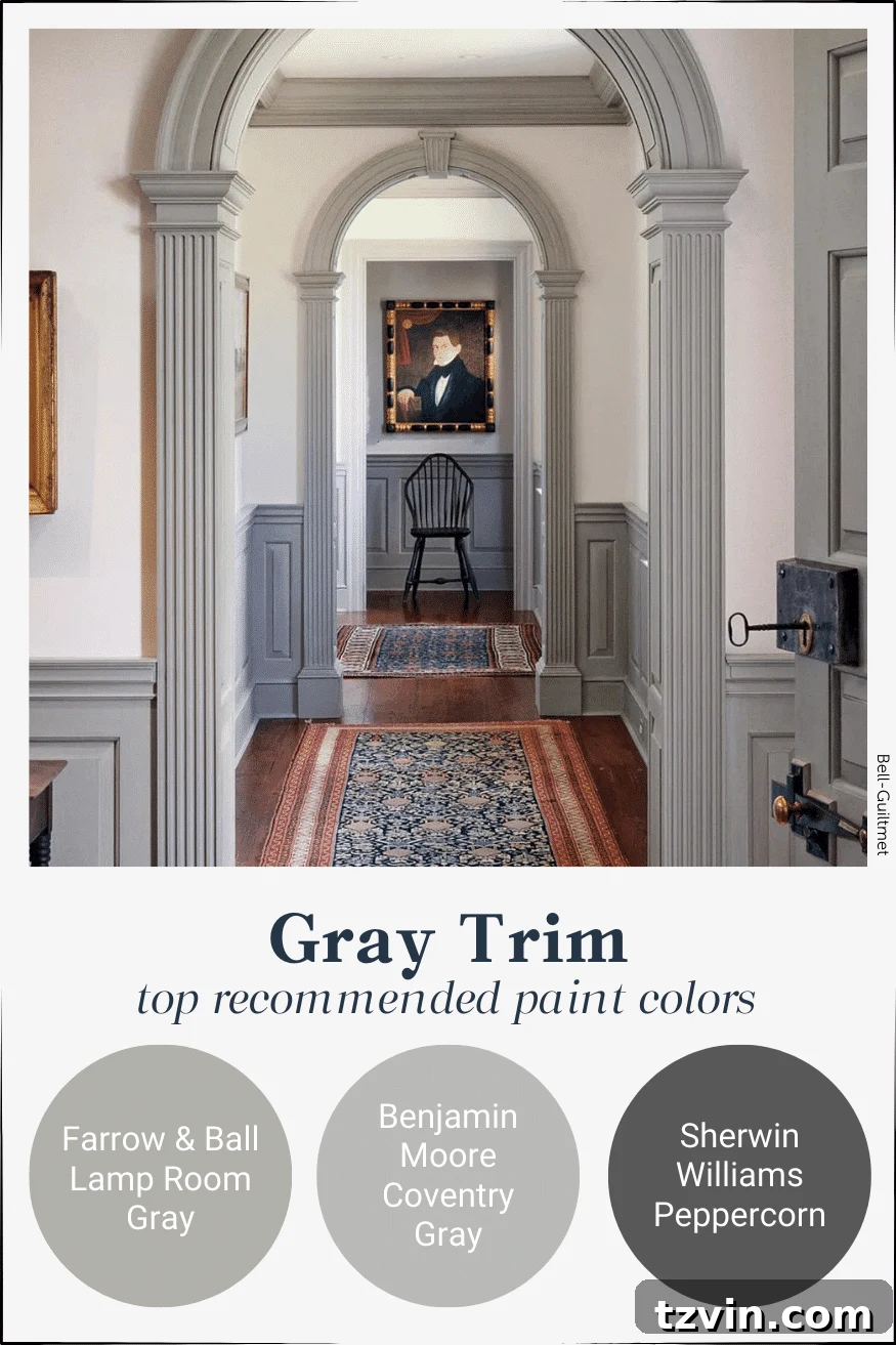
Source | Bell-Guilmet
Gray Trim Paint Colors: Modern and Understated
Gray, a timeless neutral, offers an incredible range of possibilities for trim, from light, airy silvers to deep, dramatic charcoals. Gray trim provides a sophisticated and modern contrast that is less stark than black but equally impactful. It pairs seamlessly with almost any wall color, from crisp whites to deeper blues or greens, creating a refined and elegant backdrop. Charcoal gray trim can add an architectural edge to a minimalist design, while lighter grays offer a subtle, sophisticated frame for more traditional settings.
- Farrow & Ball Lamp Room Gray
- Benjamin Moore Coventry Gray
- Sherwin Williams Peppercorn
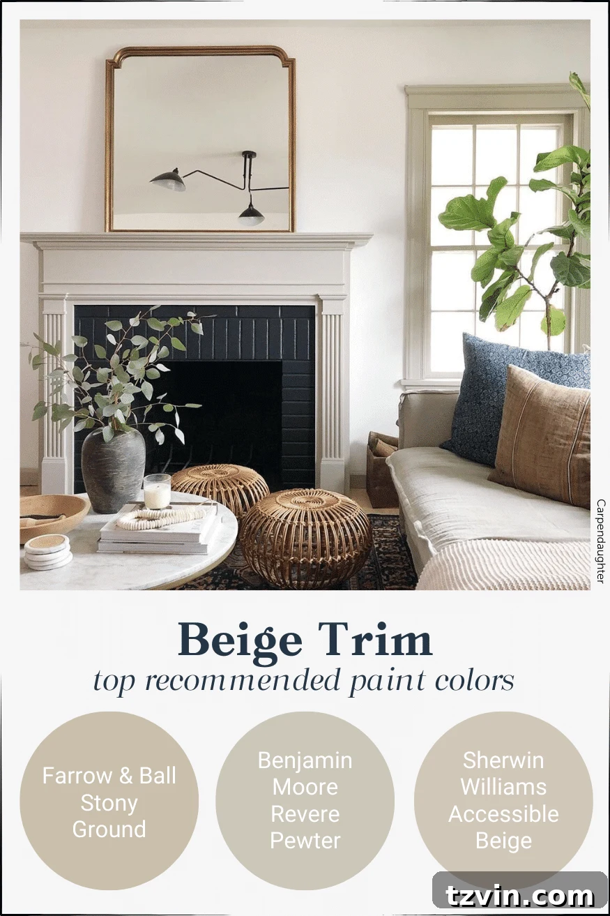
Source | Carpendaughter
Beige Trim Paint Colors: Warm and Inviting Neutrals
Beige, a classic and enduring neutral, offers a subtle yet effective contrast, particularly when paired with off-white walls or slightly darker beige tones. Beige trim brings warmth, comfort, and an inviting atmosphere without overwhelming the space. It’s perfect for creating a sophisticated, understated look that feels both classic and contemporary. Different undertones within beige – from sandy to greige – allow for a nuanced contrast that enhances architectural details gracefully, ideal for traditional or minimalist interiors.
- Farrow & Ball Stony Ground
- Benjamin Moore Revere Pewter
- Sherwin Williams Accessible Beige
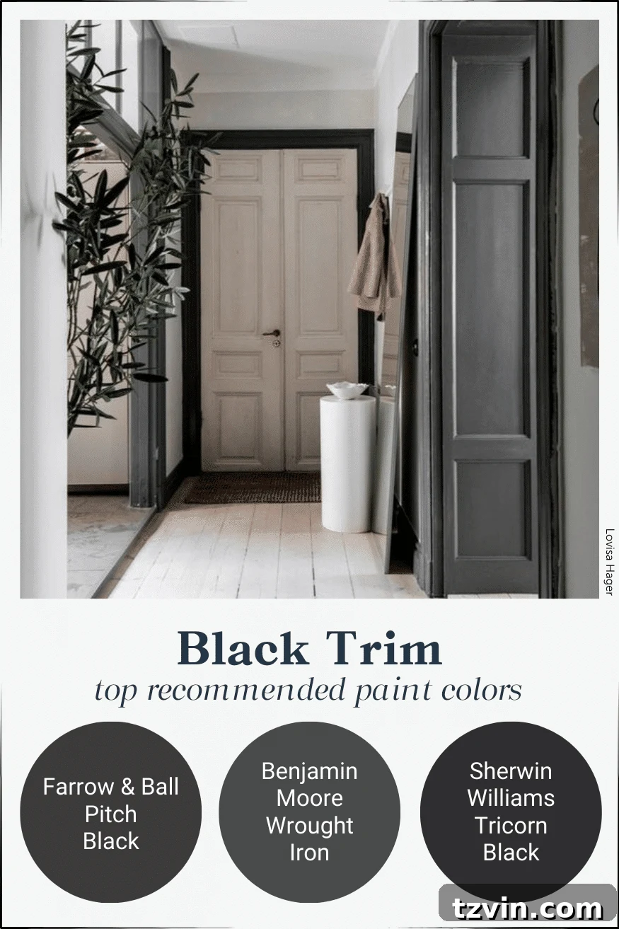
Source | Lovisa Hager
Black Trim Paint Colors: Ultimate Drama and Sophistication
For the boldest statement, black trim is the ultimate choice. It provides unparalleled drama, sophistication, and a distinctly modern edge. Against crisp white or very light gray walls, black trim defines a room with striking precision, drawing attention to every architectural line. This high-contrast look can make a room feel expansive and incredibly chic. It’s perfect for contemporary homes, industrial styles, or any space seeking a powerful, minimalist statement. Consider it for a grand foyer or a sleek living area.
- Farrow & Ball Pitch Black
- Benjamin Moore Wrought Iron
- Sherwin Williams Tricorn Black
How to Find the Perfect Contrast Trim Color for Your Space
Choosing the ideal contrast trim color can feel daunting, but there’s a simple, foolproof trick that interior designers often employ to ensure harmonious results. This method guarantees that your chosen wall and trim colors will naturally complement each other, creating a cohesive and sophisticated look every time.
Here’s the little secret that ALWAYS works when aiming for that perfect high-contrast aesthetic:
- Start with a Paint Sample Strip: Head to your local paint store and pick up several paint sample strips that catch your eye. Each strip typically showcases a gradient of shades within the same color family, from lightest to darkest.
- Select Your Wall Color: For your walls, choose either the lightest color or the second lightest color from your selected paint sample strip. This establishes a bright, airy base that will make your trim truly pop.
- Choose Your Trim Color: Using the *very same paint sample strip*, select the darkest color or the second darkest color for your trim.
Why does this trick work so flawlessly? Because all the colors on a single paint strip are designed to have the same inherent undertones. By selecting shades from the same strip, you eliminate any guesswork regarding whether the colors will clash. They are inherently meant to work together, guaranteeing a cohesive and visually pleasing pairing. This method ensures your contrast is striking yet harmonious, giving your home a professionally curated feel.
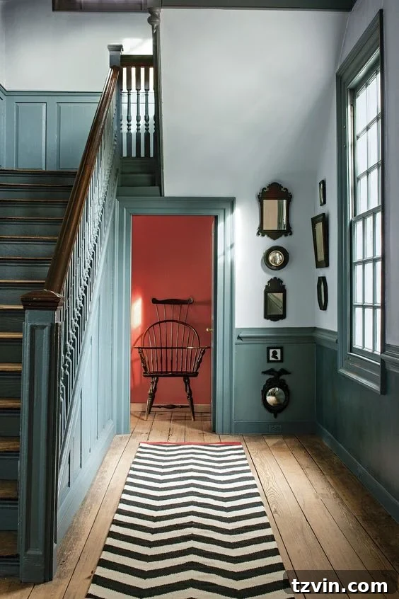
Source | Benjamin Moore
In addition to this trick, consider the existing elements of your room: your furniture, flooring, and natural light. A room with abundant natural light can handle bolder, darker trim, while a darker room might benefit from a slightly lighter, reflective trim color. Also, don’t overlook the importance of paint sheen. A semi-gloss or high-gloss finish on trim not only makes it more durable and easier to clean but also adds a subtle reflective quality that enhances the contrast and highlights architectural details even further.
Are you inspired to try out contrast trim in your home? Or perhaps you’ve already ventured into this captivating trend? Share your experiences!
If you’re not quite ready to commit to repainting all your trim, a simpler yet equally effective step is to paint your interior doors a contrasting color. This alone can introduce significant visual interest and depth, making a remarkable difference with minimal effort. It really does go such a long way in elevating your home’s aesthetic.
Explore More Paint Color Inspiration and Ideas
Beyond the captivating world of contrast trim, there’s a universe of paint possibilities waiting to transform your home. Dive into these additional resources to discover more expert recommendations and creative painting ideas for every corner of your living space.
The Best Gold Spray Paints: Ranked for Superior Finish

Master the Art: How to Choose Paint Colors for Your Home Interior Like a Pro
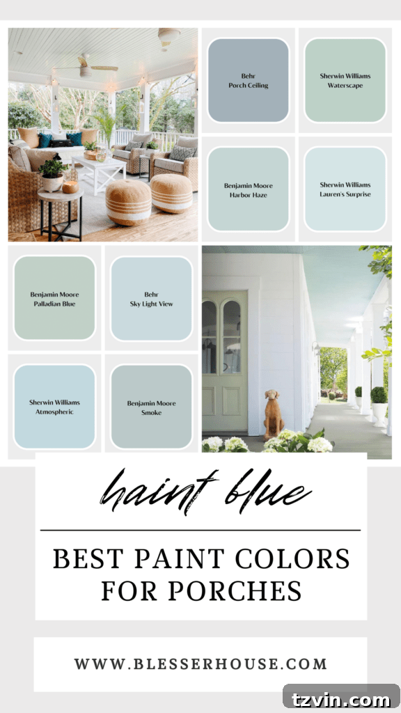
Southern Charm: Discover the Best Haint Blue Paint Color for Porch Ceilings
See more expert paint color recommendations and guides for your home here.