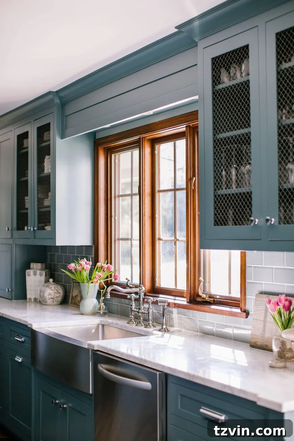
The Top 12 Blue-Green Teal Paint Colors Designers Love for Moody & Vibrant Spaces
Welcome to the enchanting world of teal paint! If you’re looking to infuse your home with a color that is both calming and invigorating, sophisticated yet playful, then teal is your perfect muse. This week, we’re diving deep into the captivating allure of teal, particularly as we transform an office/conference room/multipurpose meeting space for The Cottage with The Life House Women’s Shelter in our community. Our goal? To craft an environment that feels serene, deeply moody, and undeniably vibrant – a harmony that only teal can truly achieve.
Over the years, we’ve consistently gravitated towards blue-green paint colors for our room makeovers, drawn by the immediate sense of calm and uplifting energy they evoke. The power of paint to transform a mood and atmosphere the moment you step into a room is truly remarkable, and teal excels at this like no other shade.
My journey into the rich spectrum of dark blue-green paint colors felt like a delightful descent into an “Alice in Wonderland”-esque rabbit hole – a fitting adventure in my quest to pinpoint the absolute best hues. This exploration uncovered a treasure trove of designer favorites, perfect for curating a comprehensive guide to add to our favorite paint color archives. Prepare to discover the ultimate shades that will bring depth, character, and a touch of magic to your bedrooms, bathrooms, and home offices.
Where to Unleash the Beauty of Teal Paint Colors in Your Home
Teal is more than just a trending color; it’s a statement. Its rising popularity was solidified when Glidden named its mid-tone blue-green shade, Vining Ivy, as its paint color of the year. This recognition highlights a broader shift in homeowner preferences. After years dominated by neutral grays and an abundance of soft pastels that emerged during the pandemic, many are now craving bold colors that possess distinct character and personality.
The unique appeal of teal lies in its balanced composition. As a medium to dark shade that gracefully oscillates between blue and green, it offers the calming attributes of blue alongside the revitalizing energy of green. This makes it an incredibly versatile choice for various rooms where both serenity and vibrancy are desired. According to color psychology, teal is known to promote feelings of clarity, emotional balance, and significant stress relief, making it a powerful tool for interior design.
Given its deep connections to the natural world – from the serene depths of the ocean and the vibrant hues of tropical lagoons to the lushness of jungles and the mesmerizing patterns of peacock feathers – incorporating teal into your home can effortlessly bring a soothing, organic feel to any space. It’s a color that speaks of both tranquility and exotic beauty, creating an immersive experience.
Ideal Spaces for Teal:
- Bedrooms: Create a peaceful, spa-like sanctuary where relaxation is paramount. Teal walls can envelop you in comfort, perfect for winding down.
- Bathrooms: Transform a functional space into a refreshing, luxurious retreat. Teal evokes feelings of cleanliness and calm, reminiscent of ocean waters.
- Home Offices: Foster an environment of focus and creativity. The balanced nature of teal can reduce visual fatigue and promote a clear mindset for productivity.
- Living Rooms: Introduce sophistication and an inviting depth. Teal can serve as a stunning backdrop for diverse decor styles, from modern minimalist to bohemian chic.
- Dining Rooms: Elevate mealtime experiences with an elegant and stimulating atmosphere. It encourages engaging conversation while maintaining a sense of refinement.
- Kitchen Cabinets: For a striking and modern update, painting kitchen cabinets in a rich teal offers a bold statement without overwhelming the space.
- Accent Walls: If a full room feels too daring, a teal accent wall with features like board and batten can add a relaxed mood and a subtle pop of color to an otherwise busy or neutral area.
- Front Doors: Make a memorable first impression with a welcoming and unique teal front door that hints at the style within.
Whether you lean towards a teal-blue or a teal-green, this color provides a bold yet grounding presence. It’s an excellent choice for those seeking to make a statement while maintaining an inviting and harmonious home environment.
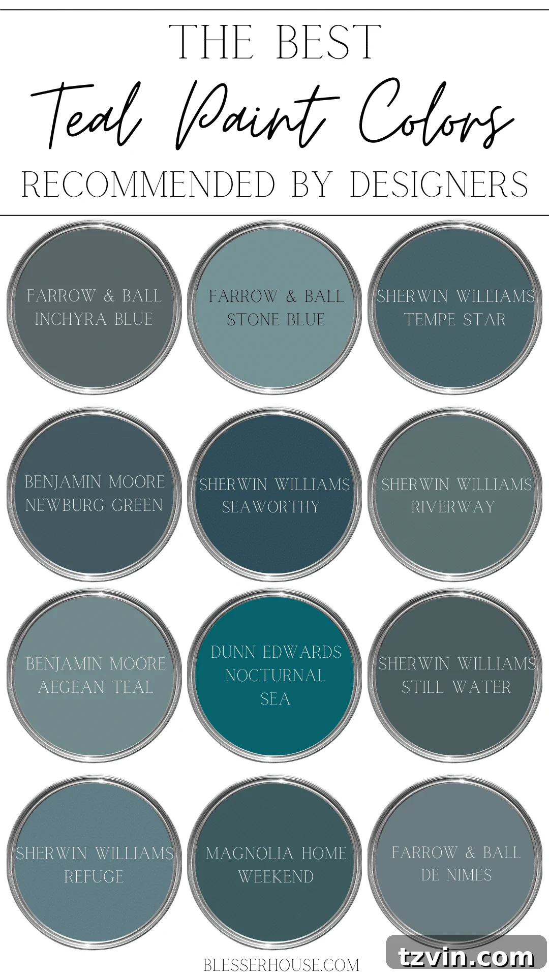
12 Best Blue-Green Teal Paint Colors Recommended by Designers
Through countless samples and numerous room makeovers, we’ve had the pleasure of working with a wide array of dark teal paint colors. Building on our personal favorites, I’ve also extensively researched and compiled a list of additional teal blue paint colors that are consistently recommended and utilized by leading interior designers. This curated selection represents the pinnacle of blue-green beauty, offering shades that promise to transform your space.
Farrow & Ball Inchyra Blue
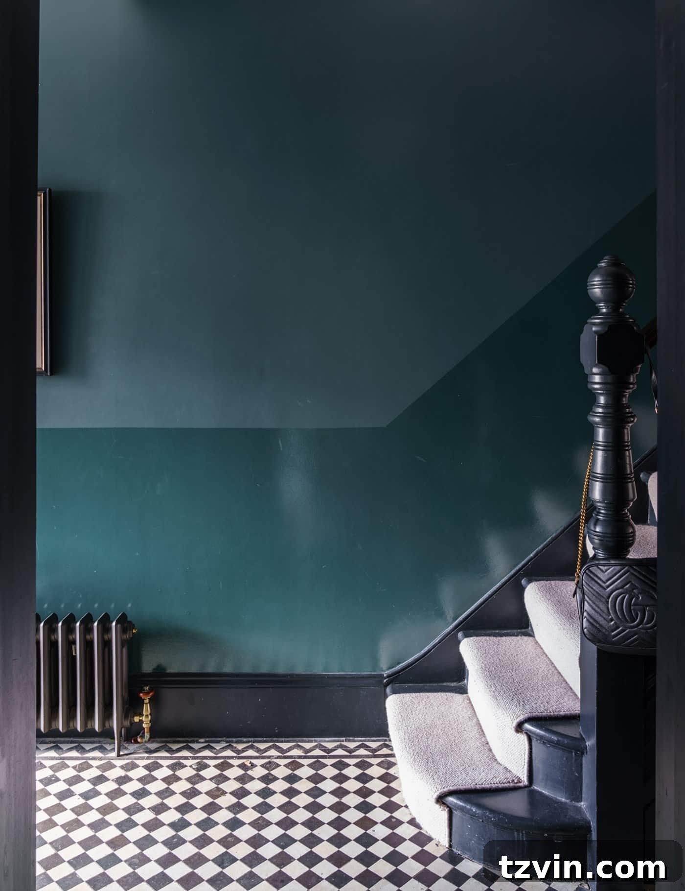
Inchyra Blue is a rich, dark blue-green that truly embodies sophistication. It has a beautiful depth that can appear more blue in some lights and more green in others, making it a dynamic choice. Perfect for creating a dramatic and cozy atmosphere, it works wonderfully in studies, dining rooms, or a luxurious entryway, offering a grand yet inviting feel. Its complexity pairs beautifully with natural wood tones and metallic accents.
Farrow & Ball Stone Blue
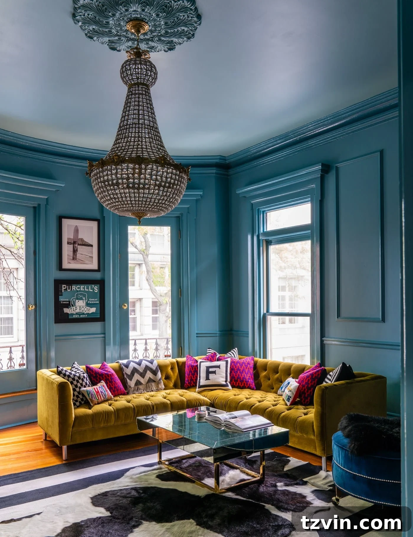
Stone Blue by Farrow & Ball is a timeless, aged blue that carries subtle green undertones, giving it a soft, almost chalky teal quality. It’s less intense than some other teals, offering a gentle yet distinct color that can make a room feel both historical and fresh. Ideal for living rooms or traditional bedrooms, it evokes a sense of calm and heritage, especially when applied with a high-gloss finish for added drama.
Sherwin Williams Tempe Star
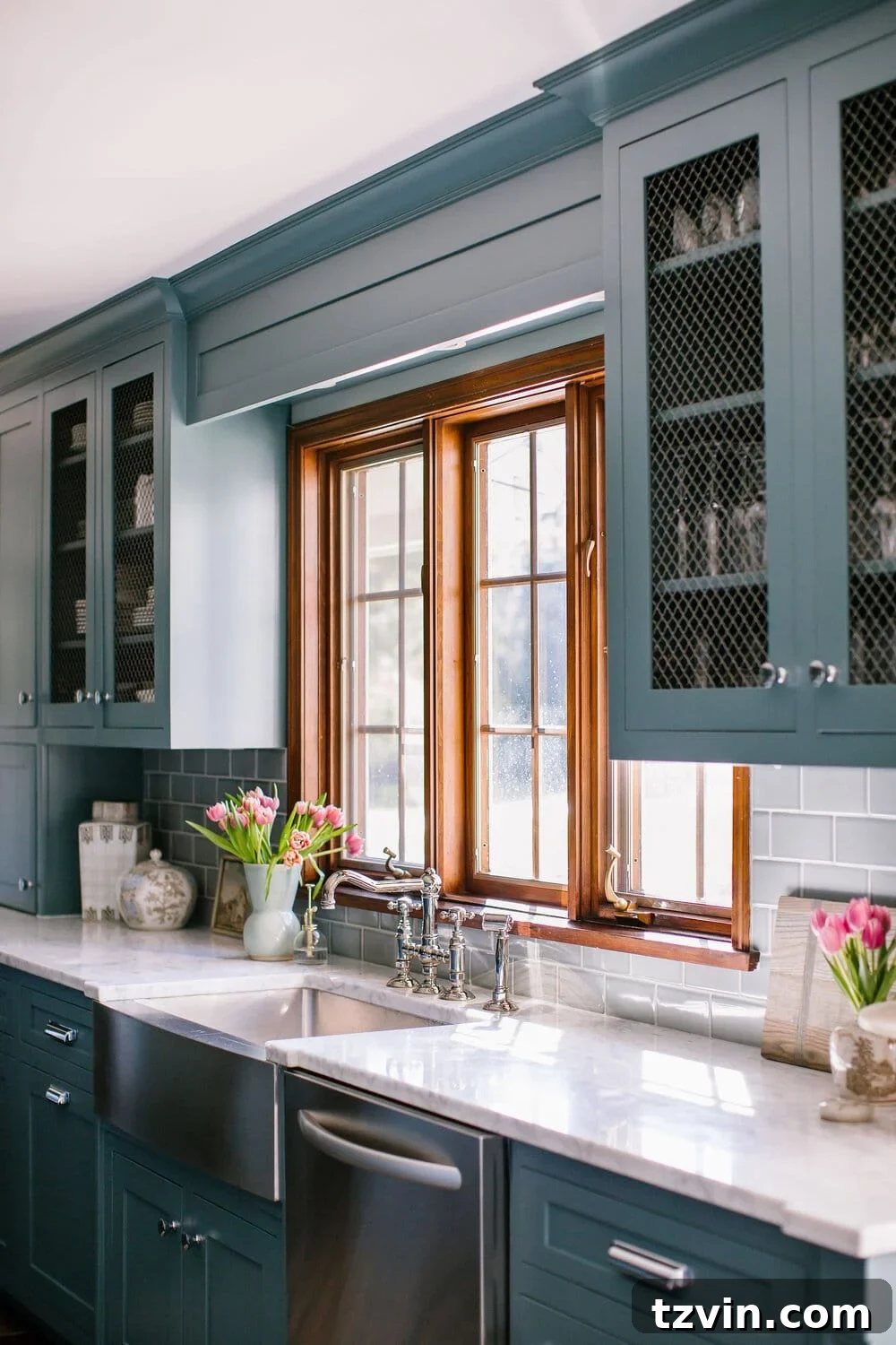
Tempe Star from Sherwin Williams is a stunningly rich, dark teal with a strong lean towards blue. It’s a bold and luxurious choice, perfect for making a dramatic statement, such as on kitchen cabinets or as an accent wall in a sophisticated living room. This color brings a deep sense of calm and elegance, pairing beautifully with brass hardware and warm wood tones to create a truly bespoke look.
Benjamin Moore Newburg Green
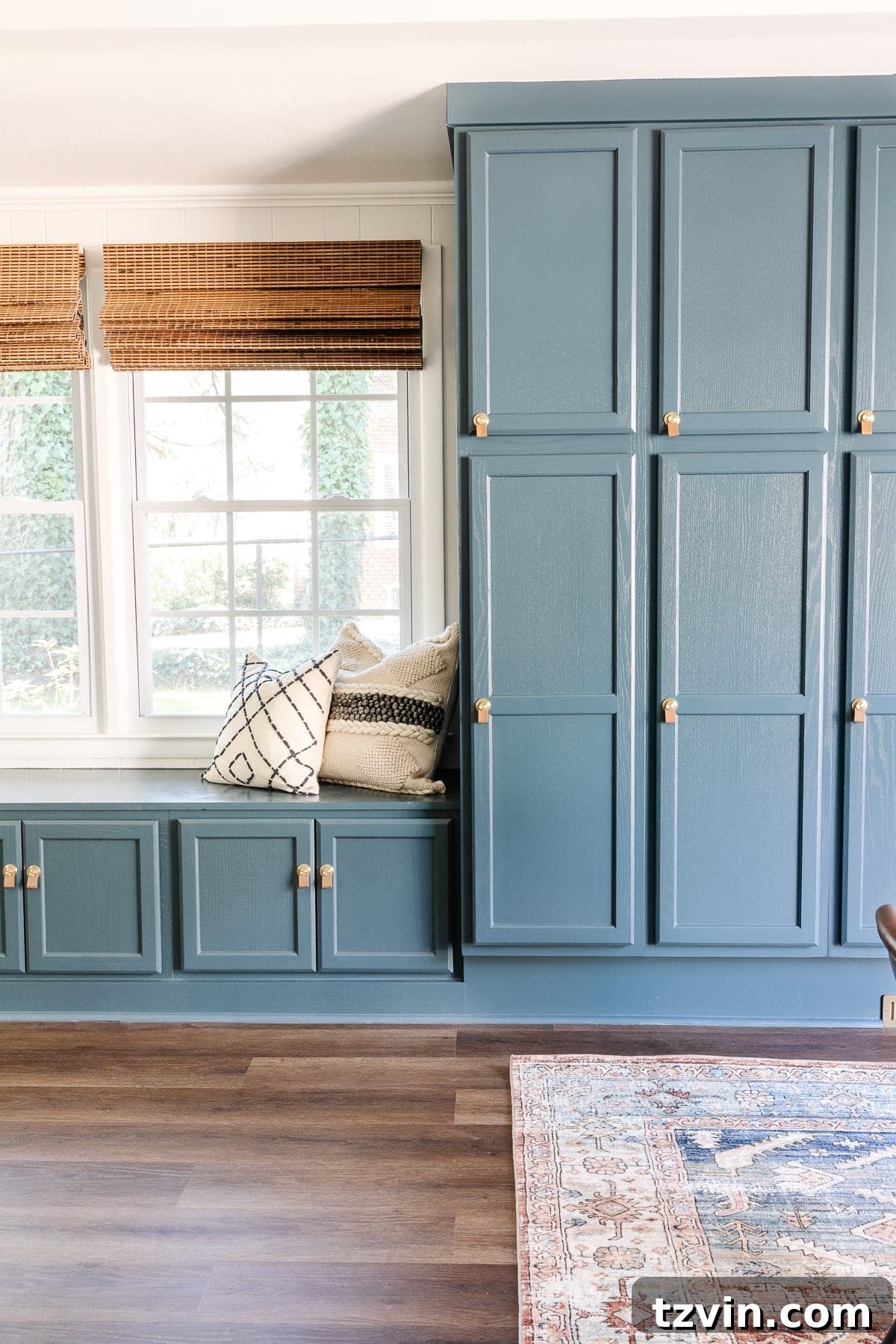
Benjamin Moore’s Newburg Green is a deep, majestic blue-green that feels both rich and inviting. It has a classic quality, reminiscent of traditional libraries or studies. This shade works incredibly well on built-in cabinetry, creating a focal point with timeless appeal. It’s a versatile color that can look elegant and formal, or more playful and relaxed depending on the surrounding decor and lighting conditions.
Sherwin Williams Seaworthy
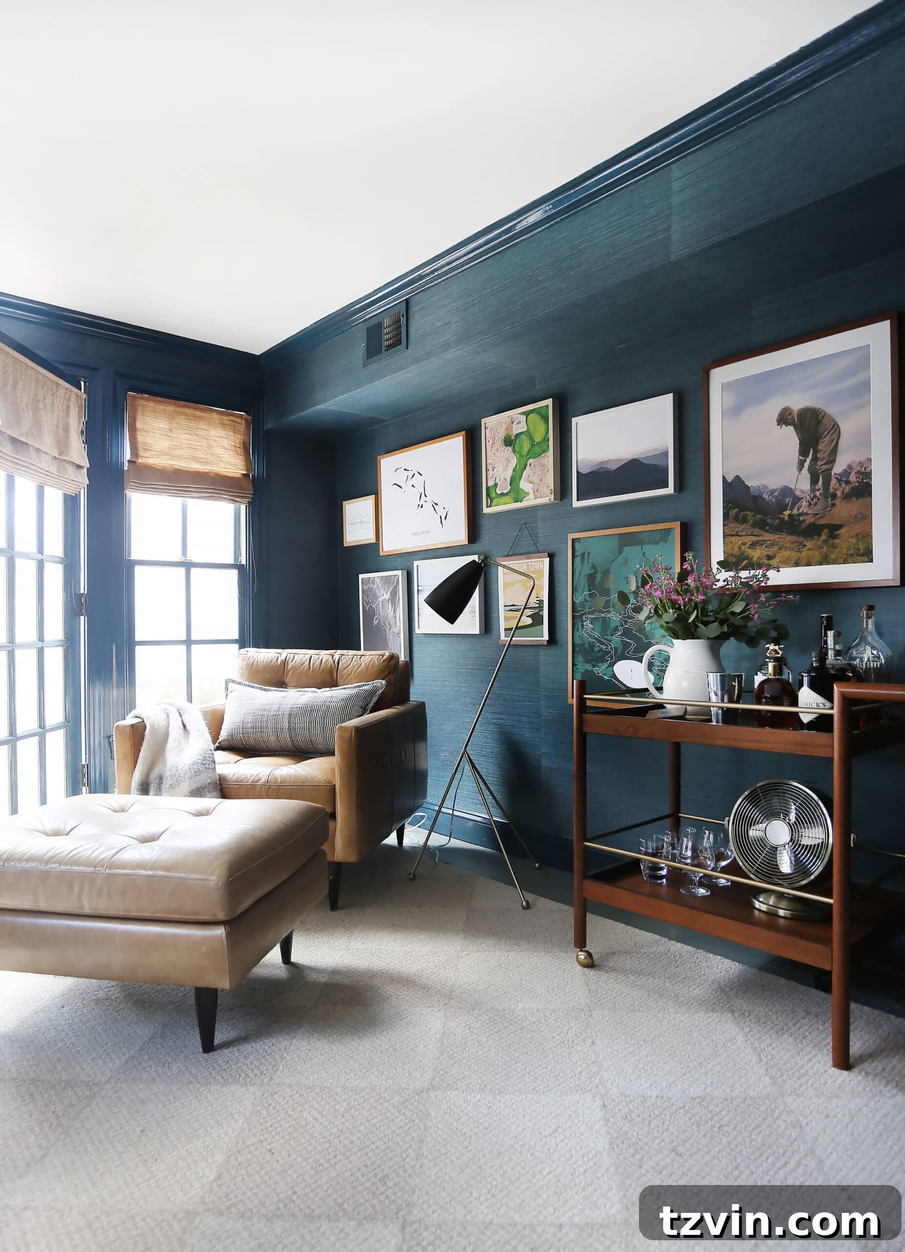
Seaworthy by Sherwin Williams is a dynamic teal that captures the essence of deep ocean waters. It’s a vibrant, medium-dark blue-green that brings life and energy to any room. This color is particularly effective in spaces aiming for a coastal, nautical, or even a bold bohemian aesthetic. It provides a striking backdrop that enhances brighter accents and natural textures, creating a sense of adventure and tranquility.
Sherwin Williams Riverway
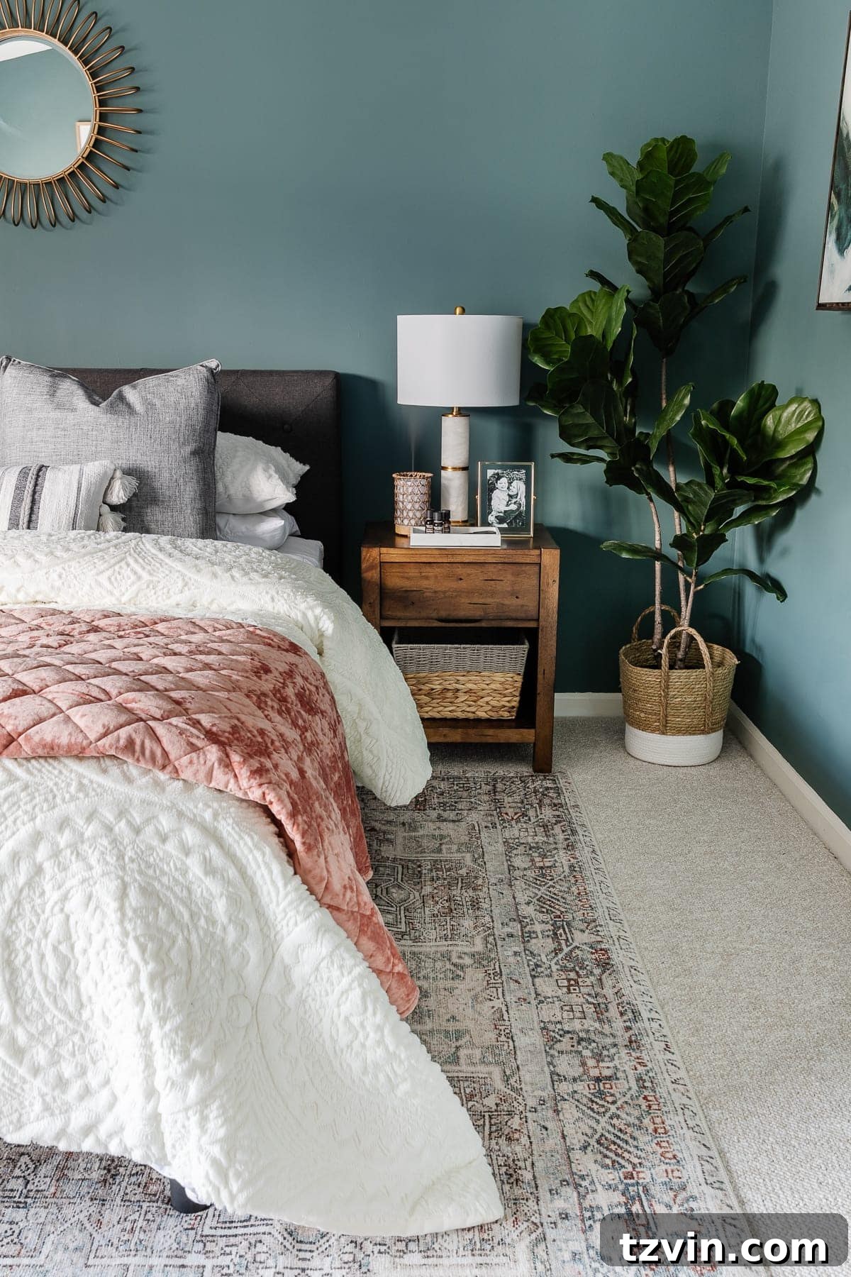
Riverway from Sherwin Williams is a soothing and sophisticated blue-green that leans slightly more green, offering a tranquil depth. It’s an excellent choice for bedrooms, creating a serene and enveloping atmosphere conducive to relaxation. This shade pairs beautifully with warm neutrals and soft pinks or blush tones, allowing for a balanced and elegant design scheme that feels both fresh and timeless.
Benjamin Moore Aegean Teal
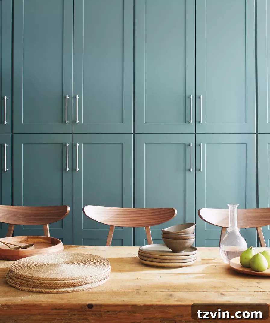
Benjamin Moore’s Aegean Teal, famously a former Color of the Year, is a balanced and inviting blue-green that truly captures the warmth of its namesake sea. It possesses a slightly desaturated quality that prevents it from being overly bright, giving it an earthy elegance. Perfect for kitchen cabinets or a cozy reading nook, it radiates both calmness and confidence, adapting beautifully to various light conditions and decorative styles.
Dunn Edwards Nocturnal Sea
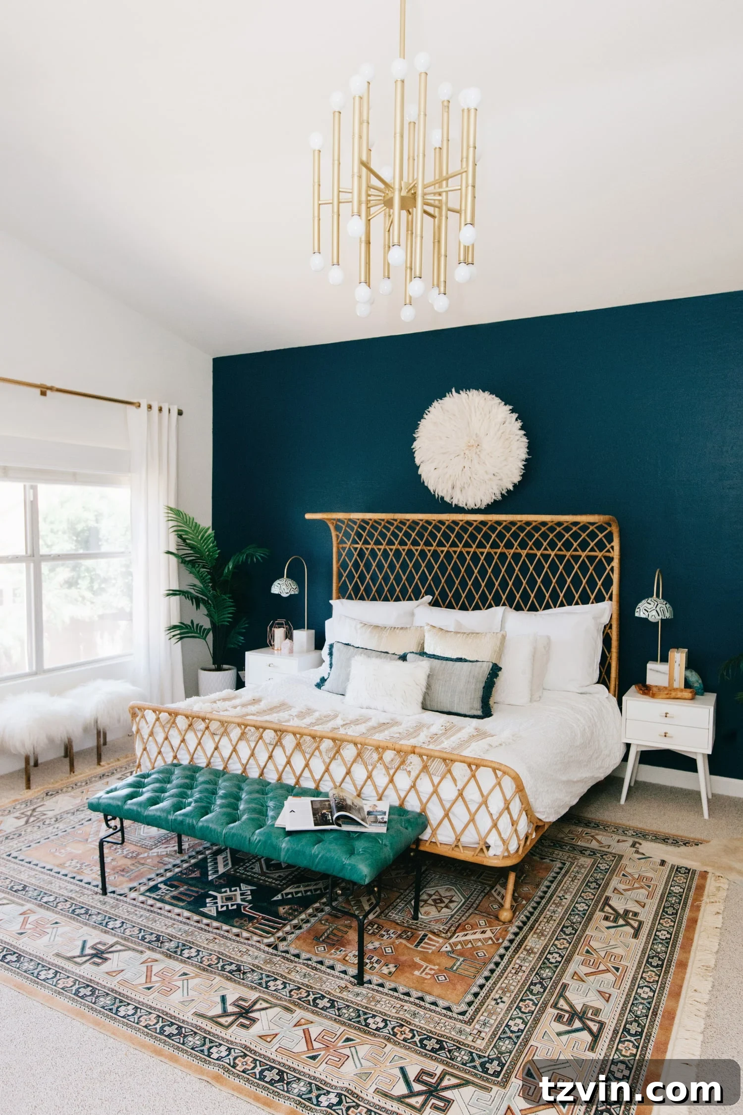
Dunn Edwards’ Nocturnal Sea is a deep, evocative teal that leans heavily into its blue tones, offering a truly profound and luxurious feel. This rich shade is excellent for creating a dramatic accent wall in a bedroom or a sophisticated backdrop in a formal dining area. It pairs exceptionally well with metallic finishes like gold and brass, as well as crisp white trim, to highlight its opulent depth and create a sense of grandeur.
Sherwin Williams Still Water
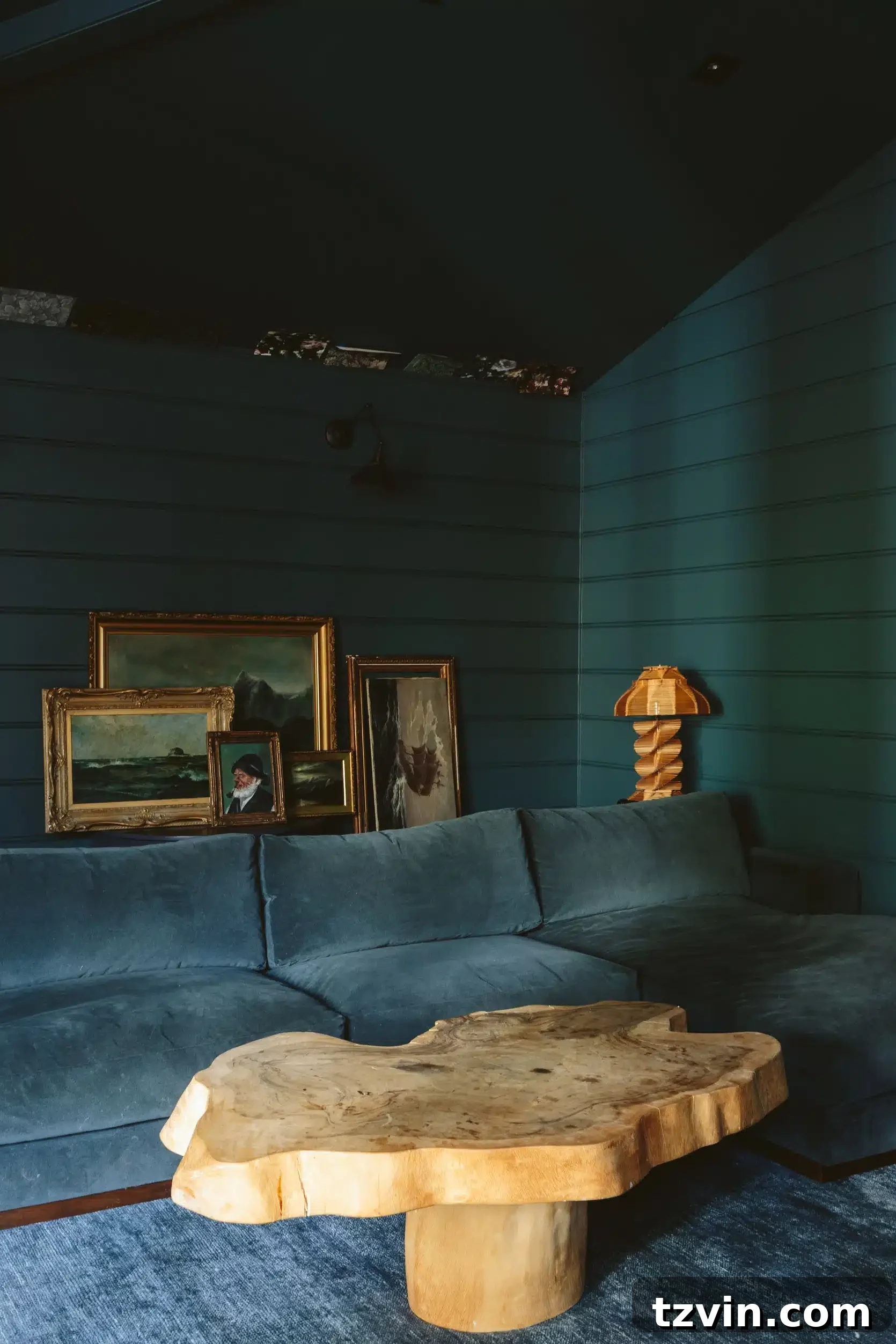
Still Water by Sherwin Williams is a beautifully muted teal that evokes the calm surface of a deep, undisturbed lake. It has a slightly grayed quality that lends it an understated elegance and makes it incredibly versatile. This shade is perfect for creating a serene family room or a tranquil bedroom, offering a sophisticated splash of color that is neither too bold nor too light. It harmonizes well with both warm and cool palettes.
Sherwin Williams Refuge
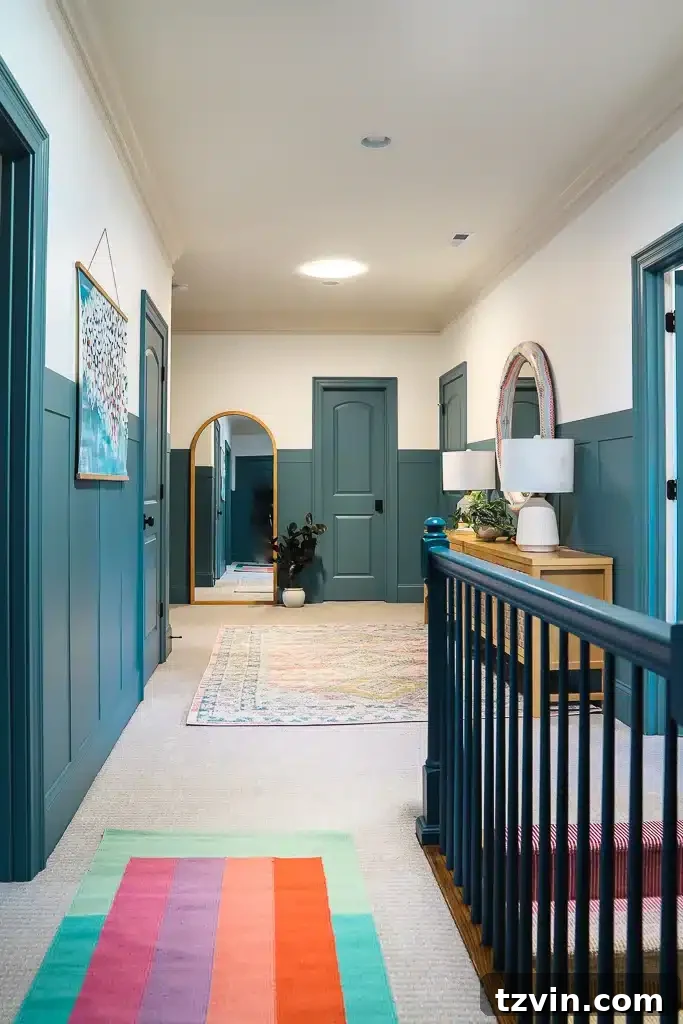
Sherwin Williams Refuge is a wonderfully balanced teal that provides a sense of sanctuary and comfort. It’s a slightly darker, more subdued teal with subtle gray undertones that prevent it from being overly bright. This shade is perfect for creating a cozy atmosphere in a hallway, mudroom, or on interior doors, adding a touch of unexpected sophistication. It feels grounded and timeless, creating a welcoming embrace in transition spaces.
Magnolia Home Weekend
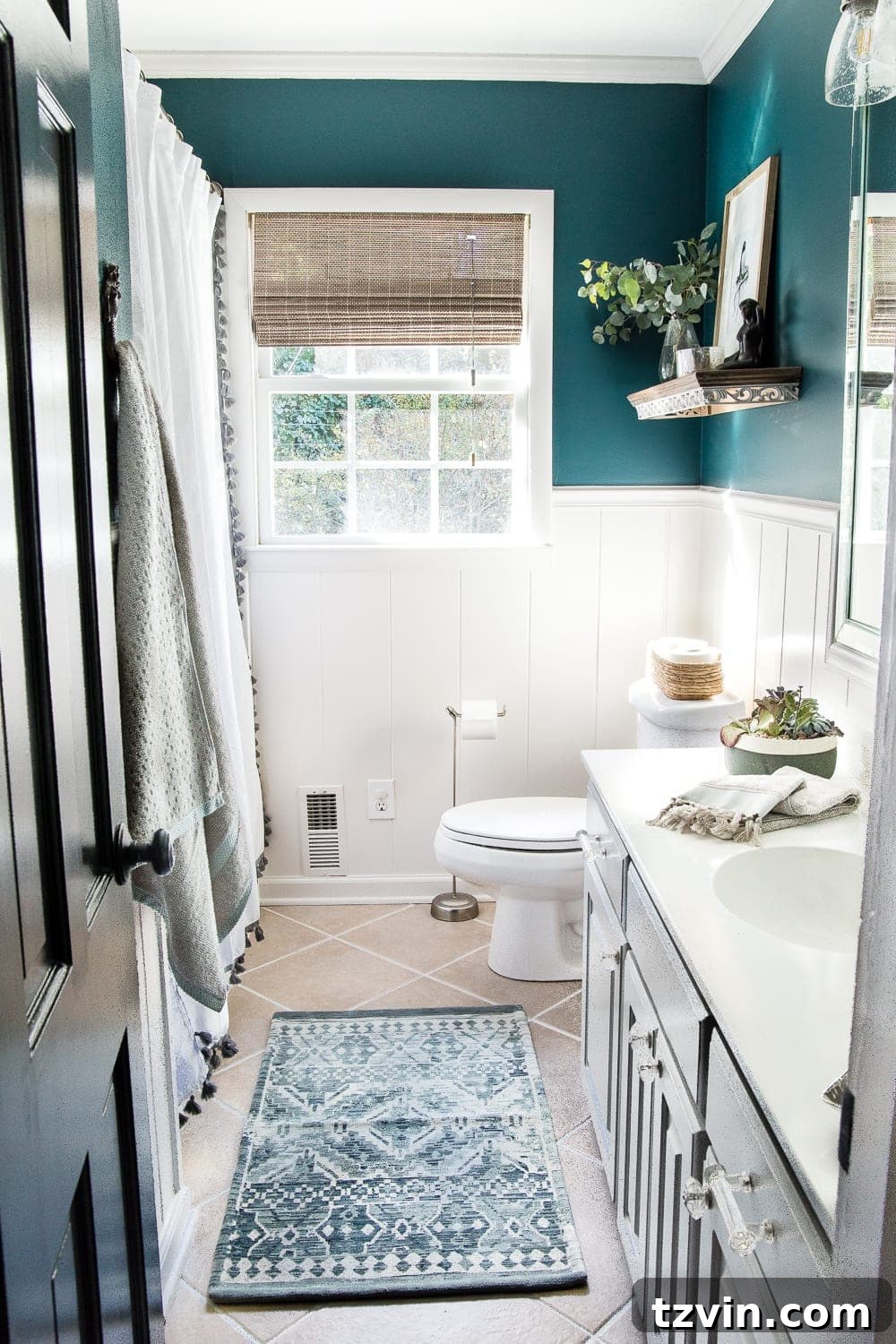
Magnolia Home Weekend is a delightful, relaxed teal that brings a fresh and inviting energy to any space. This shade has a subtle warmth that makes it feel exceptionally cozy and livable. It’s an excellent choice for a guest bathroom or a child’s room, offering a playful yet sophisticated backdrop. Weekend truly embodies a comfortable, easygoing aesthetic, perfect for spaces where you want to unwind and feel at ease.
Farrow & Ball De Nimes
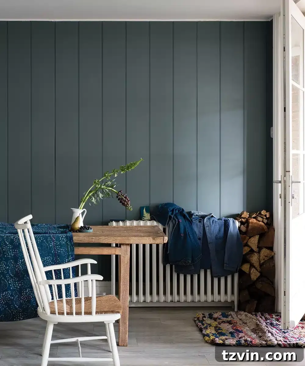
Farrow & Ball’s De Nimes is a beautifully muted blue with subtle green undertones, reminiscent of faded denim. This color has a strong, yet sophisticated presence, offering a relaxed and understated elegance. It’s ideal for creating a lived-in, comfortable feel in an entryway, living room, or even a kitchen. Its historical charm makes it perfect for traditional or transitional interiors, providing depth without being overly dark.
Romabio New Hope
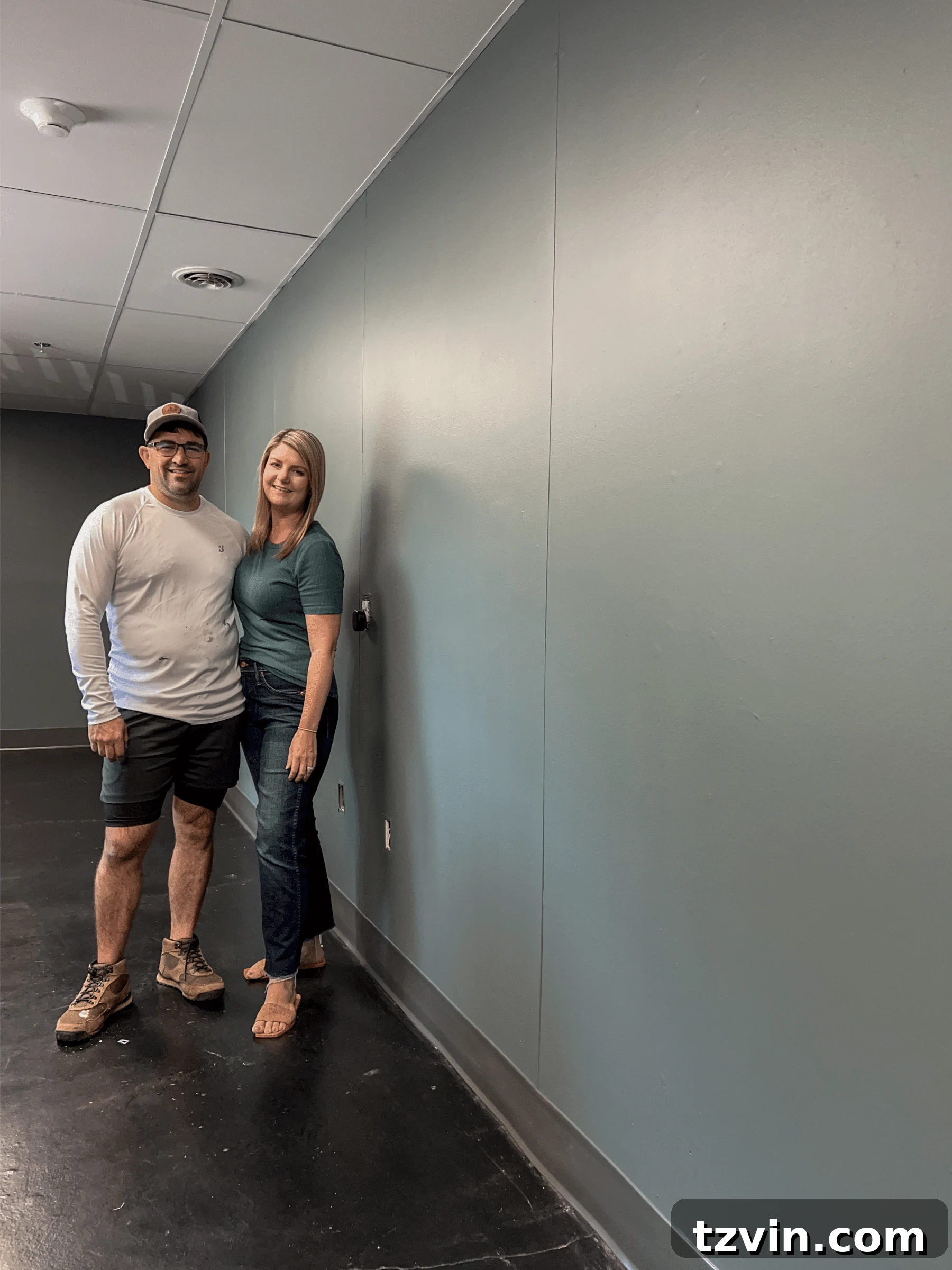
We recently had the pleasure of painting The Cottage conference room with our very own teal paint color, New Hope, from the Bless’er House Color Collection with Romabio Paints. This shade is a truly beautiful mid-tone chameleon, gracefully shifting between blue and green, all while infused with subtle gray undertones that desaturate it into a soft, sophisticated teal.
While the initial fluorescent lights in the room did the color absolutely no justice, we know that once we introduce warmer ambient lighting with lamps, its true depth and character will emerge, transforming the space into a cozy and inviting retreat. We are incredibly excited to embark on the decorating phase for this office space now that the painting is complete! You can follow along with the room makeover progress in our Instagram Stories for real-time updates and inspiration.
What Colors Harmonize and Compliment Teal Paint?
Teal’s rich complexity allows it to pair beautifully with a wide range of colors, each pairing creating a unique mood and aesthetic. Understanding these complementary relationships can elevate your design, adding depth and cohesion to your spaces.
Soft White or Grey: Crisp Contrast and Serene Balance
For a clean, crisp, and effortlessly relaxed look, soft whites and light grays are impeccable companions to teal. These shades provide a refreshing contrast that allows teal to truly pop, enhancing its vibrant qualities while maintaining an airy feel. Consider Benjamin Moore Chantilly Lace or Sherwin Williams Extra White for your trim, ceilings, or complementary furnishings. For subtle gray accents, Benjamin Moore Gray Owl or Sherwin Williams Passive offer a sophisticated, muted backdrop that enhances teal’s depth without overpowering it. This pairing is ideal for modern, coastal, and minimalist aesthetics.
Warm White: Highlighting Teal’s Green Undertones
Teal is a fascinating chameleon color, and its perception can subtly shift depending on the surrounding hues. When paired with a slightly creamy or ivory warm white, teal often appears to lean more towards its green side, creating a cozy and organic ambiance. This happens because the warm yellow undertones in cream help draw out the green notes within the teal. Shades like Sherwin Williams Alabaster or Benjamin Moore Swiss Coffee work beautifully to soften the overall look, making a room feel more inviting and comfortable. Incorporate warm whites through wooden furniture, natural linen textiles, or cozy throws to enhance this effect.
Pink: Modern Vibrancy and Soft Contrast
As a direct complement on the color wheel, pink offers a captivating contrast to teal. A bold fuchsia or magenta can inject a space with contemporary energy and playful vibrancy, creating a dynamic and stylish interior. For a softer, more romantic aesthetic, opt for pastel pinks or blush tones. These gentler shades offer a delicate balance against teal’s depth, promoting a feeling of gentle sophistication. Introduce pink accents through textiles like velvet throw pillows, elegant draperies, or luxurious bedding. Artwork featuring pinks can also beautifully tie the two colors together.
Red: Adding Depth and Eclectic Character
Muted reds possess an incredible ability to add rich depth and an eclectic touch when paired with teal. Think of the deep, earthy tones found in traditional Persian rugs, the warmth of terra cotta tiles, or the rustic charm of an exposed brick wall. These elements introduce a grounding warmth that beautifully complements teal’s cool freshness. If you’re feeling more adventurous, consider bolder pinkish-reds or purplish-reds for a truly dramatic effect. Start small with accent pieces like pottery, cushions, or a vintage-inspired armchair. The more red tones you thoughtfully incorporate alongside teal, the more a room will take on a curated, bohemian, or globally inspired feel.
Yellow: Soothing Serenity or Bold Sunshine
Yellow, in its various forms, can create stunning effects when paired with teal. It doesn’t have to be a bright, in-your-face mustard yellow to make an impact. Subtle yellow tones found in natural textures like rattan furniture, sisal rugs, bamboo accents, or light-toned natural wood create an atmosphere reminiscent of a soothing, luxurious spa. These organic elements bring warmth and a grounded feeling to teal-painted spaces. For those who dare to be more audacious, a bold, sunny yellow can create an incredibly energetic and uplifting contrast, adding a playful pop that prevents the teal from feeling too somber. Consider yellow in abstract art, vibrant throw blankets, or unique decorative objects.
Metallic Accents: A Touch of Glamour
Beyond traditional colors, don’t overlook the power of metallics. Gold, brass, and even copper accents truly sing against a teal backdrop. These warm metals add a layer of luxury and sophistication, catching the light and enhancing the richness of the teal. Incorporate them through lighting fixtures, decorative mirrors, cabinet hardware, or elegant picture frames for an instant touch of glamour.
Related: How to Choose Paint Colors for Your Home Interior Like a Pro
Explore More Designer-Recommended Blue-Green & Related Paint Colors
If your journey into color continues beyond teal, we have more curated lists to inspire your next home transformation:
- 12 Best Sage Green Paint Colors for a Relaxing Room
- The Most Recommended Blue Grey Paint Colors
- The Best Haint Blue Paint Color for Porch Ceilings
- The Most Recommended Navy Blue Paint
Frequently Asked Questions About Teal Paint Colors
Teal is a fascinating and complex deep blue-green color. It’s truly a blend, encompassing both blue and green pigments. Depending on the specific shade and the lighting conditions in a room, it can appear to lean more towards blue or more towards green. This chameleon-like quality is one of its most appealing attributes, offering incredible versatility. The hex code for a pure teal is #008080, which sits perfectly in the middle of the blue-green spectrum.
Colors closely related to teal often share its vibrant yet calming blue-green essence. The most similar hues include aqua, which is typically a lighter and brighter blue-green; turquoise, which tends to be more saturated and can lean slightly more blue; and sea green, which is generally a softer, often lighter green with blue undertones. Other close relatives might include peacock blue or certain shades of emerald green that have a strong blue component.
In color theory and psychology, teal is rich with symbolism. It represents clarity of thought, emotional calm, and profound serenity, often associated with spiritual healing and renewal. Its connection to water and nature also links it to feelings of refreshment and balance. Teal is widely regarded as a helpful color for stress relief and promoting introspection, making it an excellent choice for rooms where you desire to feel relaxed, such as bedrooms, bathrooms, and meditation spaces.
Lighting significantly impacts how teal paint appears in a room. Natural light, particularly from north-facing windows, can bring out its cooler blue tones, making it feel more serene. South-facing light or warmer artificial lighting can emphasize its green undertones, creating a cozier, richer feel. Always sample teal paint colors on your walls and observe them throughout the day in different lighting conditions before making a final decision.
Absolutely! Teal paint has moved beyond being just a fleeting trend and has established itself as a versatile and enduring classic in interior design. Its ability to be both bold and calming, vibrant and sophisticated, ensures its longevity. With Glidden naming Vining Ivy a Color of the Year, and its consistent presence in designer portfolios, teal remains a highly stylish and sought-after color for modern homes.
Have you had the pleasure of discovering a favorite teal paint color in your past decor projects that left you completely head-over-heels in love? We’re always eager to hear about your experiences and discoveries, as teal remains a steadfast favorite that we continuously return to, regardless of fleeting trends.
We hope this comprehensive guide inspires you to embrace the captivating beauty of blue-green teal in your own home, creating spaces that are truly a reflection of peace, vibrancy, and sophisticated style.