
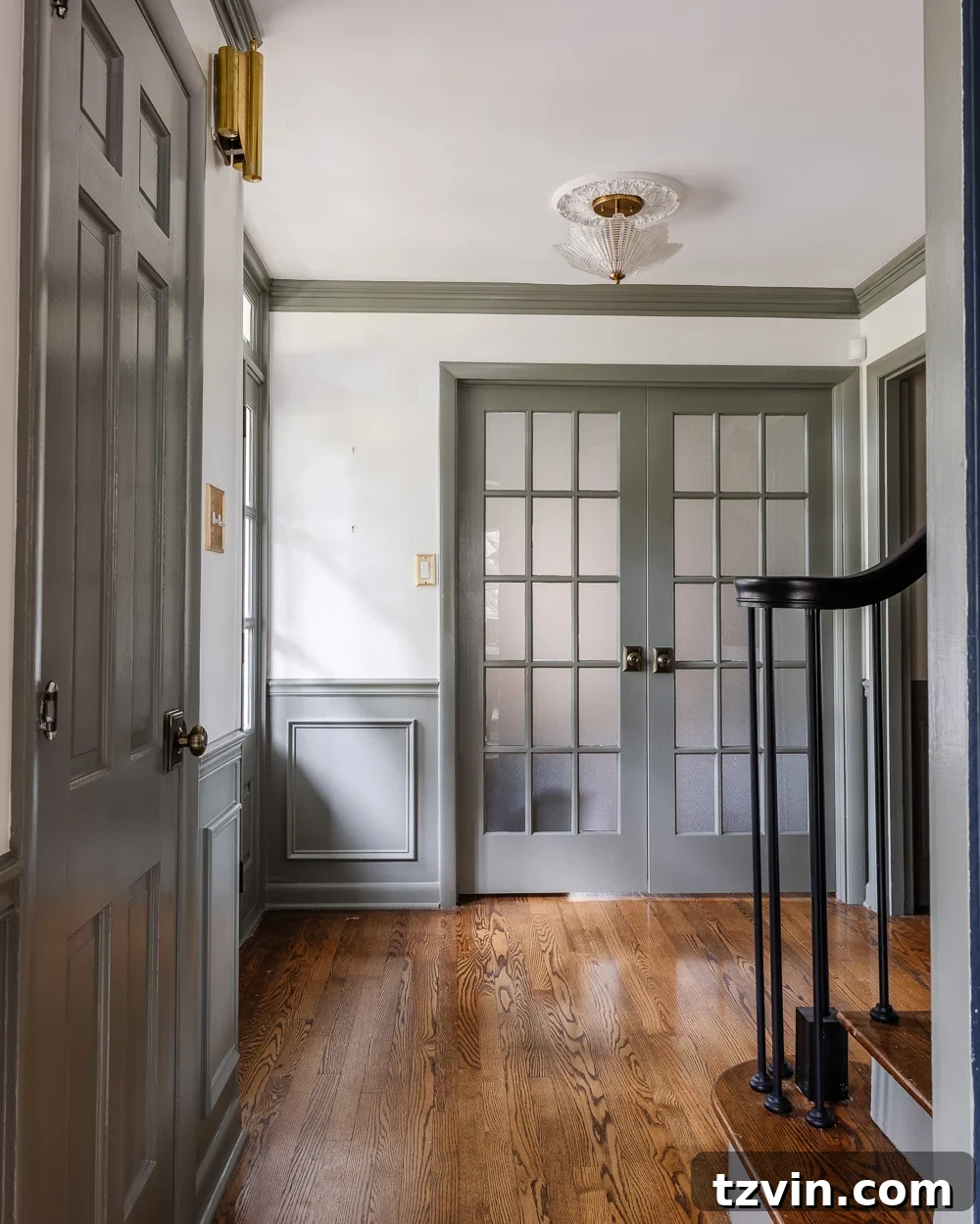
After what felt like an endless four-month deliberation over countless paint color samples, we’ve finally achieved a magnificent transformation in our home! The foyer and stairway have been painted, and the result is nothing short of breathtaking. We embarked on this journey seeking a shade that would marry sophistication with comfort, and we ultimately discovered the most perfect green-gray paint color of our dreams. This particular hue possesses a rare quality, appearing beautiful and dynamic across literally every type of lighting scenario imaginable.
Certain paint colors have a magical way of adapting to their environment, showcasing their charm irrespective of the time of day or the light source. Think of iconic shades like Sherwin Williams Sea Salt or Farrow & Ball Pigeon; they are celebrated for their versatility and enduring appeal. Our quest was for a color with similar chameleon-like qualities, something that would feel fresh and inviting without being overly bold. The decision-making process was thorough, but the moment we encountered our chosen shade, we knew it was ‘the one’.
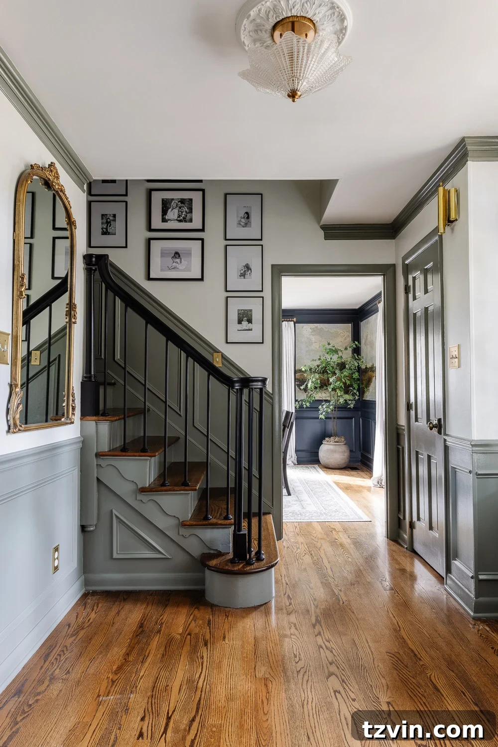
Introducing Sherwin Williams Willowleaf: The Ultimate Green-Gray
Our extensive search led us to the truly remarkable Sherwin Williams Willowleaf, and from the instant we saw it, there was no turning back. This particular green-gray paint color struck us as THE one because of its impeccable balance; it’s wonderfully neutral but carries just the right whisper of green to make it profoundly interesting and beautifully unusual. It manages to offer a gentle hint of color without ever feeling overwhelming, making it a sophisticated alternative to traditional neutrals.
Willowleaf presents itself as a beautifully muted green, artfully blending the earthy with the elegant. It instills a sense of calming tranquility, a refreshing clarity, and a deeply grounded vibe that makes it incredibly versatile for a multitude of decorating styles. Whether your home’s aesthetic leans towards modern minimalism, timeless traditionalism, free-spirited boho, or rugged rustic, Willowleaf integrates flawlessly, serving as a harmonious backdrop. It adapts beautifully, complementing everything from rich wood tones to contemporary furnishings, and truly enhances the overall ambiance of any space it graces.
We are utterly captivated by its ability to act as a captivating alternative to a true neutral. When you desire a subtle ‘pop’ of color that still affords the flexibility to effortlessly pair it with a vast array of other colors and textures in a room, Willowleaf stands out as an exceptional choice. It provides depth and character without committing to an overtly dominant color, ensuring your design remains fluid and adaptable as your tastes evolve.
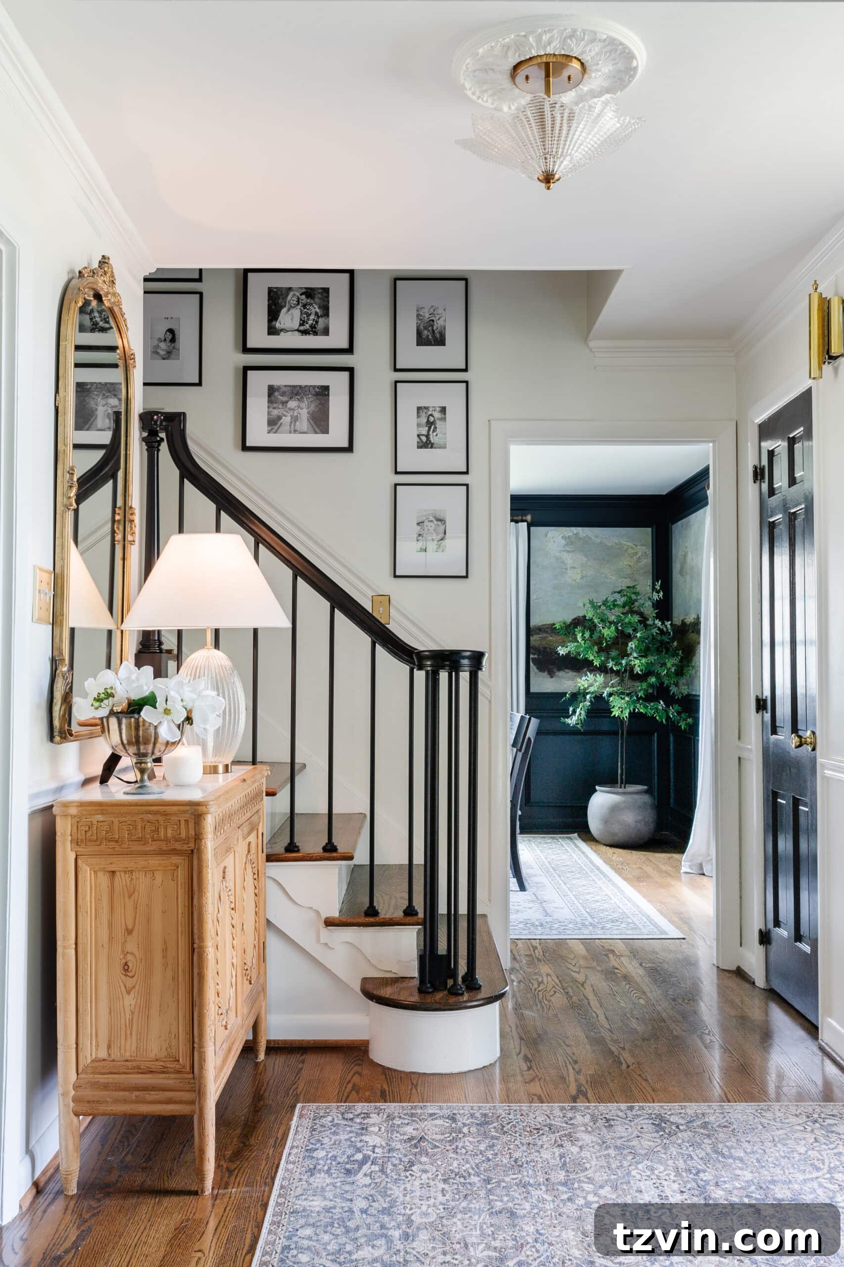
Before this transformation, our foyer was a vision in pristine white. While we still appreciate the crisp, airy feel of an all-white aesthetic, we found ourselves longing for a touch of warmth and personality. Sherwin Williams Willowleaf proved to be the perfect solution. It infused our entryway with just the right amount of color, without ever straying too far from the comfortable embrace of neutrality. It offers a unique paradox: feeling daring and fresh, yet simultaneously safe and timeless. This nuanced quality is precisely what makes Willowleaf such a standout choice for high-traffic areas like foyers and stairways, where both beauty and practicality are paramount.
Throughout the day, Willowleaf interacts dynamically with natural light. In the soft glow of morning, it might reveal cooler, almost misty green undertones, while by afternoon, its earthy warmth becomes more pronounced, lending a cozy, inviting feel to the space. Even under artificial lighting, this exquisite shade maintains its integrity, never appearing dull or washed out. It’s a living color that truly evolves with your home, offering continuous visual delight.
Further Inspiration: Explore our curated list of 12 Best Sage Green Paint Colors for a Truly Relaxing Room to find more serene shades for your interiors.
Design Insights: Discover the Top Recommended Contrast Trim Paint Color Ideas to elevate your home’s architectural features.
The Strategic Advantage: Why Contrast Trim Trumps Full Room Painting
The decision to utilize a contrasting paint color solely on the trim, rather than repainting the entire room, was a strategic masterstroke, particularly for a challenging area like our two-story foyer and staircase. The sheer thought of erecting and maneuvering scaffolding to tackle such a vast, elevated wall was daunting and frankly, something we wished to avoid. This innovative approach allowed us to achieve the desired refresh and sophisticated aesthetic without the monumental undertaking of painting every surface from scratch. It’s a technique that offers a myriad of benefits:
- Significant Financial Savings: Painting only the trim dramatically reduces the quantity of paint needed, leading to substantial savings on materials. Furthermore, it eliminates the necessity for costly equipment rentals, such as professional scaffolding, which can add hundreds, if not thousands, to a project’s budget.
- Unparalleled Time Efficiency: The labor involved in meticulously painting trim is considerably less intensive and time-consuming compared to preparing and painting entire wall surfaces. This streamlined our project timeline significantly, allowing us to enjoy our beautifully refreshed space much sooner. We experienced notable reductions in preparation, application, and clean-up times.
- Reduced Effort and Stress: Bypassing the extensive wall preparation, precise cut-ins against ceilings, and the arduous task of reaching high, difficult areas made the entire renovation process far more manageable. This diminished the overall effort and stress, transforming a potentially overwhelming project into an enjoyable creative endeavor focused on precision and aesthetic impact.
- Instant Historical Charm: Employing contrasting trim instantly imbues a room with a profound sense of architectural depth and historical character. This time-honored design technique has been a staple in elegant homes for centuries, creating a sophisticated, layered appearance that beautifully highlights the room’s structural elements. Our foyer now exudes a distinguished charm, reminiscent of the timeless elegance found in Colonial Williamsburg, adding a layer of grandeur that was previously absent.
- Exceptional Dirt and Smudge Concealment: A highly practical advantage, especially vital in a bustling family home, is the superior ability of darker trim colors to camouflage everyday dirt, scuffs, and fingerprints. Unlike white trim, which notoriously highlights every speck and mark, our green-gray trim deftly disguises the inevitable signs of daily life, ensuring the space maintains a cleaner appearance for extended periods. With lively children and active pets, this feature is invaluable, significantly reducing the frequency of necessary touch-ups and extensive cleaning.
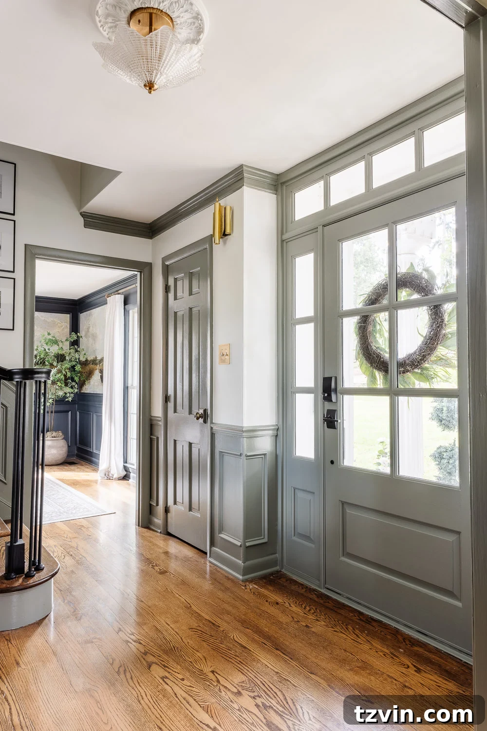
By making the strategic choice to paint only the trim, we were able to gracefully retain our existing Benjamin Moore Chantilly Lace walls. This crisp, luminous white now acts as the perfect, bright counterpoint to the rich depth of the Willowleaf trim. This harmonious pairing creates a balanced visual narrative, delivering a dramatic and impactful transformation with surprisingly minimal effort compared to a complete repaint. It truly exemplifies a win-win scenario, maximizing aesthetic impact with exceptional efficiency.
DIY Essential: Learn How to Paint Doors and the Best Ways to Make Them Durable for lasting beauty.
Exploring Other Captivating Green-Gray and Sage Paint Colors
While Sherwin Williams Willowleaf emerged as the definitive choice for our foyer and stairway, our journey involved a thorough exploration of various other magnificent green-gray and sage green hues. We’ve previously considered, and in some cases even utilized, several of these exceptional shades in past room makeovers. Each color possesses its own unique charm and character, making them worthy contenders for anyone seeking a similar calming yet stylish aesthetic in their home. Here are some of our top favorites and their distinct attributes:
- Sherwin Williams Evergreen Fog: Recognized as their 2022 Color of the Year, Evergreen Fog is a deeply sophisticated gray-green that leans more prominently into the green spectrum than Willowleaf. It evokes a sense of organic earthiness, ideal for cultivating a serene and grounded atmosphere in spaces like living rooms, master bedrooms, or even a tranquil kitchen. Its slightly deeper saturation lends a cozy, enveloping feel.
- Farrow & Ball French Gray: This iconic shade from Farrow & Ball is celebrated for its timeless elegance and subtle complexity. French Gray is a softer, highly muted green-gray that has a remarkable ability to transform; it can appear as a gentle green in abundant natural light and then shift to a truer, sophisticated gray in more shaded conditions. Its incredible versatility makes it a superb choice for creating a refined, classic backdrop in traditional or transitional interiors.
- Benjamin Moore October Mist: Also a Color of the Year for 2022, October Mist (BM-1495) is a gentle, restorative sage green that conjures images of a quiet, dew-kissed morning. It’s a muted, silvery-green that inherently promotes feelings of well-being and tranquility. This shade pairs exceptionally well with natural textures, light wood tones, and organic elements, making it perfect for crafting a peaceful sanctuary in bedrooms or a focused, calm home office environment.
- Benjamin Moore Saybrook Sage: A perennial favorite, Saybrook Sage (HC-114) is a more saturated and traditional sage green. It carries a richer, deeper hue compared to October Mist or French Gray, offering a comforting and established presence. It is an excellent choice for creating a sense of heritage and warmth in formal dining rooms, libraries, or studies where a classic, inviting ambiance is desired.
Each of these distinguished colors offers incredible depth and versatility, positioning them as strong contenders for any home renovation project. Our ultimate selection of Willowleaf for this particular project was driven by its precise undertones and how impeccably it harmonized with the specific natural light characteristics of our entryway, along with the existing architectural nuances.
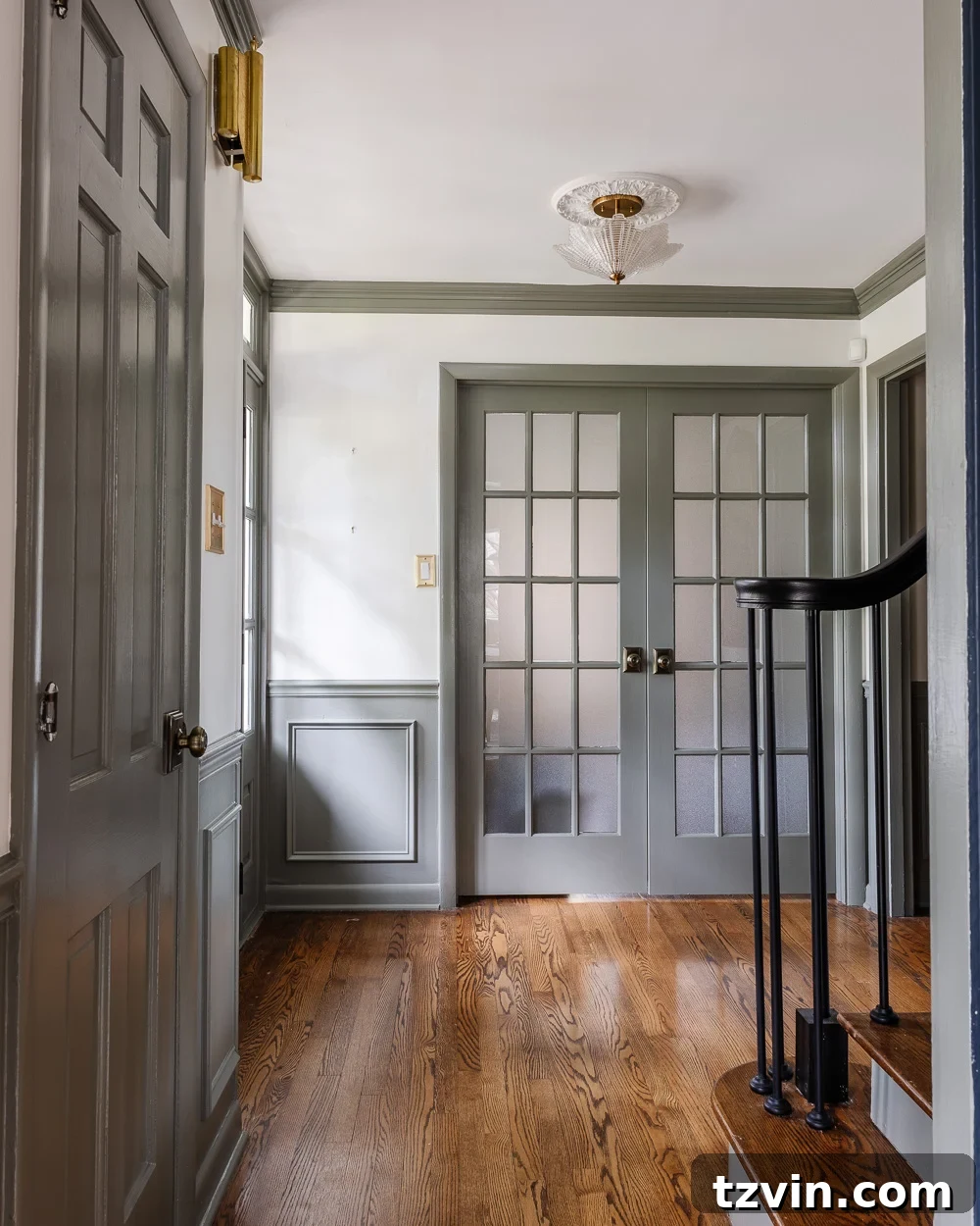
In a design choice that might surprise some traditionalists, we decided to paint the interior side of our front door the exact same Sherwin Williams Willowleaf color, rather than opting for a natural wood stain. This decision was purely aesthetic, intended to foster a seamless and continuous visual flow with the newly painted trim throughout the entire foyer. This continuity ensures a cohesive design narrative, elegantly extending the inviting green-gray hue right to the very threshold of our home, creating a unified and welcoming first impression.
Home Palette Guide: Explore Our Calming Whole House Paint Color Palette for harmonious and cohesive living spaces.
Final Reflections and Our Foyer’s Future Evolution
Completing this significant paint project has undeniably transformed our entryway, creating a space that now feels both profoundly inviting and impeccably sophisticated. The subtle yet powerful elegance of Sherwin Williams Willowleaf, masterfully paired with the strategic application of contrasting trim, has far exceeded our initial expectations. This renovation was more than just applying a fresh coat of paint; it was a comprehensive reimagining of a pivotal area within our home, enhancing its inherent character, and significantly boosting both its aesthetic appeal and functional charm.
We firmly believe that an entryway serves as the crucial first impression, effectively setting the tone for the entire home. With the thoughtful integration of Willowleaf, we’ve successfully cultivated a welcoming ambiance that perfectly balances warmth with a refined sense of style. The contrasting trim meticulously highlights the intricate architectural details of our staircase and doorways, thereby adding significant depth and a touch of historical grandeur without ever feeling overly formal or stuffy. It’s a testament to how intelligent color choices can profoundly impact the perception of space.
Robert and I are already enthusiastically brainstorming a few more small, complementary projects for this revitalized space. Our aim is to truly complete its transformation by adding carefully selected decorative elements and perhaps some ingenious functional improvements that will seamlessly integrate with the new, cohesive color scheme. We are eager to share all the exciting progress, along with behind-the-scenes glimpses of our creative process, on my Instagram Stories very soon. Be sure to follow along for all the latest updates and inspiring design insights!
Pin This for Later ⤵️
More Curated Paint Color Recommendations for Your Home
Discover the Best Navy Blue Paint Colors Recommended By Top Designers
The Most Recommended Blush Pink Paint Colors for Elegant Interiors
12 Trending Burgundy Paint Colors Recommended by Designers for Rich Spaces