
The Ultimate Whole House Paint Color Palette: Neutrals, Blues, Greens, and Jewel Tones for a Cohesive Home
Crafting a harmonious paint color scheme for your entire home can feel like a daunting task. The sheer number of options, the subtle differences between shades, and the anxiety of making the “wrong” choice often lead to sleepless nights for homeowners. But imagine a home where every room flows seamlessly into the next, radiating a sense of classic elegance, serene calm, or captivating drama, all thanks to a thoughtfully curated palette. This comprehensive guide will unveil a collection of exquisite paint colors – ranging from soothing neutrals to vibrant blues, tranquil greens, and rich jewel tones – designed to transform your house into a truly cohesive and inviting sanctuary.
Currently, we’re deep into selecting paint colors for the contrasting trim in our upcoming hallway and foyer project, which has naturally led us down a rabbit hole of reassessing all the colors we’ve embraced throughout our home. Ensuring every hue within our palette works together cohesively is paramount. While choosing a paint color for a single room presents its own challenges, curating an entire house paint color scheme that flows harmoniously from one space to another is an even greater endeavor.
Yet, the question “What’s the paint color?” remains one of the most frequently asked whenever we share a glimpse of our home. So, we’ve compiled a definitive round-up of every paint color we’ve used, creating a convenient, single reference point for our entire house paint color scheme. This guide is here to assist you in designing your own cohesive and beautiful living spaces.
If you ever need guidance in selecting the perfect shades for your own home, here’s how to find the perfect paint color every single time.
Essential Tips for Choosing a Cohesive Whole House Paint Color
Selecting paint colors for your home goes beyond simply picking shades you like. It involves a strategic approach to ensure fluidity, mood, and timeless appeal. Here’s a streamlined process to guide you:
- Initial Research and Inspiration: Begin by exploring platforms like Google and Pinterest for paint color ideas and inspiration. Pay attention to how colors are used in spaces you admire. However, remember that colors can appear drastically different on screens compared to real life due to monitor calibration and digital rendering. Use these platforms as a starting point for discovering names and concepts, rather than definitive visual references.
- In-Store Exploration with Physical Swatches: Once you have a shortlist of potential colors, head to your local paint store. Obtain physical sample paper strips for your favorite hues. These strips provide a more accurate representation of the color’s true tone and undertones than digital images. Hold them against various backdrops and compare them to each other to see how they interact.
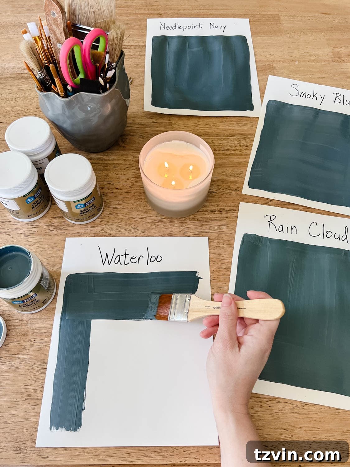
- Invest in Sample Pots: This step is non-negotiable and often underestimated. While paint strips are helpful, they don’t fully convey how a color will look when applied to a larger surface. Purchase small sample pots of your top contenders. This minor investment can save you significant time, money, and frustration by preventing costly repaints down the line.
- Test Colors on White Foam Boards: Instead of painting directly onto your walls, which can leave patched marks and uneven textures, paint your sample colors onto large white foam boards. This method offers several advantages:
- Portability: You can move the boards around the room, placing them on different walls and in various corners.
- Lighting Variations: Observe the colors throughout the day and night. Natural light, artificial lighting (warm vs. cool bulbs), and shadows will dramatically alter how a color appears. A shade that looks perfect in morning sun might appear dull or too vibrant under evening lamps.
- True Color Reflection: White foam boards prevent existing wall colors from influencing your perception of the new sample.
- Define Your Preference and Select Your Winner: After thorough observation, you’ll likely develop a clear favorite. When making your final decision, consider your personal style and the mood you want to create. For instance, many prefer significant contrast, opting for the lightest or second lightest shade on a color strip for a bright, airy feel, or the darkest or second darkest for a bold, dramatic statement. Medium shades, while versatile, may not always deliver the distinct impact some desire. Trust your instinct and choose the color that truly resonates with the aesthetic you envision for your home.
Now that you have the tools to choose, let’s explore some of our favorite colors that have brought calm, classic, and dramatic flair to our own home.
Our Calming, Classic, and Dramatic Whole House Paint Color Scheme
Here’s a look at the specific paint colors we’ve incorporated into our home, creating a cohesive and inviting atmosphere:
1. Benjamin Moore Swiss Coffee: A Warm and Inviting White
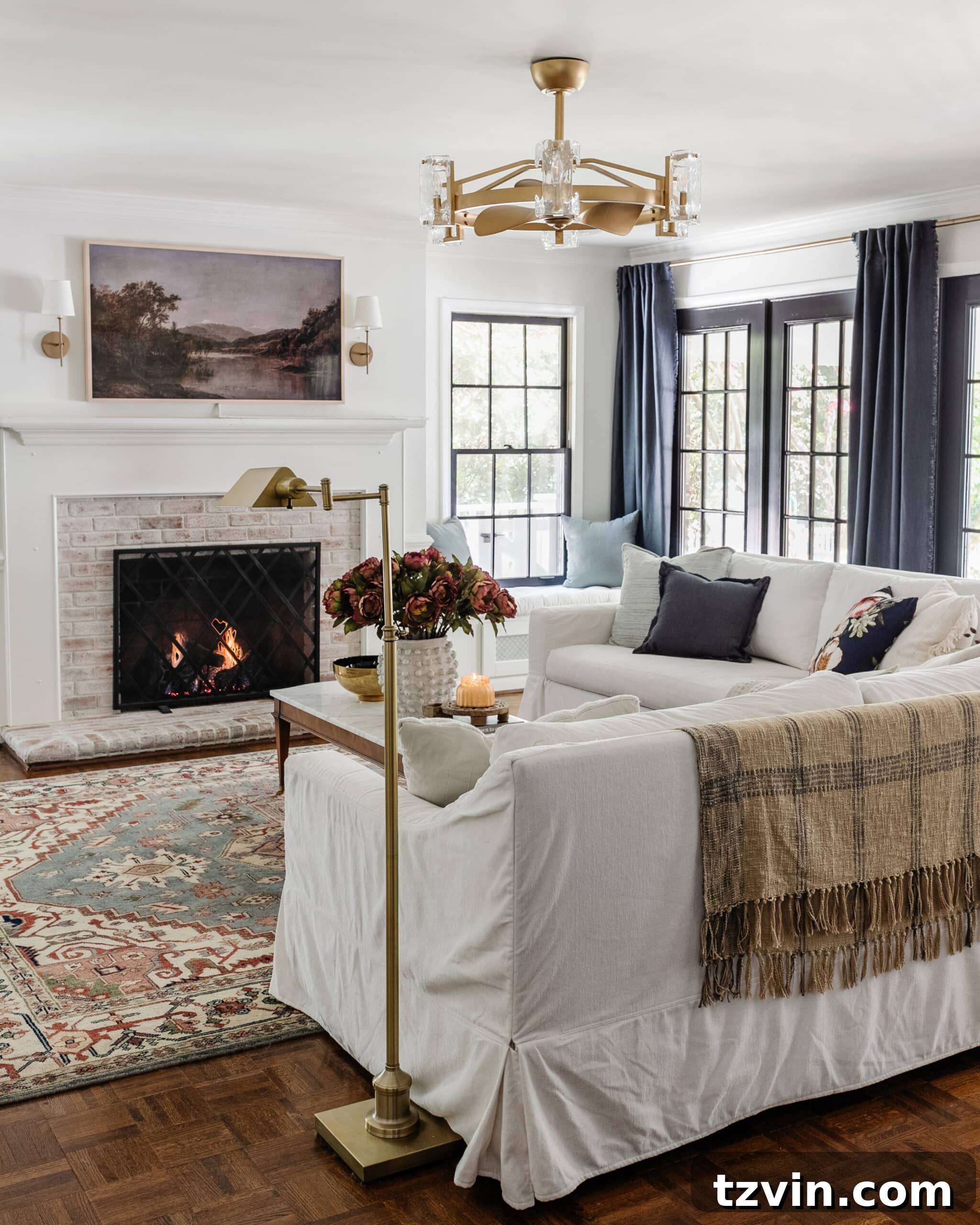
Benjamin Moore Swiss Coffee is our go-to for a slightly creamy white that provides just the right amount of warmth. Unlike stark, clinical whites, Swiss Coffee ensures a room feels clean and fresh without appearing sterile or “hospital-like.” Its subtle warmth makes it incredibly versatile, acting as a gentle backdrop that allows other decor elements to shine. While it’s excellent for walls, for a purer, crisper white on trim, we often opt for Sherwin Williams Simply White, creating a beautiful, nuanced contrast. This shade is ideal for living spaces where comfort and an inviting ambiance are key.
Related: Best Designer-Approved Off-White Color Paints to Try
(More info about our living room here)
2. Benjamin Moore Wrought Iron: The Essence of Sophisticated Drama
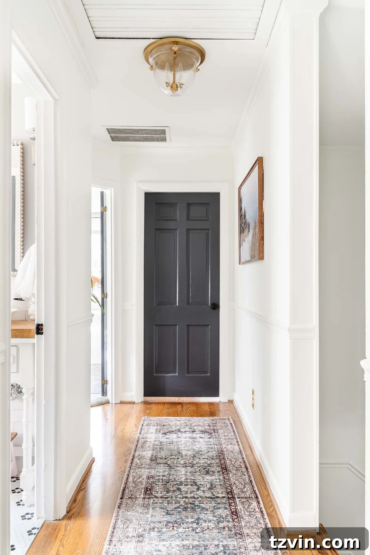
For a touch of sophisticated drama, we’ve painted all our interior doors with Benjamin Moore Wrought Iron. This deep, almost-black charcoal shade instantly elevates any room, imparting a high-end feel without the high-end cost. Its rich depth creates a striking contrast against lighter walls, framing each doorway with elegant definition. Beyond its aesthetic appeal, Wrought Iron is incredibly practical, cleverly concealing smudges and little handprints – a definite bonus for homes with active children. It’s a statement color that grounds spaces and adds an architectural element of design.
(By the way, I have a nifty trick for painting French doors that you might find strangely satisfying!)
Related: How to Paint Doors and Best Ways to Make Them Durable
3. Benjamin Moore Chantilly Lace: The Epitome of Crisp White
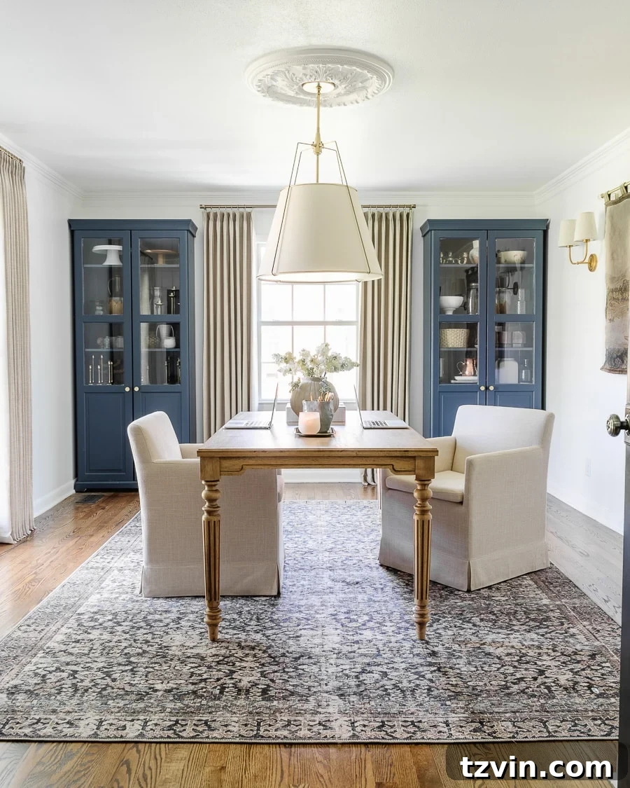
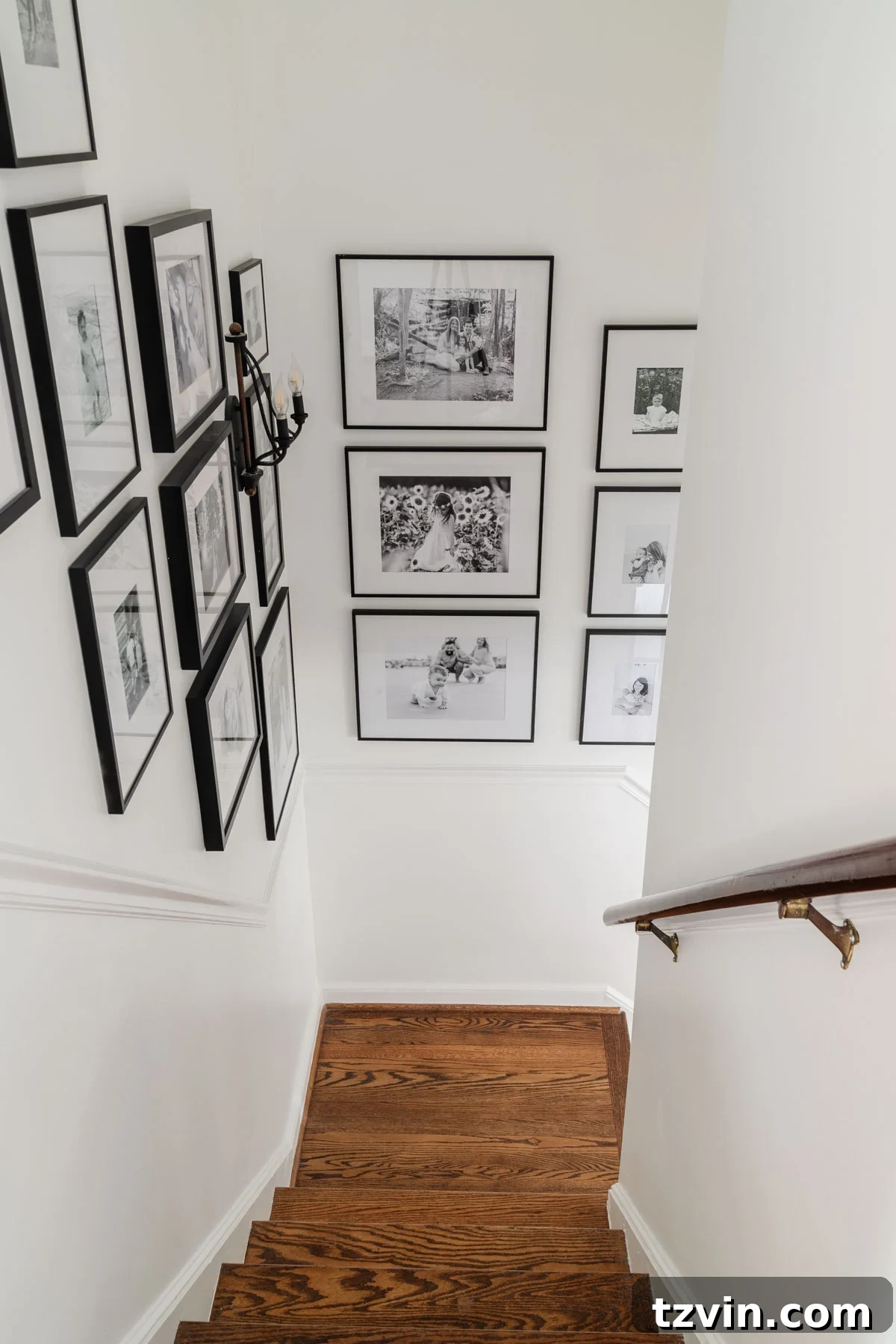
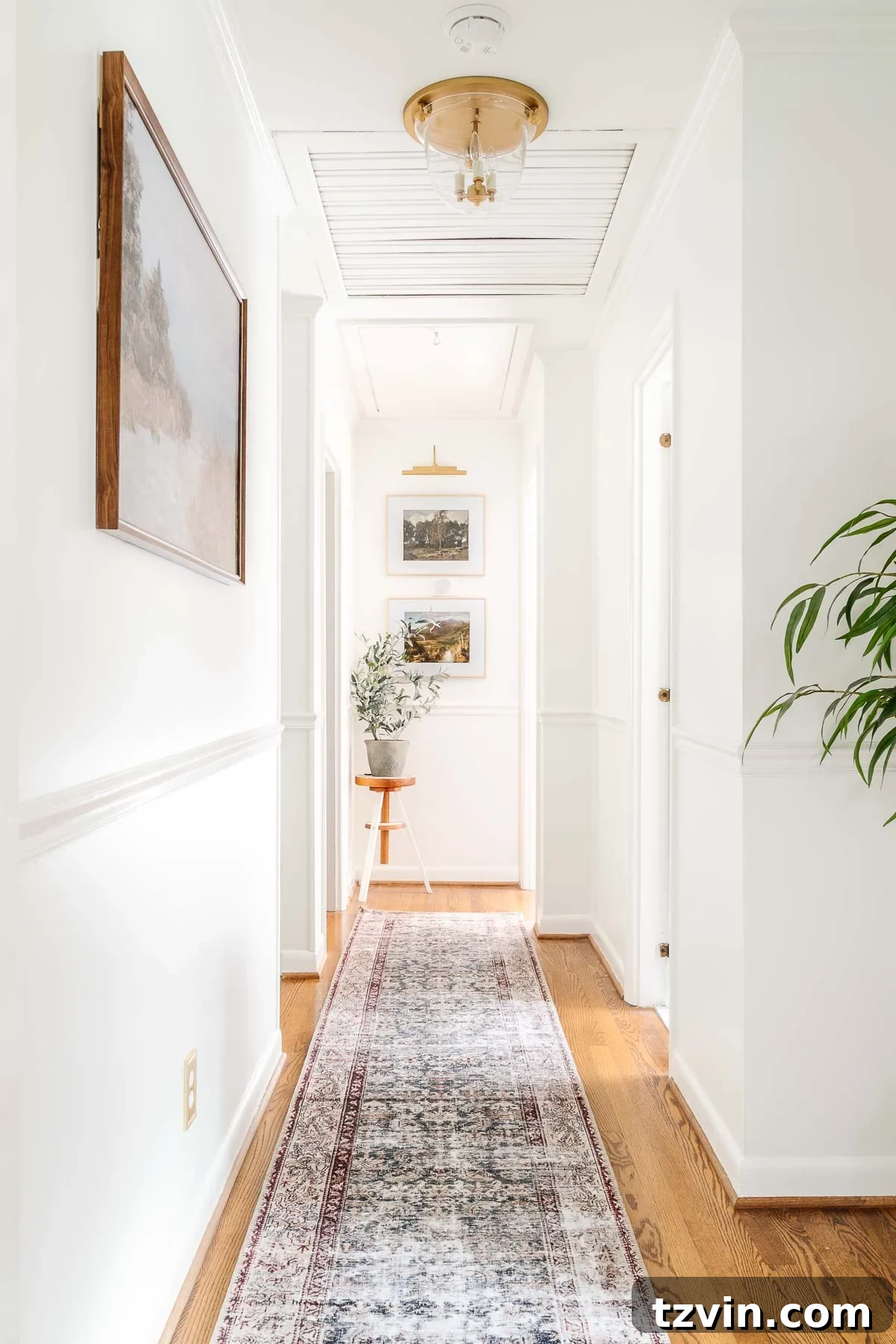
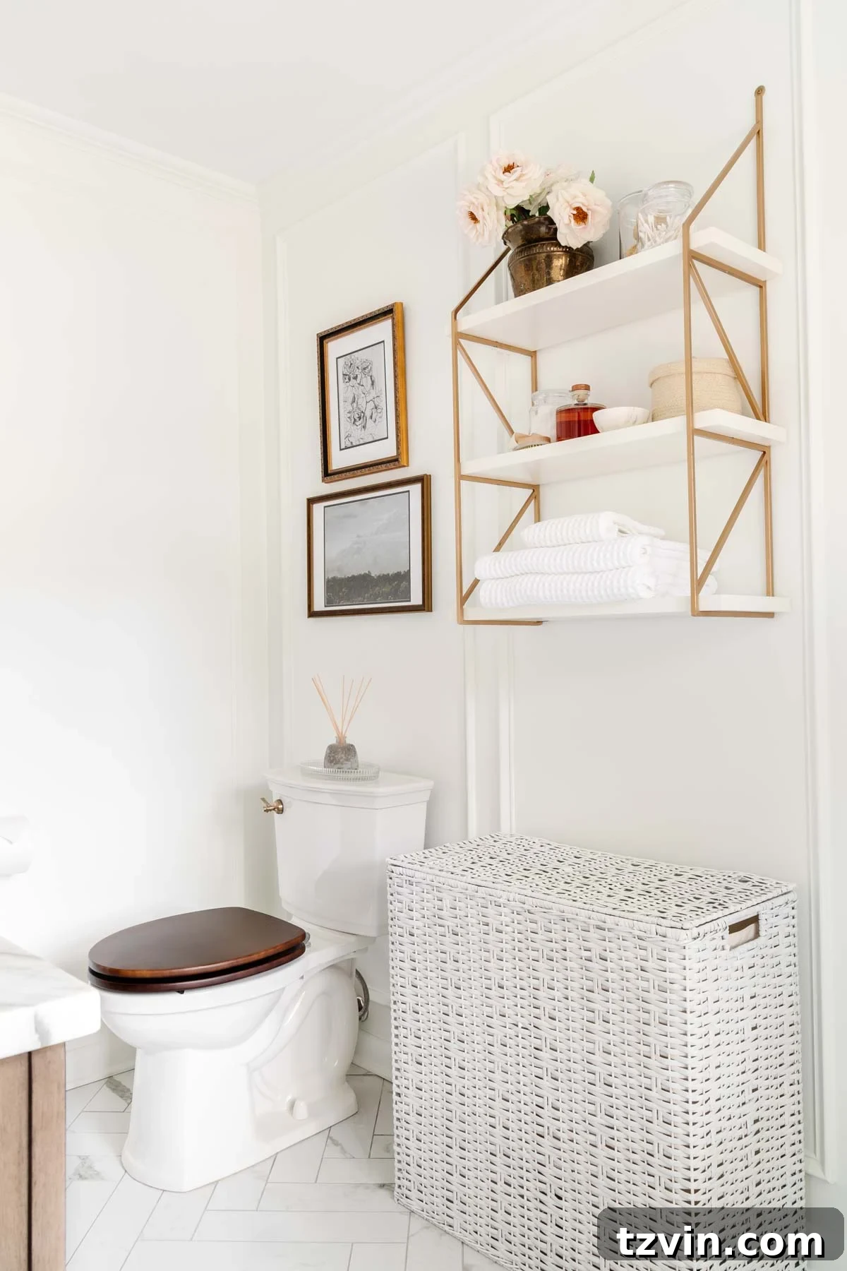
Benjamin Moore Chantilly Lace is as true white as it gets. This refined, crisp, and impeccably clean shade creates an airy and expansive feel in any space. It’s the perfect choice when you desire a pristine canvas that accentuates natural light and allows your furnishings and artwork to take center stage. We’ve extensively used Chantilly Lace on the walls in various areas of our home, including our home office, foyer, stairway, hallway, and primary bathroom. Its pure quality provides a consistent, bright backdrop that unifies these different zones.
4. Sherwin Williams Willowleaf: The Enigmatic Green-Gray
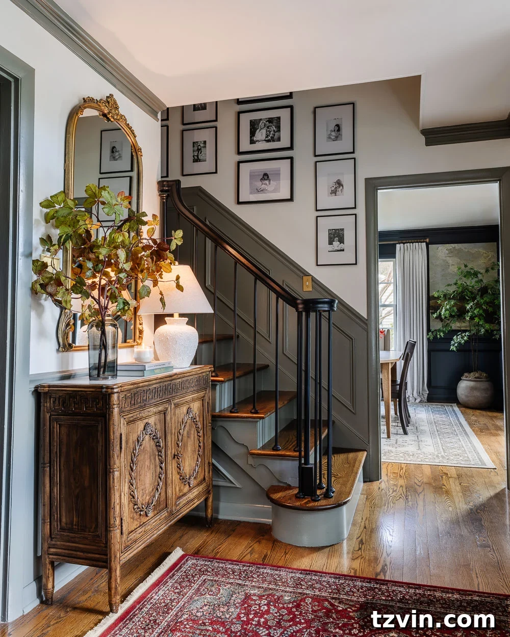
Sherwin Williams Willowleaf is a truly captivating color that gracefully dances between green and gray, leaving many wondering about its true classification – and that’s precisely its charm. It possesses an inherent beauty that is both earthy and sophisticated. In our foyer, where we faced the challenge of a towering 2-story wall, we chose Willowleaf for the trim. This clever application allowed us to introduce a nuanced pop of color without the arduous effort of renting scaffolding to paint the entire wall. It offers a subtle, nature-inspired hue that brings a sense of calm and understated elegance, proving that color doesn’t always need to be on the walls to make an impact.
5. Sherwin Williams Slate Tile: A Calming, Dusty Blue-Gray
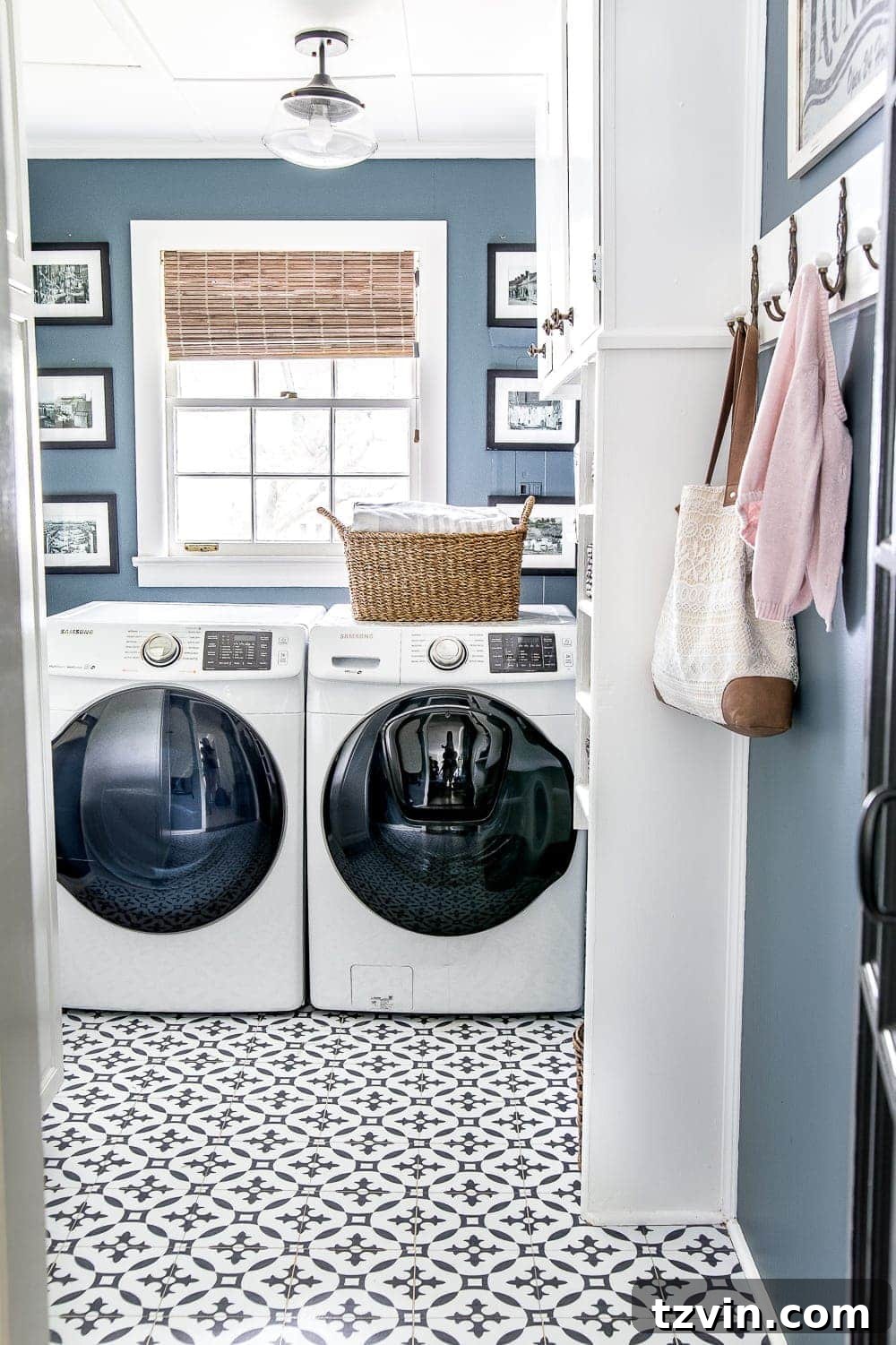
Our journey with Sherwin Williams Slate Tile began many years ago during a Lowe’s Spring Makeover, where we used it on bathroom cabinets. I instantly fell in love with this shade and knew I had to incorporate it into our main home palette. Slate Tile is a deeply saturated blue, but it’s beautifully tempered with just enough gray to give it a calming, dusty quality. It’s not a stark blue, but rather one that feels grounded and tranquil, making it an excellent choice for creating serene spaces. It evokes a sense of quiet sophistication and pairs wonderfully with both cool and warm accents, adding depth without being overwhelming.
(More info about our laundry room here.)
6. Romabio Blue Ridge Parkway: The Classic, Versatile Navy
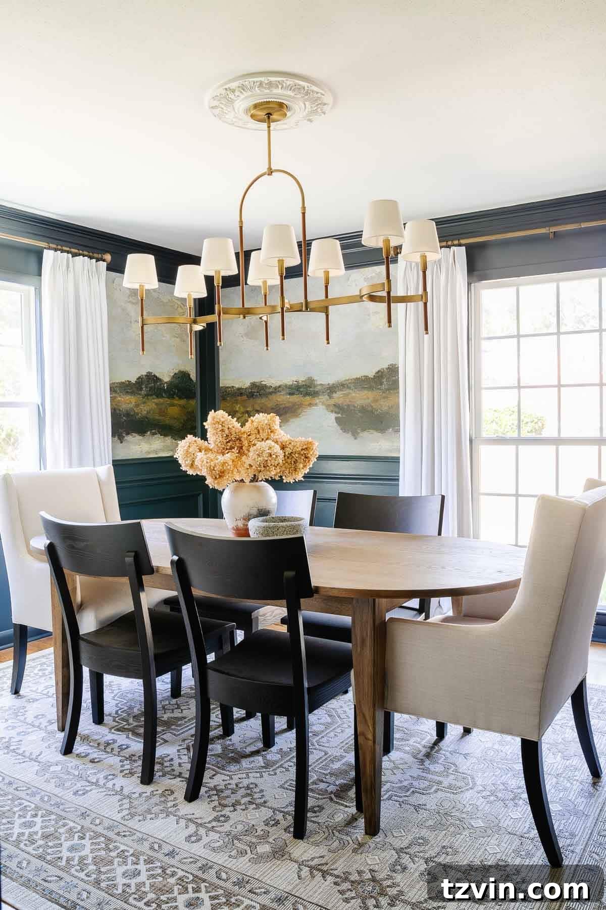
Romabio Blue Ridge Parkway captures the essence of a true classic navy blue, a color we adore for its incredible richness and versatility. It offers that perfect pop of deep, sophisticated color while maintaining the flexibility to act as a grounded neutral within a larger palette. This deep blue evokes a sense of tradition and stability, making it an excellent choice for dining rooms, studies, or accent walls where you want to create an atmosphere of refined elegance. It pairs beautifully with crisp whites, warm woods, and metallic accents, proving its adaptability in diverse design schemes.
Related: Best Navy Blue Paint Colors Recommended By Designers
(More info about our dining room here.)
7. Sherwin Williams Billiard Green: A Handsome, Earthy Statement
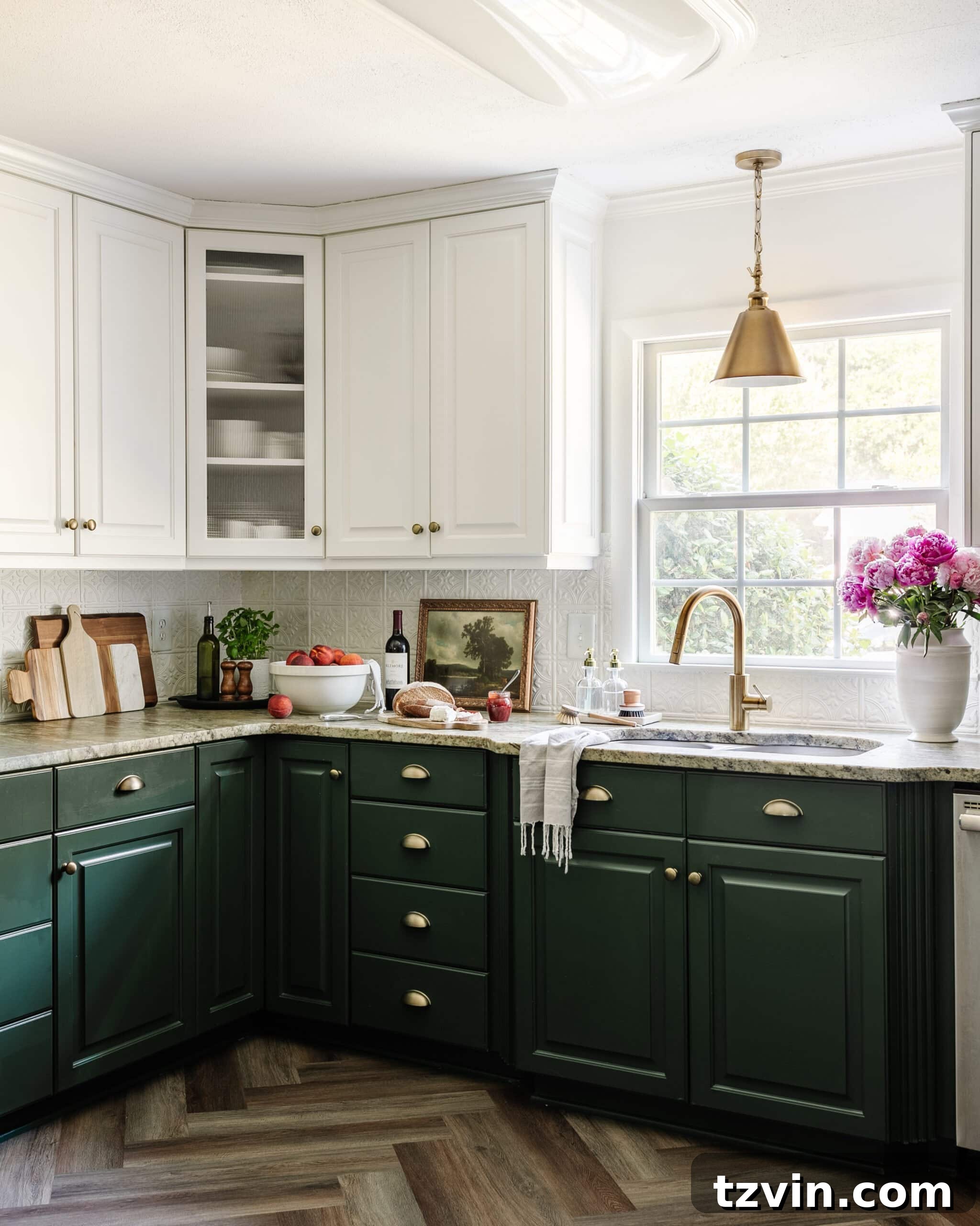
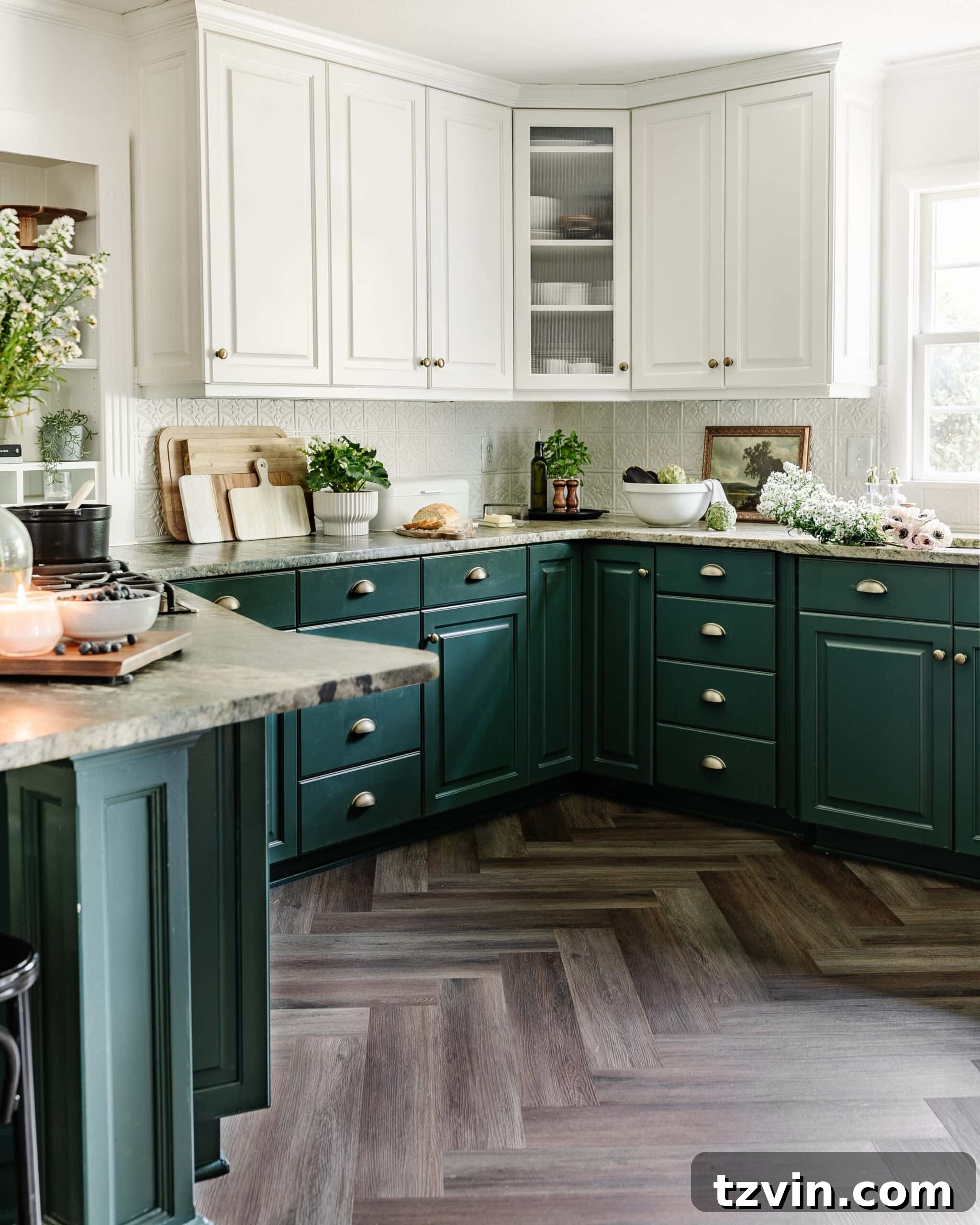
When it came to our kitchen cabinets, specifically the lower units, Sherwin Williams Billiard Green was the undeniable winner after testing nearly a dozen different green shades. This color is incredibly accurate to its name, reminiscent of the deep, rich felt of a billiard table. It’s a handsome, earthy shade that brings a natural yet sophisticated touch to the kitchen. Paired with Benjamin Moore Simply White on the upper cabinets – our trusted trim color – it creates a beautiful two-tone effect that feels both classic and contemporary. This deep green adds a sense of warmth and character, making the kitchen feel inviting and well-appointed.
Related: Green Kitchen Cabinet Inspiration
(More info about our kitchen here.)
8. Sherwin Williams Cascades: The Moody, Vibrant Chameleon
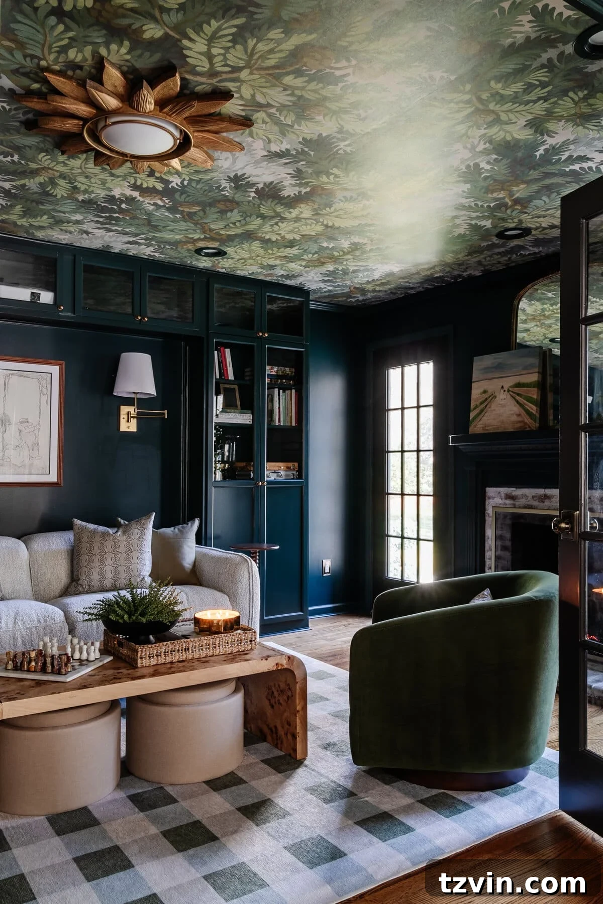
Sherwin Williams Cascades is truly perfect for our media room, creating an incredibly cozy and immersive atmosphere for family movie nights. This color is wonderfully moody yet retains a vibrant essence, transforming beautifully with the changing light. Depending on the ambient lighting in the room, Cascades can shift between looking like a deep hunter green, a rich teal, or even a profound navy blue. This chameleon-like quality makes it fascinating and dynamic. It’s a hard color to precisely describe, but its stunning depth and nuanced transitions in various lights make it an absolute showstopper, adding a layer of luxurious drama.
Related: Best Teal Paint Colors to Try and Why It’s Trending
(More info about our media room here.)
9. Farrow and Ball Brinjal: A Luxurious Burgundy-Eggplant
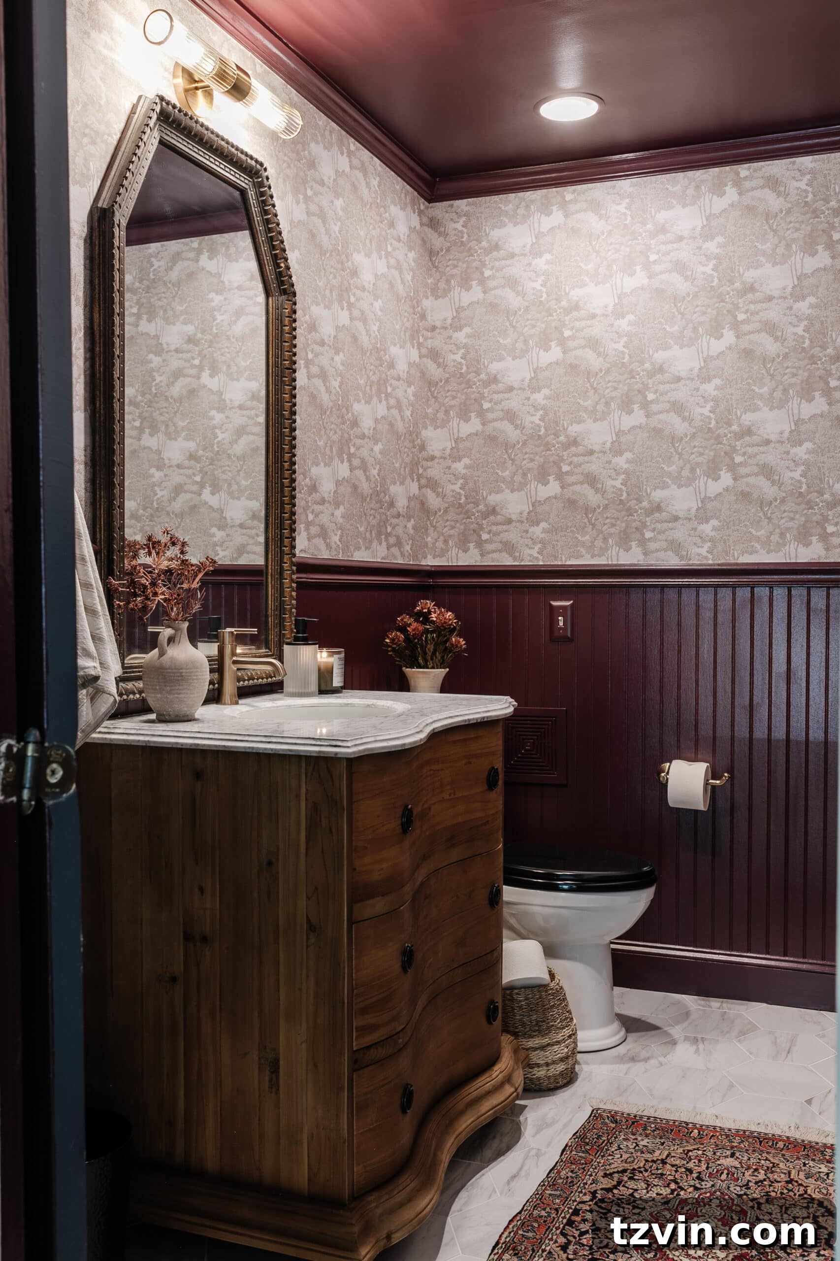
While the lighting in our powder room admittedly doesn’t fully capture its splendor, Farrow and Ball Brinjal is a gorgeous, bold color that defies easy categorization. It lies somewhere between a deep burgundy and a rich eggplant, offering a truly luxurious and enveloping hue. The moment you step into the room, Brinjal immediately creates a feeling of warmth and intimate coziness. It’s a dramatic statement color that works beautifully in smaller spaces, turning them into jewel boxes of design. Its depth and sophistication make it an unforgettable choice, adding an unexpected touch of glamour to any space.
Related: 12 Trending Burgundy Paint Colors Recommended by Designers
(More info about our powder room here.)
10. Sherwin Williams Smoky Blue: A Historical and Bold Dusty Blue
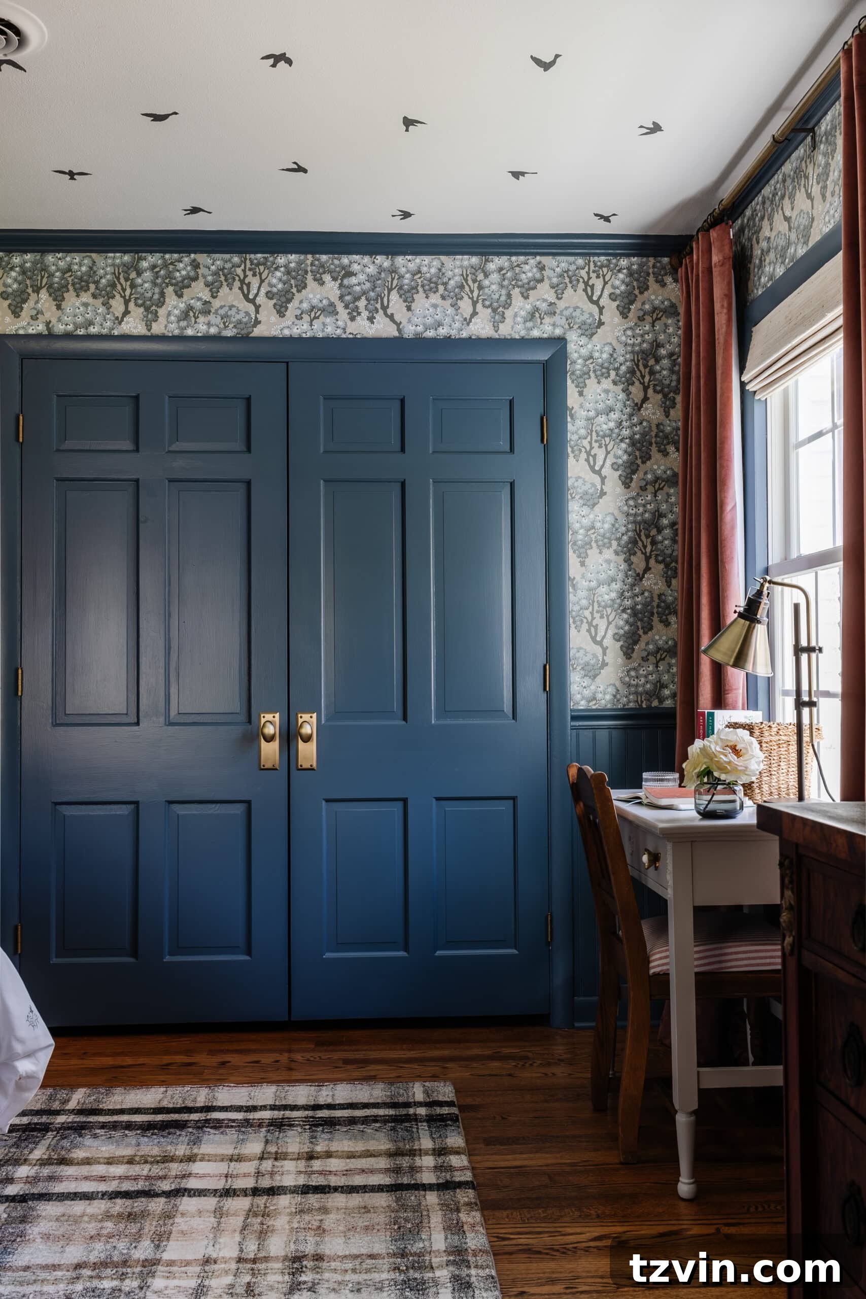
Our home undeniably has an affinity for blue, and Sherwin Williams Smoky Blue is a testament to that. It took countless samples to discover this perfect shade – a bold yet beautifully dusty blue with an unmistakable historical vibe. Smoky Blue instantly transports you to the colonial era, offering a sense of timeless charm and grounded tranquility. It’s a color that feels both strong and soothing, capable of creating a serene retreat while still making a confident statement. Its unique depth allows it to pair well with both traditional and modern decor, providing a versatile foundation for any room, particularly bedrooms where a calming atmosphere is desired.
Related: Most Recommended Blue-Gray Paint Colors for a Calm Home
(More info about Olivia’s bedroom here.)
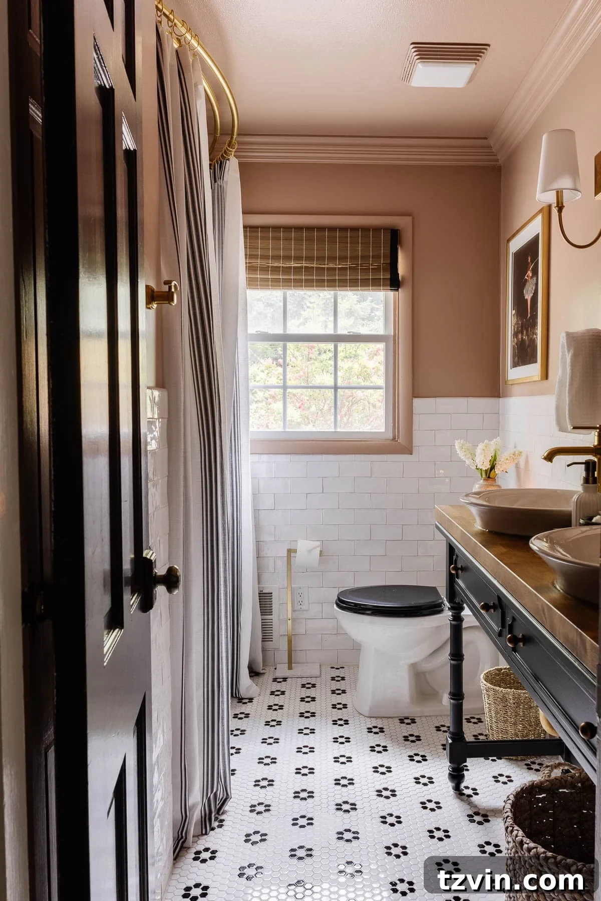
11. Behr Postmodern Mauve: A Neutral-Leaning Blush Pink
Behr Postmodern Mauve stands out as my absolute favorite medium blush pink, uniquely leaning slightly neutral to offer warmth in an unconventional yet sophisticated manner. This delicate balance makes it incredibly adaptable, moving beyond typical feminine connotations to create a cozy and inviting ambiance that can suit various styles. We chose it for our girls’ bathroom, where it delivered the perfect pop of soft color, infusing the space with a sense of gentle comfort and whimsy. It’s a subtle yet impactful choice for those looking to add a touch of warmth and personality without overwhelming a room, pairing beautifully with both crisp whites and deeper tones.
(More info about our kid’s/guest bathroom refresh here.)
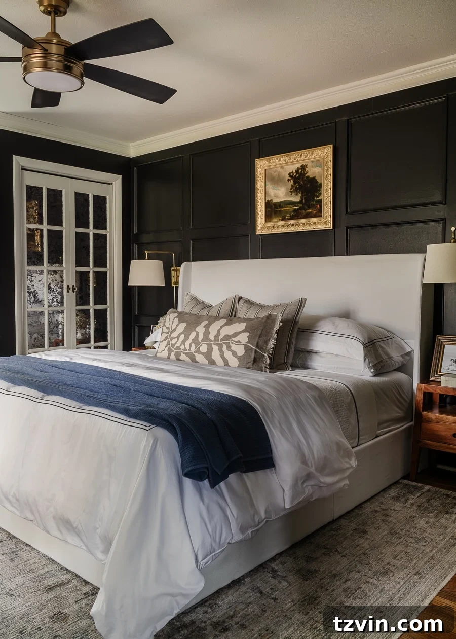
12. Kilz Rebel: The Deepest, Truest Black for Dramatic Spaces
When it comes to creating truly dramatic and sophisticated spaces, Kilz Rebel is an unparalleled choice. It is one of the deepest, truest blacks you can find, capable of transforming a room with its profound intensity. This color isn’t for the faint of heart; it makes a bold statement, enveloping a space in an aura of moody elegance and contemporary chic. We embraced this intense hue in our primary bedroom, giving it a full makeover in winter 2020. The result was a stunning, high-contrast retreat that exuded a luxurious sense of drama and intimacy. Kilz Rebel proves that black paint can be incredibly stylish and inviting when used thoughtfully.
Related: Making a Case for Black Paint
We gave our bedroom a full makeover with that heaping dose of drama.
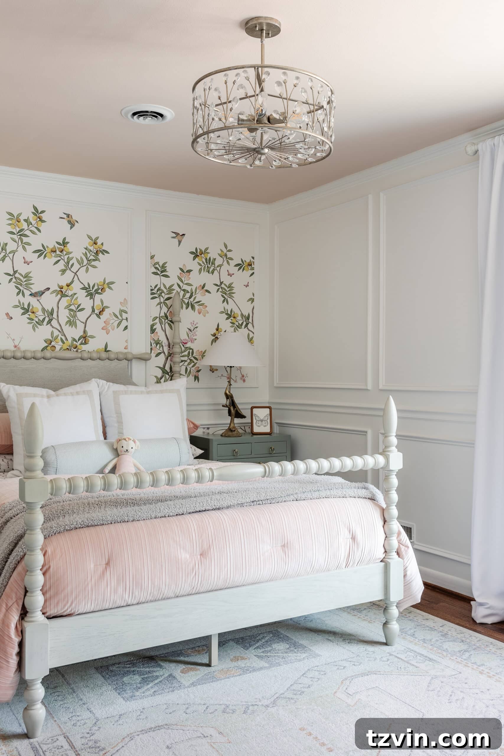
13. Romabio Barefoot Dance & Magnolia True White: A Blush Ceiling Duo
In Regan’s room, we ventured into a delightful combination: Romabio Barefoot Dance on the ceiling and Magnolia True White on the walls. Magnolia True White, as its name suggests, is a bright and unequivocally true white. While it offers a crisp foundation, we personally weren’t completely satisfied with its coverage, which led us to explore other whites in subsequent projects. However, our absolute adoration belongs to Romabio Barefoot Dance on the ceiling. This peachy blush color transforms the ceiling into an unexpected focal point, casting a warm, soft glow throughout the room. It’s a whimsical and gentle touch that adds character and a sense of cozy enchantment, perfect for a child’s bedroom or any space desiring a subtle, romantic blush.
Related: Best Blush Pink Paint Colors Recommended for Interiors
(More info about Regan’s room here.)
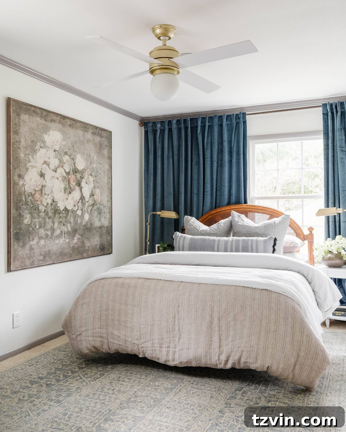
14. Benjamin Moore White Dove & Winter Gates: The Perfect Warm Gray Harmony
For those seeking the “Goldilocks” of whites – not too bright, not too creamy – Benjamin Moore White Dove is the answer. It masterfully hits all the right notes, offering a soft white with just the slightest kiss of creaminess. This makes it incredibly inviting and versatile, providing a gentle brightness without feeling stark. In our guest bedroom, White Dove graces the walls, creating a welcoming and serene atmosphere. For a beautiful contrast, the trim and doors are painted Benjamin Moore Winter Gates. We absolutely adore Winter Gates for trim and cabinets; it’s a warm gray with just enough yellow undertone to make it beautifully inviting. This combination pairs exquisitely with both cream and ivory tones, creating a sophisticated and harmonious look that is both modern and timeless.
(More info about our guest bedroom here.)
15. Benjamin Moore Palladian Blue: The Charming Southern “Haint Blue”
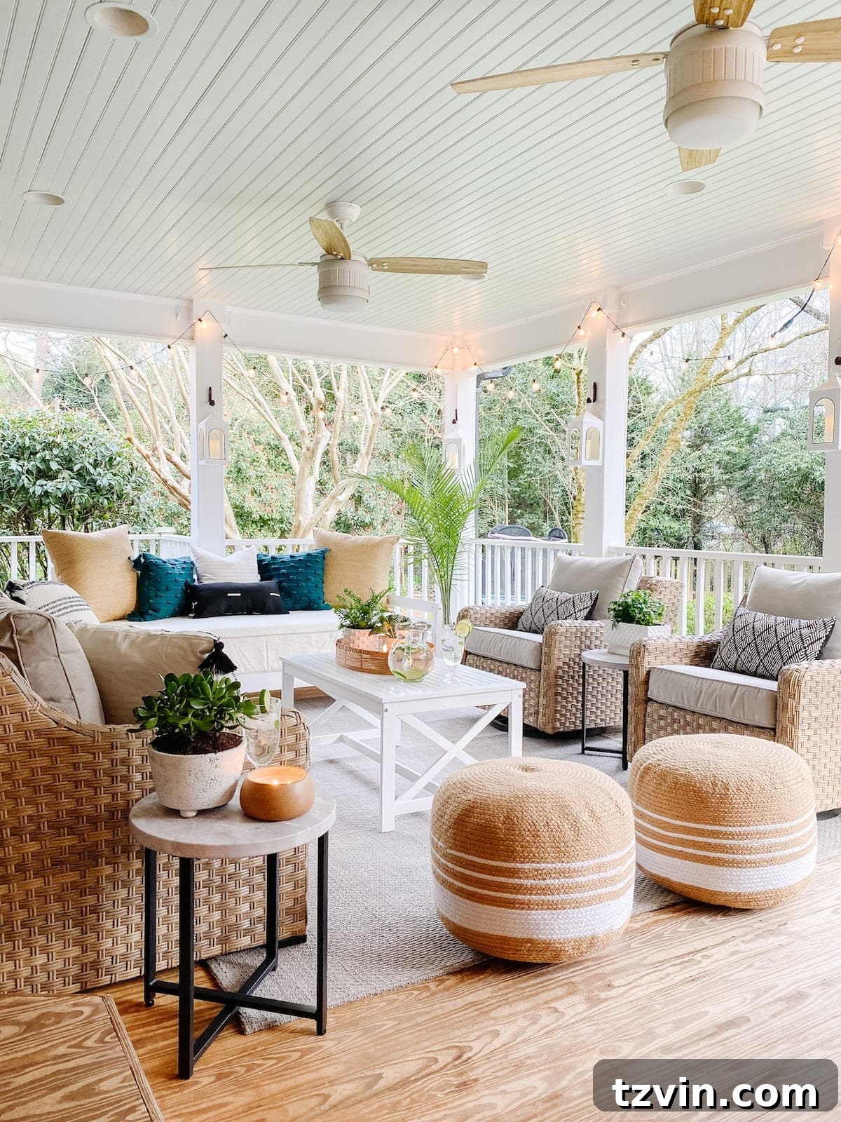
Benjamin Moore Palladian Blue holds a special place in our hearts as our chosen “Southern haint blue.” This delightful shade evokes the charm of traditional porch ceilings seen throughout Charleston, believed to ward off evil spirits and keep pests away. Its soft, serene aqua-blue hue is incredibly soothing and evokes the tranquil feeling of a clear sky. While we used it on our back porch ceiling to capture that classic Southern tradition, Palladian Blue would be equally stunning on interior walls if you’re brave enough to embrace its gentle aqua charm. It offers a subtle yet refreshing pop of color that brings a breath of fresh air to any space, inside or out.
Related: The Best Haint Blue Paint Color for Porch Ceilings
(More info about our back porch here.)
We’re always seeking fresh inspiration for our upcoming room makeovers. Do you have any favorite paint colors of your own that you swear by? We’d love to hear your suggestions and expand our creative palette!
Frequently Asked Questions About Whole House Paint Palettes
While it’s perfectly acceptable to use a single color, especially a neutral, throughout an open-concept living space to create a sense of expansive continuity, it’s generally recommended to vary your colors to some extent. The key is to maintain a feeling of cohesion and flow. For areas with no definitive breaks between spaces, like an open living and dining area, using one color can unify the space. However, in distinct rooms, introducing subtle variations in hue, saturation, or even sheen can add depth, interest, and personality without sacrificing continuity. A cohesive whole-house palette doesn’t mean every room must be identical, but rather that all colors should complement each other.
This depends entirely on your desired aesthetic and personal preference. Matching the ceiling color to the trim (often a shade of white) creates a clean, classic, and seamless look that can make walls appear taller. This is a very common and safe choice. However, breaking from this tradition can be incredibly impactful! You might choose to make the ceiling a “fifth wall” with a bold color, wallpaper, or even a soft, unexpected hue like a blush or light blue (our Romabio Barefoot Dance is a great example). Similarly, the trim can become a statement on its own with a contrasting color, as seen with our Sherwin Williams Willowleaf trim. If you opt for white on both, using the exact same shade of white for consistency is best to avoid subtle, unintended color clashes.
Choosing the right paint sheen is crucial for both aesthetics and durability. Different sheens reflect light differently and offer varying levels of resilience. While preferences can vary, here’s a general guide:
- Flat/Matte: Best for ceilings and low-traffic areas. It hides imperfections well and provides a soft, non-reflective finish.
- Eggshell: A popular choice for walls in most rooms (living rooms, bedrooms). It offers a subtle sheen, is more durable than flat, and easy to clean without being too shiny.
- Satin: Ideal for cabinets, high-traffic walls (hallways, kids’ rooms), and bathrooms. It has a smooth, velvety appearance and holds up well to cleaning and moisture.
- Semi-Gloss: Highly durable and easy to clean, making it perfect for trim, doors, and often kitchens and bathrooms. It has a noticeable shine that accentuates architectural details.
- Gloss/High-Gloss: Very reflective and exceptionally durable. Often reserved for furniture, accent pieces, or a dramatic, modern look on doors or special features due to its mirror-like finish. We rarely use it for entire walls or ceilings due to its tendency to highlight every imperfection.
Explore More Paint Color Ideas and Inspiration
12 Best Sage Green Paint Colors for a Relaxing Room
Best Navy Blue Paint Colors Recommended By Designers
Best Teal Paint Colors to Try and Why It’s Trending